Adapt — ML Transfer Learning Landing Page Template
Finetune is a split-screen landing page template built for transfer learning platforms. It pairs a live Python code snippet with a real-time training dashboard, then walks visitors through a Problem-to-Solution arc and a head-to-head comparison table. The result is a page that speaks directly to machine learning engineers and converts through clarity, not hype.
by Rocket studio
Quick summary
Finetune is a single-page landing page template designed for transfer learning platforms targeting machine learning engineers. It opens with a 50/50 split-screen header showing working Python code alongside a live training dashboard. The scroll tells a tight problem-to-solution story and closes with a competitive comparison table that makes the platform's advantages impossible to ignore.
Who this template is for
This template is built for technical founders, product marketers, and developer-relations teams promoting transfer learning or fine-tuning platforms. It speaks the language of people who read loss curves before reading copy.
- Machine learning leads at growth-stage startups who need to justify compute spend
- Research engineers at organizations with proprietary datasets but limited training budgets
- Solo practitioners and competitive modelers who need a real edge in applied deep learning
What problem this template solves
Most software landing pages describe features. This one demonstrates capability. ML engineers distrust vague claims. They want to see the code, the numbers, and the benchmark before they consider signing up. Generic SaaS templates cannot carry that weight.
- Visitors bounce when they cannot immediately tell if a tool fits their technical workflow
- Comparison-heavy audiences need side-by-side evidence, not paragraphs of marketing copy
- A mismatch between the product's depth and the page's visual credibility kills conversions before a call to action is ever clicked
What you get with this template
You get a fully structured, single-page layout engineered around the decision-making patterns of technical audiences. Every section is purposeful and sequenced to move a skeptical engineer from curiosity to action.
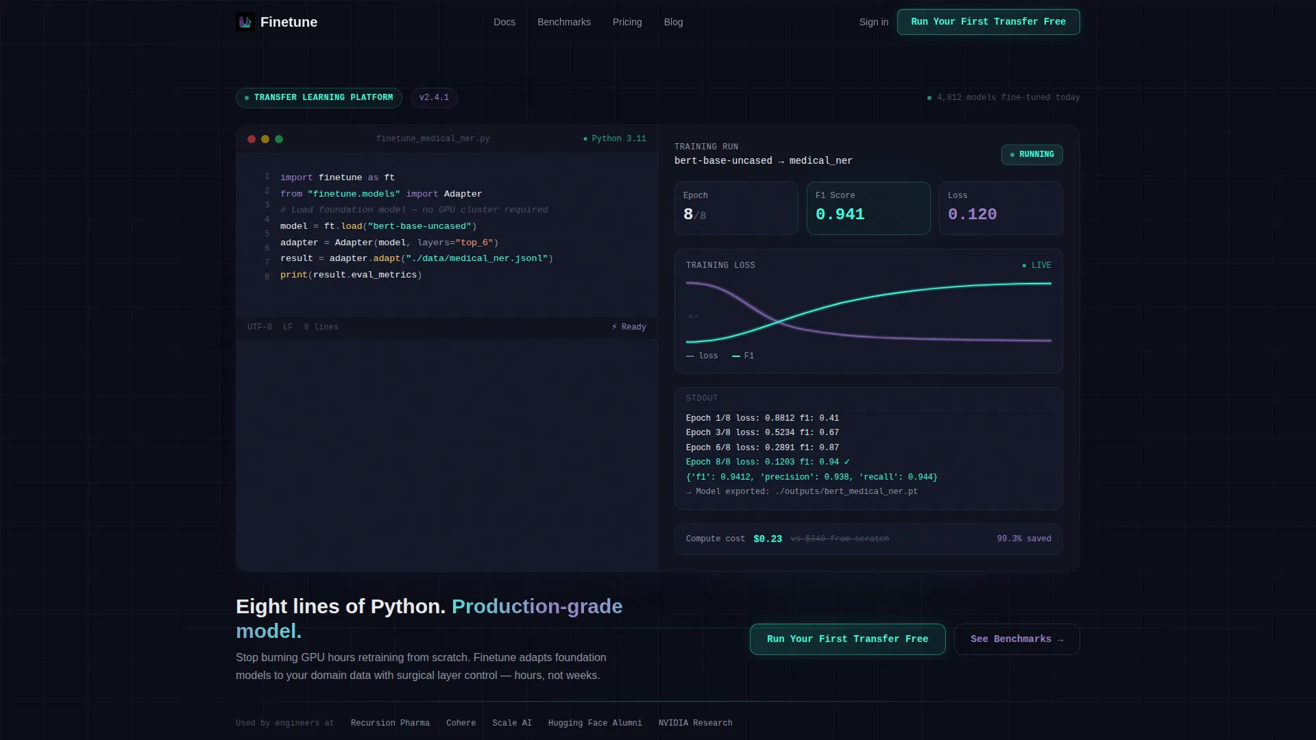
- A split-screen header block with a syntax-highlighted Python editor panel and a live-state training dashboard panel
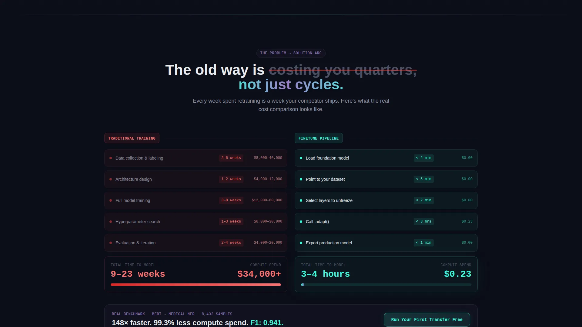
- A scrollable Problem-to-Solution arc with two versus sections, each containing real benchmark data instead of illustrations
- A sticky mid-page comparison table, dual call to action placements, and a secondary lead-qualification modal flow
Feature list
This template ships with six purpose-built sections and a cohesive visual system. Each component below is drawn directly from the design brief.
Split-Screen Header with Code and Dashboard
The header divides the viewport into two equal halves. The left panel displays eight lines of Python in a monospaced editor font with syntax highlighting: holographic violet for keywords, plasma teal for strings, and signal white for variables. The right panel shows a mid-run training dashboard with an epoch counter, a descending loss curve, and an F1 score climbing toward 0.94. The implicit message lands before a single word of copy is read.
Problem-to-Solution Scroll Arc
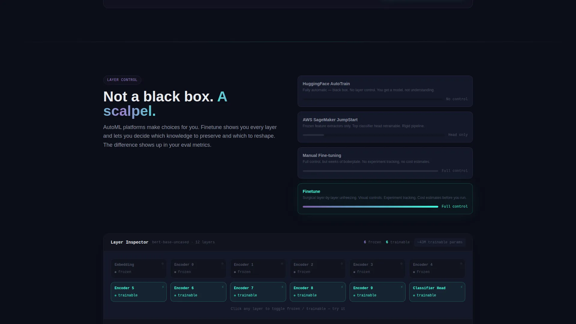
Two sequential versus sections escalate the pain of traditional workflows. The first splits a weeks-long, high-cost training timeline against an hours-long, low-cost pipeline using transfer layers. The second contrasts rigid competitor tooling against granular layer-by-layer unfreezing controls. Each section uses real benchmark tables, not decorative graphics, so the comparison feels earned.
Sticky Comparison Table
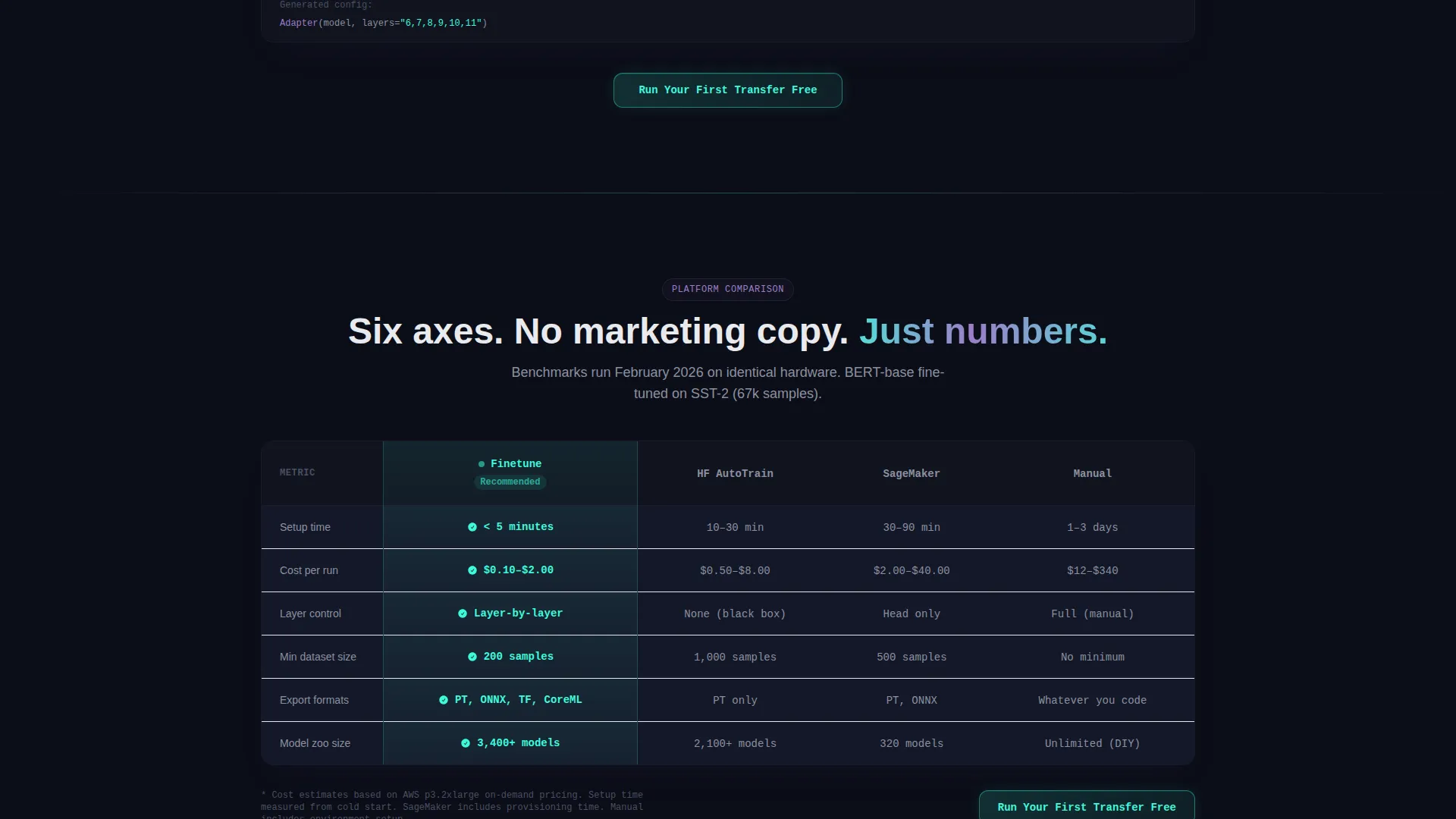
A mid-page comparison table stays anchored as the visitor scrolls. It evaluates the platform against competing tools across six axes: setup time, cost per run, layer control, dataset size minimum, export formats, and community model zoo size. The platform's column is highlighted in plasma teal for immediate visual dominance.
Dual call to action Placement
The primary call to action, "Run Your First Transfer Free," appears in the header and repeats after each versus section. This keeps the conversion opportunity visible without disrupting the editorial flow of the page.
Lead-Qualification Benchmark Modal
A secondary call to action, "See Benchmarks on Your Use Case," opens a lightweight modal. The modal asks for three inputs: domain (natural language processing, computer vision, or tabular data), base model preference, and dataset size. It returns an estimated training time and cost before any account creation is required, delivering immediate value while qualifying the lead.
AI Iridescent Color System
The entire page runs on a four-color palette designed to feel like a GPU-lit terminal at 2 AM. Void black forms the base, holographic violet drives primary actions and graph lines, plasma teal marks success states and metric highlights, and signal white handles body text and axis labels. Gradients bleed violet into teal at card edges and progress bars, giving the interface the feeling of active inference.
Page sections overview
| Section | Purpose |
|---|---|
| Split-Screen Header | Pair code with live dashboard to establish instant technical credibility |
| Training versus. Traditional | Show time and cost gap between legacy workflows and transfer learning pipeline |
| Layer Control versus. Competitors | Contrast granular unfreezing against frozen extractors and rigid AutoML tools |
| Sticky Comparison Table | Benchmark platform against competing tools across six decision axes |
| Benchmark Modal call to action | Qualify leads by domain, model, and dataset size before signup |
| Repeated call to action Strip | Re-surface primary conversion action after each persuasion section |
Design & branding system
The visual system is built on the Dashboard Pro theme with an AI Iridescent color palette. Every color choice carries functional meaning, not just aesthetic weight.
- Void black (#0B0D17) as the full-page background, holographic violet (#7B5EA7) for interactive elements and data curves, plasma teal (#3DFADC) for success indicators and the highlighted comparison column, and signal white (#E8EAED) for readable body text
- Gradient bleeds between violet and teal appear at card boundaries and progress bars, creating a sense of live computation rather than static design
- Monospaced editor typography in the code panel reinforces technical authenticity, while the overall layout keeps density high without feeling cluttered
Mobile & speed optimization
The split-screen layout is designed with responsive stacking in mind. On narrower viewports, the two-column panels reflow into a vertical sequence so the code snippet and dashboard remain readable without horizontal scrolling.
- Each panel is self-contained, which makes vertical stacking on mobile straightforward without breaking the visual narrative
- The sticky comparison table adapts to a scrollable card format on small screens so all six comparison axes remain accessible
- The benchmark modal is lightweight by design, with only three input fields, keeping interaction friction low on any device
How this template helps you convert
This page is structured around the psychology of a technical buyer who needs evidence before trust. Every layout decision serves a conversion goal.
- The code-plus-dashboard header removes the "does this actually work" objection in the first three seconds, before a visitor reads any marketing copy.
- The escalating versus sections create a growing sense that the visitor's current workflow is costing them time and money, making the primary call to action feel like relief rather than a sales ask.
- The benchmark modal converts curious visitors into qualified leads by giving them a personalized cost and time estimate before asking for any commitment.
Other information about this template
This template is built for a specific intersection: transfer learning technology platforms that need to earn trust from deeply technical audiences. A few additional details are worth noting.
- The comparison table includes named competing approaches as reference points, giving context to visitors who are actively evaluating their options in the fine-tuning and transfer learning space
- Use cases showcased in the brief include medical imaging classifiers, fraud detection pipelines, and multilingual named entity recognition, giving the page concrete domain credibility
- The template style is Split Screen (50/50), the theme is Dashboard Pro, the creative direction is Problem-to-Solution Arc, and the header concept is Code Snippet, all drawn from the matched intersection context
- The lp_direction is Comparison/Versus, meaning the entire scroll is engineered to help a visitor reach a clear "this is better" conclusion by the time they hit the final call to action
Theme
Dashboard Pro
Creative direction
Problem→Solution Arc
Color system
AI Iridescent
Style
Split Screen (50/50)
Direction
Comparison/Versus
Page Sections
Split-screen Code and Dashboard Header
Problem-to-solution Scroll Arc
Sticky Mid-page Comparison Table
Dual Call to Action with Repeated Placement
Lead-qualification Benchmark Modal
AI Iridescent Visual System
Related questions
Who is this landing page template designed for?
Can I customize the Python code snippet in the header?
Does the comparison table require a backend or live data connection?
What inputs does the benchmark modal collect?
Is this template suitable for a single product or a broader platform catalog?



