Developer Extension Landing Page Template
Extend is a dashboard-style landing page template built for a curated directory of plugins, extensions, and integrations. It features a live interactive data grid header, a head-to-head comparison engine, stats-first content sections, and a sticky comparison bar. The design uses a dark iridescent color system built for long-session browsing and confident decision-making.
by Rocket studio
Quick summary
Extend is a single-page template designed for a curated plugin and extension directory. It opens with a live data grid that behaves like the product itself, then guides visitors from browsing to deciding through stats-first content, a side-by-side comparison engine, staff picks, and two distinct conversion paths.
Who this template is for
This template is built for teams and founders who publish or maintain a directory of third-party tools, extensions, or integrations. It fits anyone whose visitors need to evaluate and compare options before committing.
- Engineering leads who need to assess third-party tools before handing over access credentials
- Operations managers hunting for a specific solution they can deploy within days
- Solo founders who want a professional, trustworthy directory that earns clicks through transparency
What problem this template solves
Most directory pages present tools as a flat list and leave the visitor to do all the research themselves. That friction kills decisions. Extend removes that friction by doing the comparison work in public, surfacing tradeoffs, and showing scoring logic so visitors trust the directory before they trust any single tool inside it.
- Visitors bounce when they cannot compare options without opening ten separate tabs
- Generic directory layouts make every tool look equally valid, which erodes trust
- Without a clear conversion path, browsing sessions end without any meaningful action
What you get with this template
You get a complete, single-page layout that takes a visitor from first impression to committed decision. Every section is designed to narrow the funnel progressively, from exploratory browsing to focused comparison to a clear call to action.
- An interactive data grid header showing live mock plugin cards with sortable columns and hover micro-expansions
- A head-to-head comparison engine with a shared spec table covering pricing, version support, webhook coverage, response time, and last-updated date
- A sticky comparison bar, staff picks section, individual plugin deep-dives with merchant reviews, and an email capture field with a role dropdown
Feature list
This template is built around a specific set of interactive and structural components. Each one is grounded in the source brief and designed to serve a distinct part of the visitor journey.
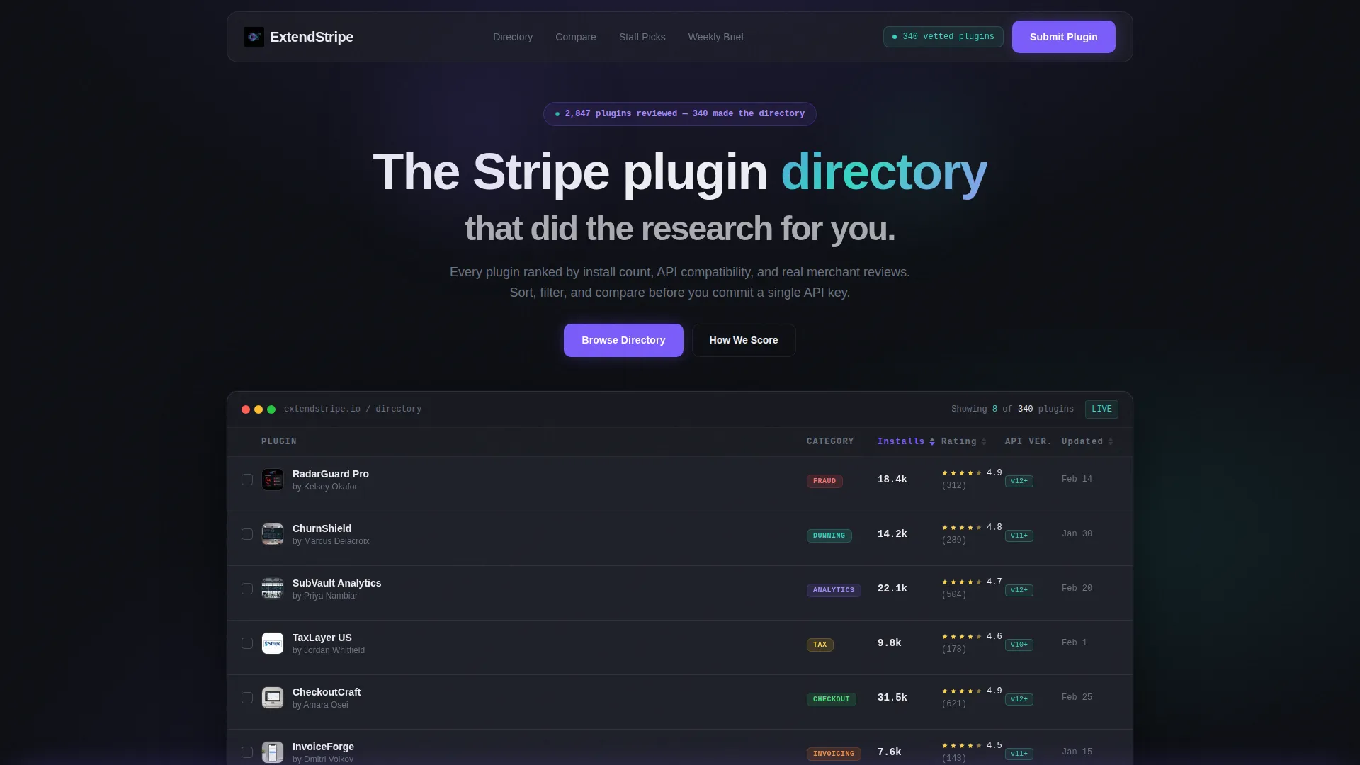
Live Interactive Data Grid Header
The header renders a functioning mock data grid directly in the viewport. Plugin cards populate in real time, each showing a name, category tag, install count, average rating, and a compatibility badge. Visitors can click column headers to re-sort by rating or installs without any page reload.
Hover Micro-Expansion Cards
Hovering any plugin card triggers a small expansion that reveals a one-line description and a "Compare" checkbox. This keeps the grid dense and scannable while giving curious visitors instant context exactly when they need it.
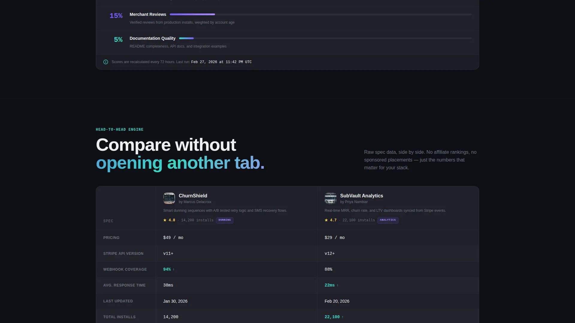
Head-to-Head Comparison Engine
Two plugin cards sit side by side above a shared spec table. The table covers pricing, API version support, webhook coverage, average response time, and last-updated date. Visitors run their own versus analysis without leaving the page.
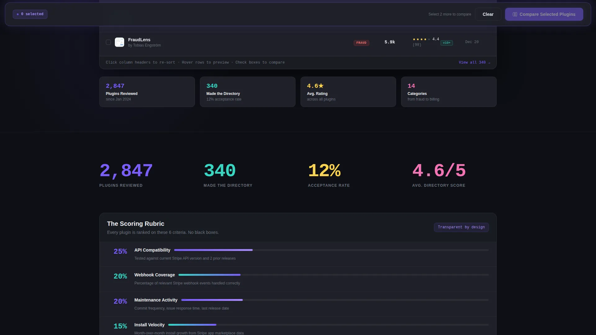
Sticky Comparison Bar
Once two or more plugin checkboxes are ticked, a sticky bar appears at the bottom of the viewport. One click generates a side-by-side spec sheet. This is the primary conversion path and it activates only when the visitor signals intent.
Stats-First Content Sections
Every scroll position leads with a number before an explanation. The first content section opens with a specific reviewed-versus-accepted count, earning trust immediately through the logic of exclusion. Each subsequent section narrows the funnel.
Email Capture with Role Segmentation
A secondary conversion path offers a weekly plugin digest. An email field is paired with a role dropdown letting visitors identify as an engineer, founder, or operations professional. This segmentation supports more relevant follow-up.
Page sections overview
| Section | Purpose |
|---|---|
| Interactive Grid Header | Shows live plugin cards; establishes product feel immediately |
| Stats Trust Block | Opens with reviewed versus. accepted count to earn credibility fast |
| Comparison Engine | Side-by-side spec table lets visitors evaluate two plugins head to head |
| Category Grid | Organizes plugins by type so visitors can browse by their specific need |
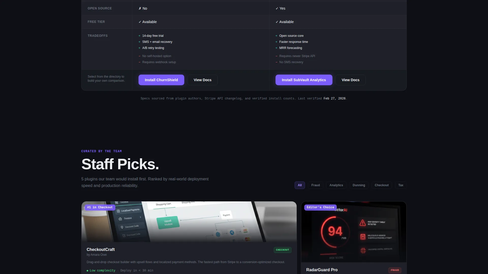
| Staff Picks Stack | Curated shortlist for visitors who want a trusted starting point |
| Plugin Deep-Dive | Individual plugin view with merchant reviews and complexity scores |
| Email Capture Section | Collects email and role for a weekly curated comparison digest |
| Sticky Compare Bar | Activates on checkbox selection; primary call to action for committed visitors |
Design & branding system
The visual identity follows a Dashboard Pro theme using an AI Iridescent color system. The palette is built for long, focused sessions in a dark environment, with color used sparingly to direct attention rather than decorate.
- Deep workspace black (#0D0F14) as the base background, muted titanium gray (#1E2028) for card surfaces, and crisp interface white (#EDEEF2) for all body and heading typography
- Iridescent violet (#7B5CFA) as the primary interactive accent color, shifting to holographic teal (#36D6C3) on hover states to signal interactivity
- The overall palette is described as a code editor running a theme slightly from the future: dark enough for hours of use, with color that pulses only where attention is needed
Mobile & speed optimization
The template layout is designed to translate from a wide data grid environment into a focused, scrollable mobile experience. The dashboard-style density of the desktop grid adapts to a single-column card flow on smaller screens.
- Column-sortable data grid headers collapse to a card-based scroll on narrow viewports
- The sticky comparison bar remains accessible at the bottom of the screen on mobile, preserving the primary conversion path
- Hover micro-expansions adapt to tap interactions so mobile visitors can still access the one-line descriptions and compare checkboxes
How this template helps you convert
The template is built specifically for a Comparison/Versus conversion model. Every structural decision pushes visitors from passive browsing toward an active side-by-side decision.
- The sticky "Compare Selected Plugins" bar activates the moment two checkboxes are ticked, meeting the visitor at peak intent with a single click to a spec sheet.
- The "Get the Weekly Plugin Brief" email capture offers a low-commitment secondary path, with a role dropdown that segments subscribers by job function for more relevant follow-up.
Other information about this template
This template sits within the Documentation and Support category, specifically targeting the Stripe plugin and extension directory niche. It is designed as a single landing page rather than a multi-page site, making it straightforward to deploy and customize.
- The template style is Dashboard and Data Grid, making it suitable for any curated tool directory beyond the payment integration space
- The creative direction is Stats-First Impact, meaning the layout is structured to lead every scroll position with a quantified claim before context
- The header concept is an Interactive Preview, which sets visitor expectations immediately by showing the product experience before any sign-up is required
- This template is built with the Dashboard Pro theme and the AI Iridescent color system, both of which are reflected in every color, surface, and interactive state across the page
Theme
Dashboard Pro
Creative direction
Stats-First Impact
Color system
AI Iridescent
Style
Dashboard/Data Grid
Direction
Comparison/Versus
Page Sections
Live Interactive Data Grid Header
Hover Micro-expansion Cards
Head-to-head Comparison Engine
Sticky Comparison Bar
Stats-first Content Sections
Email Capture with Role Dropdown
Related questions
Can I use this template for a directory outside the payment tools space?
Does the comparison engine require a backend to function?
What are the two main conversion paths in this template?
How does the interactive header data grid work?
Who is this template best suited for?


