Bold Chiropractic Social Media Landing Page Template
Adjust is a bold, modular landing page template built for chiropractic social media template shops. It combines a brutalist card grid layout with an acid digital color system to showcase carousels, stories, and reels at a glance. A dashboard-style header, live template counter, and a frictionless lead capture form make it easy to turn first-time visitors into subscribers fast.
by Rocket studio
Quick summary
Adjust is a single-page, card grid landing page template designed for chiropractic social media content shops. It opens with a content calendar dashboard preview, moves through hard-data proof cards, and closes with a low-friction lead capture form. The bold brutalist design and acid digital palette make every scroll feel deliberate and on-brand.
Who this template is for
This template is built for anyone selling or promoting chiropractic social media content. It speaks directly to practitioners and clinic operators who need a sharp, professional online presence without spending hours building one.
- Solo chiropractors managing their own Instagram between patient appointments
- Clinic managers overseeing multiple locations who need a single, polished content hub
- Chiropractic coaches building a personal brand on short-form video platforms
What problem this template solves
Most chiropractic content shops look like they were built as an afterthought. The visuals are generic, the proof is buried, and the sign-up flow asks for too much too soon. Adjust fixes that by leading with credibility, showing the product immediately, and making the free-offer form almost impossible to ignore.
- Weak first impressions that fail to communicate clinical authority or content quality
- Scattered page layouts that bury the offer and lose visitors before they scroll
- Overcomplicated sign-up flows that create friction and reduce lead capture rates
What you get with this template
You get a fully structured, single-page lead generation layout designed around a chiropractic social media content offer. Every section has a clear job, and the visual hierarchy guides visitors from curiosity to conversion without detours.
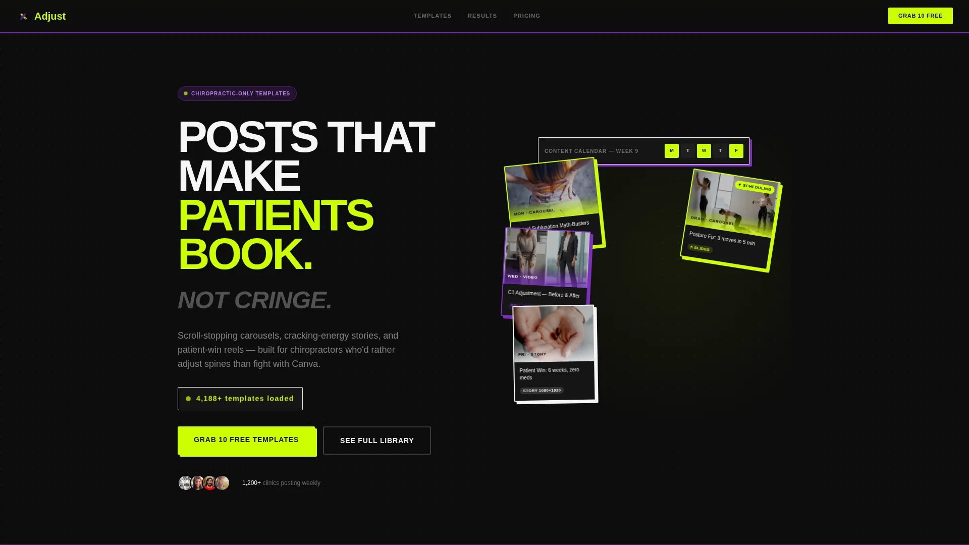
- A dashboard-style header with a rotating content calendar mock-up and a live template counter
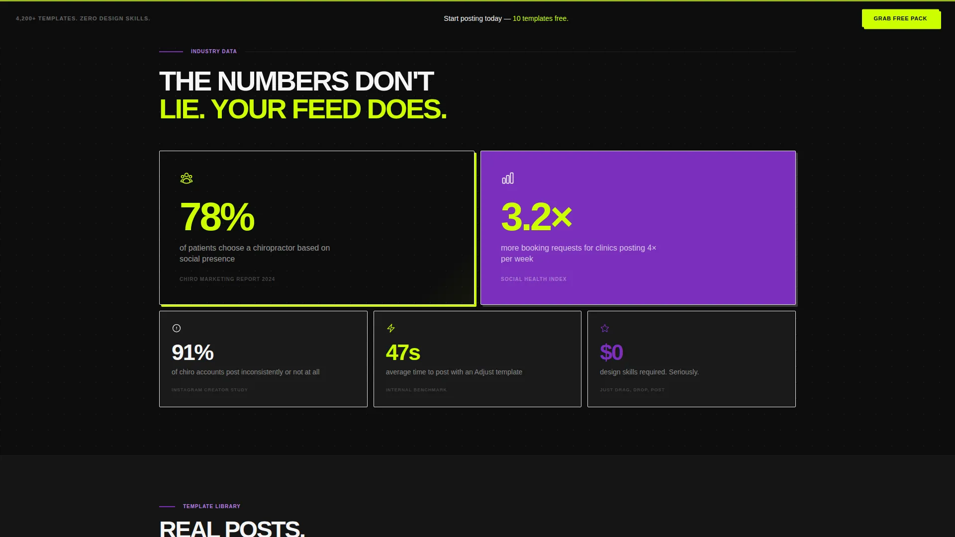
- Modular brutalist data cards displaying social proof statistics in a responsive Tetris-style grid
- A dual-path conversion system with a primary free-pack form and a secondary gated gallery link
Feature list
This template packs purpose-built components that work together as a single, cohesive lead generation machine. Each feature below comes directly from the page structure and design direction described in the brief.
Dashboard Header with Content Calendar Preview
The header opens with a mock-up of a content calendar interface showing a full week of chiropractic posts already loaded. Cards are slightly rotated with brutalist drop shadows, and one card appears mid-drag to create an active, in-progress feel. A pulsing live counter in chartreuse reads "4,200+ templates loaded" in the top corner.
Modular Brutalist Data Cards
Hard-hitting social proof statistics each occupy their own card module. Cards stack and rearrange responsively like a Tetris grid, keeping the layout dynamic across screen sizes. This approach gives every stat the visual weight it deserves without crowding the page.
Native Aspect Ratio Template Previews
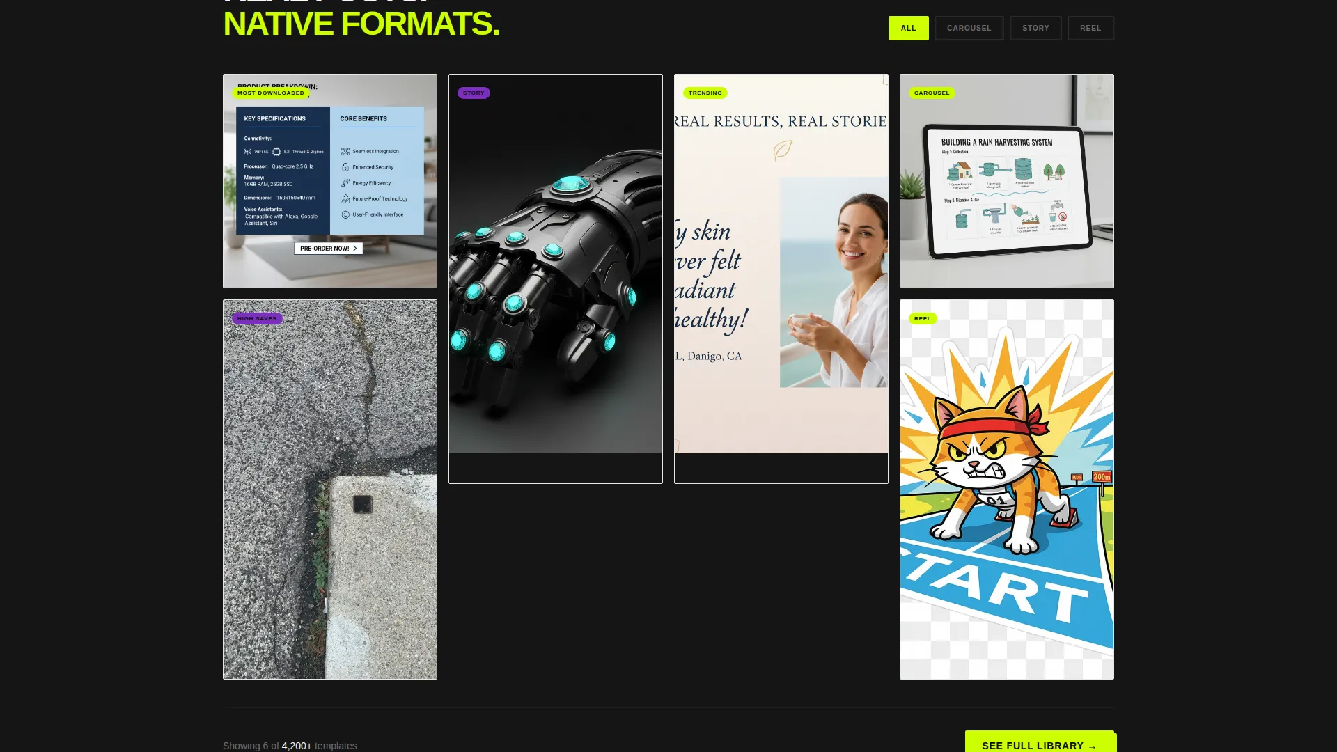
Between data sections, actual template preview cards render Instagram posts, stories, and reels at their native aspect ratios. Visitors see exactly what the content looks like before committing to anything. The rhythm alternates proof and product for a persuasive scroll experience.
Frictionless Lead Capture Form
The primary call to action, "Grab 10 Free Templates," appears first in the header and again in a sticky bottom bar after the second scroll section. The form collects an email address, a clinic name, and one practice-type toggle. That is the entire form, keeping friction at one screen.
Sticky Secondary Conversion Path
A secondary call to action, "See the Full Library," links to a gated preview gallery that captures email on entry. This gives hesitant visitors a lower-commitment way to engage. Both paths feed the same subscriber funnel without competing for attention.
Escalating Content Bundle Showcase
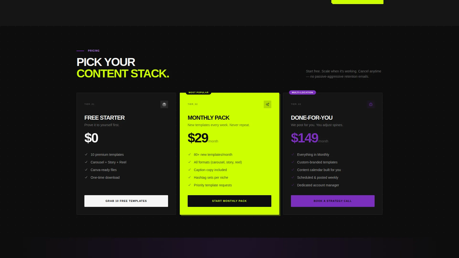
The page moves from single post previews to full content bundles to done-for-you monthly packs in a deliberate sequence. Each tier of offer is introduced after the previous one has been validated by proof. This escalation makes the upsell to a monthly subscription feel like a natural next step.
Page sections overview
| Section | Purpose |
|---|---|
| Dashboard Header | Hook visitors with a live content calendar preview and template counter |
| Social Proof Stats | Build credibility with hard data cards in a responsive modular grid |
| Template Preview Cards | Show actual post, story, and reel designs at native aspect ratios |
| Free Pack Form | Capture leads with a minimal three-field sign-up for 10 free templates |
| Content Bundle Showcase | Escalate offer value from single posts to full monthly content packs |
| Sticky call to action Bar | Reinforce the free-template offer with a persistent bottom conversion bar |
| Gated Gallery Link | Provide a secondary low-friction path to a preview library via email capture |
Design & branding system
The visual identity follows a Bold Brutalist theme powered by an Acid Digital color system. The palette is unapologetically loud, digitally native, and built to stop a scroll cold.
- Void black (#0D0D0D) dominates backgrounds and card containers for maximum contrast
- Electric chartreuse (#CCFF00) hits every call-to-action button and hover state like a highlighter dragged across the screen
- Ultraviolet (#7B2FBE) anchors section dividers and badge labels, while clinical white (#F5F5F5) keeps body text and card interiors readable
Mobile & speed optimization
The card grid layout is built to restack cleanly on smaller screens. Brutalist modules that behave like a Tetris grid on desktop collapse into a logical single-column flow on mobile without losing visual impact.
- Responsive card stacking ensures data modules and template previews remain readable at any screen width
- The sticky bottom call to action bar is designed to persist across mobile scroll without obstructing the main content
- Native aspect ratio previews for posts, stories, and reels display correctly across common mobile viewport sizes
How this template helps you convert
Adjust is engineered around a single goal: turning a first-time visitor into a named lead. Every design decision serves that outcome.
- The dashboard header creates an immediate "I need this" moment by showing a full week of professional chiropractic content already scheduled and ready.
- The alternating proof-and-product rhythm builds belief in the problem before presenting the solution, so visitors arrive at the form already convinced.
- The dual-path conversion system catches both decisive visitors and browsers, offering a free pack for the ready buyer and a gated gallery for the curious one.
Other information about this template
This template is a strong fit for anyone building or scaling a chiropractic social media content business. A few practical details worth knowing before you start customizing.
- The page style is a card grid (modular) layout, meaning individual content blocks can be repositioned to suit different offer structures or seasonal promotions
- The Bold Brutalist theme and Acid Digital palette are intentional design choices that reflect a digitally native audience, not a clinical one
- The Industry Report creative direction, with its data-first structure, works especially well for audiences who respond to proof before pitch
- This template is sold as a landing page file and does not include a connected backend, payment gateway, or pre-built subscriber list
Theme
Bold Brutalist
Creative direction
Industry Report
Color system
Acid Digital
Style
Card Grid (Modular)
Direction
Lead Generation
Page Sections
Dashboard Header with Content Calendar
Modular Brutalist Data Card Grid
Native Aspect Ratio Template Previews
Frictionless Three-field Lead Form
Sticky Bottom Conversion Bar
Escalating Bundle Showcase
Related questions
Who is this landing page template designed for?
Can I change the colors and copy to match my brand?
What does the lead capture form collect?
Do I need design experience to use this template?
Does this template include the actual chiropractic social media content?



