Chiropractic Digital Presence Complete Careers Website Template
Adjust is a high-performance chiropractic training landing page built for digital course platforms. It combines a live dashboard header, an interactive comparison grid, and a course catalog explorer into a single focused layout. The Carbon Fiber color system and Startup Velocity theme give it the sharp, instrument-ready feel of professional clinical software, built to convert skeptical practitioners into active learners.
by Rocket studio
Quick summary
Adjust is a dashboard-style chiropractic course and training platform landing page. It leads with a stylized learner portal preview, moves visitors through an interactive comparison grid, and closes with a persistent call-to-action bar. Every section is designed to feel like the product itself, purposeful, clinical, and ready to perform.
Who this template is for
This template is built for chiropractic education businesses that need a credible, high-converting digital presence. It speaks directly to the people running or building structured continuing education programs for licensed practitioners.
- Chiropractic course creators launching biomechanics or technique certification programs
- Clinic owners who need to onboard associate doctors to house standards quickly
- Platform operators targeting newly licensed doctors of chiropractic (DCs) and seasoned practitioners chasing advanced certifications
What problem this template solves
Most chiropractic training pages look like conference brochures. They list topics, drop a registration button, and ask visitors to take a leap of faith. That format fails the audience, experienced clinicians who evaluate tools critically and expect substance before commitment.
- Prospects cannot immediately see how a digital platform outperforms a weekend continuing education seminar
- Newly licensed DCs and advanced practitioners have very different needs, and a flat sales page rarely speaks to both
- There is no clear path for hesitant visitors who want to explore before they enroll
What you get with this template
You get a single, section-led landing page designed to do the selling before a visitor ever clicks a button. The layout moves from visual proof to structured comparison to a direct enrollment prompt, and every layer reinforces the one before it.
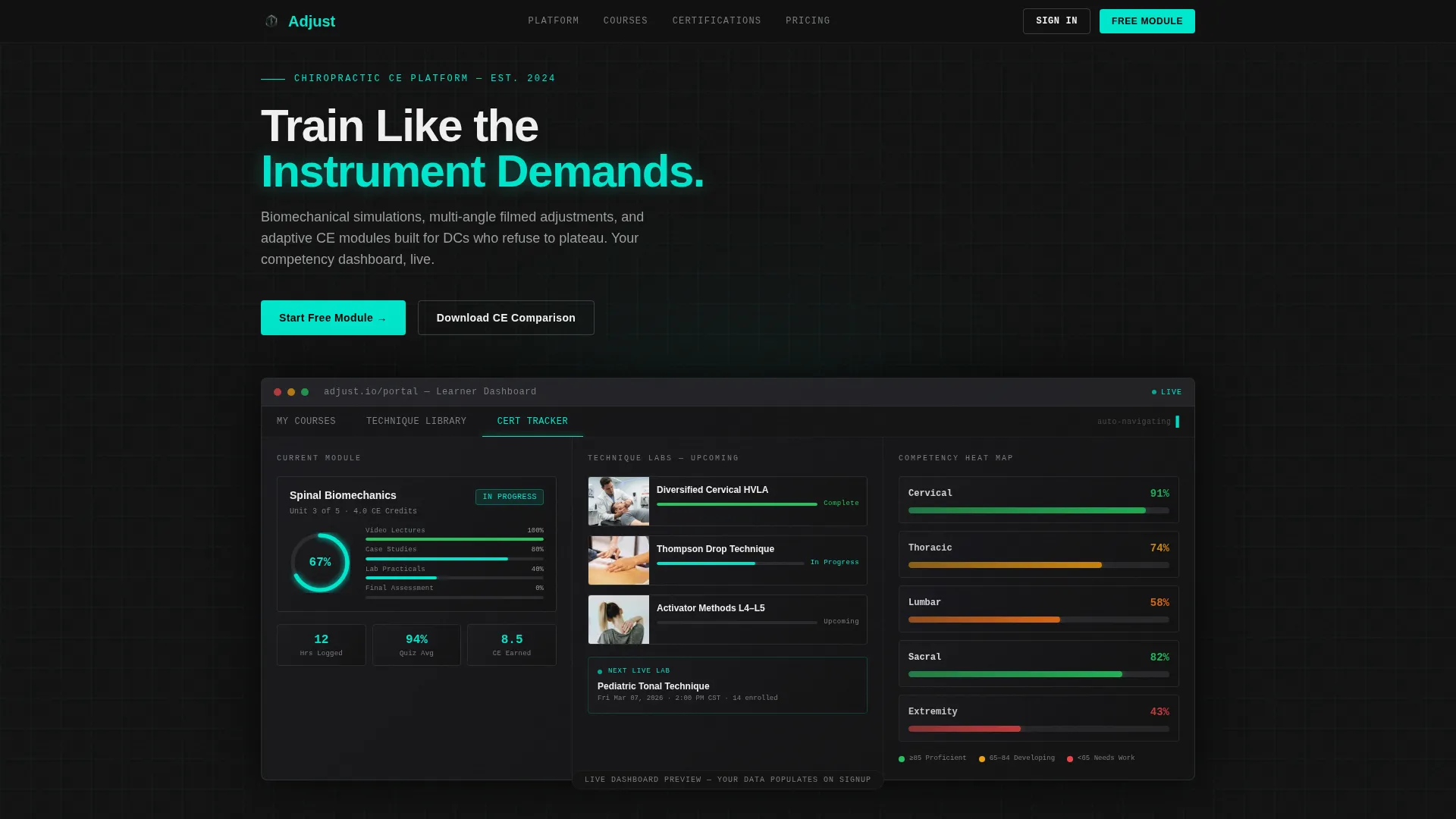
- A live dashboard header with a radial progress wheel, technique lab thumbnails, and a competency heat map
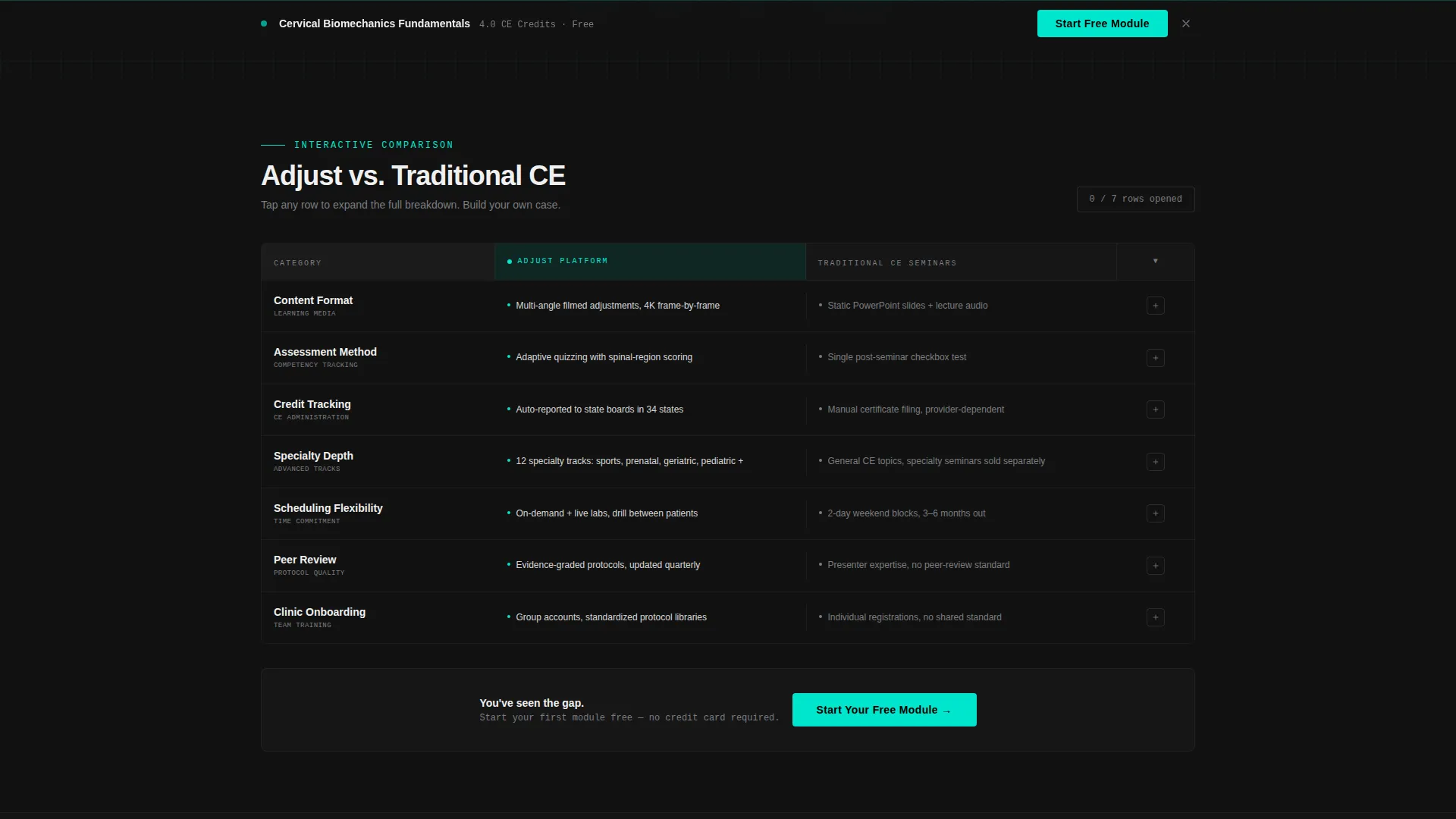
- A clickable comparison grid contrasting your platform against traditional continuing education seminars row by row
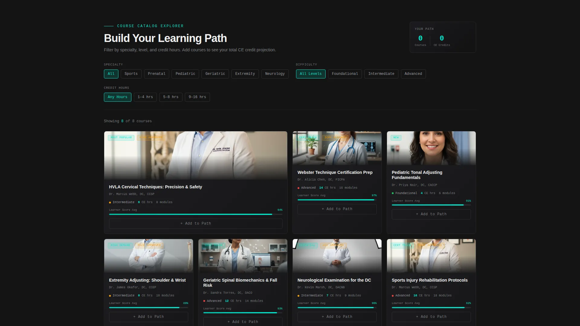
- A course catalog explorer with specialty, difficulty, and credit-hour filters so prospects can build a hypothetical learning path
Feature list
This template is built around active, exploratory layout components rather than passive read-and-scroll pages. Each feature serves a specific conversion role.
Live Dashboard Header Preview
The header renders a stylized learner portal at a glance. It shows a half-completed spinal biomechanics module, a radial progress wheel locked at 67 percent, and a competency heat map that colors cervical, thoracic, and lumbar zones from green to amber based on quiz performance. A subtle cursor animation cycles through tabs, "My Courses," "Technique Library," and "Cert Tracker", so the platform depth is visible before a visitor reads a single line of copy.
Interactive Comparison Grid
Two locked columns run a side-by-side breakdown of your platform versus traditional continuing education seminars. Each row is a clickable data cell. Tapping "Content Format" expands a micro-panel showing filmed multi-angle adjustments compared to static slide decks. Tapping "Assessment" reveals adaptive spinal-region quizzing compared to a single post-seminar checkbox. Visitors build their own case by opening only the rows that matter to them.
Course Catalog Explorer
Midway through the page, the grid shifts into a filterable course catalog. Prospects can sort by specialty, sports, prenatal, or geriatric, by difficulty tier, and by credit hours. The explorer lets a visitor assemble a hypothetical learning path before they ever enroll, making the platform feel tangible and personalized.
Persistent Bottom-Bar Call to Action
Once a visitor scrolls past the dashboard header, a floating bottom bar locks into view and stays visible throughout the scroll. The primary call to action, "Start Your Free Module," is always one tap away. It removes friction without interrupting the exploration flow.
Email-Gated Secondary Offer
A secondary conversion path offers a downloadable continuing education credit comparison sheet behind a lightweight email gate. This captures prospects who are curious but not yet ready to commit, giving the platform a warm lead rather than a lost visitor.
Comparison and Versus Conversion Architecture
The entire page is structured as a persuasion engine. By the time a visitor has opened four or five comparison rows, the distance between weekend seminars and structured digital training is impossible to ignore. The free module call to action at the end of the grid feels like the obvious next step.
Page sections overview
| Section | Purpose |
|---|---|
| Dashboard Header Preview | Opens with a stylized learner portal showing progress data and tab navigation |
| Comparison Grid Explorer | Lets visitors tap and expand rows comparing platform features to traditional seminars |
| Course Catalog Filters | Allows specialty, difficulty, and credit-hour filtering to build a learning path |
| Primary call to action Block | Places the free module prompt at the end of the comparison grid |
| Persistent Bottom Bar | Keeps the primary call to action visible throughout the full scroll |
| Email Gate Offer | Captures undecided visitors with a downloadable CE credit comparison sheet |
Design & branding system
The visual identity runs on the Carbon Fiber color system inside a Startup Velocity theme. The palette is deliberately dark and instrument-lit, modeled after the interior of a performance vehicle at night. Every color has a functional role, and none are decorative.
- Backgrounds stay in the black-to-graphite range using deep cockpit black (#121212) and woven graphite (#2A2A2E), while body text uses titanium mid-tone (#7B7D80) and near-white (#F0F0F0)
- Electric teal (#00E5CC) is reserved exclusively for progress bars, hover states, and active data points so the eye always knows where to click
- The overall aesthetic channels the feel of precision clinical software, organized, purposeful, and ready to perform at first glance
Mobile & speed optimization
The dashboard-style layout is structured for clean rendering across screen sizes without sacrificing the interactive depth that makes the page effective. The design decisions that drive desktop performance translate efficiently to narrower viewports.
- The comparison grid collapses gracefully on mobile, keeping the expandable row mechanic functional on touch screens
- The persistent bottom bar is sized and spaced for thumb-reach usability on smartphones and tablets
- Heavy visual elements like the heat map and progress wheel are styled components, keeping the page lean without losing the instrument-panel aesthetic
How this template helps you convert
The page is not built to inform visitors, it is built to move them. Each layer of the layout is a deliberate step in a conversion sequence that leads from curiosity to enrollment.
- The dashboard header creates immediate credibility by showing what the platform looks like in active use, reducing the "I wonder if this is legit" hesitation before any copy is read
- The interactive comparison grid does the persuasion work progressively, the more rows a visitor opens, the stronger the case becomes, so engagement directly correlates with conversion readiness
- The dual call-to-action structure catches visitors at two stages: the free module prompt for those ready to act, and the email-gated comparison sheet for those still evaluating
Other information about this template
This template is purpose-built for the chiropractic course and training platform niche within the broader Technology category for chiropractic digital presence. It is designed as a single landing page, not a multi-page site, so all conversion paths live within one focused scroll.
- The template style is Dashboard and Data Grid, which means the visual language borrows from clinical and professional software interfaces rather than typical course marketing pages
- The creative direction is Interactive Explorer, the scroll experience itself functions as a product demo, letting prospects feel the platform before they sign up
- The header concept is Dashboard Preview, meaning the very first thing a visitor sees is a simulation of what they will use as a learner
- The template is themed around Startup Velocity, giving it forward momentum and a modern, high-performance character consistent with premium digital training products
- The layout is pre-organized to serve three distinct learner profiles: newly licensed DCs building early confidence, experienced practitioners pursuing specialty certifications, and clinic owners standardizing associate onboarding
Theme
Startup Velocity
Creative direction
Interactive Explorer
Color system
Carbon Fiber
Style
Dashboard/Data Grid
Direction
Comparison/Versus
Page Sections
Live Dashboard Header with Progress Data
Clickable Comparison Grid
Filterable Course Catalog Explorer
Persistent Floating Call to Action Bar
Email-gated Lead Capture Offer
Related questions
Who is this landing page template designed for?
Can I use this template to present multiple course types?
What makes the comparison grid effective for conversions?
Does this template include a way to capture leads who are not ready to enroll?
What visual style does this template use?



