Modern Chiropractic Booking Landing Page Template
Adjust is a modern chiropractic landing page template built for clinics that want their booking experience to be the first impression. It uses a card grid layout with interactive service, provider, and spine-exploration modules, all tied to a live scheduling preview in the header. The Tech Glass visual style keeps it clean, clinical, and inviting at once.
by Rocket studio
Quick summary
Adjust is a single-page chiropractic booking template designed around an interactive scheduling preview and modular card grid layout. It speaks directly to desk workers, postpartum mothers, and weekend athletes who need clear answers fast. The design feels precise and calm, using frosted glass surfaces and sky blue accents to make the booking flow feel intuitive before a visitor has clicked anything.
Who this template is for
This template is built for chiropractic clinics that want to replace a generic brochure page with a booking-first experience. It suits practices serving a tech-savvy, results-oriented patient base who research before they commit.
- Chiropractors or clinic owners ready to move beyond static contact forms
- Practices offering multiple service types such as sports rehab, prenatal care, and initial assessments
- Clinics with more than one provider who want to showcase each one individually
What problem this template solves
Most chiropractic websites bury the booking step behind walls of text, stock photography, and generic "About Us" copy. Visitors leave before they ever see a time slot. Adjust solves this by making the scheduling interface the very first thing a visitor sees and explores.
- Patients can browse available slots, providers, and service types before committing to anything
- The page removes friction by routing clicks directly into the booking flow with service or provider pre-selected
- Visitors who are unsure what they need have a guided path through a short interactive assessment
What you get with this template
You get a fully structured, single-page layout built around modular card rows that each serve a distinct discovery purpose. Every component is designed to move a curious visitor toward a confident booking decision.
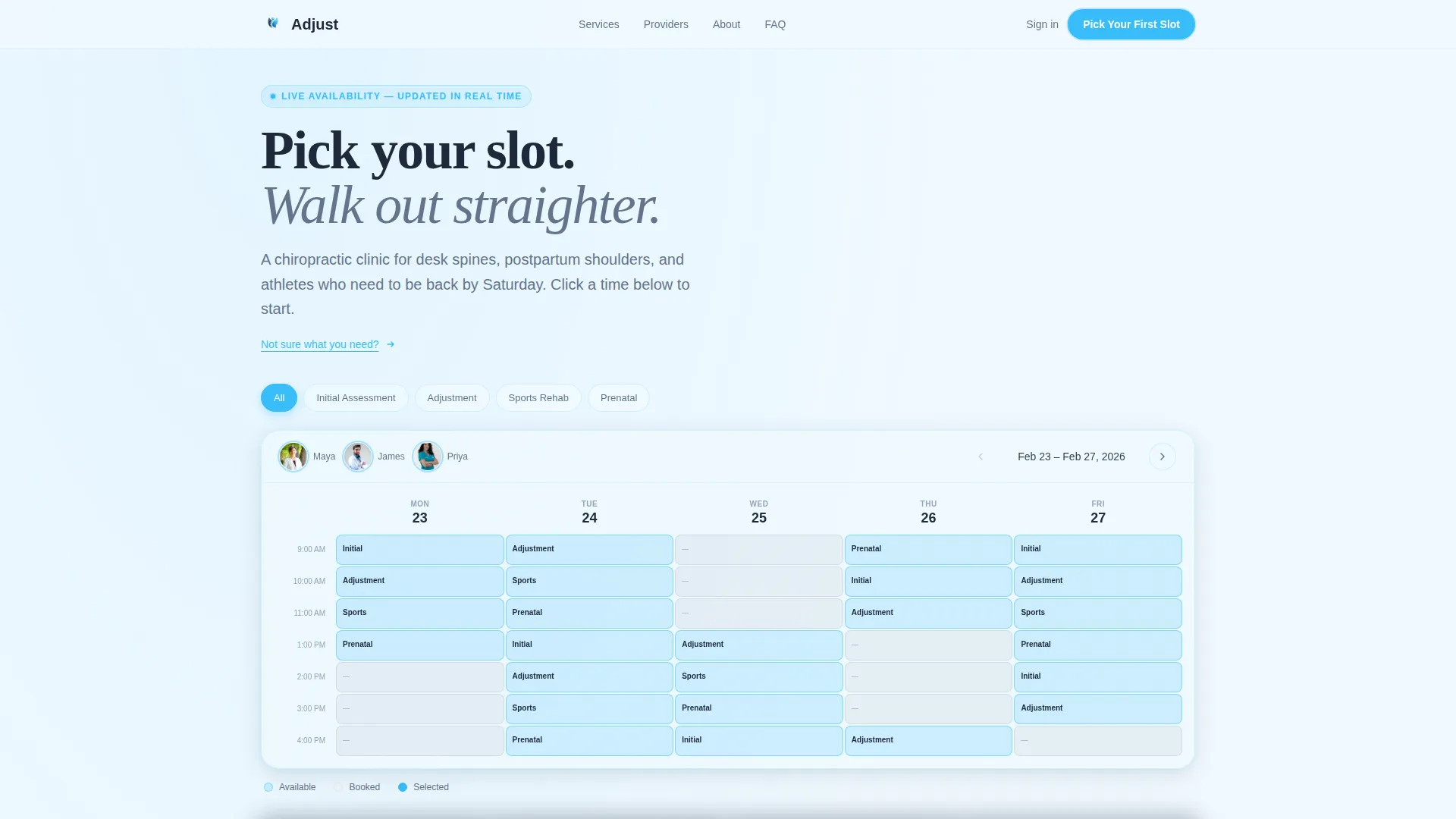
- An interactive header scheduling preview showing a full week view with filterable service tabs and provider photos
- Four rows of modular cards covering services, providers, a spine exploration diagram, and patient outcome timelines
- A persistent floating booking bar and a secondary guided assessment path for undecided visitors
Feature list
This template ships with a set of purpose-built interactive components. Each one is grounded in the goal of earning the booking click through exploration rather than persuasion.
Interactive Header Scheduling Preview
The header fills the full viewport width with a functional week-view scheduling interface. Available slots glow in sky blue, provider photos appear in soft circular frames, and service types sit in filterable glass tabs across the top. Visitors can click through days and hover over time slots to see duration and provider name before they have committed to anything.
Flip-Card Service Grid
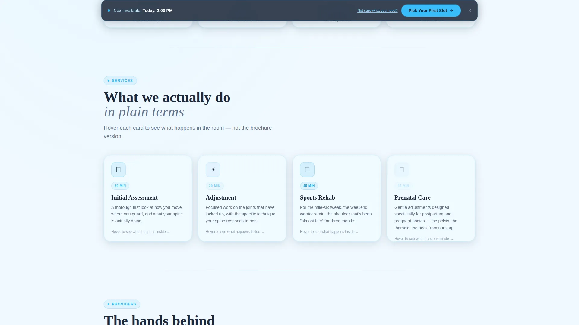
The first card row presents each service type as a card that flips on hover. The reverse side replaces clinical terminology with plain physical descriptions, such as focused work on the mid-back hinge that locks up from sitting. This helps patients understand what each session actually involves before choosing.
Provider Video Card Row
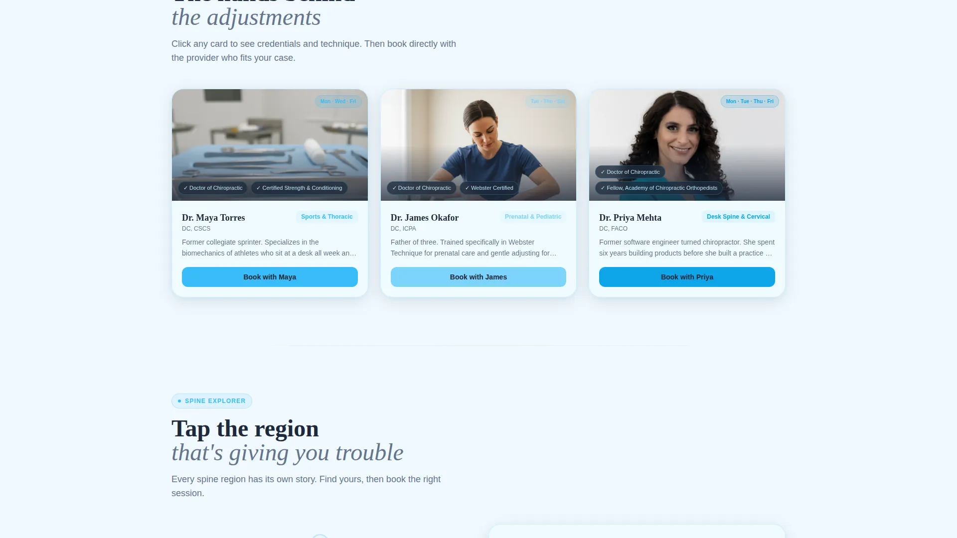
The second card row features each chiropractor with a short looping video of them demonstrating a technique. Credential information appears as glass-overlay chips layered on top of the video, keeping trust signals visible without interrupting the visual flow.
Interactive Spine Diagram
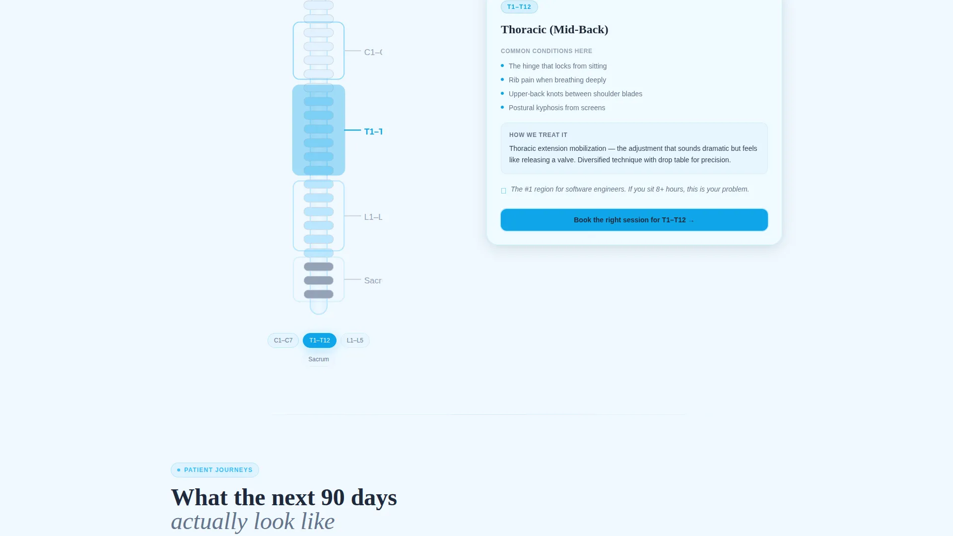
The third card row includes a tappable spine diagram. Visitors select vertebral regions to surface common conditions and recommended treatment options. This module helps undecided patients find the right service path on their own terms.
Patient Outcome Timeline Cards
The fourth card row shows real visit-frequency timelines for patients, tapering from weekly to monthly sessions. Outcome snapshots appear at each stage, giving prospective patients a realistic picture of what a care plan looks like over time.
Floating Booking Bar with Guided Assessment
After the first scroll, a fixed glass bar appears at the bottom of the viewport with the primary call to action. A secondary link offers a three-question interactive assessment that recommends a service type and deposits the visitor directly into booking with that service pre-selected.
Page sections overview
| Section | Purpose |
|---|---|
| Header Scheduling Preview | Show live week-view booking interface as the first experience |
| Service Flip Cards | Explain each service in plain physical language |
| Provider Video Cards | Introduce chiropractors with technique demos and credentials |
| Spine Diagram Explorer | Help visitors identify their condition by region |
| Patient Timeline Cards | Illustrate realistic care plan progression |
| Floating Booking Bar | Keep the primary call to action persistently accessible |
| Guided Assessment Path | Route undecided visitors to the right service before booking |
Design & branding system
The template uses a Tech Glass theme built on a Slate and Sky color system. Every surface decision reinforces the feeling of a modern, clinical space that is still approachable and human.
- Core palette: deep clinical slate (#1E293B) for typography anchors, polished instrument gray (#64748B) for secondary text, open-sky blue (#38BDF8) for all interactive elements, and frosted glass white (#F0F9FF) for card surfaces
- Card surfaces use subtle glass-morphism borders so they appear to float against the background
- Sky blue pulses on every interactive element, from time slot toggles to the primary booking button, creating a consistent visual rhythm across the page
Mobile & speed optimization
The card grid layout is built to reflow cleanly at smaller screen sizes. Touch interactions replace hover states so the flip cards, spine diagram, and time slot previews all work as intended on a phone or tablet.
- Tap interactions are mapped to every hover-dependent component including service flip cards and spine region selectors
- The floating booking bar remains anchored at the bottom of the viewport on mobile, keeping the call to action reachable at any scroll depth
- The modular card structure means each row loads and renders independently without blocking the rest of the page
How this template helps you convert
The entire page is structured as a click-through funnel. Every section is designed to deepen engagement and reduce hesitation before the visitor reaches the booking step.
- The interactive header preview lets visitors mentally choose their day and time before they have clicked any call to action, creating commitment through exploration rather than pressure.
- The floating booking bar and the guided assessment path provide two clear routes to booking, one for decided visitors and one for those still comparing options, so no one leaves without a next step.
Other information about this template
This template is a strong fit for clinics that want a polished digital presence without relying on a separate web development project. It is self-contained and purpose-built for the chiropractic booking use case.
- The template style is a card grid layout, which makes it straightforward to adapt the number of service types, providers, or timeline stages shown
- The Tech Glass theme is well suited to clinics positioned at the intersection of healthcare precision and modern design sensibility
- No form sits on the landing page itself; every call to action routes the visitor into the full scheduling interface directly
- The primary call to action label is "Pick Your First Slot," and it appears both inside the header preview and in the persistent floating bar
Theme
Tech Glass
Creative direction
Interactive Explorer
Color system
Slate & Sky
Style
Card Grid (Modular)
Direction
Click-Through
Page Sections
Interactive Header Scheduling Preview
Flip-card Service Grid
Provider Video Card Row
Interactive Spine Diagram
Patient Outcome Timeline Cards
Floating Booking Bar with Guided Assessment
Related questions
Does this template include a built-in booking system?
Can I add or remove service types from the flip card row?
What happens when a visitor clicks the 'Not Sure What You Need?' link?
Is this template suitable for a single-provider clinic?
Can the spine diagram be customized for different condition sets?



