Chiropractic Client Portal Landing Page Template
Adjust is a chiropractic client portal landing page template built on a dark Tech Glass aesthetic. It leads with an interactive ROI calculator, then unfolds as a live-data dashboard showcasing scheduling, intake, billing, and SOAP note modules. Designed for solo practitioners and multi-location clinics, it replaces clipboard-and-spreadsheet chaos with a single, glowing pane of glass.
by Rocket studio
Quick summary
Adjust is a single-page chiropractic client portal template built for lead generation. It opens with a dark, full-bleed header and an embedded ROI calculator that immediately shows clinic owners their projected time savings and revenue recovery. Every section below unfolds as a styled dashboard module, making the product feel tangible before a visitor ever books a demo.
Who this template is for
This template is built for chiropractic professionals who manage real patient volume and need a modern digital presence to match. It speaks to operators who understand the pain of fragmented workflows and want a smarter front door for their practice.
- Solo practitioners running high-volume adjustment clinics who need a clean, credible portal presence
- Multi-location wellness groups where associate doctors of chiropractic need shared access to patient files
- Front-desk coordinators who currently toggle between multiple tabs just to confirm a single appointment
What problem this template solves
Chiropractic practices lose time and revenue every day to intake forms on clipboards, missed appointments that go untracked, and SOAP notes scattered across disconnected tools. There is no single place where a patient's history, treatment plan, and billing status live together. This template gives that problem a compelling visual answer.
- Fragmented intake and scheduling workflows that slow down front-desk staff
- No-shows that drain revenue because there is no real-time visibility into the schedule
- Disconnected SOAP note and billing records that create compliance and coordination risk
What you get with this template
You get a fully structured, single-page landing page template designed specifically for a chiropractic client portal. Every section is built as a dashboard module with real chiropractic data visible inside styled components, not static screenshots.
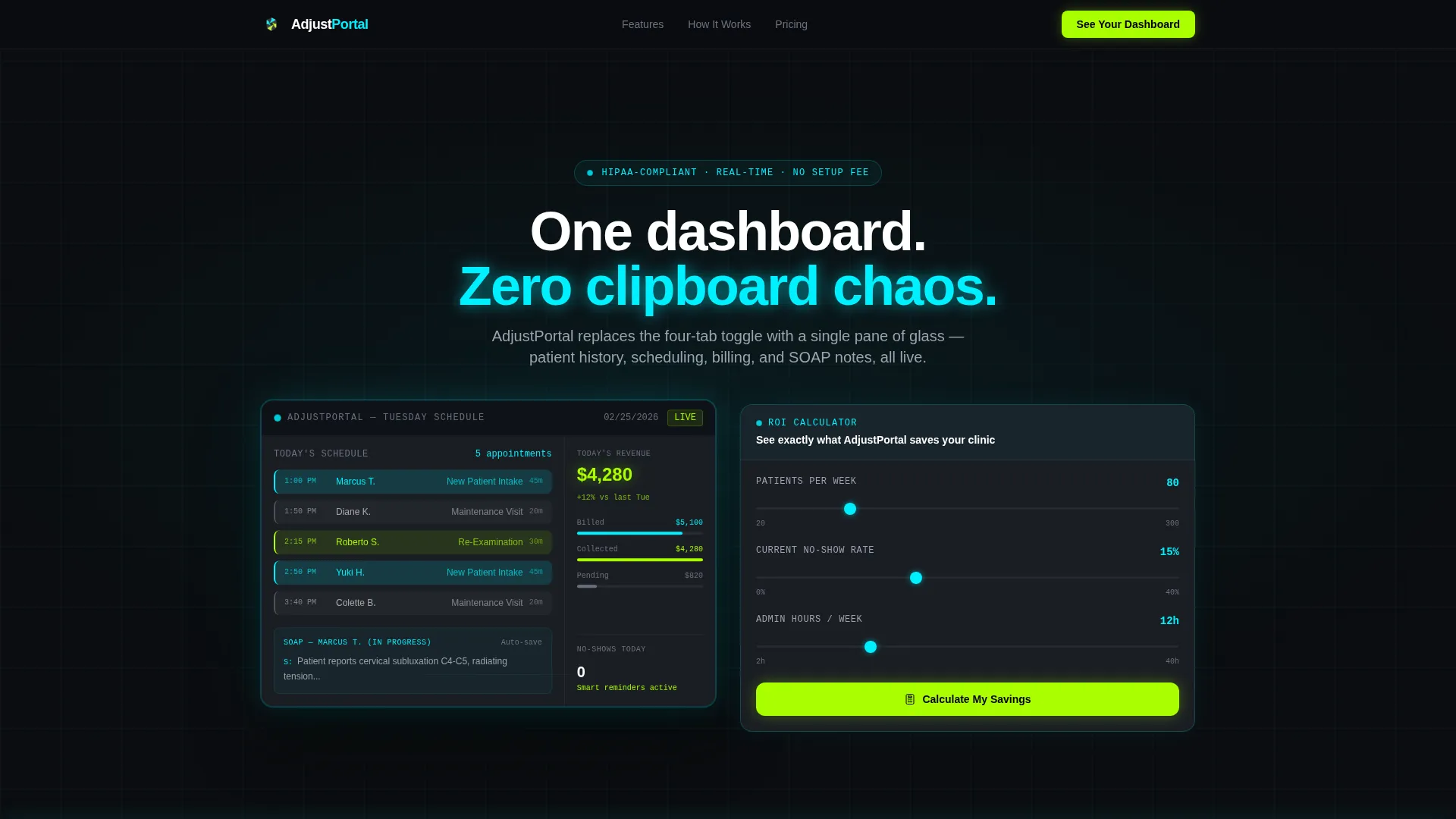
- A dark full-bleed header with a glowing dashboard preview showing a real Tuesday afternoon patient schedule
- An embedded, three-input ROI calculator that outputs projected time saved, revenue recovered, and annual cost comparison
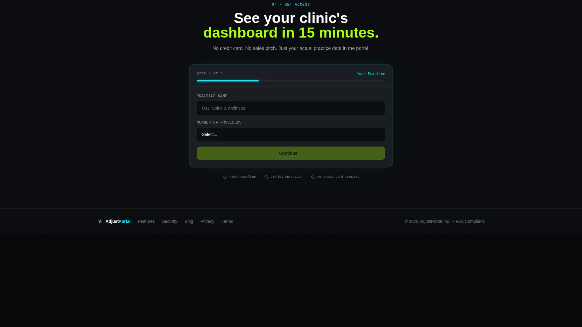
- A three-step progressive disclosure lead capture form ending with email and preferred demo time
Feature list
This template ships with six purposefully designed components, each grounded in the chiropractic portal use case.
Interactive ROI Calculator
Three inputs drive the output: number of patients per week, current no-show percentage, and hours spent on admin. The calculator instantly renders a glowing data card with projected time saved, revenue recovered from reduced no-shows, and an annual cost comparison. It earns the scroll before the visitor reaches any feature copy.
Live-Style Dashboard Preview
The header hero displays a styled patient schedule grid for a Tuesday afternoon. Adjustment types are color-coded: new patient intake in electric cyan, maintenance visits in dim white, and re-exams in toxic lime. A sidebar shows today's revenue at $4,280 and a half-completed SOAP note with cervical subluxation terminology visible.
Dashboard Module Sections
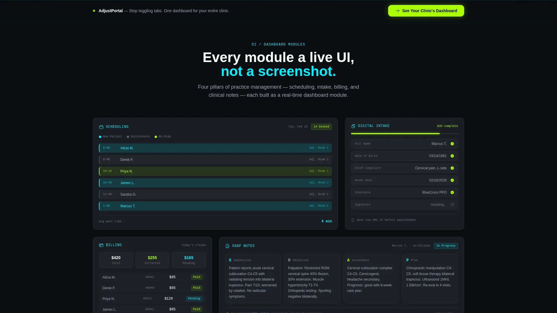
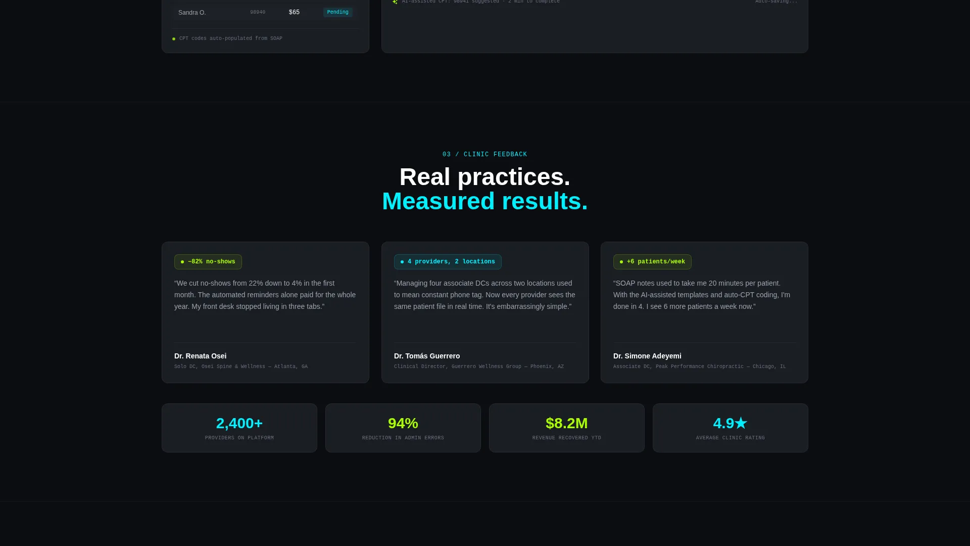
Each content section below the fold is presented as a live user interface card, not a static image. Scheduling, intake, billing, and SOAP note modules each contain real chiropractic data styled as interactive components. The rhythm moves from static data to animated data to interactive data as the visitor scrolls deeper.
Three-Step Lead Capture Form
The progressive disclosure form guides visitors through three focused steps. Step one asks for practice name and number of providers. Step two presents a dropdown for current electronic health record system, with "spreadsheets/paper" listed first. Step three captures email address and preferred demo time slot.
Sticky Call-to-Action Bar
The primary call-to-action button reads "See Your Clinic's Dashboard" in toxic lime on black. It appears first directly below the calculator results, then reappears as a sticky bottom bar after the second scroll. No pricing is shown anywhere on the page.
Acid Digital Color System
The visual identity uses void black (#0B0D10) on primary backgrounds and surgical graphite (#1A1D23) on card surfaces. Electric cyan (#00F0FF) pulses through data lines and active states. Toxic lime (#AAFF00) is reserved exclusively for success indicators and call-to-action buttons, keeping every color choice purposeful and readable.
Page sections overview
| Section | Purpose |
|---|---|
| Dark Full-Bleed Header | Establishes void-black visual identity and anchors the glowing dashboard hero |
| ROI Calculator Block | Captures immediate attention with personalized time and revenue projections |
| Schedule Grid Module | Demonstrates real-time patient scheduling with color-coded appointment types |
| Intake Dashboard Card | Shows patient history and intake flow as a live styled component |
| Billing Status Module | Displays billing state and revenue data inside a dashboard-style card |
| SOAP Notes Card | Presents a half-completed note with real cervical subluxation terminology |
| Lead Capture Form | Collects practice details, current system, email, and demo time in three steps |
| Sticky call to action Bar | Repeats the primary call to action after the second scroll as a fixed bottom bar |
Design & branding system
The template follows a Tech Glass theme powered by an Acid Digital color palette. The visual feeling is described in the brief as a spinal X-ray on a high-end radiology monitor: clinical darkness broken by luminous diagnostic data, where every glow is earned and nothing is decorative.
- Void black (#0B0D10) backgrounds, surgical graphite (#1A1D23) card surfaces, electric cyan (#00F0FF) accents, and toxic lime (#AAFF00) for success states and call-to-action elements
- A subtle cyan rim-light halo surrounds the floating dashboard preview in the header, with light bleeding outward as if the screen itself is the only light source
- No stock photography and no human faces appear anywhere; the product interface is the hero throughout the entire page
Mobile & speed optimization
The dashboard module layout and full-bleed header are structured to translate cleanly to smaller viewports. Card-based sections stack naturally, and the sticky call-to-action bar remains functional on mobile without obscuring key content.
- Each dashboard module card is self-contained, making responsive stacking straightforward without breaking visual hierarchy
- The three-step progressive disclosure form reduces cognitive load on small screens by surfacing only one decision at a time
- The color system relies on contrast rather than texture or imagery, which supports visual clarity across display sizes and conditions
How this template helps you convert
This template is engineered around a single conversion goal: getting a clinic owner to book a personalized demo. Every structural choice supports that outcome.
- The ROI calculator at the top of the page creates immediate, personalized value before any marketing copy appears, making the visitor feel the demo is already tailored to their practice.
- The progressive disclosure form lowers commitment friction by spreading data collection across three short steps rather than presenting a long form upfront.
- The sticky call-to-action bar ensures the primary conversion path stays visible as the visitor moves through each dashboard module section.
Other information about this template
This template is categorized under Technology with a subcategory of Chiropractic Digital Presence. It is built specifically for the chiropractic client portal niche, meaning every data point, color choice, and copy pattern reflects the realities of running a clinical practice rather than a generic software business.
- The template style is Dashboard/Data Grid, which means content is organized as modular user interface cards rather than traditional marketing sections
- The creative direction is Calculator/Tool First, prioritizing immediate demonstrated value over benefit lists or testimonials
- The header concept is Dark Full-Bleed with a glow effect, distinguishing this template visually from light-mode healthcare templates
- The intersection match score for this template is 13, reflecting a high degree of alignment between the Tech Glass theme, Acid Digital color system, and chiropractic portal use case
Theme
Tech Glass
Creative direction
Calculator/Tool First
Color system
Acid Digital
Style
Dashboard/Data Grid
Direction
Lead Generation
Page Sections
Interactive ROI Calculator
Color-coded Schedule Grid
Live-style Dashboard Modules
Three-step Progressive Disclosure Form
Sticky Call-to-action Bar
Tech Glass Visual Identity
Related questions
Who is this template designed for?
Does the template include the ROI calculator functionality?
Is there a pricing section on the page?
Can the color system be customized for a different brand?
What makes this template different from a standard healthcare landing page?



