AI for Higher Education Professional Website Template
Admit is a comparison-focused landing page template built for a machine-learning university recommendation engine. It uses a dark Electric Indigo color system, an animated terminal header, live stat counters, and a full-width competitor comparison table to show prospective users exactly why AI-powered college matching outperforms every traditional alternative.
by Rocket studio
Quick summary
Admit is a single-page landing page template designed for an AI-powered university recommendation engine. It opens with an animated code terminal, drops into a live stats row, and anchors on a twelve-row competitor comparison table. The layout is built to convert high-school students, parents, and school counselors by letting the data do the persuading.
Who this template is for
This template is built for teams launching or marketing an AI-driven college admissions tool. It speaks directly to three distinct audiences who all share the same anxious need for clarity.
- High-school juniors and first-generation college families who need trustworthy, personalized university guidance
- School counselors managing large student caseloads and looking for a credible tool to recommend
- Edtech founders and product teams who want a high-converting landing page that leads with evidence
What problem this template solves
Most college-search tools bury their value in vague promises. Students and parents cannot quickly see how an AI recommendation engine differs from a school counselor, a generic search portal, or an expensive private consultant. This template solves that trust and clarity gap head-on.
- Visitors arrive skeptical and leave convinced, because every claim is backed by a visible data row in the comparison table
- The progressive sign-up flow removes friction by asking only the most essential information first, reducing drop-off before the match dashboard is revealed
What you get with this template
This template delivers a complete, structured landing page layout ready to represent an intelligent admissions platform. Every section is purposeful and sequenced to move a visitor from curiosity to sign-up.
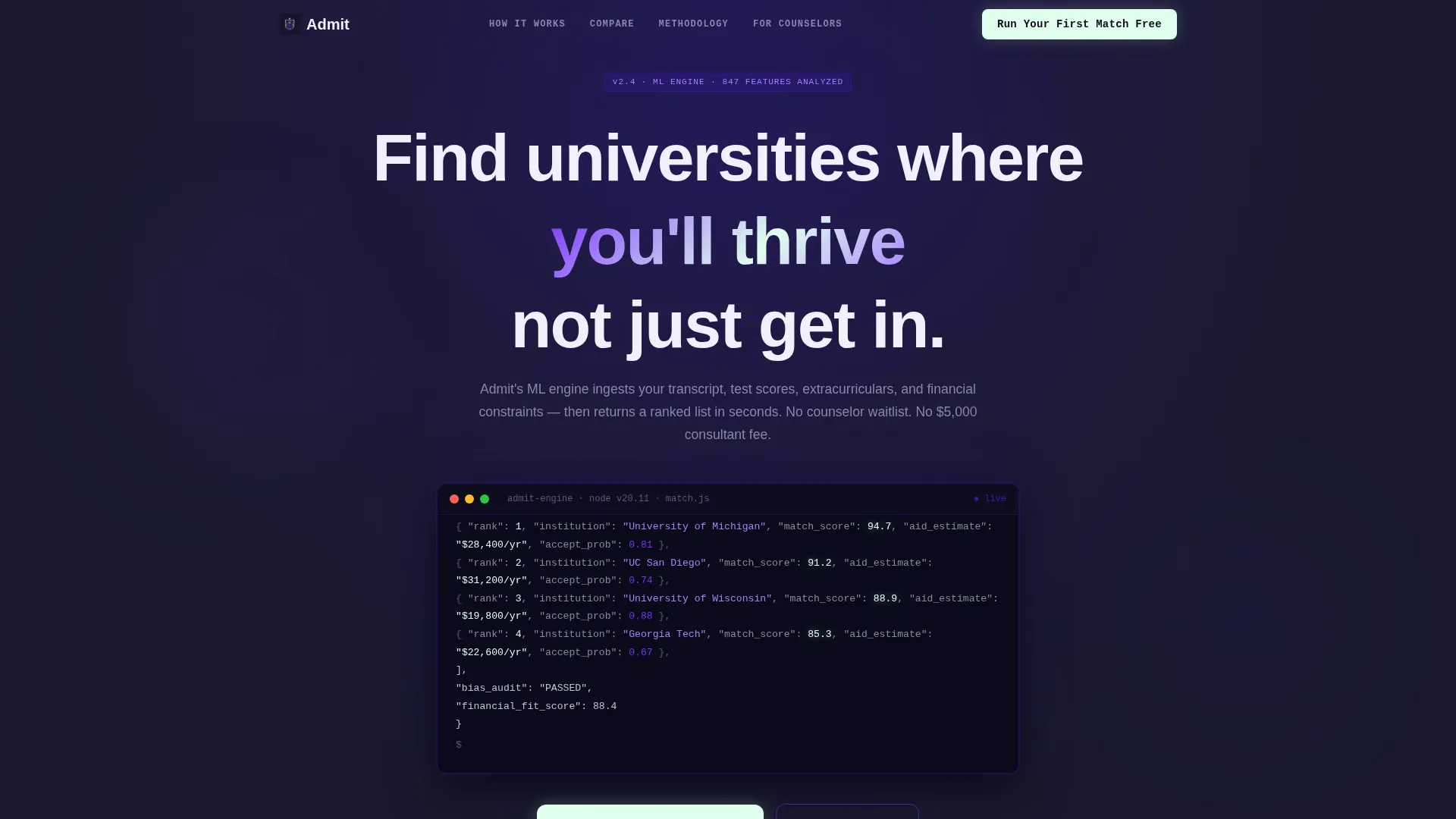
- An animated terminal header block showing a live API call with streaming JSON output, including university names, match percentages, financial-aid estimates, and acceptance probability scores
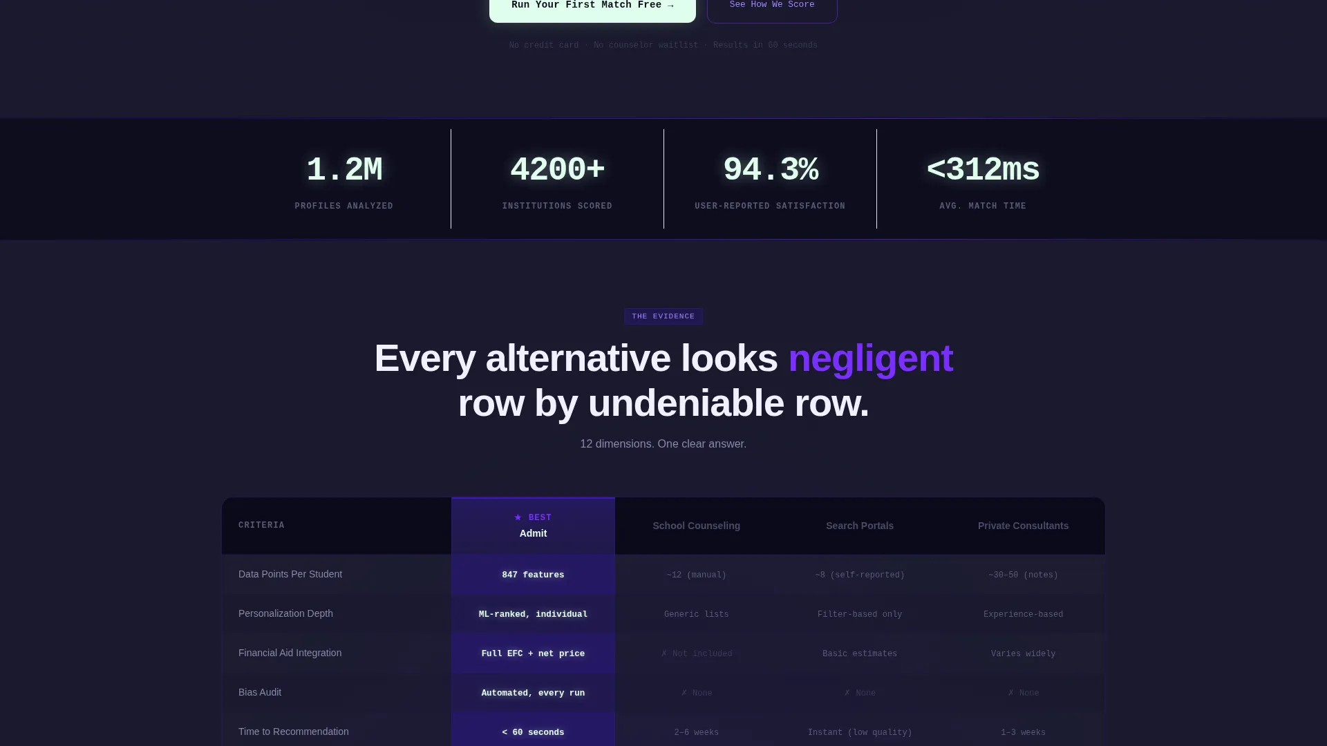
- A scroll-triggered live counter row displaying aggregate platform statistics such as profiles analyzed, institutions scored, and user satisfaction rate
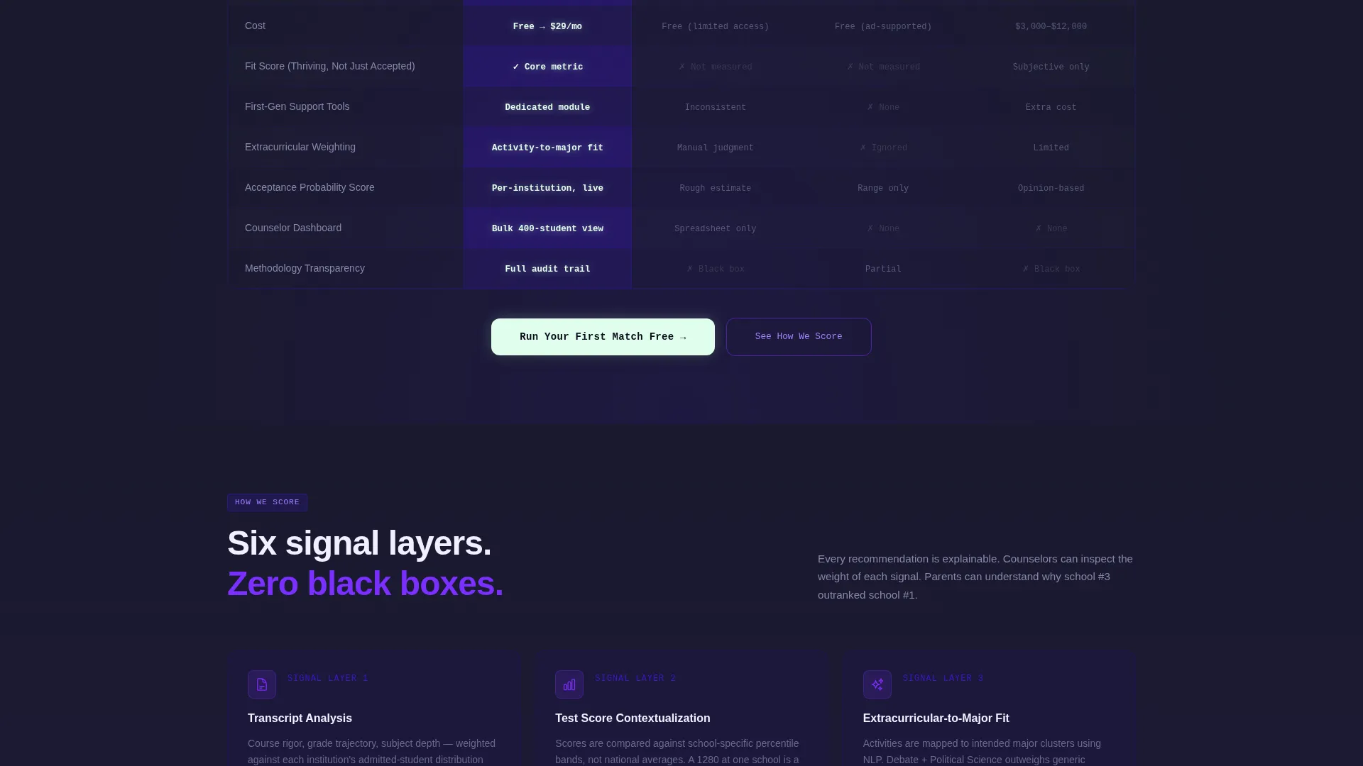
- A full-width, twelve-row comparison table pitting the platform against traditional counseling, generic portals, and private consultants, with phosphor-green highlights on all platform cells
- A sticky navigation bar and a phosphor-green primary call-to-action button pinned below the comparison table, plus a secondary path for methodology-curious visitors
- A three-screen progressive sign-up form that collects GPA range and intended major first, then test scores and state, then reveals the match dashboard behind a simple email sign-up wall
Feature list
This template is structured around purposeful, conversion-focused components drawn directly from the brief.
Animated Terminal Header
The header renders a styled, animated code block showing the admit.match(student_profile) API call. Output streams line by line, populating university names, match percentages, financial-aid estimates, and acceptance probability scores. A blinking cursor and indigo glow pulse behind the block, signaling that this tool is real and working.
Scroll-Triggered Stats Counter Row
Immediately below the header, a row of aggregate platform numbers ticks upward on scroll entry. The counters display statistics such as 1.2 million profiles analyzed, 4,200-plus institutions scored, and a 94.3 percent user-reported satisfaction rate. Each digit animates to create an immediate impression of scale and credibility.
Twelve-Row Competitor Comparison Table
The spine of the page is a full-width table that compares the platform against traditional counseling, generic college-search portals, and private consultants. Twelve data points cover areas including personalization depth, cost, time to recommendation, financial-aid integration, and bias auditing. Platform cells glow in terminal phosphor green; competitor cells sit in muted gray.
Progressive Three-Screen Sign-Up Form
Clicking the primary call-to-action opens a multi-step form. The first screen asks only for GPA range and intended major. The second requests test scores and state. The third reveals the full match dashboard behind a single email sign-up, reducing commitment anxiety at every step.
Sticky Navigation with Persistent Call to Action
A sticky navigation bar keeps the primary call-to-action button visible throughout the entire scroll. This ensures that visitors who are convinced mid-table do not need to scroll back to act.
Secondary Methodology Transparency Path
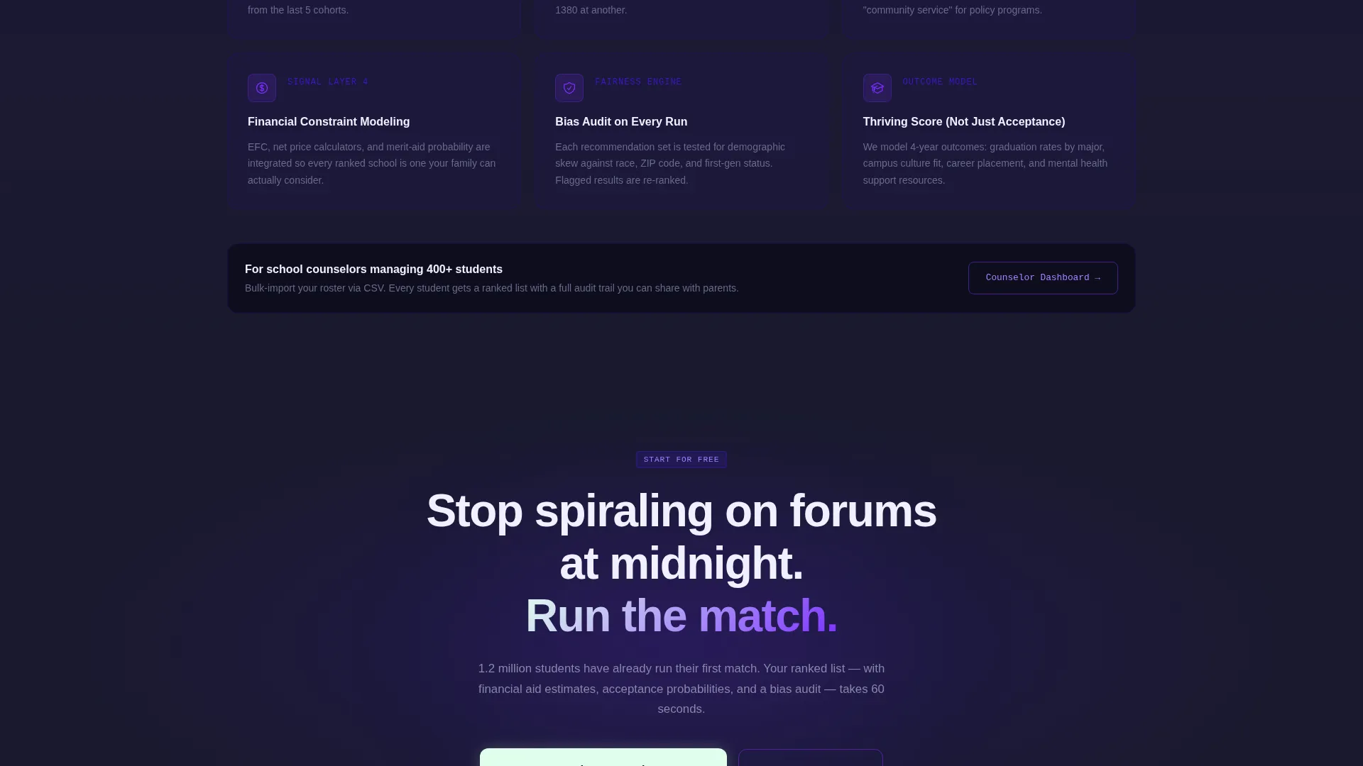
A "See How We Score" link provides a secondary conversion path for data-literate users. It directs skeptical counselors or analytical parents to a methodology page, building the additional trust that data-driven audiences require before signing up.
Page sections overview
| Section | Purpose |
|---|---|
| Animated Terminal Header | Opens with a live API output block to establish immediate product credibility |
| Live Stats Counter Row | Displays aggregate platform numbers to signal scale and proven usage |
| Comparison Table | Benchmarks the platform against three alternatives across twelve data points |
| Primary Call-to-Action Block | Phosphor-green button below the table opens the progressive sign-up form |
| Sticky Navigation Bar | Keeps the call-to-action accessible throughout the entire page scroll |
| Secondary Methodology Link | Offers a transparency path for skeptical or research-oriented visitors |
Design & branding system
The visual identity is built around a Startup Velocity theme expressed through an Electric Indigo color system. The palette feels like a focused development environment at night: dark, precise, and charged with forward momentum.
- Deep runtime indigo (#3D17C6) anchors backgrounds; ultraviolet highlight (#7B2FFF) activates hover states and active table rows; terminal phosphor (#E0FFED) marks stat callouts and positive-delta indicators; cool slate (#1A1A2E) forms the base canvas
- Typography and layout lean into a code-terminal aesthetic with no stock photography or campus imagery, letting the raw data output carry all visual weight
Mobile & speed optimization
The layout is designed to translate cleanly from desktop to smaller screens without losing its structured, data-forward character.
- The comparison table is built to scroll horizontally on mobile, preserving all twelve rows of competitor data without collapsing critical information
- The sticky navigation bar and pinned call-to-action button remain accessible on all screen sizes, keeping the conversion path intact regardless of device
How this template helps you convert
The Comparison/Versus landing page direction means every design and copy decision is engineered to make inaction feel like the worse choice.
- The animated terminal header establishes product credibility in the first three seconds, before a visitor reads a single line of marketing copy, replacing narrative persuasion with visible proof of function
- The twelve-row comparison table prosecutes the case row by row, making every competitor alternative look slower, more expensive, or less personalized by the time a visitor reaches the call-to-action button
- The three-screen progressive form reduces sign-up anxiety by starting with low-commitment inputs, so the email sign-up wall at the end feels like a fair exchange for the match dashboard already partially revealed
Other information about this template
This template is part of a broader category of AI for higher education tools, sitting at the intersection of technology and intelligent admissions. A few additional details worth noting:
- The template style is a Comparison Table layout, which is particularly effective for edtech and AI SaaS products where differentiation from incumbents is the core sales challenge
- The creative direction is Stats-First Impact, meaning aggregate numbers are placed above the fold to anchor credibility before any feature explanation begins
- The header concept is a Code Snippet, a deliberate choice to signal technical sophistication to data-literate parents, counselors, and students who distrust polished marketing visuals
- This layout can support a methodology transparency page linked from the secondary call-to-action, giving teams a natural place to publish scoring criteria and bias-auditing details
- The template is categorized under Technology and AI for Higher Education, making it relevant for teams building tools in the intelligent admissions, college matching, or higher education AI recommendation engine space
Theme
Startup Velocity
Creative direction
Stats-First Impact
Color system
Electric Indigo
Style
Comparison Table
Direction
Comparison/Versus
Page Sections
Animated Terminal Header Block
Scroll-triggered Stats Counter Row
Twelve-row Competitor Comparison Table
Three-screen Progressive Sign-up Form
Sticky Navigation with Persistent Call to Action
Secondary Methodology Transparency Link
Related questions
Who is this landing page template designed for?
Can I customize the comparison table rows and competitor columns?
What does the progressive sign-up form collect?
Does this template include the methodology transparency page?
Is the animated terminal header easy to adapt to a different product?



