Admit — School Enrollment Landing Page Template
Enroll is a split-screen landing page template built for education marketing automation platforms. It combines a dark Dashboard Pro aesthetic with an interactive, guided walkthrough experience. Designed for admissions teams and enrollment marketers, the template moves visitors from problem awareness through product exploration to a high-intent lead capture form, all in a single compelling page flow.
by Rocket studio
Quick summary
Enroll is a high-impact split-screen landing page template for education marketing automation platforms. It uses a dark cockpit-style visual identity, animated funnel visualizations, and an interactive explorer flow to walk admissions professionals through the product before they ever speak to sales. The result is a page that earns trust before it asks for anything.
Who this template is for
This template is purpose-built for teams that manage student enrollment pipelines and need to convert interest into action quickly. It speaks directly to the people running those pipelines under real pressure.
- Enrollment vice presidents at mid-tier universities watching prospects drop out of a leaky funnel
- Marketing directors at community colleges running lean teams across multiple campaigns
- Education technology bootcamp founders who need to convert webinar registrants before a cohort closes
What problem this template solves
Admissions and enrollment teams often rely on disconnected tools. A customer relationship management system here, an email platform there, a spreadsheet full of red cells. Prospects fall through the gaps and no one knows exactly where or why. This template gives a platform the visual language and interactive structure to make that problem undeniable, and then present a clear solution.
- Visitors arrive skeptical; the page renders the problem as live data, not as a sales pitch
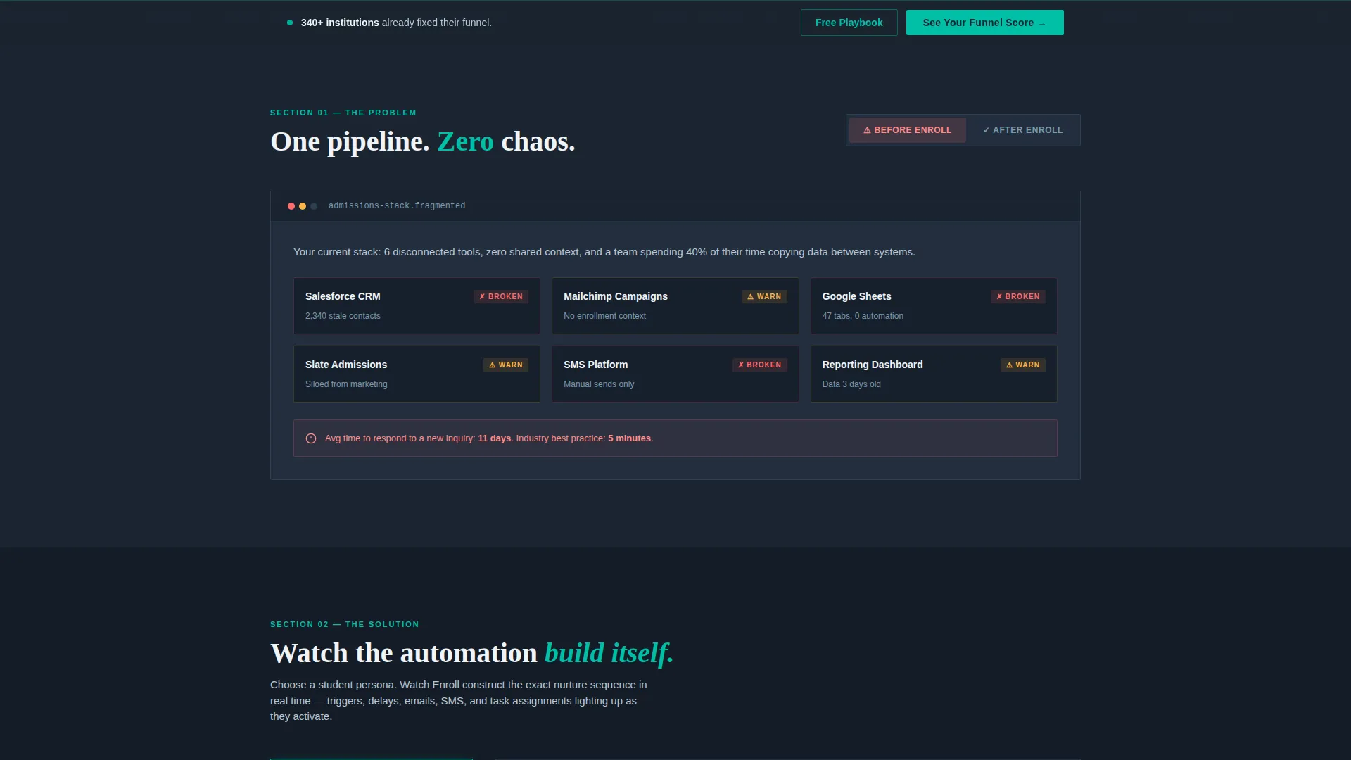
- The fragmented-tools story is shown visually before the unified-pipeline answer is revealed
- Lead capture feels like a natural next step, not an interruption, because visitors have already explored the product logic
What you get with this template
You get a fully structured single-page layout that functions as both a product demonstration and a lead generation engine. Every section is designed to escalate the visitor's confidence level in a deliberate sequence.
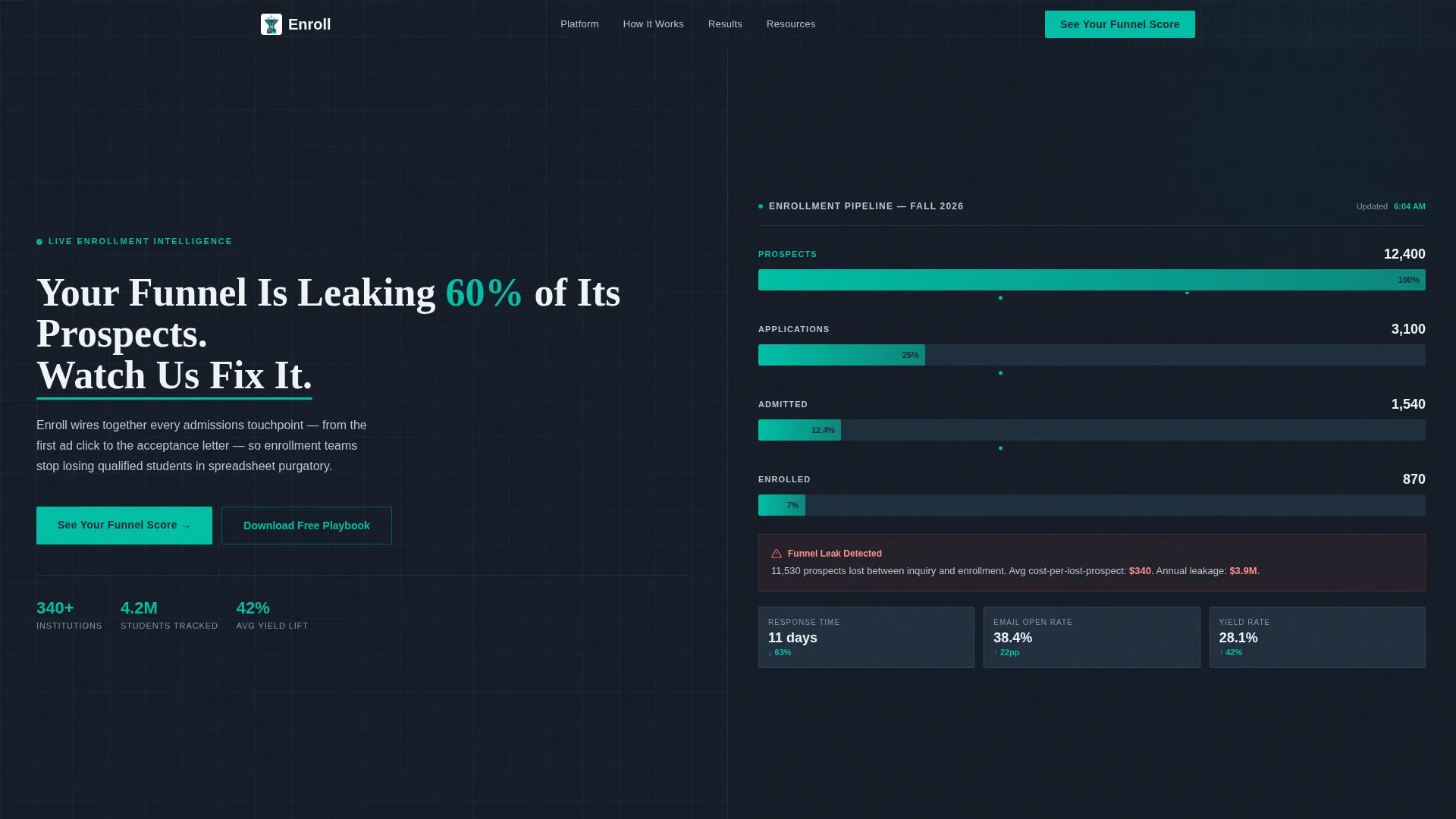
- A dark full-bleed split-screen header with an animated funnel visualization and a headline that names the problem directly
- Three interactive content sections covering the before-and-after dashboard toggle, a clickable student persona journey map, and an animated proof metrics panel
- A progressive three-step lead capture form plus a secondary conversion path offering a gated downloadable playbook
Feature list
This template includes a carefully sequenced set of interactive and visual components. Each one is grounded in the prompt brief and designed to serve enrollment marketing use cases.
Animated Funnel Visualization Header
The header fills the full screen edge to edge in deep charcoal. The right half displays a simulated dashboard with a funnel showing 12,400 prospects narrowing to 3,100 applications and then to 870 enrolled students. Each stage pulses in electric teal, with animated dots trickling between stages to suggest live data flow.
Before and After Dashboard Toggle
Section one lets visitors switch between two states. The "Before" view shows fragmented tools in visual disarray. The "After" view consolidates everything into one unified pipeline. This toggle makes the product's core value proposition immediately tangible without requiring a spoken explanation.
Clickable Student Persona Journey Map
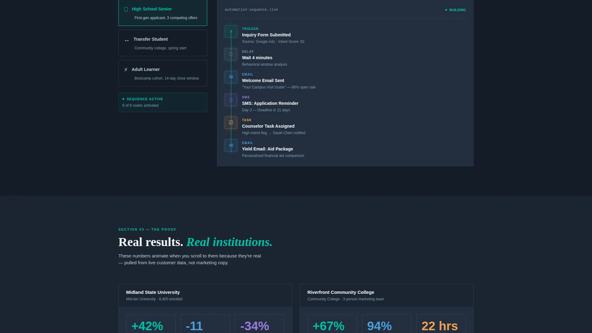
Section two is a live-built automation sequence. Visitors choose a student persona from three options: high school senior, transfer student, or adult learner. The automation sequence then builds itself in real time, with each node, trigger, delay, email, SMS, and task assignment lighting up in teal as it appears.
Animated Proof Metrics Panel
Section three surfaces real case study numbers in a live-styled metrics panel. Key results such as a 42 percent increase in yield rate and an 11-day reduction in response time animate as counters when the section scrolls into view. This converts abstract claims into a felt, visual experience.
Progressive Three-Step Lead Capture Form
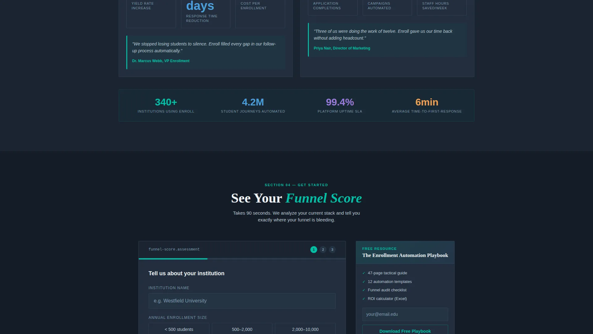
The primary call to action is "See Your Funnel Score." The form asks for institution name and enrollment size in step one, current tools used via checkboxes in step two, and name, email, and role title in step three. Low friction at entry and increasing commitment at each step keeps drop-off low.
Sticky Bottom Bar and Secondary Conversion Path
A sticky bottom bar appears after the first scroll and keeps the primary call to action visible throughout the page. A secondary path offers a downloadable "Enrollment Automation Playbook" gated behind a single email field, capturing visitors who are not yet ready for a sales conversation.
Page sections overview
| Section | Purpose |
|---|---|
| Split Screen Header | Show the funnel problem as live data and anchor the primary call to action |
| Before/After Toggle | Let visitors compare fragmented tools against a unified pipeline view |
| Persona Journey Map | Walk visitors through an automation sequence tailored to a student type |
| Proof Metrics Panel | Animate real case study numbers to build belief in the platform's results |
| Progressive Lead Form | Capture high-intent leads through a low-friction three-step form sequence |
| Sticky call to action Bar | Keep the primary call to action visible after the first scroll |
| Gated Playbook Offer | Convert undecided visitors with a downloadable resource behind one email field |
Design & branding system
The visual identity follows a Dashboard Pro theme built around the Teal Catalyst color system. Every color choice is intentional. The palette evokes a mission-control cockpit at cruising altitude: dark, confident, and precise.
- Deep charcoal (#1B2430) dominates all backgrounds so data elements breathe and stand out clearly
- Electric teal (#00BFA6) owns every interactive state including hover glows, toggle switches, progress bars, and active navigation indicators
- Muted slate (#3D5A73) acts as a divider between content blocks, while chalk white (#F0F4F7) anchors text and card surfaces against dark backgrounds
Mobile & speed optimization
The split-screen layout and interactive components are designed with a structured, responsive approach in mind. The dark surface and contained card components translate well to smaller viewports.
- The 50/50 split-screen header is structured to reflow cleanly on narrower screens, keeping the funnel visualization and headline readable at mobile sizes
- Interactive elements such as the persona toggle and the before/after dashboard are built as discrete components, making them manageable on touch devices
- The sticky bottom bar is designed to remain visible and functional across all scroll depths on both desktop and mobile
How this template helps you convert
This template is built around a deliberate escalation strategy. Each section moves the visitor one level closer to the form before the form ever appears. The page earns the click.
- The header confronts the visitor with their own funnel leak, rendered as real data, creating immediate relevance and urgency without a single marketing claim.
- The interactive explorer sections let visitors experience the product's logic firsthand, so by the time they reach the lead form, they feel informed rather than sold to.
- The progressive form structure and the secondary playbook offer give visitors two distinct entry points, capturing both high-intent prospects and early-stage researchers in one page flow.
Other information about this template
This template is part of a broader library of education software and SaaS landing page templates built for lead generation use cases. It is designed to function as a standalone page that teams can deploy quickly for a specific campaign or product launch.
- The template is categorized under Technology and specifically targets the education marketing automation niche, making it suitable for platforms competing in the enrollment technology space
- The interactive explorer creative direction means this template goes beyond static layouts; it is built to simulate product behavior before a demo is ever booked
- The Teal Catalyst color system and Dashboard Pro theme are reusable design system choices that can be extended or adapted if the platform has an existing brand guide
Theme
Dashboard Pro
Creative direction
Interactive Explorer
Color system
Teal Catalyst
Style
Split Screen (50/50)
Direction
Lead Generation
Page Sections
Animated Funnel Visualization Header
Before and After Dashboard Toggle
Clickable Persona Journey Map
Animated Proof Metrics Panel
Progressive Three-step Lead Form
Sticky Call to Action Bar and Gated Playbook Offer
Related questions
Who is this landing page template designed for?
Can I customize the funnel numbers and proof metrics shown on the page?
How does the three-step lead capture form reduce drop-off?
Is there a conversion path for visitors not ready to request a demo?
What makes the interactive explorer structure different from a standard landing page?



