Specialist Classic Fashion Pricing & Packages Website Template
Clasp is a full-width immersive jewelry landing page template built for classic jewellery brands that sell through atmosphere as much as product. It pairs a Soft Mist color system with scroll-triggered animations, a spotlight hero, and an upgrade selector so customers can compare pieces and move toward a higher tier without leaving the page.
by Rocket studio
Quick summary
Clasp is a stunning, single-page jewelry landing page template designed for elegant, minimal jewellery brands. It guides customers through a scroll-driven unboxing experience, presents silver, gold, and pavé tier panels, and closes with a clear upgrade call to action. Every design decision supports one goal: turning a browsing moment into a confident purchase.
Who this template is for
This landing page template is built for jewellery brands and jewelry designers who sell through emotion, not noise. It suits premium direct-to-consumer stores where the jewelry collection speaks quietly and the design does the persuading.
- Jewelry brand owners running upsell or upgrade campaigns for existing customers
- Independent jewelry designers and small studios launching a signature collection
- Stylists and creative directors who need elegant, editorial-ready pages to shop and display pieces
What problem this template solves
Most ecommerce jewelry landing pages crowd the screen with sale items, competing banners, and busy layouts. That visual clutter dilutes trust and pushes customers away before they reach the upgrade prompt. A dedicated landing page for jewelry is essential for highlighting offerings and converting visitors into customers, and this template solves exactly that.
- Visitors arrive and feel overwhelmed by too many choices, losing the sense of occasion that fine jewellery deserves
- Existing customers who have already made a purchase need a smooth, focused path to a higher tier, not a return to a full catalog
- Mobile users browsing rings, necklaces, earrings, or bracelets late at night need a quiet, fast-loading page that respects their attention
What you get with this template
This template delivers a complete, production-ready jewelry landing page design with every section built from the source brief. High quality images are displayed against controlled backgrounds, product descriptions are positioned for emotional impact, and the upgrade flow is structured to reduce friction.
- A spotlight hero section, scroll-linked unboxing sequence, three tier comparison panels, a live metal-type toggle selector, a closing call-to-action section, and a minimal footer
- Full Luxe Minimal styling with a Soft Mist color system, Fraunces display serif headings, and DM Sans body text across all layouts
- Client-side interactivity for the metal toggle with live price and delivery updates, and server-rendered static sections for reliable, consistent page loads
Feature list
This landing page template includes six core features derived directly from the project brief. Each feature serves the jewelry store's upsell goal without adding unnecessary complexity.
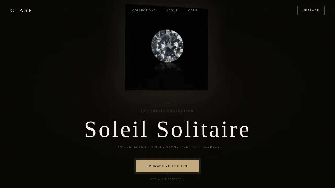
Spotlight Hero with Slow-Rotation Animation
The hero places a single jewellery piece on a pure black field, lit by one directional light source. A CSS keyframe rotation gives the piece an imperceptible shimmer. After a held pause, the collection name appears in thin, tracked-out cashmere type. High quality photos displayed this way let the object command full attention before any copy appears.
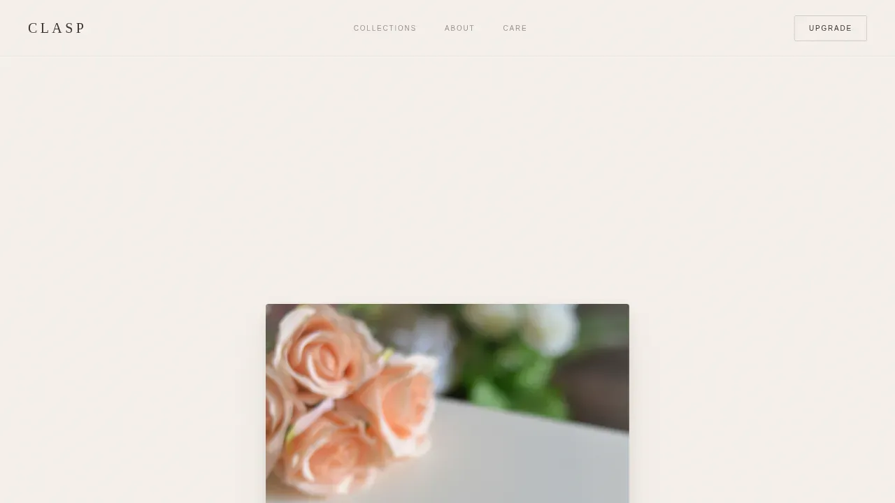
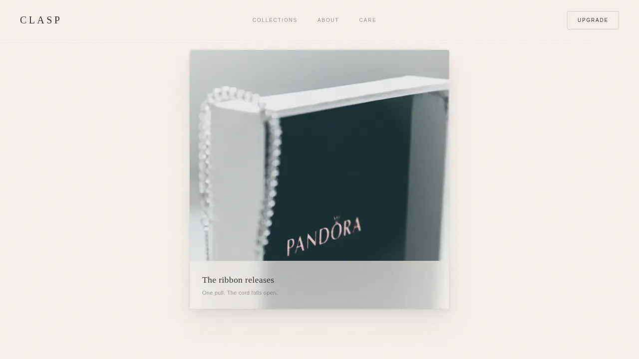
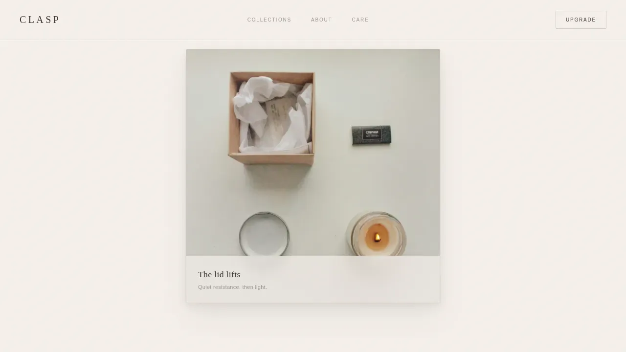
Scroll-Triggered Unboxing Sequence
Scrolling reveals the linen-wrapped box stage by stage: outer box, ribbon pull, lid lift, tissue parting, then the piece nestled inside. Each scroll increment triggers one reveal using Intersection Observer and parallax depth layers with opacity transitions. This sequence turns browsing into a ritual, forging an emotional connection with customers before they reach the upgrade prompt.
Three-Tier Material Panels
Three full-width mist-toned panels display the same silhouette in silver, gold, and pavé. Each panel grows warmer and more luminous as the visitor scrolls deeper. Product images are shown against neutral, controlled backgrounds so customers can compare pieces clearly and determine which tier matches their intent.
Live Metal-Type Upgrade Selector
A horizontal toggle lets customers switch between metal types in a single tap. Price, product imagery, and estimated delivery update in real time without a page reload. This feature reduces friction between the initial jewelry purchase and the upgraded tier, keeping the user on one focused landing page rather than navigating back through the full ecommerce store.
Tiered Call-to-Action Architecture
The primary call to action, "Upgrade Your Piece," appears in muted gold only after the tier comparison, so the value gap is felt before the ask. A secondary "Add Gift Wrapping" link sits beneath in quiet cashmere text, capturing smaller conversions. Calls to action are prominently placed to guide visitors toward checkout without pressure.
Extreme Minimal Footer
The footer follows a Superhuman Extreme Minimal pattern: social links and copyright only. No distractions, no extra navigation, no competing promotions. This keeps the page's quiet, showroom atmosphere intact all the way to the bottom and supports a better user experience for customers who have just completed the upgrade flow.
Page sections overview
| Section | Purpose |
|---|---|
| Spotlight Hero | Introduce the piece with directional lighting and name reveal |
| Unboxing Sequence | Simulate the ritual of receiving the jewellery through scroll |
| Silver Tier Panel | Display the base silhouette on a cool mist background |
| Gold Tier Panel | Raise warmth and perceived value at mid-scroll |
| Pavé Tier Panel | Peak luminosity and material richness before the ask |
| Upgrade Selector | Toggle metal type with live price and delivery update |
| Closing Call to Action | Primary upgrade prompt plus secondary gift-wrap link |
| Minimal Footer | Social links and copyright, nothing more |
Design & branding system
The design follows a Luxe Minimal theme built entirely around restraint. Every color, spacing choice, and typographic decision is calibrated so the jewelry remains the visual subject. Strategic use of white space prevents visual overload and draws attention directly to the product.
- Soft Mist color system: warm pearl (#F5F0EB) for backgrounds, whispered blush (#E8DDD3) for surfaces, deep cashmere (#3B3330) for text, and muted gold (#C2A97E) reserved for call-to-action elements, hover states, and fine section dividers
- Typography uses Fraunces as the display serif for headings and DM Sans as the modern sans-serif for body text, keeping fonts minimal and elegant throughout
- A neutral palette with subtle metallic accents matches the private-showroom mood, ensuring the overall fashion aesthetic stays cohesive across all desktop and mobile layouts
Mobile & speed optimization
This template is built mobile-first. The midnight phone-browsing scenario described in the brief shaped every layout decision, from tap-target sizes to scroll-trigger thresholds. Modern jewelry templates are mobile responsive by default, and Clasp applies that standard rigorously.
- All sections reflow cleanly across mobile devices, tablets, and desktop viewports without breaking the unboxing sequence or the tier panels
- Static sections use server-rendered components for reliable loads; the metal toggle and scroll interactions use client components, keeping interactive layers lean
- Product images and high quality images throughout the page are sized and layered for quick loading on mobile connections, supporting a smooth browse experience on any device
How this template helps you convert
A well-designed jewelry landing page should guide visitors toward a single clear action. This template is structured so every scroll increment builds desire before any ask is made.
- The unboxing sequence builds emotional investment early, so by the time customers reach the upgrade selector they have already imagined receiving the piece, making the purchase feel like completing something rather than starting it.
- The tier panels organize jewelry by material, letting customers see the difference between silver, gold, and pavé before they interact with the toggle, so the upgrade decision feels informed rather than pushed.
- The muted-gold "Upgrade Your Piece" call to action appears only after the full value gap has been displayed, and the secondary "Add Gift Wrapping" link captures additional sales from customers who are not ready for the full upgrade but still want to add something.
Other information about this template
This section covers practical details for jewelry designers, jewelers, and other professionals evaluating this landing page template against their ecommerce needs.
- The Clasp Luxe Minimal Classic Jewelry Brand Landing Page Template is categorized under Fashion and Classic Fashion, making it a strong match for boutique jewelry store owners, emerging jewellery labels, and luxury jewelry brands looking to create a premium online store presence
- Jewelry website templates like this one provide an easy-to-use starting point: you can easily customize colors, swap product images, update descriptions, and adjust copy just a few clicks into your build, without deep coding knowledge
- The template supports the display of necklaces, rings, earrings, bracelets, and other jewellery pieces through its tier panels and product gallery structure, giving designers flexibility to apply it to any jewelry collection
- Compelling product descriptions that highlight details like gemstone quality and precious metal types help forge an emotional connection with customers and support organic traffic growth through well-crafted, story-driven copy
- Premium jewelry website templates typically range from $50 to $300 for lifetime use; investing in a quality template delivers a better user experience, fewer technical issues, and built-in support compared to free options that often lack advanced features
- Special offers, promotions, and gift-wrapping options can be surfaced through the existing call-to-action architecture without modifying the core template layouts
- The template's stunning visual identity and cohesive landing page design make it equally effective as a campaign homepage, a product launch page, or a seasonal collection feature for any jewellery business or fashion company
- Sharing the jewelry brand's story through the unboxing narrative and tier descriptions helps build trust with new visitors and reinforces the beauty and craftsmanship behind each piece
Theme
Luxe Minimal
Creative direction
Unboxing Experience
Color system
Soft Mist
Style
Full-Width Immersive
Direction
Upsell/Upgrade
Page Sections
Spotlight Hero with Rotation Animation
Scroll-triggered Unboxing Experience
Three-tier Material Comparison Panels
Live Metal-type Upgrade Selector
Tiered Call-to-action Architecture
Extreme Minimal Footer
Related questions
Can I use this template without coding experience?
Does the template support jewelry pieces beyond rings and necklaces?
Is this landing page design built for mobile users?
How does the live upgrade selector work?
Can I add promotions or gift wrapping options to this template?


