Advanced Consulting Digital Presence Appointment Booking Website Template
Consult is a split-screen consulting landing page template built for mobile app directories. It features an interactive phone-frame preview, live stat counters, a category grid, and a freemium call-to-action flow. The Carbon Fiber color system gives it a sharp, technical feel that signals quality without clutter. Ideal for teams launching a consultant marketplace or booking app.
by Rocket studio
Quick summary
Consult is a single-page landing page template designed for consulting mobile app directories. It uses a 50/50 split-screen layout, a stats-first scroll rhythm, and an interactive app preview to turn visitors into active users before they ever reach the call-to-action button.
Who this template is for
This template is built for product teams, startup founders, and digital agencies launching a consultant discovery or booking platform. If your core offering is a directory of vetted experts, this layout speaks directly to the people searching for them.
- Startup founders building fractional executive marketplaces or on-demand advisory platforms
- Product and marketing teams at mid-market SaaS companies promoting a consulting app
- Solo entrepreneurs or agencies creating a niche consultant directory with a freemium entry model
What problem this template solves
Finding the right consultant is already a high-friction experience. Most directory pages make it worse by burying proof behind long paragraphs and generic stock photos. This template flips that pattern entirely.
- Visitors never read past a vague hero headline before bouncing, so this design leads with data and an interactive demo instead
- Prospects struggle to trust a new platform, so verified consultant counts, ratings, and response time stats are surfaced immediately
- Decision fatigue slows conversions, so the page assembles evidence section by section until the choice feels inevitable
What you get with this template
The template delivers a complete, structured landing page ready to customize for any consulting app or expert directory. Every section is purposeful and sequenced to move skeptical visitors toward a low-risk first action.
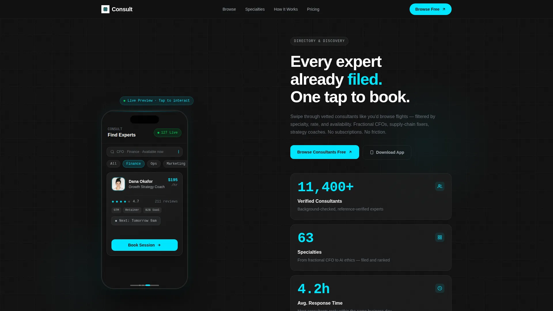
- A life-sized interactive phone frame in the header showing three pre-loaded consultant profile cards with tap and swipe functionality
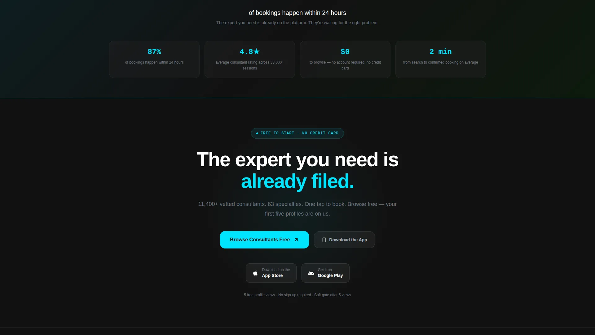
- A stats-first scroll pattern where key data points such as "87% of bookings happen within 24 hours" appear before supporting copy
- A floating "Browse Consultants Free" call-to-action button pinned after the first scroll, plus a secondary "Download the App" path with auto-detecting platform badges
Feature list
This template includes purpose-built components that reflect exactly how a consulting directory app should present itself to first-time visitors.
Interactive Phone Frame Header
The left half of the header holds a life-sized phone frame displaying a functional prototype of the app search screen. Three consultant cards are pre-loaded with name, hourly rate, star rating, and a green "Available Now" badge. Visitors can tap and swipe directly inside the frame, making the product its own best demo.
Live Stat Counter Stack
The right half of the header displays a stat stack that counts upward on page load. The three counters show "11,400+ Verified Consultants," "63 Specialties," and "Avg. 4.2-hour response time." These numbers replace a hero image and make the platform's scale tangible from the first second.
Stats-First Scroll Transitions
Every scroll transition opens with a standalone data point before any paragraph text appears. The headline stat lands first, then supporting copy fades in beneath it. This rhythm keeps momentum high and prevents visitors from tuning out between sections.
Category Grid with Consultant Counts
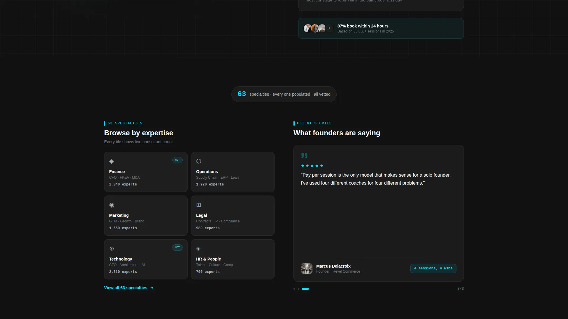
Section two features a live category grid on the left side covering finance, operations, marketing, legal, tech, and HR. Each tile displays the number of consultants available in that specialty. This gives visitors an immediate sense of depth and relevance to their specific need.
Booking Flow Screen Recording
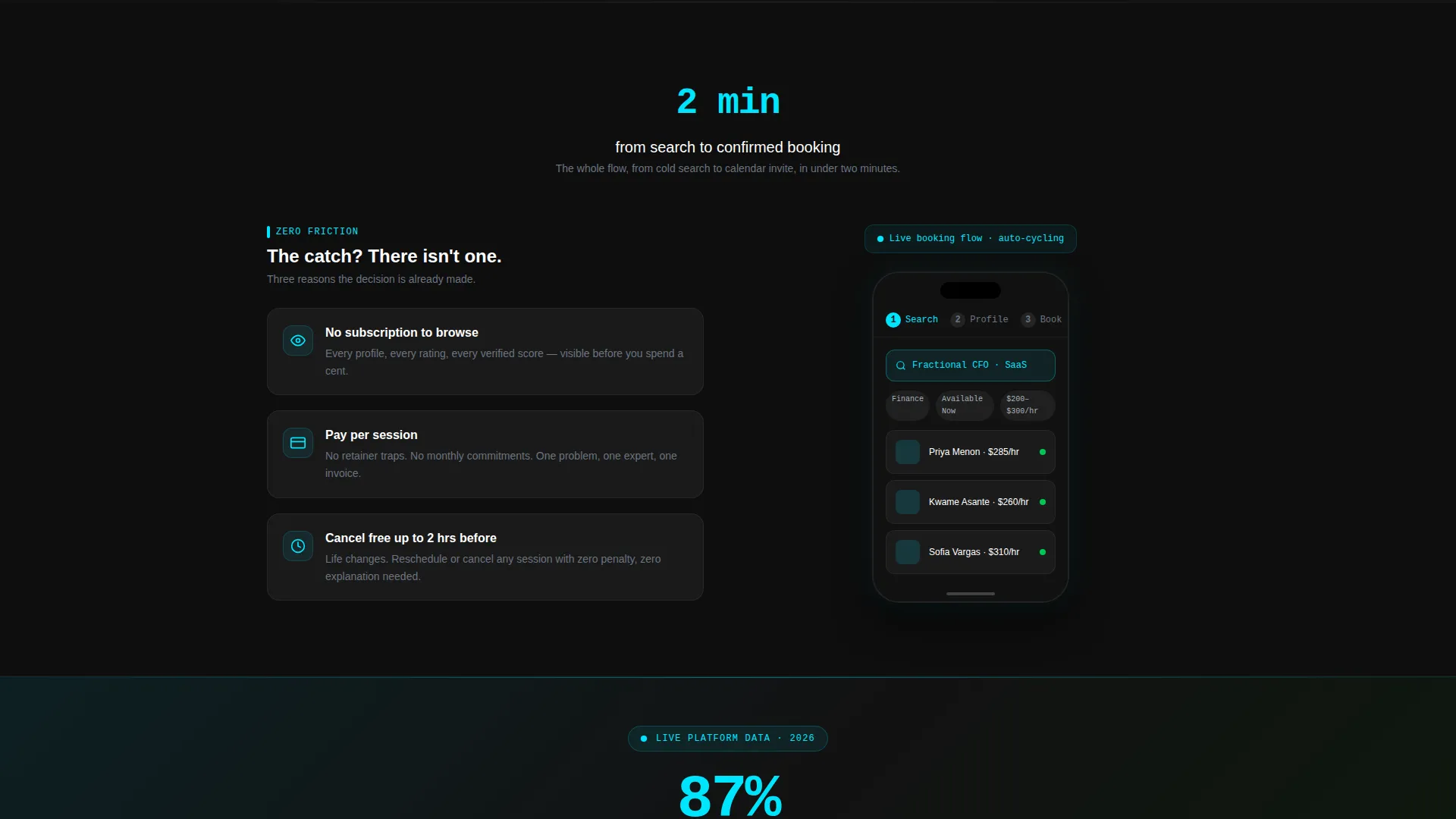
Section three includes a short looping screen recording of the app booking flow on the right side of the split. The left side pairs it with three proof points: "No subscription to browse," "Pay per session," and "Cancel free up to 2 hrs before." The combination removes hesitation at the exact moment commitment feels close.
Freemium Call-to-Action System
The primary call-to-action button reads "Browse Consultants Free" in electric cyan and floats persistently after the first scroll. A secondary path offers "Download the App" with auto-detecting iOS and Android badges. Tapping the primary button opens the live web directory with five free profile views before a soft email gate appears.
Page sections overview
| Section | Purpose |
|---|---|
| Interactive header preview | Show the app live and prove the directory is populated |
| Live stat counters | Establish scale and response speed immediately |
| Category grid panel | Let visitors find their specialty and see consultant depth |
| Testimonial carousel | Build social trust alongside the category evidence |
| Booking flow demo | Show how fast and low-risk a first session is |
| Friction-killing proof points | Remove the three most common objections in one block |
| Floating call to action button | Keep the primary action visible at every scroll position |
| App download path | Offer a mobile-native entry point with platform detection |
Design & branding system
The visual identity uses a Carbon Fiber color system that feels like the inside of a matte-black instrument panel. Every color choice is functional rather than decorative, and the palette keeps the focus entirely on consultant data and interactive states.
- Core backgrounds use deep cockpit black (#121212) and woven graphite (#1E1E1E), giving the layout a tactile, technical depth
- Brushed aluminum (#A8B2BD) handles text, labels, and secondary user interface elements to maintain legibility without competing with content
- Electric cyan (#00E5FF) is reserved exclusively for interactive states, live data highlights, and call-to-action pulses, so every glow carries meaning
Mobile & speed optimization
The layout is built around a mobile-first product experience. Because the template is promoting a mobile app, the design decisions consistently prioritize how the page feels on a phone screen.
- The 50/50 split-screen format adapts to stack vertically on smaller screens, keeping the phone frame demo prominent at the top
- The looping booking flow screen recording is sized and positioned to remain clear and unobtrusive on mobile viewports
- Floating button placement is tuned for thumb-reach zones, so the call-to-action stays accessible without covering key content
How this template helps you convert
The entire page is sequenced like a closing argument. Each section adds one more piece of evidence until the decision to browse feels like the obvious next step.
- The interactive header lets visitors experience the product before reading a single line of copy, which builds confidence faster than any written claim
- The stats-first scroll rhythm front-loads credibility at every section break, so trust accumulates naturally as the visitor moves down the page
- The freemium entry model removes financial commitment entirely, and the five free profile views inside the live directory mean the product closes the deal on its own
Other information about this template
This template is categorized under Technology and sits within the Consulting Digital Presence subcategory, targeting the Consulting Mobile App niche. It pairs well with any team ready to launch or promote a consultant marketplace where speed and trust are the core selling points.
- The Directory and Discovery theme is expressed through the index-card metaphor, where every expert is already ranked and every answer is pre-filed
- The template follows a Freemium and Trial landing-page direction, meaning no sign-up form appears on the page itself
- The Split Screen (50/50) layout and Interactive Preview header concept are matched intersection context fields, meaning the design choices are intentionally aligned to the consulting app use case
- The Stats-First Impact creative direction ensures data always leads copy, which suits audiences who are evaluating a platform on measurable credibility rather than brand familiarity
Theme
Directory & Discovery
Creative direction
Stats-First Impact
Color system
Carbon Fiber
Style
Split Screen (50/50)
Direction
Freemium/Trial
Page Sections
Interactive Phone Frame Header
Live Stat Counter Stack
Stats-first Scroll Rhythm
Category Grid with Counts
Booking Flow Screen Recording
Freemium Call-to-action System
Related questions
Can I customize the consultant profile cards in the header?
Does this template include a sign-up form on the page?
What layout format does this template use?
Is this template suitable for a niche consultant directory?
What happens after a visitor taps the primary call-to-action button?



