Aggregate - Powerful Whitelabel Landing Page Template
Aggregate is a lead generation landing page template built for white-label review and rating platforms. It uses a dark Data Command visual theme with glowing teal accents, a modular card grid layout, and a two-step lead capture form. The design communicates technical credibility at a glance, targeting SaaS product managers, e-commerce CTOs, and platform founders.
by Rocket studio
Quick summary
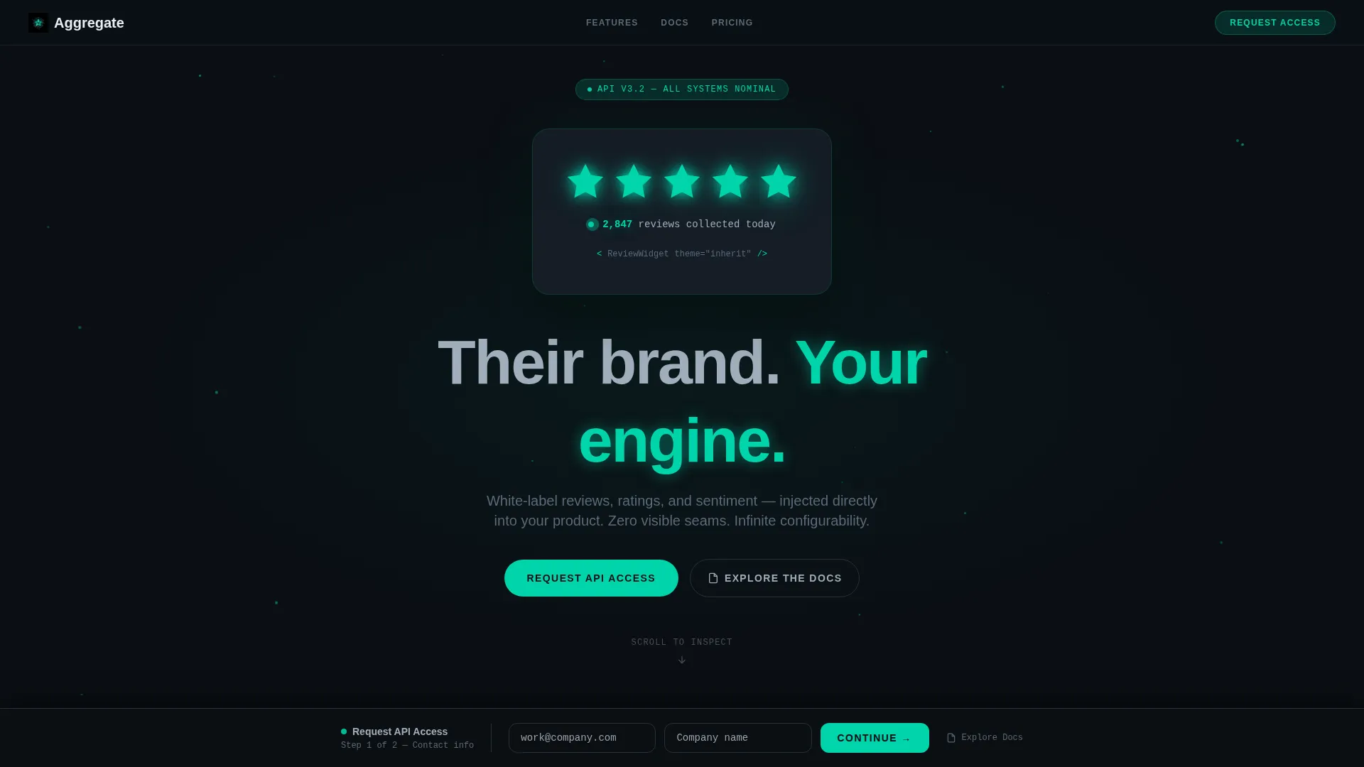
Aggregate is a single-page, card grid landing page template for a white-label review and rating platform. It opens with a glowing teal five-star component on a void-black canvas and walks visitors through modular capability cards that read like a technical spec sheet. The page ends with a sticky two-step lead capture form anchored by a primary call to action.
Who this template is for
This template is built for technical and product-led buyers who evaluate tools the same way they read documentation. It speaks to builders and decision-makers, not casual shoppers.
- SaaS product managers who need to bolt social proof into an existing marketplace without building from scratch
- E-commerce CTOs who require a review engine that matches their design system precisely
- Platform founders tired of maintaining a homegrown ratings codebase that breaks with every sprint
What problem this template solves
Most landing pages for developer tools describe what a product does without showing it working. Buyers in the white-label review and rating space are skeptical by default. They need proof, not promises.
- Generic landing pages fail to communicate deep white-labeling capability to technical evaluators
- Product managers and CTOs leave pages that cannot demonstrate real-time review data or theme flexibility
- The absence of a structured lead qualification flow sends unqualified inquiries to sales teams
What you get with this template
You get a complete, conversion-ready landing page structured around live proof points. Every section is designed to earn trust before asking for a commitment.
- A dark full-bleed header with a glowing animated five-star component and a particle grid background
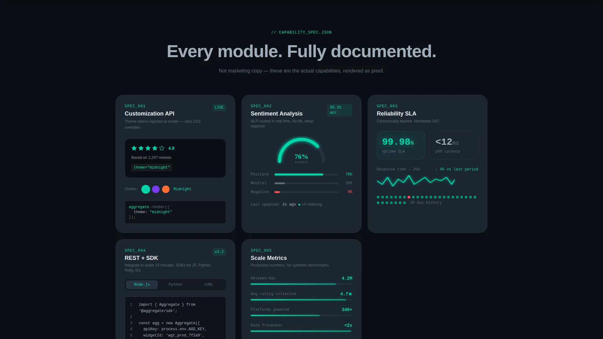
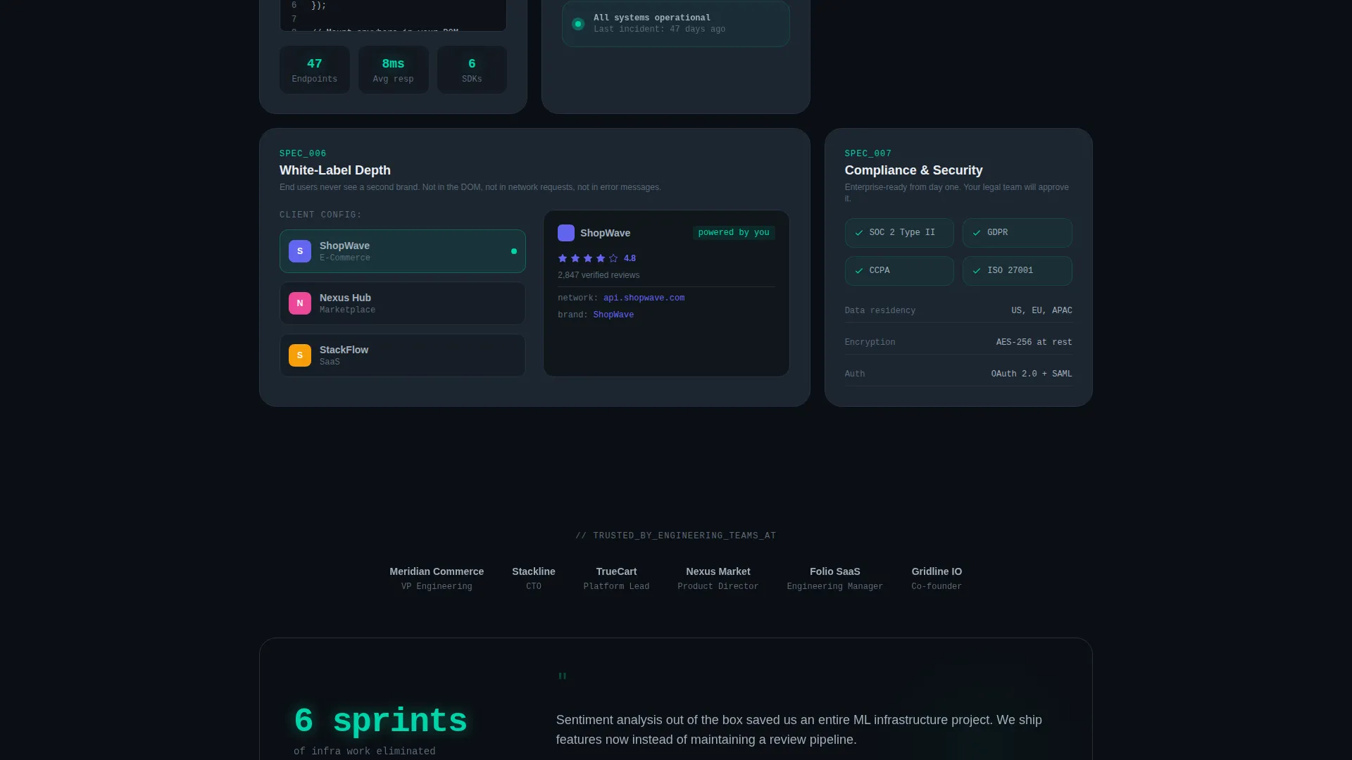
- A modular card grid where each card presents one platform capability as a technical specification
- A sticky bottom bar with a progressive two-step lead capture form and a secondary developer path
Feature list
This template packages several distinct, purposeful components into one cohesive layout. Each feature below maps directly to a section or interaction described in the brief.
Animated Five-Star Header Component
The header opens on a void-black canvas with a centered five-star rating component rendered in primary teal. Each star fills in sequence with a soft pulse animation, simulating reviews arriving in real time. A faint particle grid drifts behind it, reinforcing the sense of a live data mesh.
Modular Capability Card Grid
Each card in the grid represents one platform capability formatted as a technical specification rather than a marketing claim. Cards include a live theme-switcher toggling a review widget across three brand palettes, a sentiment-analysis gauge with real percentages, and an uptime and latency card with a mini sparkline. Cards stagger-animate into view row by row as the page loads.
Sticky Two-Step Lead Capture Form
A sticky bottom bar appears after the second card row scrolls into view. Step one of the form captures work email and company name. Step two asks for monthly review volume via a dropdown and the visitor's primary platform type, producing qualified leads without overwhelming the first touchpoint.
Secondary Developer Path
A clearly labeled "Explore the Docs" link runs alongside the primary call to action. It routes developer visitors to public API documentation, capturing a second audience segment that prefers to self-qualify through direct engagement with technical content.
Theme-Switcher Widget Card
One dedicated card demonstrates the customization API by toggling the review widget live across three distinct brand palettes. This single interaction is the most direct proof of white-label depth the page can offer without a full product demo.
Spec Sheet Creative Direction
The overall page is styled with a Spec Sheet cadence. Reading the cards feels like browsing well-designed architecture documentation. Every data point is presented as a proof point, making the call to action feel like a logical next step rather than a sales push.
Page sections overview
| Section | Purpose |
|---|---|
| Full-Bleed Header | Introduce the product through a live animated rating component |
| Headline Block | Deliver the core brand message in a single silver line |
| Capability Card Grid | Present each platform feature as a scannable technical spec |
| Theme-Switcher Card | Demonstrate white-label customization depth interactively |
| Sentiment Analysis Card | Show real percentage data from the sentiment-analysis gauge |
| Uptime and Latency Card | Communicate reliability with a sparkline and specific figures |
| Sticky call to action Bar | Anchor the primary lead capture form after card row two |
| Two-Step Lead Form | Qualify leads progressively across two focused steps |
| Docs Explorer Link | Provide a secondary path for developer self-qualification |
Design & branding system
The visual identity follows a Data Command theme built entirely around the Teal Catalyst color system. The palette is precise and intentional, designed to read like a mission-control interface at 2 a.m.
- Void-black (#0B0F14) background, muted slate (#1C2530) card surfaces, and cool silver (#A0AEBB) body text create a calm, high-contrast reading environment
- Primary teal (#00D4AA) functions as the single "live" signal across star fills, hover states, active API-call animations, and chart lines
- The overall system conveys technical authority without relying on imagery, letting the animated components carry all visual weight
Mobile & speed optimization
The card grid layout and modular structure are built to adapt across screen sizes. Each card is self-contained, which makes responsive reflow straightforward without redesigning the layout logic.
- Modular card blocks reflow naturally from multi-column grid to single-column stack on smaller viewports
- The sticky bottom bar and two-step form are designed to remain accessible and functional at mobile widths
- Stagger animations are scoped to card rows, keeping the sequential boot-up effect readable on any screen size
How this template helps you convert
The page is structured so that every scroll action builds confidence before the call to action appears. Nothing asks for commitment before delivering proof.
- The animated header and capability cards function as working demonstrations, so visitors arrive at the lead form already convinced the product is real and capable
- The sticky two-step form captures intent in low-friction steps, separating email collection from qualification questions to reduce drop-off at the first field
- The secondary "Explore the Docs" path converts developer visitors who would otherwise leave without engaging, turning passive browsers into self-qualified leads
Other information about this template
This template is part of a broader library of niche-specific, high-intent landing page templates built for the technology and consumer platform category. A few additional points worth knowing before you customize it.
- The template is designed specifically for the white-label review and rating platform niche, where buyers are technical and need to see the product working before they trust a form
- The Data Command theme and Teal Catalyst color system are fully defined in the brief, giving any designer or developer a precise starting palette to work from
- The card grid structure is modular, meaning individual cards can be swapped, reordered, or extended without breaking the overall layout
- The progressive lead form is built around two distinct steps, making it easier to pass richer lead data to a sales or CRM workflow downstream

Theme
Data Command
Creative direction
Spec Sheet
Color system
Teal Catalyst
Style
Card Grid (Modular)
Direction
Lead Generation
Page Sections
Animated Teal Five-star Header
Modular Capability Card Grid
Sticky Two-step Lead Capture
Live Theme-switcher Widget
Secondary Developer Path
Related questions
Who is this landing page template designed for?
Can I customize the card grid to show different capabilities?
How does the two-step lead form work?
Does this template include the API documentation page?
What makes this template different from a generic SaaS landing page?



