Agriculture Survey Landing Page Template
Agripulse is a single-page agriculture survey landing page template built for cooperative managers, agribusiness HR leads, and extension officers. It features a three-tier comparison table, a full-width dashboard screenshot header, and a freemium conversion flow. The template uses a Dashboard Pro theme with a deep navy, teal, and harvest gold palette designed to feel authoritative and field-ready.
by Rocket studio
Quick summary
Agripulse is a landing page template for agriculture survey and feedback platforms. It leads with a product screenshot hero, drives scroll through a three-tier feature comparison table, and closes with a focused freemium signup. The visual system uses deep navy, satellite teal, and harvest gold to create a dashboard feel that agriculture professionals recognize and trust immediately.
Who this template is for
This template is built for teams who collect field data and need a fast, credible way to present their platform to potential users. It speaks the language of people who measure seasons, not quarters.
- Cooperative managers tracking member sentiment across dozens of scattered farms
- Agribusiness human resources leads measuring seasonal worker retention and satisfaction
- Extension officers gathering adoption data on new seed varieties or irrigation methods
What problem this template solves
Agriculture feedback platforms often struggle to communicate their value to users who are skeptical of software and short on screen time. A poorly structured page loses those visitors before the first scroll.
- Visitors cannot quickly see which plan tier matches their operation size
- The real-world capabilities that field professionals care about go unspotted in generic feature grids
- Conversion stalls because the signup flow asks for too much too soon
What you get with this template
You get a complete, single-page layout organized around one clear goal: turning a skeptical field professional into a free trial user. Every section earns its place on the page.
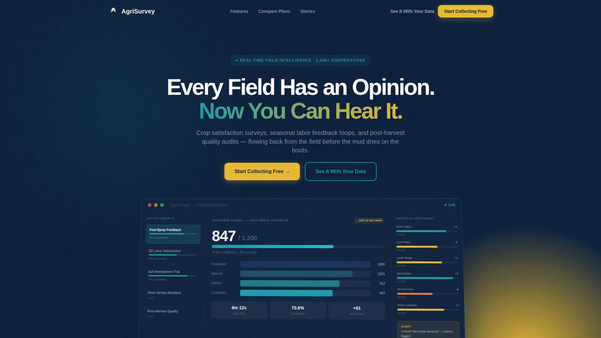
- A full-width product screenshot header showing the dashboard mid-use with live survey data
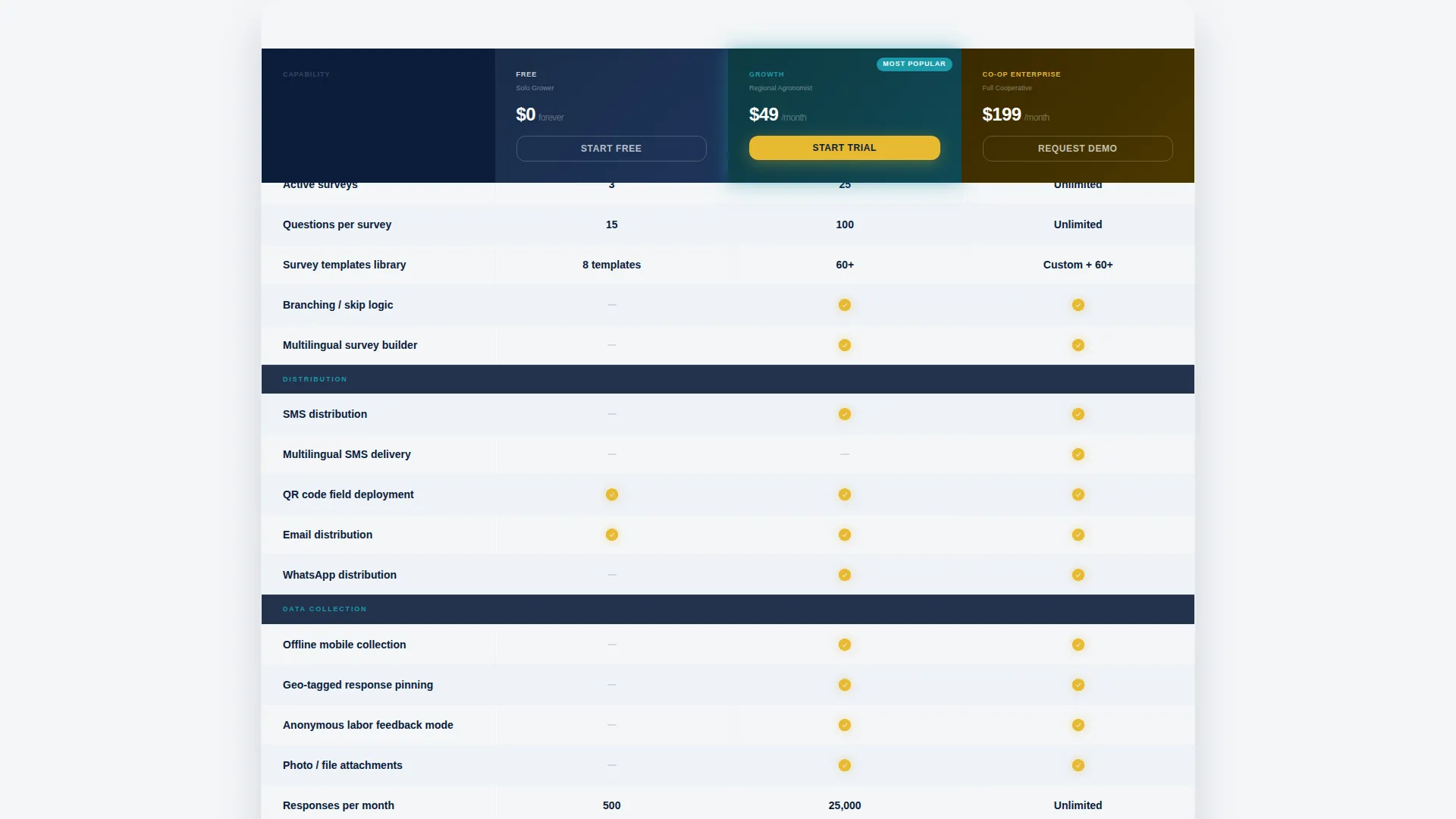
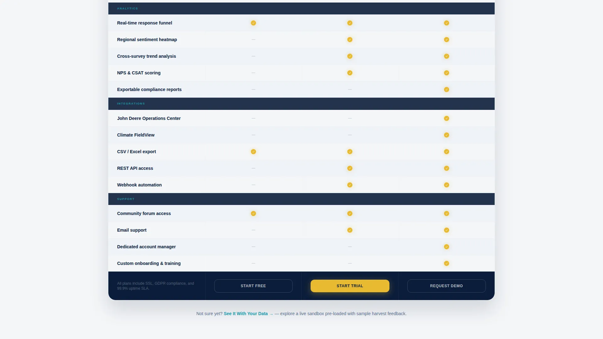
- A three-tier comparison table covering Free, Growth, and Co-Op Enterprise plan capabilities
- A two-field freemium signup form and a secondary sandbox demo path
Feature list
This template delivers a focused set of built-in components that support agriculture survey platform marketing from first impression to signup click.
Three-Tier Comparison Table
The core creative element is a scrollable feature matrix comparing Free, Growth, and Co-Op Enterprise tiers. Each row covers a discrete capability that agriculture professionals look for: offline mobile collection, multilingual SMS distribution, geo-tagged response pinning, anonymous labor feedback mode, and exportable compliance reports. Rows alternate between silo white and a faint navy tint for clean scannability.
Dashboard Product Screenshot Header
The header displays a full-width, pixel-perfect screenshot of the platform mid-use. The image shows a left sidebar listing active surveys, a center response funnel tracking 847 of 1,200 collected responses, and a right-column sentiment heatmap across six farm regions. The screenshot sits at a subtle angle beneath the headline "Every Field Has an Opinion. Now You Can Hear It."
Sticky Mobile Conversion Bar
On mobile screens, the primary call-to-action button locks into a sticky bottom bar. This keeps the "Start Collecting Free" prompt visible throughout the entire scroll without interrupting the comparison table experience.
Two-Field Freemium Signup Form
The signup flow is intentionally minimal: a work email field and an organization type dropdown. The dropdown options map directly to the target audience segments, including independent farm, cooperative, agribusiness, and extension service.
Secondary Sandbox Demo Path
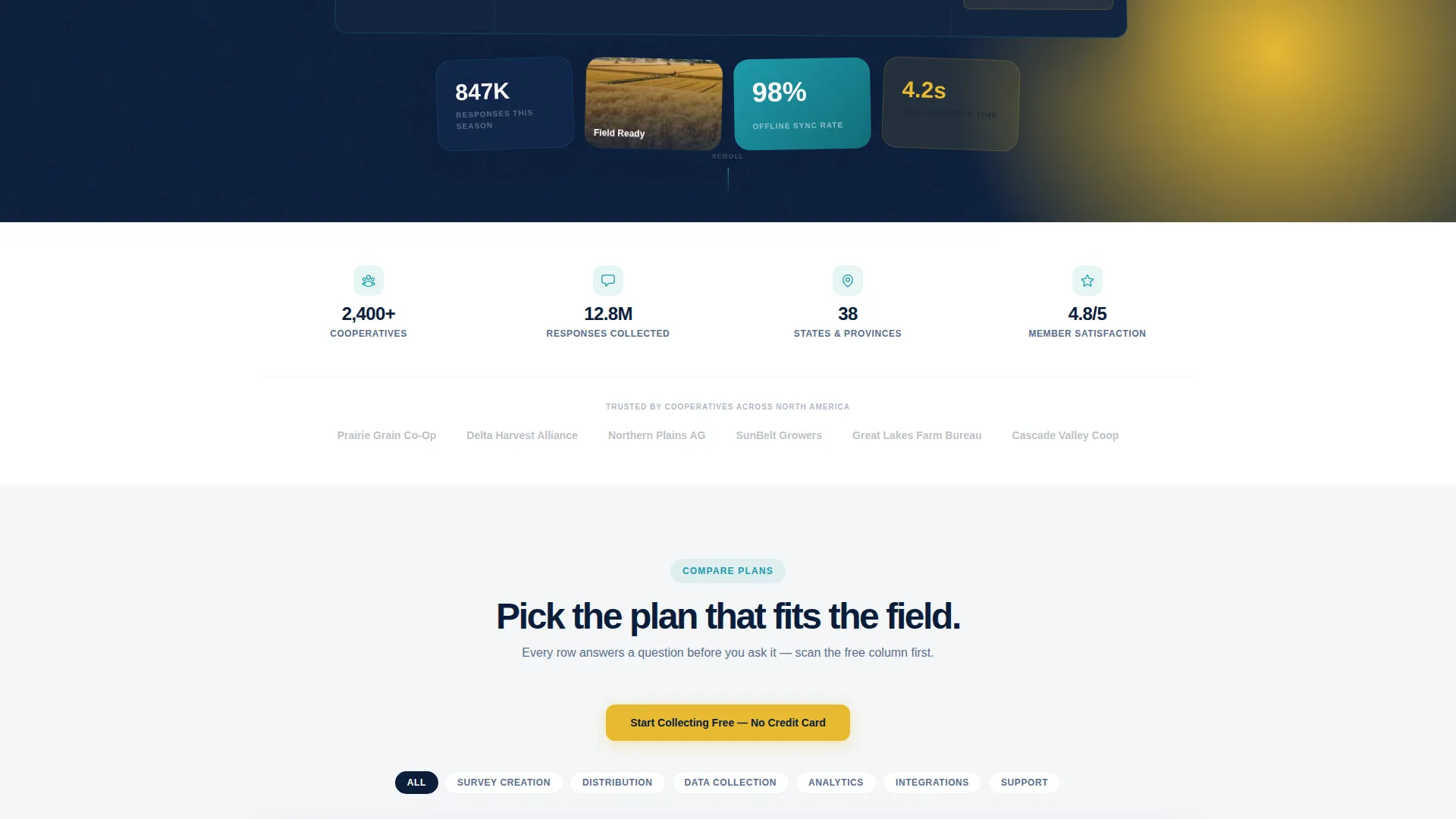
A second conversion path labeled "See It With Your Data" links to a live sandbox pre-loaded with sample harvest feedback. This path serves visitors who need proof before committing, reducing friction for the most skeptical buyers.
Gold-Accent Visual Feedback System
Checkmarks in the comparison table glow in harvest gold, and each tier column header carries a short descriptor: "Solo Grower," "Regional Agronomist," and "Full Cooperative." Gold notification badges appear in the header screenshot, reinforcing the real-time data feel throughout the page.
Page sections overview
| Section | Purpose |
|---|---|
| Hero Header | Anchors attention with a product screenshot and primary headline |
| Comparison Table | Lets visitors self-qualify across three plan tiers row by row |
| Tier Column Headers | Labels each plan with a recognizable role descriptor |
| Primary call to action Block | Drives freemium signups with a two-field form above the table |
| Sticky Bottom Bar | Keeps the signup prompt accessible on mobile throughout scroll |
| Secondary Demo Link | Offers a sandbox path for visitors who need to see data first |
Design & branding system
The visual identity follows a Dashboard Pro theme built on a Midnight Blue color system. The palette is designed to feel like a weather radar screen glowing inside a dark equipment shed: authoritative, data-dense, and built for people who read numbers the way they read seasons.
- Deep field-at-dusk navy (#0B1D3A) for backgrounds, teal (#1B9AAA) for progress bars and accents, and harvest gold (#E8B931) for checkmarks and call-to-action buttons
- Silo white (#F4F6F8) for card backgrounds and alternating table rows to maintain readability against the dark base
- The overall aesthetic feels like opening a well-organized clipboard at dawn: clean, purposeful, and nothing wasted
Mobile & speed optimization
The template is structured to deliver a smooth experience on the small screens that field staff and farm managers actually use during their day. Mobile layout decisions prioritize the conversion path above all else.
- The sticky bottom bar keeps "Start Collecting Free" visible without requiring the user to scroll back to the top
- The comparison table is designed to scroll cleanly on narrow screens so row-by-row evaluation stays clear
- The two-field signup form stays lean on mobile, reducing tap friction for users on slow rural connections
How this template helps you convert
Every layout decision in this template is aimed at reducing the distance between a first-time visitor and a completed free signup. The page earns the click rather than demanding it.
- The comparison table is built so that the free tier shows genuine, substantive capabilities. By the time a visitor has scanned ten rows of the free column, the upgrade path feels like a natural next season rather than a sales push.
- Two conversion paths run in parallel: the direct "Start Collecting Free" form for ready visitors, and the "See It With Your Data" sandbox link for those who need one more reason to trust the platform.
Other information about this template
This template is part of a broader agriculture software category and is designed specifically for the agriculture survey and feedback niche. It fits naturally into a technology-forward cooperative or agribusiness marketing stack.
- The template style is a Comparison Table layout using the Dashboard Pro theme, making it well-suited for platforms that need to communicate tiered pricing to a professional audience
- The creative direction follows a Feature Matrix approach, which mirrors how agriculture professionals already evaluate tools: row by row, capability by capability, season by season
- Integration capabilities shown in the comparison table rows include references to field operations platforms and climate data tools, reflecting the real workflow context of the target audience
Theme
Dashboard Pro
Creative direction
Feature Matrix
Color system
Midnight Blue
Style
Comparison Table
Direction
Freemium/Trial
Page Sections
Three-tier Feature Comparison Table
Product Screenshot Hero Header
Freemium Two-field Signup Form
Secondary Sandbox Demo Path
Sticky Mobile Call-to-action Bar
Gold-accent Visual Feedback System
Related questions
Who is this landing page template designed for?
Can I customize the comparison table tiers and row labels?
Does the template include the sandbox demo functionality?
How does the sticky mobile bar work?
Is this template suitable for a freemium platform launch?



