Micro-SaaS & Developer Tools Specialist Professional Website Template
Airwave is a scroll-reveal landing page template built for podcast hosting platforms. It opens with a live-coded RSS terminal sequence, then unfolds a full dashboard view. A Problem-to-Solution arc builds trust by naming what's broken before showing what's fixed. The sticky comparison table and single-field migration form turn browsers into signups fast.
by Rocket studio
Quick summary
Airwave is a single-page, scroll-reveal landing page template designed for podcast hosting platforms. It leads with a terminal code snippet that resolves into a dashboard screenshot, then guides visitors through a Problem-to-Solution arc. A sticky comparison table and a one-field migration form make the conversion path as direct as possible.
Who this template is for
This template fits teams and creators who need to communicate a serious hosting platform without a bloated, outdated presentation. It speaks directly to people who care about honest data, clean tooling, and fast onboarding.
- Indie podcast creators running interview shows who want a credible, technical first impression
- Marketing teams repurposing webinars into branded audio series and pitching sponsors or leadership
- Network producers managing multiple feeds who need to show a single, trustworthy dashboard story
What problem this template solves
Podcast hosting platforms have a credibility problem. Legacy hosts inflate download numbers, embed players look outdated, and dashboards feel chaotic. A landing page that speaks in the same language as the product, code, metrics, clean user interface, closes that gap fast.
- Visitors leave when they cannot tell if the analytics are real or padded
- Creators distrust platforms that demo polished screenshots but hide the actual interface
- Network producers need proof of multi-feed control before they consider switching tools
What you get with this template
You get a complete scroll-reveal landing page built around a progression from tension to resolution. Every section earns the next one. The layout is structured to move a skeptical visitor from "I've been burned before" to "this is exactly what I need."
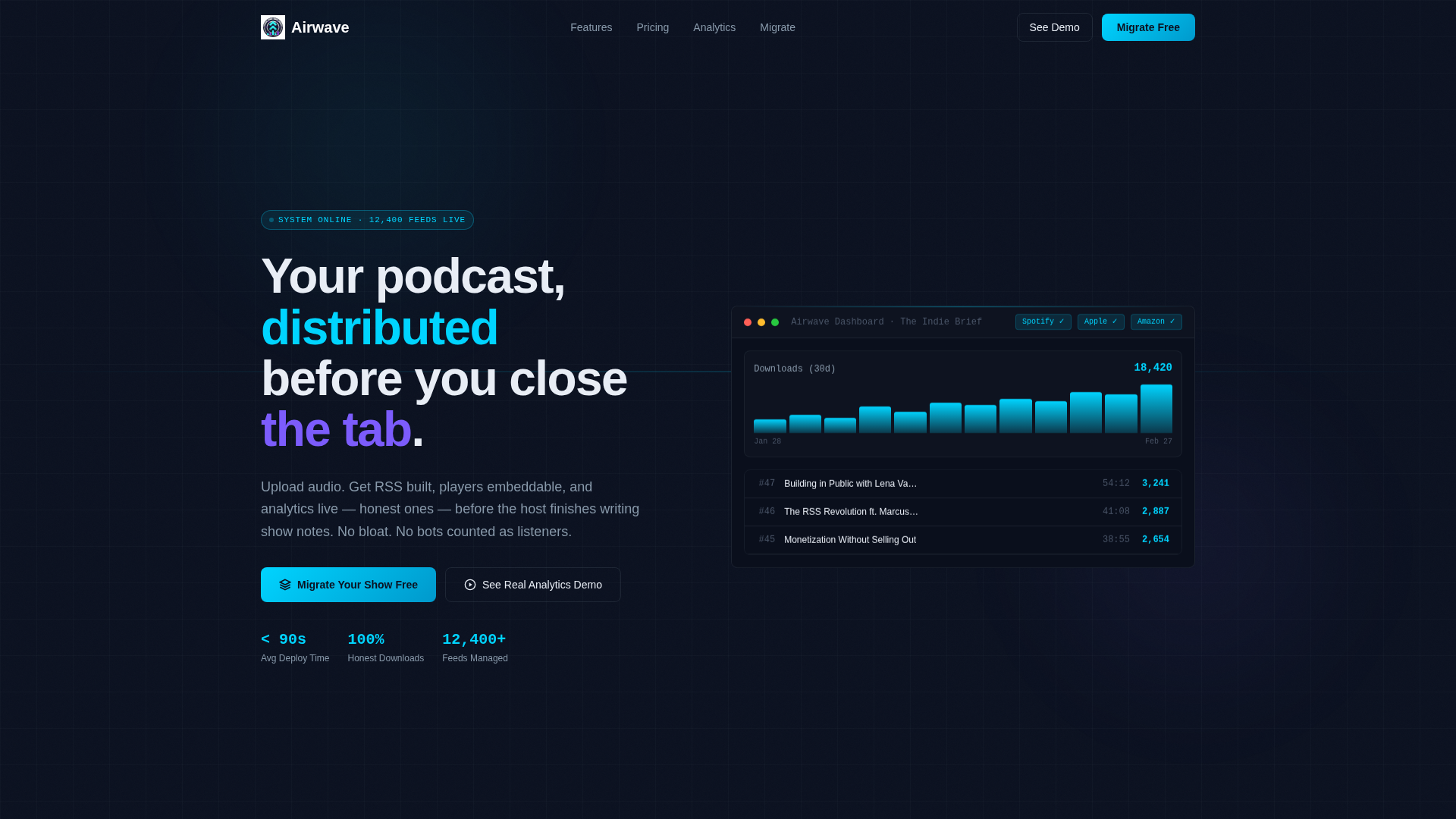
- A header with an animated code snippet block that transitions into a live dashboard screenshot
- A full Problem-to-Solution arc with stacked problem cards that fade in before the solution panels appear
- A sticky comparison table, a primary migration call to action, and a secondary sandbox demo path
Feature list
This template is built around a specific set of components described in the brief. Each one serves the conversion goal directly.
Animated Terminal Header
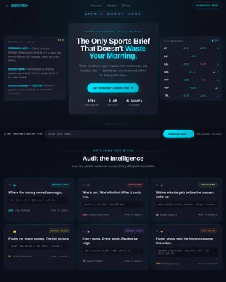
The page opens with a styled code block showing three lines of RSS configuration feeding into a terminal. A JSON response returns episode metadata, the cursor blinks, and the block dissolves outward to reveal a full dashboard screenshot beneath it. No headline needed, the interface speaks first.
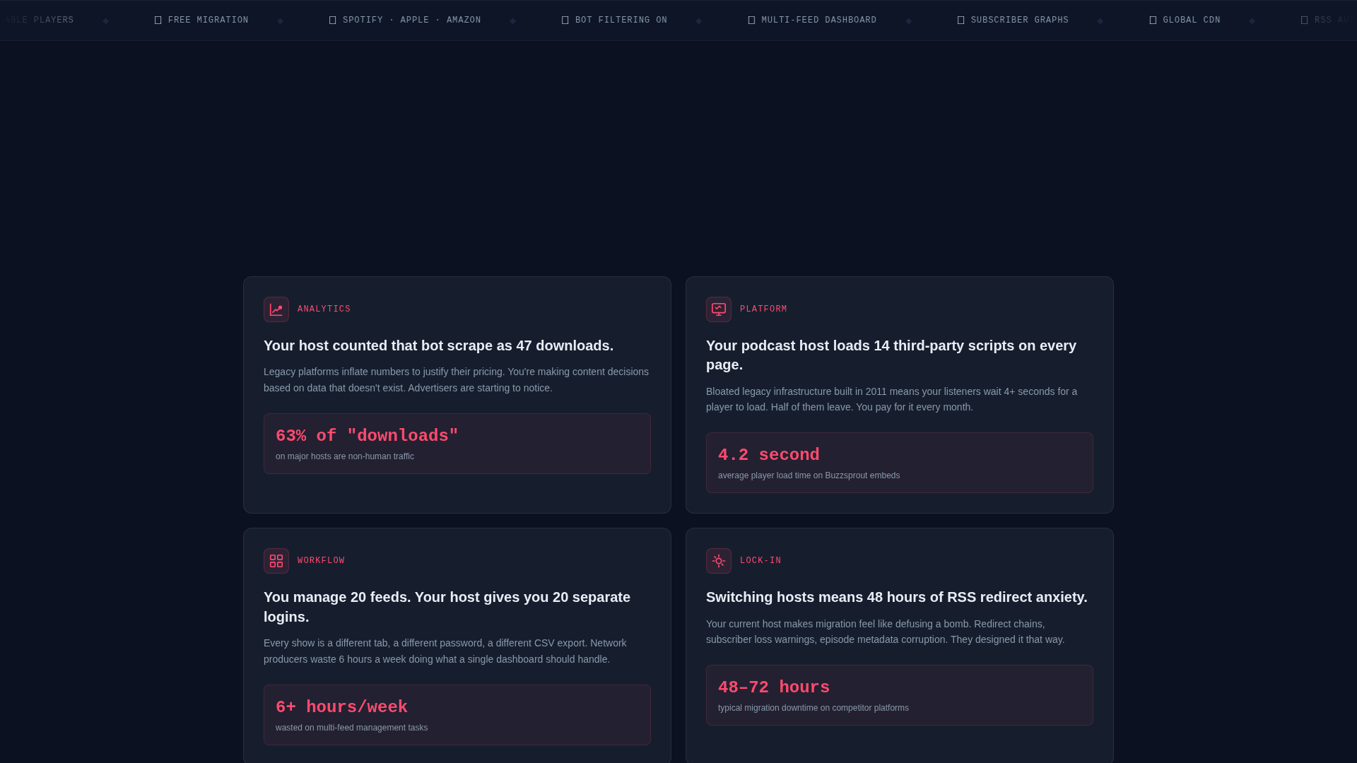
Problem-to-Solution Scroll Arc
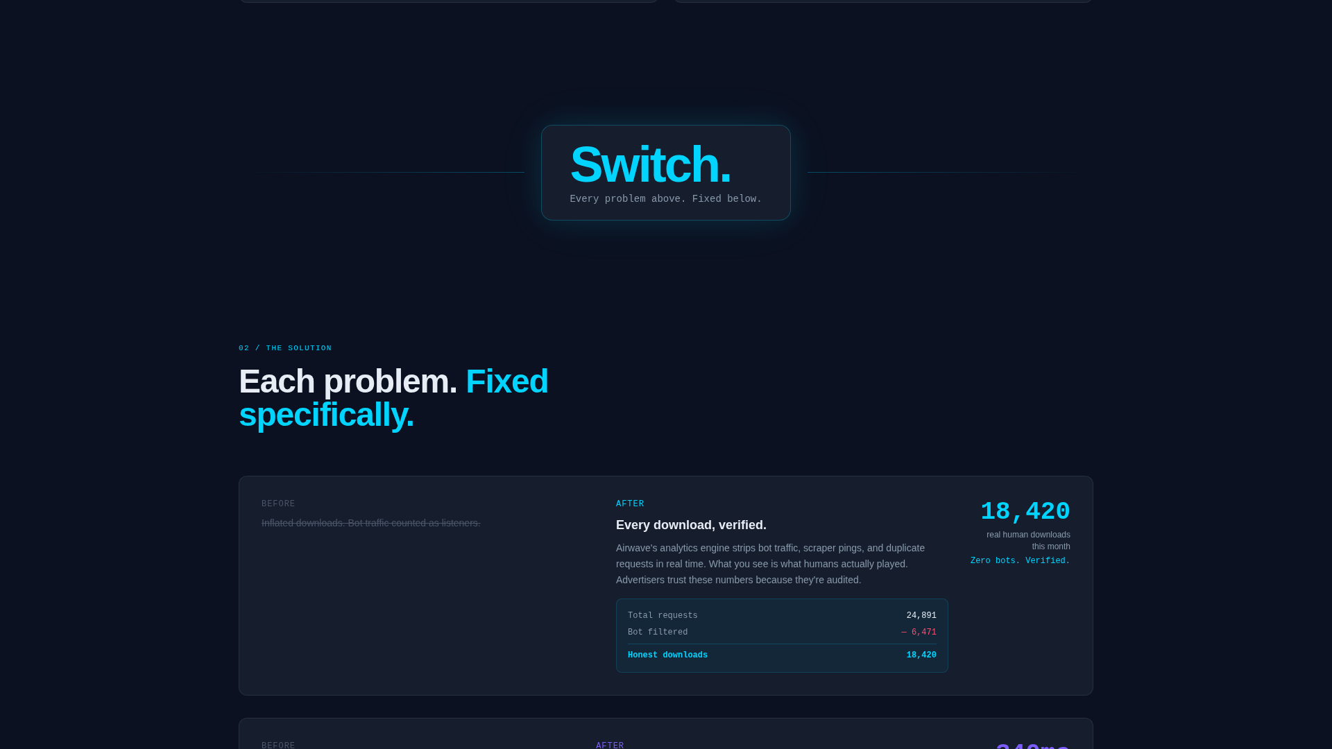
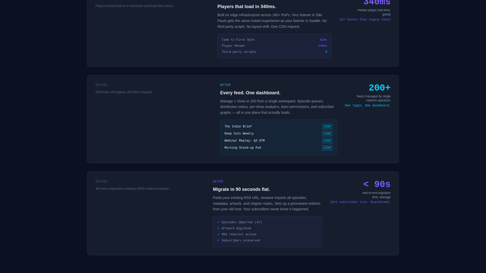
Section one surfaces pain points one by one: bloated hosts, inflated numbers, outdated players. Each problem card fades in on scroll, stacking tension deliberately. A single dividing line breaks the page with the word "Switch." Then each problem re-emerges paired with the platform's specific answer, metrics overlaid, user interface fragments animating into place.
Sticky Comparison Table
A feature and pricing comparison table materializes mid-scroll and stays visible as the user continues reading. It compares the platform against two named competitors across features, pricing, and analytics transparency. The table is the primary persuasion engine on this page.
One-Field Migration Form
The primary call to action reads "Migrate Your Show Free" and uses a single RSS feed URL input that triggers automatic import. There is no multi-step form, no account creation wall. One field, one action.
Secondary Demo Path
A second conversion path offers "See Real Analytics Demo" linking to a live sandbox dashboard. This gives hesitant visitors a no-commitment way to verify the product before they commit an RSS feed.
Dashboard Screenshot Reveal
Behind the terminal animation sits a full dashboard screenshot showing an episode list, a download graph trending upward, and distribution status badges all marked green. It lands as evidence before any marketing copy appears.
Page sections overview
| Section | Purpose |
|---|---|
| Terminal Header Block | Opens with RSS code snippet animating into a dashboard reveal |
| Problem Cards Row | Fades in legacy hosting pain points one by one on scroll |
| Solution Panels Row | Pairs each pain point with a platform answer and live metrics |
| Sticky Comparison Table | Compares features, pricing, and analytics against competitors |
| Migration call to action Section | Single RSS URL field with "Migrate Your Show Free" primary action |
| Demo Sandbox Link | Secondary path to a live analytics sandbox for hesitant visitors |
Design & branding system
The visual identity follows a Dashboard Pro theme built on a Midnight Blue color system. Every color decision reinforces the feeling of a mission control interface at low brightness.
- Base layer uses deep terminal navy (#0B1120) for backgrounds and panel-surface slate (#161E2E) for component surfaces
- Active elements and key data points use active-signal cyan (#00D4FF), with muted-label silver (#8899AA) for secondary text
- Hover states and toggles fire in electric violet (#7C5CFC), giving interactive elements a distinct, earned glow
Mobile & speed optimization
The scroll-reveal structure is designed to stay coherent on smaller screens. Progressive disclosure means content loads in stages, which keeps the experience focused even on a narrow viewport.
- Scroll animations are tied to section visibility, so each panel enters cleanly without competing with others
- The sticky comparison table is structured to remain readable on mobile without requiring horizontal scrolling
- The single-field migration form reduces tap friction to one input and one button on any screen size
How this template helps you convert
The entire page is structured as a persuasion sequence, not just a feature list. Every design and copy decision moves the visitor closer to one of two actions.
- The Problem-to-Solution arc builds specific credibility by naming real frustrations before presenting answers, which makes the platform's claims feel earned rather than generic.
- The sticky comparison table removes the need for the visitor to research competitors independently, keeping them on the page and giving them the information they need to decide.
- The one-field migration form removes every signup barrier except intent, so the visitor who is ready to act can do so in seconds.
Other information about this template
This template is categorized under Technology, specifically within the Micro-SaaS and Developer Tools subcategory, targeting the podcast hosting platform niche. It is built as a scroll-reveal, single-page layout using the Dashboard Pro theme.
- The template style is Scroll Reveal (Progressive), meaning sections animate into view as the visitor scrolls rather than loading all at once
- The creative direction follows a Problem-to-Solution Arc, a structure well suited to platforms competing against established but flawed incumbents
- The header concept is a Code Snippet, which signals technical credibility immediately to developer-adjacent and creator audiences
- The landing page direction is Comparison-Versus, making the sticky competitor table a structural priority rather than an optional component
Theme
Dashboard Pro
Creative direction
Problem→Solution Arc
Color system
Midnight Blue
Style
Scroll Reveal (Progressive)
Direction
Comparison/Versus
Page Sections
Animated Terminal Header Block
Problem-to-solution Scroll Arc
Sticky Competitor Comparison Table
One-field Migration Form
Secondary Sandbox Demo Path
Dashboard Screenshot Reveal
Related questions
Who is this landing page template designed for?
Can I update the comparison table to reflect my actual competitors?
Does this template include real dashboard or analytics functionality?
What makes the one-field migration form different from a standard signup form?
How does the scroll-reveal animation work across sections?