Mobile App Pricing Website Template
Aisle is a modular card-grid landing page template built for a deal-tracking and price-comparison shopping app. It opens with a live-data stats wall, flows into interactive comparison modules, and closes with a friction-free app-store call to action. The dark Carbon Fiber palette and electric mint accents give every section a high-signal, engineered feel that matches the product's power.
by Rocket studio
Quick summary
Aisle is a single-page template designed for a shopping and e-commerce app that aggregates deals, tracks prices, and curates retailer feeds. The layout opens with an animated stats wall, moves through interactive comparison modules, and ends with a device-detected app-store link. Every section is built to earn the install before asking for it.
Who this template is for
This template is built for teams launching or marketing a deal-tracking or price-comparison shopping app. It speaks directly to technically minded product builders who want a landing page that shows the product working, not just promises it.
- App developers and product teams promoting a shopping or price-tracking tool
- Digital marketers who need a high-converting, comparison-led landing page for an e-commerce app
- Side-hustle resellers and deal-focused consumer brands wanting a credible, data-forward first impression
What problem this template solves
Most app landing pages ask visitors to trust claims they cannot verify. Aisle flips that dynamic. It puts real aggregate data and interactive tools front and center, so the visitor experiences the product value before the call to action ever appears.
- Eliminates passive, copy-heavy pages that fail to demonstrate the app's live capabilities
- Removes friction from the install funnel by replacing email forms with a direct, device-detected app-store link
- Closes the credibility gap for deal-tracking apps by leading with concrete, animated statistics
What you get with this template
You get a fully structured, single-page card-grid layout built around three distinct scroll layers. Each layer deepens engagement before the final call to action. The template is production-ready in visual structure and content hierarchy.
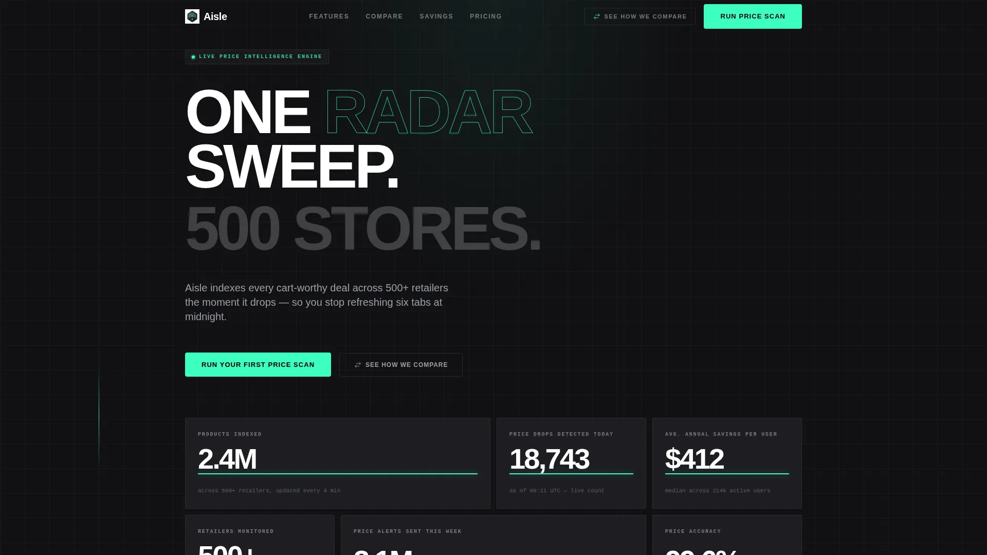
- An animated Stats/Metrics header wall with oversized aggregate numbers and mint underline ticker animations
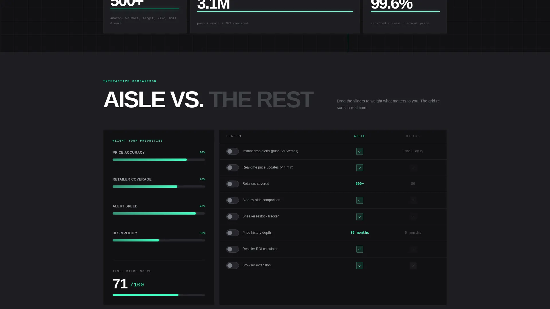
- A modular interactive comparison grid with toggle switches, drag sliders, and a real-time re-sorting grid
- A sticky secondary navigation bar, a savings-receipt mosaic section, and a device-detected app-store call-to-action block
Feature list
This template packs a focused set of purpose-built components. Each one is designed to serve the comparison and discovery flow that deal-hunting audiences respond to.
Animated Stats Header Wall
The header section displays aggregate performance numbers in oversized titanium numerals on graphite cards. Mint underlines animate on load like live tickers refreshing, establishing scale and credibility before any body copy appears.
Interactive Comparison Grid
Each card in the modular grid functions as a comparison module. Visitors toggle between competing apps, drag sliders to weight factors like price accuracy and retailer coverage, and watch the grid re-sort in real time based on their inputs.
Live Price-Check Race Section
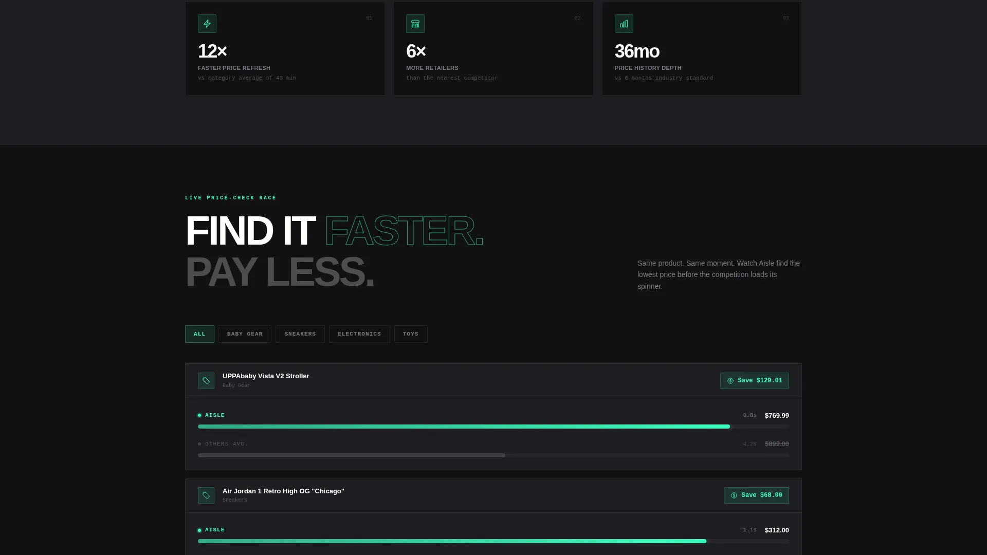
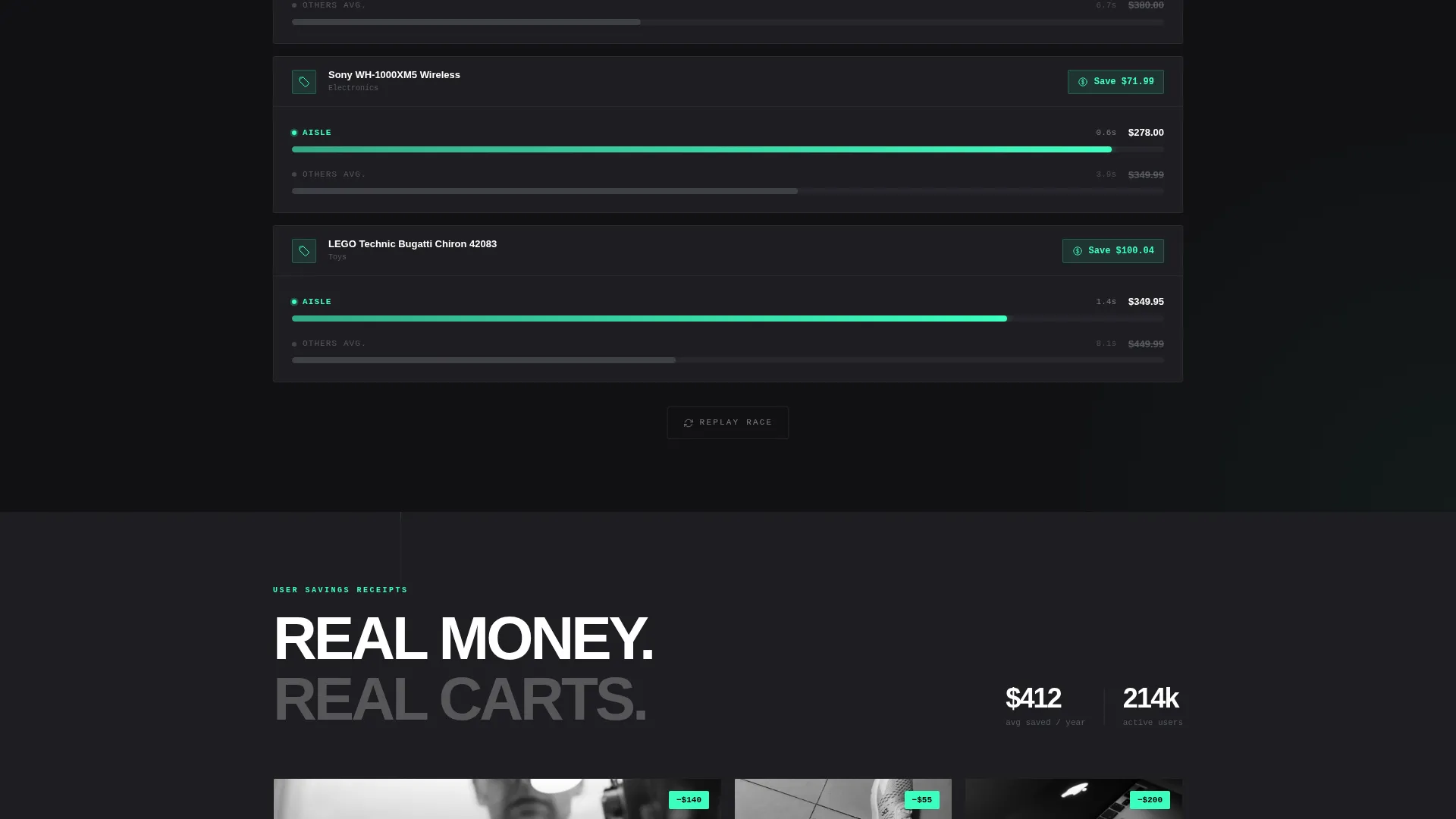
A dedicated scroll layer shows identical products being found across retailers in a simulated speed race format. This section makes the app's speed and breadth tangible rather than theoretical.
User Savings Receipt Mosaic
A third scroll layer displays user-submitted savings receipts as a visual mosaic. Real-world proof replaces testimonial quotes, giving skeptical visitors concrete social evidence in a format that feels native to the product.
Sticky Secondary Navigation Bar
A persistent bar at the top of the page offers a "See How We Compare" anchor link. It captures skeptical visitors who scroll past the header and routes them directly to the versus modules.
Device-Detected App Store call to action
The primary call-to-action block deep-links to the correct app store based on the visitor's device. No email form, no extra steps. A single tap is all that separates the visitor from the install.
Page sections overview
| Section | Purpose |
|---|---|
| Stats Metrics Header | Establish scale with animated aggregate data numbers |
| Feature Versus Cards | Side-by-side app comparison with toggles |
| Live Price Race | Show real-time product discovery speed |
| Savings Receipt Mosaic | Display user-submitted proof of savings |
| Primary call to action Block | Drive installs via device-detected app store link |
| Sticky Nav Bar | Anchor skeptical visitors to comparison modules |
Design & branding system
The template uses a Carbon Fiber color system built around four tones that layer naturally from background to interactive accent. The overall aesthetic feels engineered and precise, like the interior of a high-performance device.
- Core palette: cockpit black (#111113) and woven graphite (#1E1E22) alternate as card and section backgrounds to create depth without visible borders
- Titanium mid-tone (#7A7D85) handles secondary text, numerical labels, and divider lines throughout the layout
- Electric mint (#3DFFC0) activates on hover states, toggle switches, comparison checkmarks, and all live-data accents to signal interactivity
Mobile & speed optimization
The card-grid layout is structured to adapt cleanly across screen sizes. The modular format means individual cards reflow without breaking the comparison logic or visual hierarchy.
- Card modules stack vertically on smaller screens, preserving the comparison structure in a single-column flow
- The device-detected call-to-action block automatically surfaces the correct app store badge based on the visitor's operating system
- The sticky navigation bar remains accessible at all scroll depths, keeping the anchor link reachable on both desktop and mobile
How this template helps you convert
The page is built around a Comparison/Versus conversion strategy. Visitors are not asked to commit early. Instead, the layout earns trust through layers of evidence before the call to action appears.
- The stats wall opens with undeniable scale data, creating immediate credibility before any feature claims appear.
- The interactive comparison grid lets visitors manipulate real inputs and see the app outperform alternatives, making the win feel self-discovered rather than advertised.
- The device-detected install link appears only after the visitor has moved through two proof layers, reducing resistance to a single tap at the moment of peak confidence.
Other information about this template
This template is categorized under Technology, with a Mobile App subcategory and a Shopping and E-Commerce App niche. It is built on a Directory and Discovery theme and uses the Interactive Explorer creative direction to support hands-on visitor engagement.
- The template style is Card Grid (Modular), making individual sections easy to reorder or expand without disrupting the overall layout
- The header concept follows a Stats/Metrics wall approach, which suits any app that can surface real aggregate numbers as proof of scale
- This template works well alongside tools like Framer, Webflow, or similar no-code platforms where interactive card behaviors and slider components are natively supported
Theme
Directory & Discovery
Creative direction
Interactive Explorer
Color system
Carbon Fiber
Style
Card Grid (Modular)
Direction
Comparison/Versus
Page Sections
Animated Stats Header Wall
Interactive Comparison Grid
Live Price-check Race Section
User Savings Receipt Mosaic
Device-detected App Store Call to Action
Sticky Secondary Navigation Bar
Related questions
Who is this landing page template designed for?
Can I customize the stats displayed in the header section?
Does this template require coding skills to use?
Why does the template use a direct app-store link instead of an email form?
Can I add more comparison categories to the interactive grid?



