Bento Grid Landing Page for Wedding Mobile Apps
Aisle is a bento grid landing page template built for a wedding mobile app. It combines a void-black and electric violet visual identity with a data-command aesthetic, comparison-versus conversion layout, and a live dashboard hero. The template is designed to turn first-time visitors into sign-ups through evidence-stacking tiles and a two-field, zero-friction form.
by Rocket studio
Quick summary
Aisle is a single-page bento grid template for a wedding mobile app. It opens with a dark, full-bleed header showing a live wedding dashboard, then builds its case section by section using head-to-head comparison tiles. The void-black and electric violet palette gives the page a premium, data-forward feel that stands apart from every pastel wedding site in existence.
Who this template is for
This template is built for teams and founders who need a high-converting landing page for a wedding planning app. The brief positions it for an audience that takes planning seriously and expects precision.
- Type-A couples managing large weddings, including multi-day Indian weddings with 200 or more guests
- Grooms and partners handling budgets and logistics quietly behind the scenes
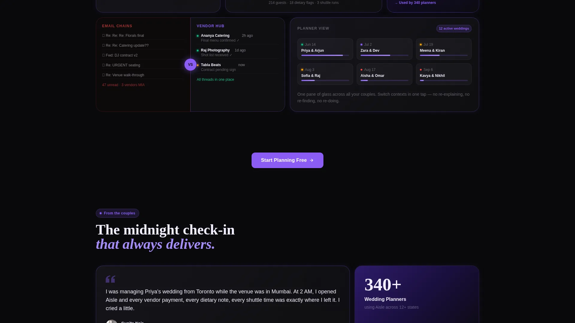
- Professional wedding planners coordinating multiple events simultaneously who need one clear view across all their couples
What problem this template solves
Most wedding app landing pages look identical: soft florals, stock couple photography, and vague value propositions. This template solves the credibility problem by showing the product itself as the hero.
- Couples drowning in shared spreadsheets, Pinterest boards, and endless email chains need proof that a better system exists
- Planners juggling twelve concurrent weekends need to see that one interface can handle the complexity
- The versus-architecture tiles prosecute the problem directly, stacking evidence until the case for the app is undeniable
What you get with this template
You get a complete, ready-to-customize bento grid landing page built around a Comparison/Versus conversion architecture. Every design decision supports the core objective: get couples and planners to sign up.
- A dark full-bleed header with a glowing app user interface mockup, headline, and heartbeat-pulse animation
- A grid of alternating feature close-up tiles and head-to-head comparison tiles covering guest management, vendor coordination, and seating
- A two-field signup form asking only for email and wedding date, plus a floating mobile call-to-action bar
Feature list
This section covers the core built-in capabilities of the Aisle landing page template.
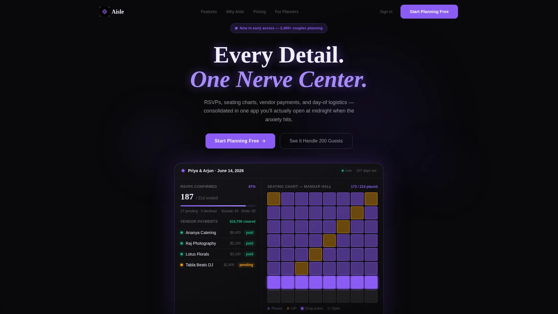
Live Dashboard Hero Section
The header places a rendered wedding app dashboard at center screen. It displays 187 of 214 RSVPs confirmed, a vendor payment timeline with status indicators, and a seating chart with visible drag handles. No stock photography of couples appears anywhere. The product interface is the visual centerpiece.
Bento Grid Layout with Micro-Animations
The page uses a bento grid structure where each tile snaps into view with micro-animations styled to feel like app notifications arriving in real time. Tiles alternate between feature close-ups and versus panels, keeping the scroll dynamic and the pacing intentional throughout.
Comparison Versus Tiles
Every third tile is a head-to-head comparison. These panels place the app directly against spreadsheets, email chains, and paper seating charts. One tile shows a chaotic screenshot of seventeen browser tabs; the adjacent tile shows the same data inside one calm, violet-lit interface.
Glowing Primary Call to Action
The primary call-to-action button reads "Start Planning Free" and uses a glowing violet treatment with a subtle outer bloom effect. It appears after the first comparison row and again as a pinned floating bar on mobile screens.
Interactive Guest Count Calculator
A secondary conversion path invites visitors to enter their guest count and watch the app dashboard populate in real time. This interactive element is labeled "See It Handle Your Guest Count" and acts as a soft demo before any commitment.
Two-Field Signup Form
The signup form collects only an email address and a wedding date. This intentional two-field design removes friction and reflects the brief's principle that the app sells itself once the visitor is inside.
Page sections overview
| Section | Purpose |
|---|---|
| Dark Hero Header | Introduces the app via a glowing live dashboard mockup with a bold headline |
| RSVP Status Tile | Displays confirmed guest count as a live data readout to build immediate credibility |
| Vendor Timeline Tile | Shows payment status indicators, reinforcing the app's coordination capability |
| Seating Chart Tile | Previews drag-and-drop seating arrangement with visible interaction handles |
| Spreadsheet Versus Panel | Contrasts seventeen chaotic tabs with one consolidated violet-lit interface |
| Budget Tracker Tile | Highlights live burn-rate calculations as a feature close-up tile |
| Guest List Tile | Demonstrates dietary-tag filtering on the guest management view |
| Vendor Chat Tile | Shows consolidated vendor communication threads in a single interface |
| Email Chain Versus Panel | Compares fragmented email coordination against the app's unified vendor chat |
| Paper Seating Versus Panel | Contrasts day-of paper chaos with real-time in-app seating adjustments |
| Guest Count Calculator | Interactive secondary call to action where visitors enter their count and see the dashboard respond |
| Signup Form Section | Two-field form collecting email and wedding date with zero-friction entry |
| Floating Mobile Bar | Pinned bottom call-to-action bar persistent on mobile scroll |
Design & branding system
The visual identity follows a Data Command theme. The palette is built from four deliberate colors that evoke a spacecraft console redesigned for a love story.
- Void black (#09090B) dominates backgrounds at roughly 80%, keeping the interface feeling deep and immersive
- Electric violet (#8B5CF6) pulses through borders, notification badges, progress rings, and hover states that bloom like bioluminescence responding to touch
- Lunar white (#F0EEFF) is used exclusively for typography and data readouts, floating clean and weightless against the dark ground
- Deep cosmic purple (#2D1B69) fills mid-layer surfaces, creating depth between the void background and violet accent elements
Mobile & speed optimization
The template is built with mobile users in mind. The floating bottom bar for the primary call to action is a mobile-specific design decision that keeps conversion accessible throughout the scroll.
- The bento grid layout reflows cleanly for smaller screens, keeping tile content legible and the pacing intact
- The floating "Start Planning Free" bar stays pinned at the bottom of the screen on mobile, so the primary action is never more than one tap away
How this template helps you convert
The Comparison/Versus conversion architecture is the structural engine of this template. Every section is positioned to move hesitant visitors toward signup.
- The dashboard hero leads with the product itself, showing real data states rather than aspirational photography, so visitors understand the value before reading a single line of body copy
- The versus tiles stack concrete evidence with every scroll, framing spreadsheets and email chains as the problem and the app as the only logical answer
- The two-field form and interactive calculator remove every remaining barrier, letting the app demonstrate its own value before asking for any commitment
Other information about this template
This template is categorized under Technology, specifically the Wedding Software and Software-as-a-Service subcategory, with a niche focus on wedding mobile app products. It carries an intersection match score of 13, reflecting strong alignment between the design direction and the target use case.
- The Launch Energy creative direction means the page opens with maximum confidence and sustains its momentum through every scroll section without decelerating
- The template style is Bento Grid, a layout pattern well suited to app-focused products where multiple features need equal visual weight without hierarchy fatigue
- The header concept is Dark Full-Bleed plus Glow, meaning the void-black background extends edge to edge with the app user interface generating its own violet light source at center screen
- This template is well suited for use with tools commonly found in the wedding technology space, including planning platforms and mobile app product launches


Theme
Data Command
Creative direction
Launch Energy
Color system
Void & Violet
Style
Bento Grid
Direction
Comparison/Versus
Page Sections
Live Dashboard Hero with Glow Effect
Bento Grid with Snap Animations
Comparison Versus Tiles
Interactive Guest Count Calculator
Two-field Zero-friction Signup Form
Floating Mobile Call-to-action Bar
Related questions
Who is this landing page template designed for?
Does this template use stock photography of couples?
What is the primary conversion goal of this template?
Can the comparison tiles be customized for a different app?
What makes this template different from a typical wedding website template?


