Chiropractic Community Forum Landing Page Template
Align is a hub-and-spoke landing page template built for chiropractic community forums. It uses a dark glassmorphic visual style, a terminal-inspired header, and a three-tier feature matrix to showcase Free, Pro, and Clinic membership options. Freemium conversion flows, real thread previews, and anchor navigation make it easy for chiropractors to find their seat and sign up.
by Rocket studio
Quick summary
Align is a single-page chiropractic community forum landing page. It opens with a developer-aesthetic terminal header, flows through a three-spoke feature matrix, and closes every section with a low-friction sign-up prompt. The template is built for forums targeting solo practitioners, new graduates, and multi-location clinic owners in the chiropractic field.
Who this template is for
This template is designed for anyone launching or relaunching a chiropractic community forum online. It works especially well when your audience expects a professional but energetic digital space to connect and learn.
- Solo chiropractors running independent cash-pay clinics who want a community hub
- New chiropractic graduates looking for peer support and practice resources
- Multi-location clinic owners seeking a platform to compare notes on staffing and credentialing
What problem this template solves
Chiropractic professionals are a specialized audience. Generic forum landing pages fail to signal relevance, and plain membership pages rarely communicate the real value locked behind a paid tier. Align fixes both problems in one scroll.
- Visitors cannot see what they are missing on a vague sign-up page, so this template shows real thread titles and live activity proof
- Free versus paid tiers are rarely communicated clearly, so the feature matrix makes the upgrade path visible and persuasive
- Chiropractors distrust slick marketing, so the terminal-style header creates honest cognitive friction that earns a second look
What you get with this template
You get a fully structured hub-and-spoke landing page with anchor navigation, a glassmorphic dark visual system, and a freemium conversion flow. Every major content block is purpose-built for a chiropractic forum audience.
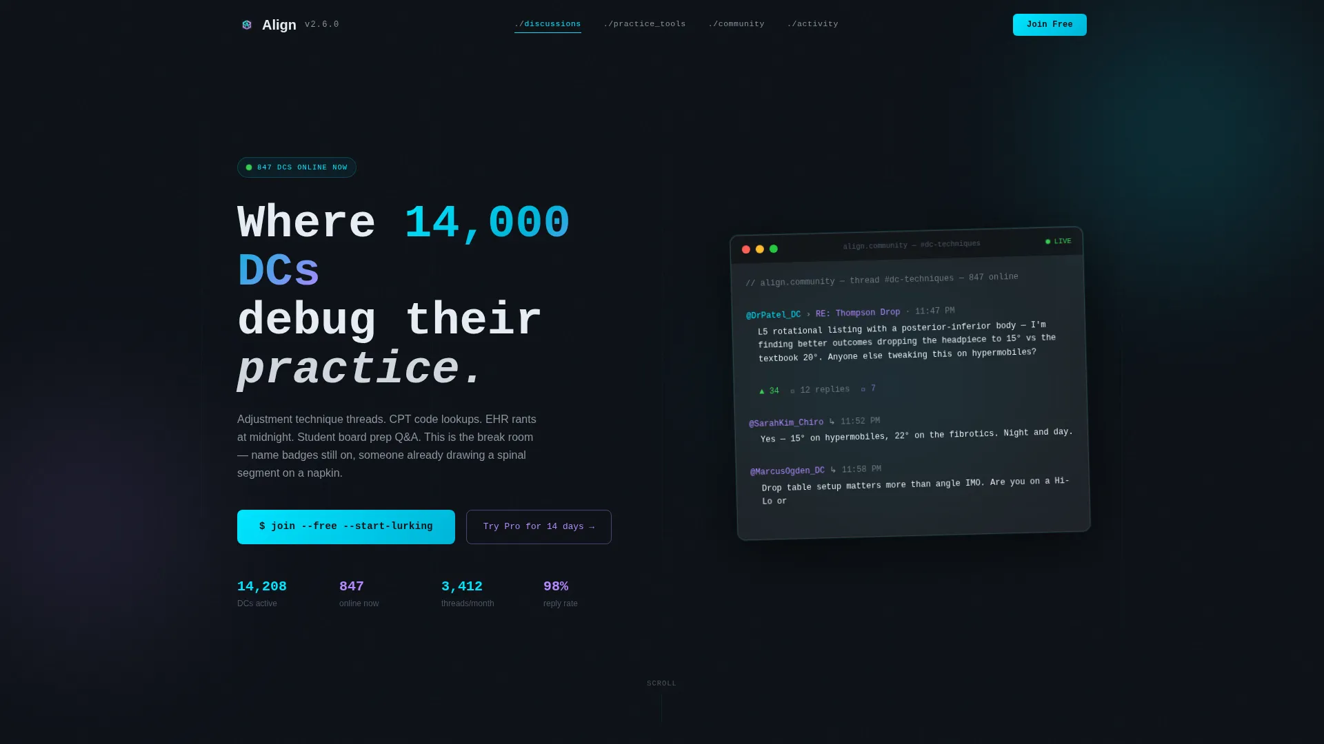
- A code-snippet terminal header block with a syntax-highlighted mock forum post and monospace headline
- Three spoke sections covering discussion features, practice tools, and community access, each with a Free, Pro, and Clinic comparison matrix
- A repeating call-to-action layout with a single-field email input, a Google OAuth button, and a secondary 14-day Pro trial path
Feature list
This template includes several purpose-built components that work together to communicate value and drive sign-ups.
Terminal-Style Code Snippet Header
The header opens with a glassmorphic card displaying a syntax-highlighted forum post. It shows a nested reply thread, upvote counts, and a flashing cursor. A monospace headline above reads: "Where 14,000 DCs debug their practice." The slight card tilt and frosted blur behind it create immediate visual interest.
Anchor Navigation Hub Structure
The page uses a hub-and-spoke layout where each nav item jumps directly to a feature matrix spoke. This lets visitors skip to the section most relevant to their role. Discussion features, practice tools, and community access each have their own dedicated anchor section.
Three-Tier Feature Comparison Matrix
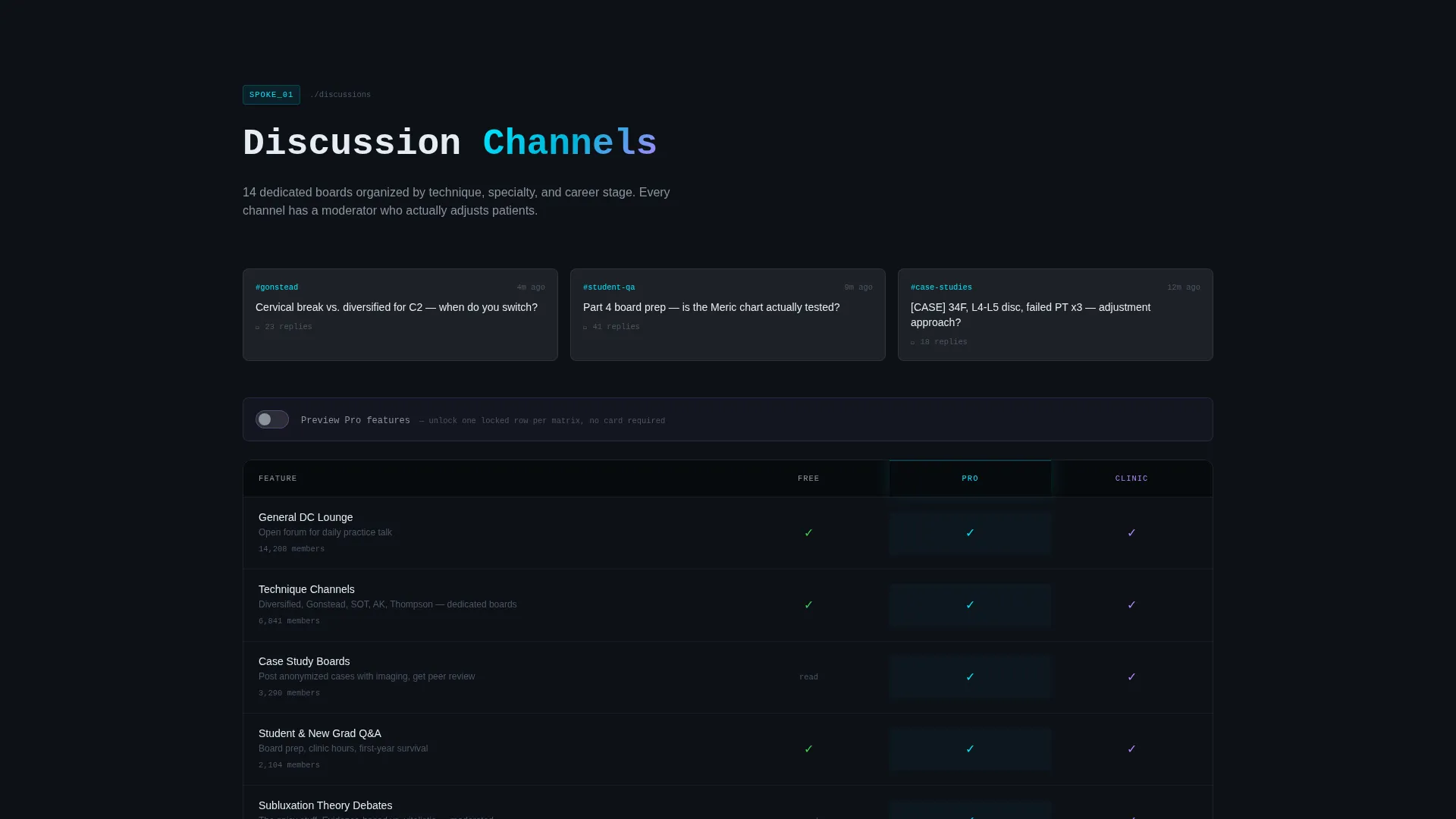
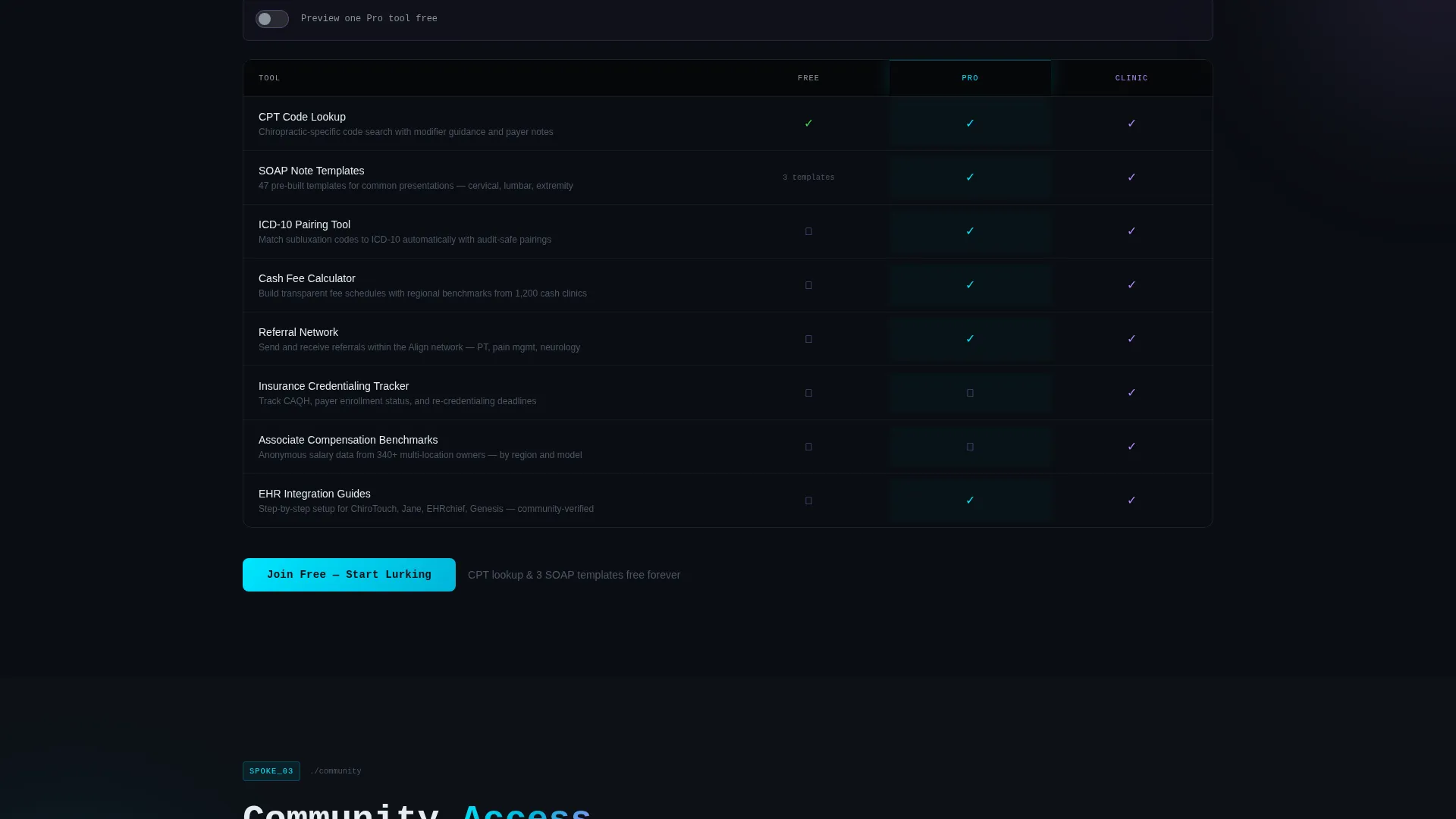
Each spoke section contains a translucent grid comparing Free, Pro, and Clinic membership tiers row by row. Cyan checkmarks mark available features and lavender lock icons highlight locked ones. The visual gap between tiers grows as you scroll, making the value of upgrading feel earned rather than pushed.
Freemium Conversion Flow
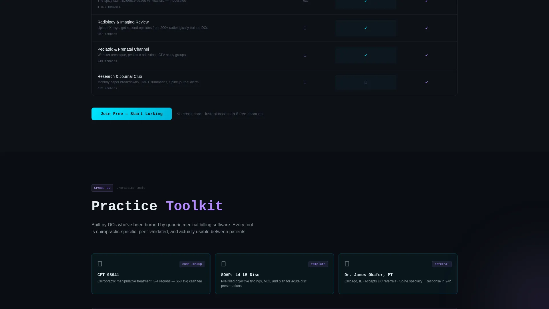
The primary call to action "Join Free, Start Lurking" repeats at every spoke anchor. Each instance includes a single-field email input and a Google OAuth button. A secondary path offers a 14-day Pro trial with no credit card required, unlocking a preview of one locked feature per matrix row.
Live Activity Proof Elements
The template includes a live activity ticker and real member counts per channel. Actual thread titles are displayed rather than placeholder copy. Together these elements show visitors that the community is already active, reducing hesitation before sign-up.
Locked Feature Preview Toggle
Visitors on the secondary trial path can toggle a preview state that reveals one locked feature per matrix row. This gives prospective Pro members a concrete taste of the upgrade without committing. The interaction is visual and contained within the existing matrix layout.
Page sections overview
| Section | Purpose |
|---|---|
| Terminal Header Block | Opens with a code-snippet styled forum post and primary headline |
| Anchor Navigation Hub | Lets visitors jump directly to each spoke section |
| Discussion Features Spoke | Compares case study boards, technique channels, and student Q&A across tiers |
| Practice Tools Spoke | Shows CPT code lookup, documentation templates, and referral network by tier |
| Community Access Spoke | Covers live adjustment reviews, mastermind rooms, and vendor AMAs by tier |
| Repeating call to action Blocks | Collects emails and OAuth sign-ups at each anchor point |
| Live Activity Ticker | Displays real-time thread activity and member counts per channel |
Design & branding system
The visual identity follows a Startup Velocity theme rendered through a glassmorphic color system. The result feels like a developer console crossed with a lightbox, intentionally unfamiliar to chiropractic audiences and all the more memorable for it.
- Core palette: deep spinal midnight (#0D1117) as the base, frosted glass panels at 12% opacity (#FFFFFF1F), electric cyan (#00E5FF) for interactive edges and checkmarks, and soft lavender (#B388FF) for hover states, lock icons, and notification pings
- Typography uses monospace styling in the header and clean sans-serif body text to reinforce the developer-console aesthetic throughout
- Translucent glassmorphic cards float over layered dark backgrounds, with cyan traces on interactive borders and lavender blooms on engagement points like unread thread indicators and live status markers
Mobile & speed optimization
The template is structured with a single-page scroll flow that translates cleanly across screen sizes. Anchor navigation remains accessible on smaller viewports so mobile visitors can still jump directly to their section of interest.
- Glassmorphic card layouts are designed to stack vertically on narrow screens without losing visual hierarchy
- The feature matrix uses a translucent grid format that adapts to constrained widths while keeping tier comparisons readable
- The repeating call-to-action blocks remain compact and functional at mobile scale, keeping the sign-up path short and visible
How this template helps you convert
Align is built around a freemium model where every design and copy decision is tuned to reduce friction and make the value of upgrading obvious.
- The live activity ticker and real thread titles show visitors that the community is already full and active, creating genuine urgency without manufactured scarcity.
- The feature matrix makes the Free-to-Pro value gap undeniable by the time a visitor reaches the third spoke, building natural momentum toward the trial sign-up.
- Every spoke section ends with the same low-commitment call to action, so visitors who are ready to convert can act immediately without scrolling back to the top.
Other information about this template
This template was built at the intersection of chiropractic digital presence and technology-forward design. A few additional details are worth noting for teams evaluating it for their forum platform.
- The template style is classified as Hub and Spoke with Anchor Navigation, making it straightforward to adapt spoke sections if your forum has more or fewer feature categories
- The freemium and 14-day trial conversion paths can coexist on the same page, giving you two distinct audience entry points without added complexity
- The chiropractic community forum niche means the included copy references, such as CPT code lookup, documentation templates, and referral networks, are directly relevant to the target audience rather than generic placeholders
- This template falls under the Technology category with a Chiropractic Digital Presence subcategory, and the design choices reflect a startup-velocity energy that differentiates it from traditional healthcare web templates
Theme
Startup Velocity
Creative direction
Feature Matrix
Color system
Glassmorphic
Style
Hub & Spoke (Anchor Nav)
Direction
Freemium/Trial
Page Sections
Terminal-style Code Snippet Header
Hub and Spoke Anchor Navigation
Three-tier Feature Comparison Matrix
Repeating Freemium Call to Action
Live Activity Proof Elements
Locked Feature Preview Toggle
Related questions
Who is this landing page template designed for?
Does this template support multiple membership tiers?
What does the freemium conversion flow look like?
Can I customize the thread titles and member counts shown on the page?
How does the anchor navigation work on this page?



