Chiropractic Directory Listing Landing Page Template
Align is a single-page chiropractic directory landing page built on a Dashboard Pro theme with an Acid Digital color palette. It connects patients searching by technique, insurance, and ZIP code with local practitioners. Practice owners get a tiered comparison table, live network metrics, and a three-step lead capture form to claim or upgrade their listing without paid advertising.
by Rocket studio
Quick summary
Align is a dark, data-forward chiropractic directory landing page. It presents three listing tiers side by side in a structured comparison table, opens with a live metrics wall showing network scale, and closes every scroll section with hard evidence. Practice owners see exactly what they gain by upgrading. Patients find who they need in seconds.
Who this template is for
This template is built for two audiences working the same page in opposite directions. Practice owners who want steady new patient flow without paid search ads will find a clear upgrade path. Patients with acute or chronic conditions will find a fast, filterable directory experience.
- Chiropractic practice owners who want organic patient leads from a directory listing
- Desk workers, weekend athletes, and post-accident patients searching by technique, insurance, or same-day availability
- Directory operators launching or scaling a chiropractic listing and comparison site
What problem this template solves
Most chiropractic directories bury the value of upgrading inside dense text or vague benefit claims. Practice owners cannot quickly see what a paid tier actually adds. Patients cannot filter by the things that matter most to them. Align solves both problems on one page.
- Practice owners struggle to justify listing spend without visible proof of directory reach and patient volume
- Patients waste time calling offices that do not accept their insurance or do not offer the technique they need
- Directory operators need a conversion funnel that moves free users toward paid tiers without a heavy sales process
What you get with this template
You get a fully structured, single-page chiropractic directory landing page with every major section pre-built and ready to populate. The layout handles both the patient-facing directory pitch and the practice-owner upgrade path in one continuous scroll.
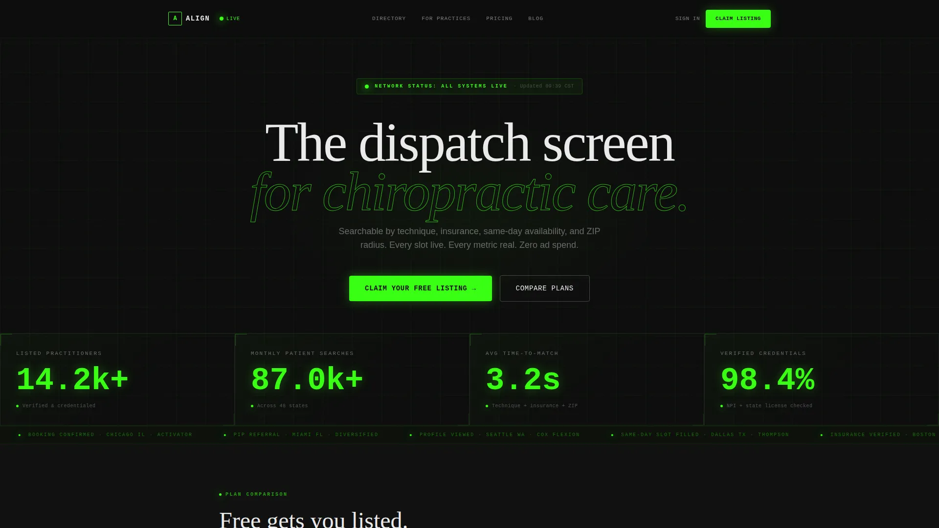
- A live stats header wall with four animated counters displaying practitioner count, monthly searches, match time, and credential verification rate
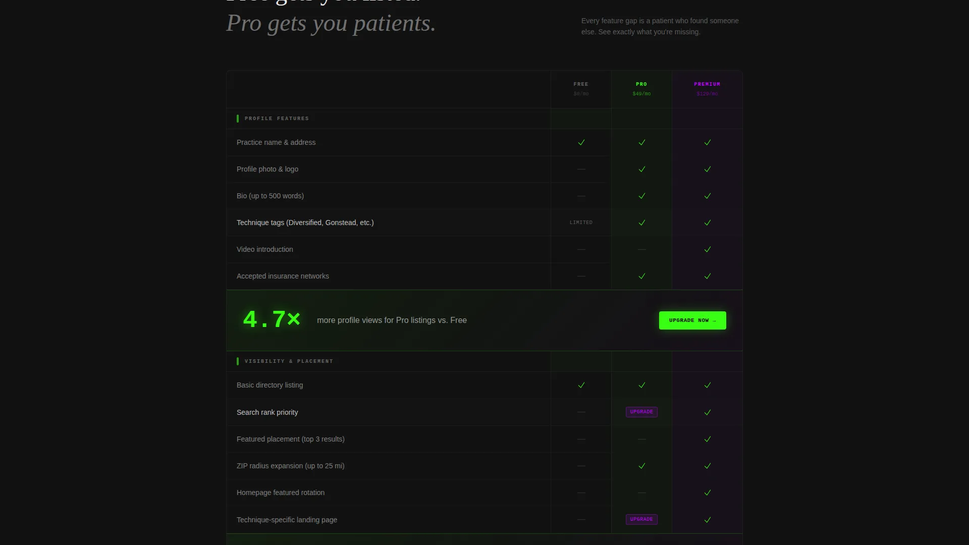
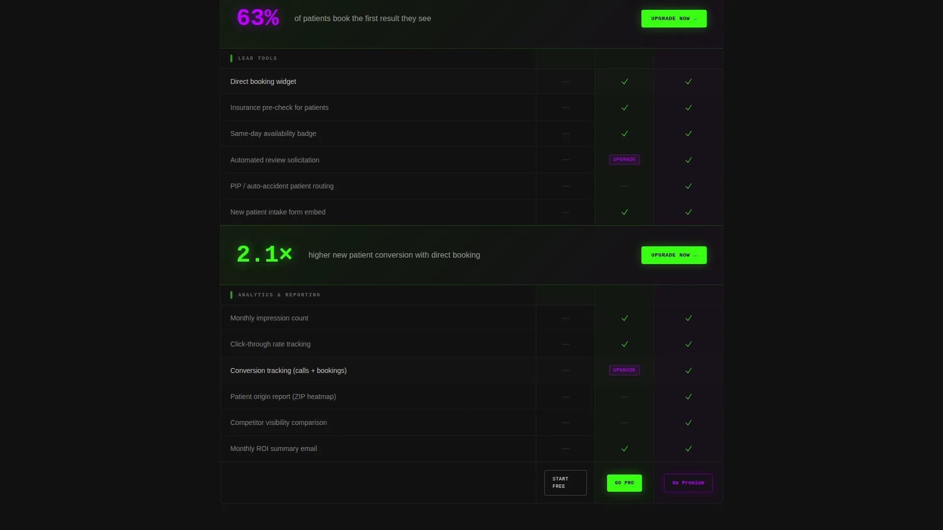
- A three-column comparison table covering Free, Pro, and Premium listing tiers across profile features, visibility, lead tools, and analytics rows
- A three-step progressive disclosure lead capture form for practice owners, plus a secondary "Check If You're Already Listed" search path
Feature list
This section covers the core built-in components that make Align work as a conversion-focused chiropractic directory landing page.
Animated Metrics Header
The header opens with four oversized animated counters in terminal green: 14,200-plus listed practitioners, 87,000-plus monthly patient searches, 3.2-second average time-to-match, and 98.4% verified credentials. Each counter sits in a four-column grid with a micro-label in interface white beneath it. A scan-line animation crosses the dark background, making the whole header feel like a live operations dashboard.
Three-Tier Comparison Table
The Feature Matrix is the core of the page. It compares Free, Pro, and Premium listing tiers across four row groups: profile features such as photo, bio, and technique tags; visibility boosts including search rank priority and radius expansion; lead tools covering the booking widget, insurance pre-check, and review solicitation; and analytics rows for impressions, click-through rates, and conversion tracking. Green checkmarks, violet upgrade pills, and dimmed dashes make tier gaps immediately obvious.
Pressurized Callout Bars
Between table sections, single-stat callout bars interrupt the scroll with evidence statements. The template includes one reading "Pro listings receive 4.7 times more profile views." These bars maintain urgency and keep the reader moving toward the claim call to action without requiring a hard sell.
Sticky Bottom Bar call to action
After the first table section scrolls past, a sticky bottom bar activates and anchors the primary call to action: "Claim Your Listing." This bar stays visible throughout the rest of the page, giving practice owners a constant, low-friction entry point into the lead form.
Three-Step Progressive Lead Form
The claim form uses progressive disclosure across three steps. Step one collects practice name and ZIP code. Step two asks for primary techniques via a dropdown multi-select covering Diversified, Gonstead, Activator, Thompson, and Cox Flexion, plus accepted insurance networks. Step three collects email and phone. This pacing reduces friction and improves form completion.
Secondary Conversion Path
A "Check If You're Already Listed" search option gives cautious practice owners a low-commitment first step. They search the directory, find their auto-generated stub profile, and are then guided into claiming and upgrading it. This path converts passive curiosity into active ownership without a cold ask.
Page sections overview
| Section | Purpose |
|---|---|
| Live Metrics Header | Display network scale with animated counters |
| Free Tier Column | Show baseline listing features |
| Pro Tier Column | Highlight mid-tier visibility and lead tools |
| Premium Tier Column | Present top-tier analytics and placement |
| Callout Stat Bars | Inject social proof between table sections |
| Sticky call to action Bar | Keep "Claim Your Listing" always accessible |
| Three-Step Lead Form | Capture practice owner contact and details |
| Already Listed Search | Provide a secondary low-friction entry path |
Design & branding system
The visual identity follows a Dashboard Pro theme using the Acid Digital color system. The palette evokes a network operations center: dark surfaces, neon data pulses, and high-contrast type that makes every number legible at a glance.
- Void black (#0D0D0D) forms the base background, making colored elements project forward like data on glass
- Terminal green (#39FF14) drives all calls to action, live-status indicators, and animated counter values
- Electric violet (#BF00FF) marks premium tier labels and hover states, visually separating upgrade prompts from standard content
- Interface white (#EAEAEA) handles body text and table borders, ensuring readability against the dark background
Mobile & speed optimization
The layout is structured for fast scanning on any screen size. The dark background, large type, and high-contrast color system support quick comprehension on smaller displays. The comparison table is designed to remain usable when columns stack or scroll horizontally on mobile.
- Oversized counter values and short micro-labels in the header stay readable at mobile font sizes
- The sticky bottom bar call to action remains anchored at all viewport heights, keeping the claim action reachable without scrolling back up
- The three-step form breaks a potentially long form into short, focused screens that feel manageable on a phone
How this template helps you convert
Align is built around two conversion goals at once: getting patients to search and getting practice owners to claim. Every design and copy decision pushes toward one of those two outcomes.
- The animated metrics wall establishes immediate trust in the network's scale, giving both patient searchers and practice owners a reason to take the page seriously before reading a single feature row
- The Feature Matrix makes the cost of staying on the free tier visible without any persuasion copy, letting the table do the selling while the callout bars reinforce the evidence with specific numbers
- The progressive three-step form and the secondary "Check If You're Already Listed" path give practice owners two separate on-ramps, so hesitant users who would abandon a direct form still enter the funnel through the search path
Other information about this template
Align ships as a single landing page template inside a broader marketplace of niche-specific directory and comparison layouts. It is part of the Dashboard Pro theme family, which applies the Acid Digital color system across multiple verticals.
- The template is categorized under Technology with a subcategory of Chiropractic Digital Presence
- The niche focus is a chiropractic directory and listing site, making it a specialized tool rather than a general healthcare template
- The comparison table structure is directly reusable for any directory with tiered listing plans, not only chiropractic practices
- The Intersection Match Score for this template is 13, reflecting the tight alignment between the Dashboard Pro theme, Acid Digital palette, Feature Matrix creative direction, and Lead Generation landing-page objective
Theme
Dashboard Pro
Creative direction
Feature Matrix
Color system
Acid Digital
Style
Comparison Table
Direction
Lead Generation
Page Sections
Animated Live Metrics Header
Three-tier Feature Matrix Table
Evidence Callout Bars
Sticky Claim Call to Action Bar
Three-step Progressive Lead Form
Secondary Directory Search Path
Related questions
Who is this template primarily designed for?
Can I customize the listing tier names and row labels in the comparison table?
Does the template include actual directory search functionality?
How does the secondary conversion path work in the template?
Can I change the color system to match a different brand?



