Chiropractic Digital Presence Careers Website Template
Align is a split-screen chiropractic landing page template built around a Problem-to-Solution comparison engine. It places a generic health template side by side with a chiropractic-specific layout, making the gap unmistakable. A live preview configurator, a persistent call-to-action bar, and a Dark Glass Panel header give practices a clinical, conversion-focused first impression.
by Rocket studio
Quick summary
Align is a single-page, split-screen chiropractic landing page template. It uses a 50/50 comparison layout to show visitors exactly what a purpose-built chiropractic site looks like versus a generic health template. The design is precise, clinical, and intimate, built to move office workers, weekend athletes, and new mothers from curiosity to booked appointment.
Who this template is for
This template is designed for chiropractic practices that need a focused, conversion-ready online presence. It suits clinics that want to speak directly to patients dealing with everyday postural pain, not just anyone browsing health services.
- Chiropractors replacing a generic health website with something built for their niche
- Practices targeting desk workers, active adults, and postpartum patients
- Clinic owners who want to let the design do the persuading before a prospect ever calls
What problem this template solves
Most health website templates were not designed with chiropractic in mind. Buried booking buttons, walls of unstructured text, and no visual storytelling around pain and relief leave prospective patients unconvinced. Align confronts those weaknesses directly.
- Visitors struggle to self-identify with generic health layouts, so they leave without booking
- Practices lose trust when their site looks identical to a dentist or a physiotherapist
- A confusing booking flow creates friction right before the conversion moment
What you get with this template
Align delivers a fully structured single-page layout that walks visitors through a visual diagnosis of their current site versus what a chiropractic-first design looks like. Every section serves a specific role in the persuasion arc.
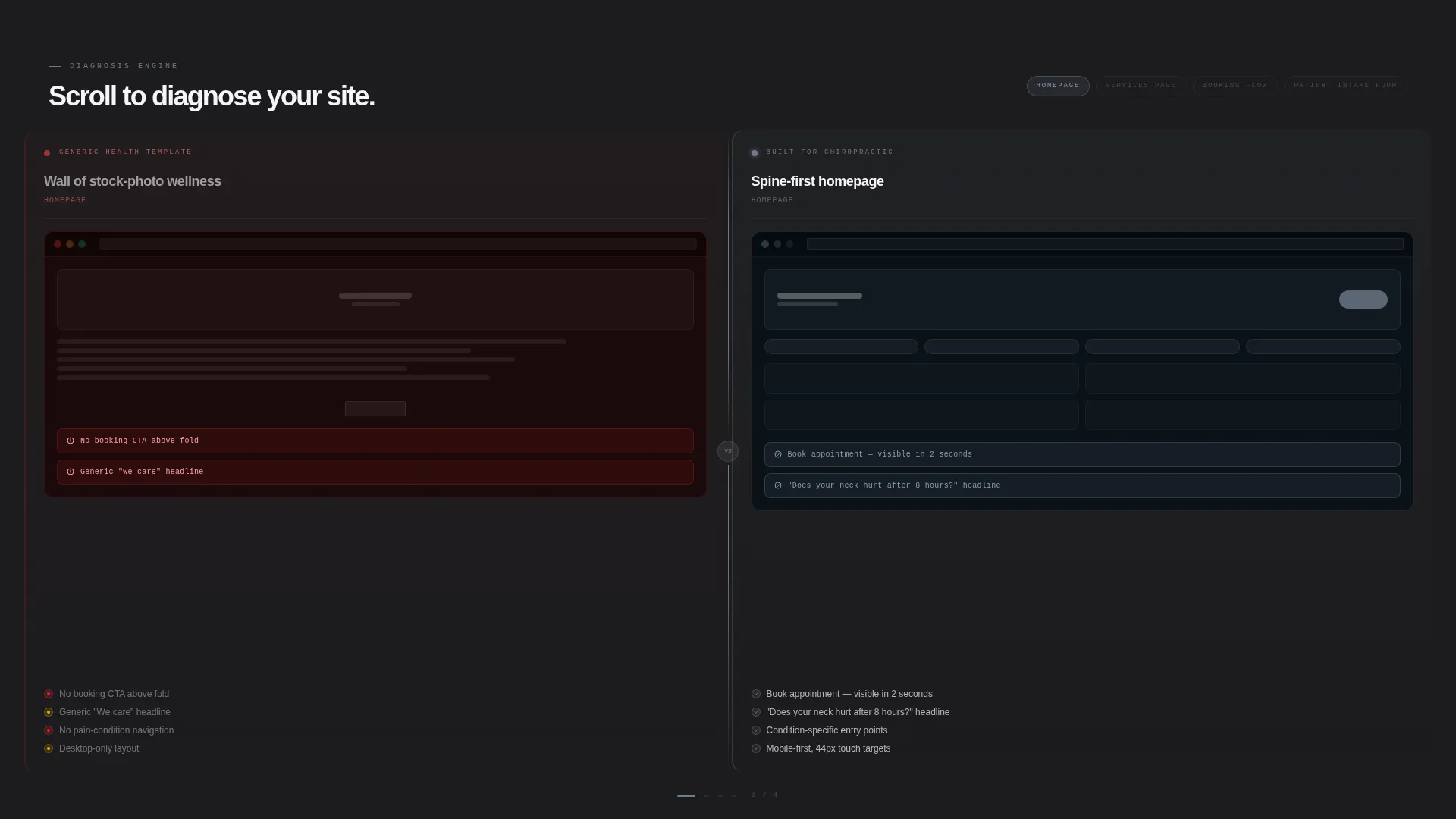
- A 50/50 split-screen comparison engine spanning homepage, services, booking flow, and patient intake
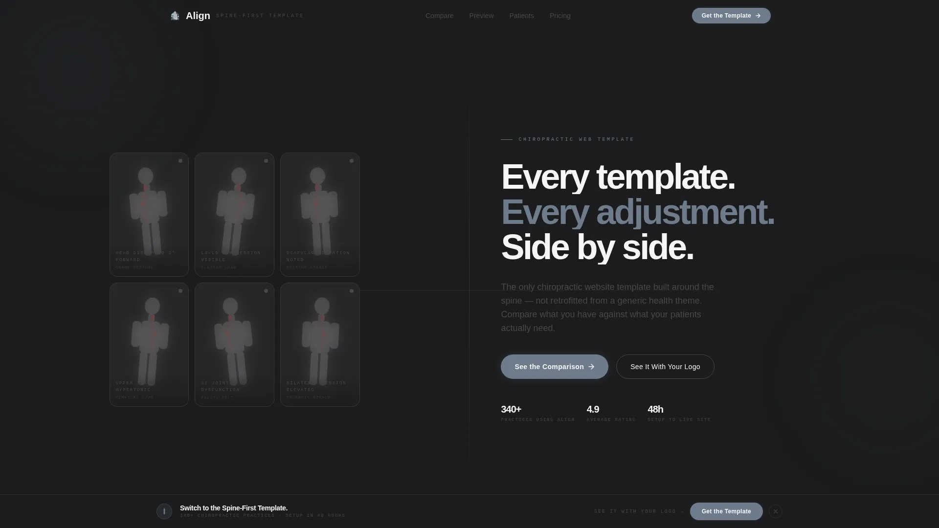
- A Dark Glass Panel header with interactive posture silhouettes that clear on hover to reveal corrected spine alignment
- A persistent floating call-to-action bar and a live preview configurator for real-time personalization
Feature list
This section covers the core built-in capabilities that define how Align works as a chiropractic landing page template.
Dark Glass Panel Header
The header uses a grid of frosted, translucent panels, each holding a ghosted silhouette of a common pain posture: forward-head position, lumbar hunch, and locked shoulder. As the cursor passes over each panel, the glass clears to reveal the corrected posture with the spine highlighted in chrome blue. The headline strikes in from the left after a two-second interaction pause.
Split-Screen Comparison Engine
The left column is labeled "Generic Health Template" and the right is labeled "Built for Chiropractic." Each scroll step escalates the comparison: homepage layout, services page structure, booking flow, and patient intake form. Visitors effectively diagnose their own current site against the improved version, making the solution feel necessary rather than optional.
Problem-to-Solution Scroll Arc
The scroll progression is structured as a visual debate. Red-flag callouts mark problems on the left panel, while the right panel mirrors the same section rebuilt cleanly. The stakes rise with each scroll increment, creating a sense of urgency that builds naturally through the page.
Persistent Floating Call-to-Action Bar
A floating bar stays visible throughout the scroll journey. It carries the direct message "Switch to the Spine-First Template" so the conversion path is never more than one click away, regardless of how far down the page a visitor has scrolled.
Live Preview Configurator
A secondary conversion path invites visitors to input their practice name and brand color. The template renders a personalized preview in real time, removing the last objection a prospective user might have about whether the design will work for their specific practice.
Monochrome Steel Visual System
The color palette uses surgical charcoal, instrument-grade steel, bone-white, and a single cold chrome blue accent reserved for interactive states and hover reveals. The result is a clinical, deliberate aesthetic where every visual element serves a functional purpose.
Page sections overview
| Section | Purpose |
|---|---|
| Dark Glass Header | Interactive posture panels introduce the template with a hover-reveal animation before the headline appears |
| Split-Screen Comparison | Side-by-side homepage layouts show the difference between a generic and a chiropractic-specific design |
| Services Page Comparison | The comparison escalates to services structure, highlighting buried content versus a clear layout |
| Booking Flow Comparison | Shows a cluttered booking process on the left versus a clean, patient-friendly flow on the right |
| Patient Intake Comparison | Contrasts a generic intake form with a chiropractic-specific version designed to reduce drop-off |
| Floating call to action Bar | Persistent conversion prompt keeps the primary action visible at every scroll position |
| Live Preview Configurator | Visitors enter their practice name and brand color to see the template personalized in real time |
Design & branding system
The visual identity follows a Directory and Discovery theme executed through a Monochrome Steel color system. Every color choice is deliberate, evoking the precision of a clinical environment without feeling cold or uninviting.
- Surgical charcoal (#1C1C1E) and instrument-grade steel (#48484A) anchor the layout with authority and calm
- Bone-white (#F5F5F7) provides the open, breathable negative space that keeps content readable
- Cold chrome blue (#6E7B8B) is used exclusively for interactive states and hover reveals, maintaining visual discipline across all interactive elements
Mobile & speed optimization
The template is designed as a single-page layout, which keeps the structure lean and focused. The split-screen format adapts to narrower viewports without losing the comparison logic that drives the persuasion arc.
- The 50/50 split-screen layout is structured to reflow cleanly for smaller screen sizes
- Section-led scroll design ensures each comparison step loads as a discrete, digestible unit
- The floating call-to-action bar is positioned to remain accessible on mobile without blocking content
How this template helps you convert
Align is structured around a single insight: showing is more convincing than telling. The entire page is built to create a felt sense of the gap between a generic site and a purpose-built chiropractic landing page.
- The Dark Glass Panel header creates immediate curiosity with interactive posture silhouettes, giving visitors a reason to stay and explore before the headline even appears
- The scrolling comparison engine turns passive browsing into active self-diagnosis, so visitors feel the urgency to switch rather than being told to
- The live preview configurator removes the final barrier by letting practices see their own name and color inside the template before committing
Other information about this template
Align sits within the Technology category under the Chiropractic Digital Presence subcategory. It is a strong fit for practices evaluating chiropractic website template options and wanting to move away from multipurpose health themes.
- The template theme follows a Directory and Discovery structure, making it easy to position a practice clearly within a competitive local market
- The creative direction is a Problem-to-Solution Arc, a proven persuasion pattern that mirrors how patients themselves think about their pain
- The landing-page direction is a Comparison and Versus engine, which suits buyers who need to justify a template switch to a partner or practice manager
- The header concept, Dark Glass Panels, is a distinctive visual device not typically found in standard health or wellness templates


Theme
Directory & Discovery
Creative direction
Problem→Solution Arc
Color system
Monochrome Steel
Style
Split Screen (50/50)
Direction
Comparison/Versus
Page Sections
Dark Glass Panel Header
Split-screen Comparison Engine
Problem-to-solution Scroll Arc
Persistent Floating Call-to-action Bar
Live Preview Configurator
Monochrome Steel Color System
Related questions
Who is this landing page template designed for?
Can I personalize the template with my practice name and colors?
Does this template work for a single chiropractic service or a full clinic?
What makes this different from a generic health website template?



