Advanced Consulting Digital Presence Professional Website Template
Aligncore is a scroll-reveal consulting landing page template built for firms that fix broken organizations. Designed around a Bold Brutalist aesthetic with a Void and Violet color system, it presents engagement frameworks as numbered specs, case studies as data tables, and drives a single primary action: downloading a proprietary diagnostic tool before the first call.
by Rocket studio
Quick summary
Aligncore is a single-page, scroll-reveal template for high-stakes consulting firms. It opens with a crawling logo bar and one commanding headline, then unfolds like a classified document, each panel harder and more precise than the last. The primary call to action drives app downloads. The design rewards analytical buyers with evidence, not prose.
Who this template is for
This template is built for consulting firms that sell outcomes, not hours. It speaks directly to operators who need clients to feel the weight of the work before a single call is booked.
- Organizational consultants advising COOs, founders, and private equity-backed leadership teams
- Boutique strategy firms that want a digital presence matching the rigor of their boardroom delivery
- Independent advisors ready to replace a generic website with a conversion-focused consulting landing page
What problem this template solves
Most consulting websites look like brochures. They describe capabilities in soft language and bury proof in case study pages no one finds. Aligncore flips that. It builds a wall of evidence on a single scrollable page, so the prospect arrives at your call already convinced.
- Generic consulting sites fail to communicate analytical rigor before the first conversation
- Narrative-heavy layouts lose high-intent buyers who want data, not storytelling
- Weak calls to action send qualified leads to a contact form instead of a meaningful first step
What you get with this template
You get a fully structured, single-page layout designed to do one job: convert a skeptical, data-driven buyer into a prospect who downloads your diagnostic tool and books a debrief. Every section is pre-built and purposeful.
- A scroll-reveal progressive layout where each content panel animates into view with hard-cut transitions
- A fixed viewport call-to-action button that stays visible after the first scroll, linked to the diagnostic app download
- A gated secondary call to action that appears only after the final case study, requiring an email and company-size selector
Feature list
This section describes the core built-in features of the Aligncore template as delivered.
Crawling Logo Bar Header
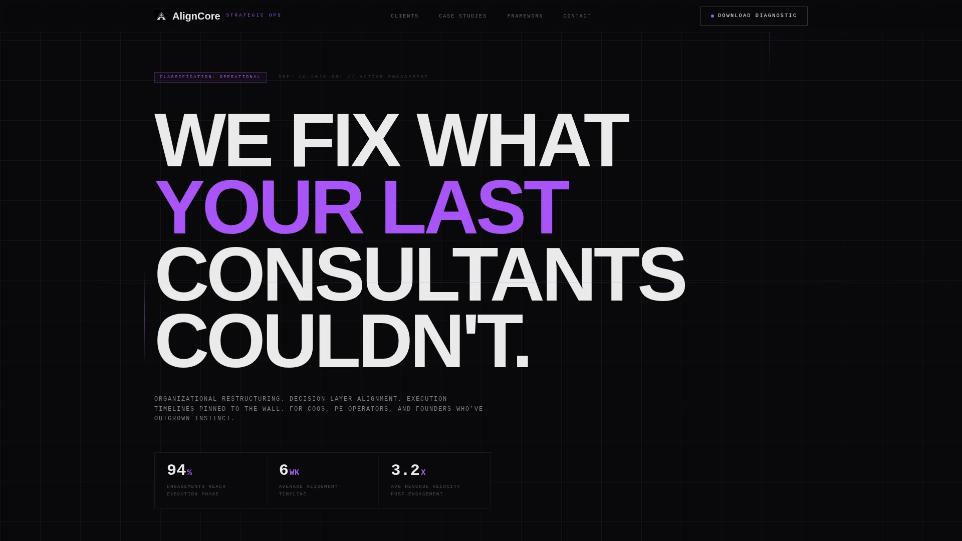
The page opens with a horizontal strip of monochrome client logos in a slow, infinite crawl against a void-black background. Above the strip, a single brutalist headline in bone white sets the tone before a single paragraph loads. There is no hero image and no illustration, proof moves before copy does.
Scroll Reveal Progressive Animations
Content blocks slam into the viewport with hard-cut animations as the visitor scrolls. There is no easing or soft fade. Each reveal feels like a classified document being declassified one panel at a time, building urgency and analytical weight with every section.
Spec Sheet Engagement Frameworks
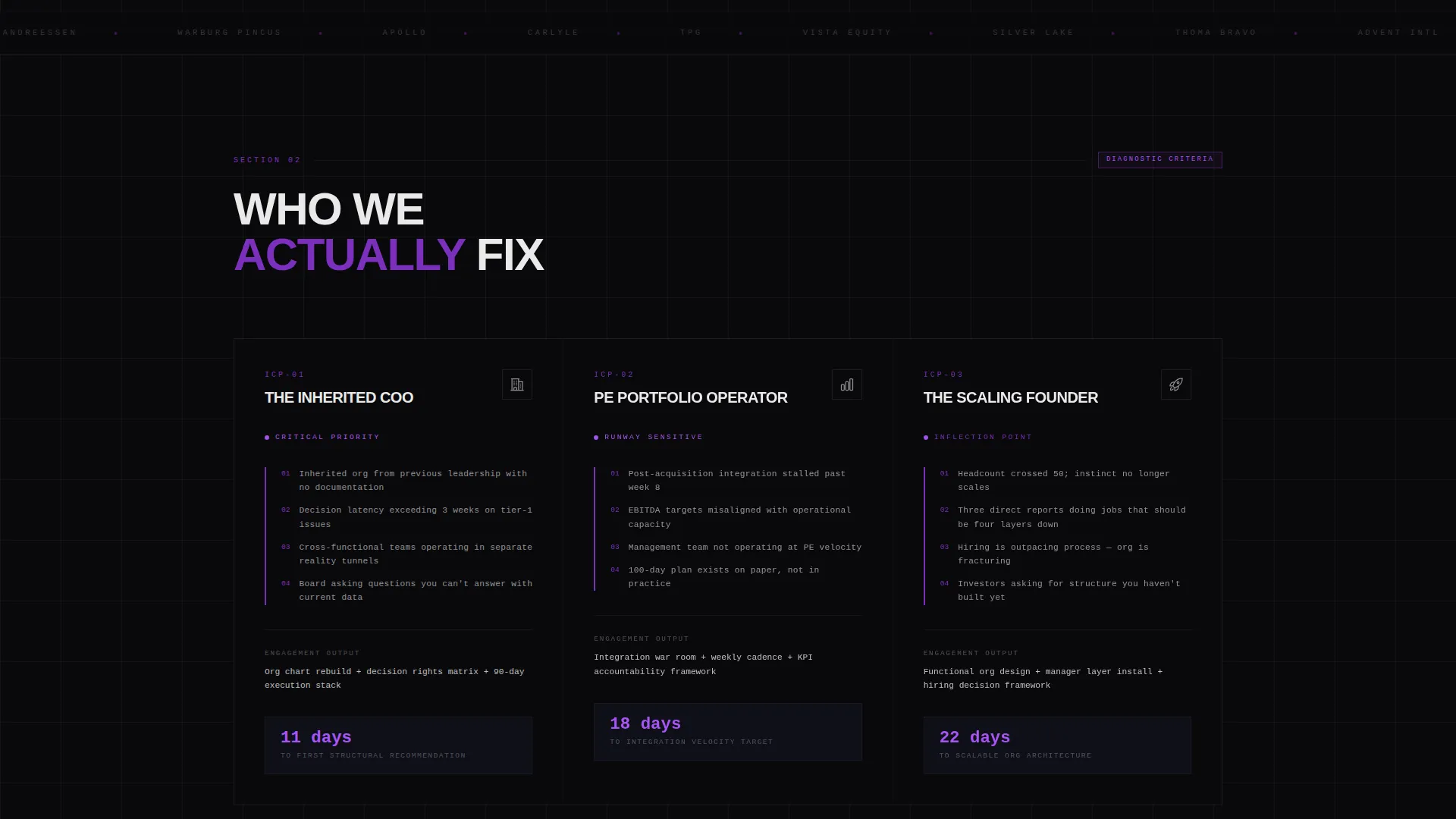
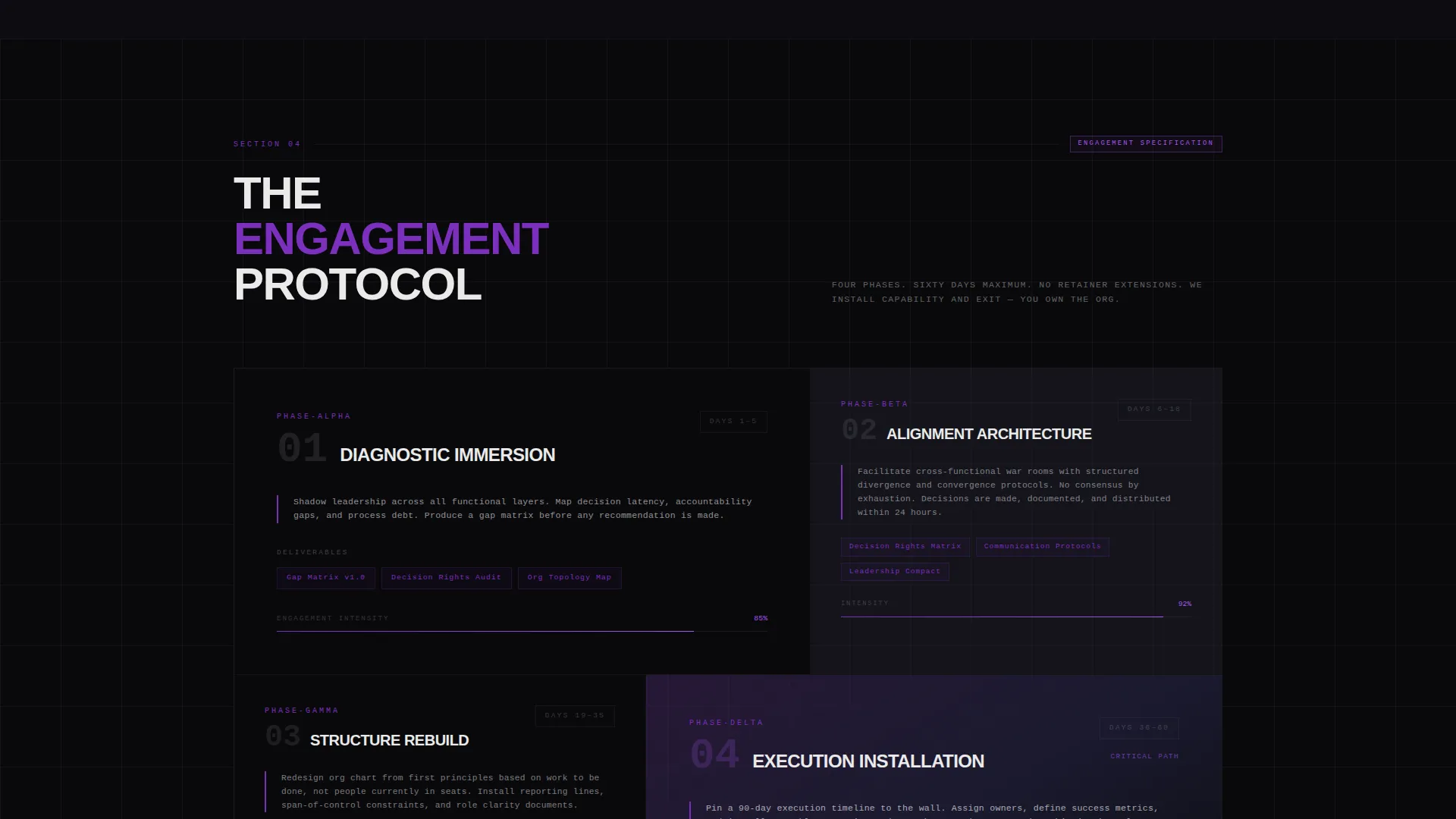
Consulting methodology and engagement frameworks are laid out as numbered specifications, separated by violet rule lines. This treatment communicates process rigor visually before the visitor reads a single word of body copy.
Case Study Data Tables
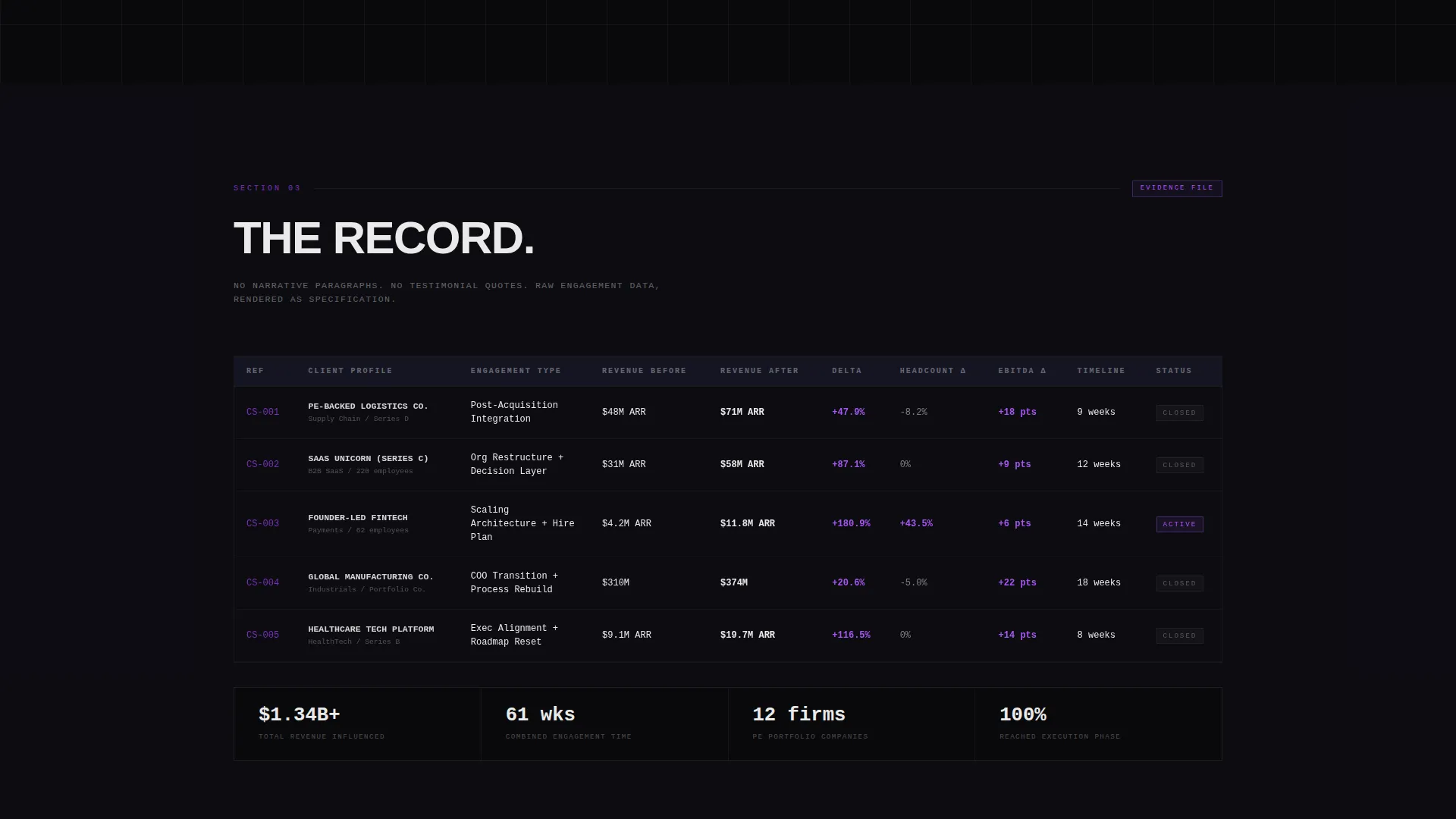
Case studies are presented as structured data tables showing revenue delta, timeline, and headcount impact. This replaces narrative paragraphs with verifiable, scannable proof, the format a COO or private equity operations lead actually trusts.
Fixed Diagnostic Download call to action
After the first scroll, an ultraviolet button labeled "Download the Diagnostic" locks to the bottom of the viewport. It stays visible throughout the scroll journey, giving the visitor a clear action at every moment without interrupting the content flow.
Gated Debrief Booking Form
A secondary call to action, "Book a Debrief," appears exclusively after the final case study spec sheet. It is gated behind an email field and a company-size selector, qualifying the lead before any calendar interaction occurs.
Page sections overview
| Section | Purpose |
|---|---|
| Brutalist headline strip | Sets the firm's positioning in one unhyphenated line above the logo bar |
| Client logo bar | Displays scrolling monochrome logos to establish credibility before copy loads |
| Engagement framework specs | Presents consulting methodology as numbered specifications with violet rule lines |
| Case study tables | Delivers outcome proof via structured data: revenue, timeline, headcount |
| Diagnostic download call to action | Fixed viewport button driving the primary app download action |
| Gated debrief form | Email and company-size gate that unlocks the "Book a Debrief" secondary action |
Design & branding system
The visual identity is Bold Brutalist, executed through a Void and Violet color system. Every color decision is deliberate. Violet appears only where the eye must go, rationed like a signal in a dark server room.
- Core palette: absolute black (#09090B), deep void charcoal (#1A1A2E), electric violet (#7B2FBE), searing ultraviolet (#A855F7) for interactive states and data callouts, and bone white (#EAEAEA) for all body text
- Typography runs in massive, unhyphenated brutalist weight for headlines, with clean structured type for spec-sheet body content
- The ultraviolet accent is reserved exclusively for the fixed call to action button, hover states, and data callout highlights, never used decoratively
Mobile & speed optimization
The template is structured for a clean mobile experience. The scroll-reveal behavior and fixed call to action are built to work across viewport sizes without breaking the progressive reveal sequence.
- Hard-cut section animations are designed to perform without complex easing curves, keeping motion lean and intentional
- The fixed bottom call to action adapts to mobile viewports so the diagnostic download remains reachable at all times
- The data table layout for case studies is structured to remain readable on narrower screens without collapsing critical columns
How this template helps you convert
Aligncore earns the click by making the prospect feel the firm's analytical weight long before a call to action appears. The conversion path is deliberate and sequenced.
- The crawling logo bar and single commanding headline create immediate credibility, removing doubt before the visitor reads a word of methodology
- Progressive spec-sheet reveals and data-table case studies build an evidence wall that makes downloading the diagnostic feel like the only rational next step
- The gated debrief form filters for serious leads by requiring company context, so every booking that comes through carries real qualification signals
Other information about this template
Aligncore is categorized under Technology and sits within the Consulting Digital Presence subcategory, targeting the Consulting Landing Page niche. It is a strong fit for firms that compete on precision and want their digital presence to reflect the same standard.
- The template style is Scroll Reveal (Progressive), meaning content loads in sequence as the visitor scrolls rather than all at once
- The header concept is a Logo Bar, which is a deliberate departure from the hero image conventions common in most consulting website templates
- The primary landing page direction is App Download, oriented around driving prospects to a self-assessment diagnostic tool before any sales conversation begins
- The template targets buyers such as overwhelmed COOs inheriting broken processes, private equity-backed portfolio companies, and founders scaling past fifty employees
Theme
Bold Brutalist
Creative direction
Spec Sheet
Color system
Void & Violet
Style
Scroll Reveal (Progressive)
Direction
App Download
Page Sections
Crawling Client Logo Bar
Hard-cut Scroll Reveal Animations
Numbered Spec Sheet Frameworks
Case Study Data Tables
Fixed Diagnostic Download Button
Gated Debrief Booking Form
Related questions
Who is this consulting landing page template designed for?
What is the primary call to action in this template?
How does the scroll reveal animation work in this template?
What makes this layout different from a standard consulting website template?
Can I adapt the fixed call to action if I do not have a diagnostic app yet?



