Financial Services Software Portfolio Website Template
Allocate is a split-screen landing page template built for asset management firms. It pairs a live-look portfolio dashboard on the left with bold proof metrics on the right. A scrolling feature matrix walks visitors through every capability, from allocation to estate structuring. The page closes with a clear app download call to action and a sticky QR code bar.
by Rocket studio
Quick summary
Allocate is a single-page template designed for financial asset management firms. It opens with a stats-driven header, then walks visitors through a disciplined feature matrix before driving them toward an app download. The layout is 50/50 split-screen throughout, built on a dark Data Command visual system that feels precise, credible, and quietly powerful.
Who this template is for
This template is built for firms and advisors who manage serious wealth and need their online presence to reflect that. The design signals institutional sophistication without requiring a large team to build or maintain it.
- High-net-worth client-facing asset management firms
- Independent financial advisors who need institutional-grade presentation tools
- Family office managers communicating generational portfolio mandates
What problem this template solves
Most financial services landing pages look either too corporate or too generic. They fail to communicate real capability to a sophisticated audience that already knows what good looks like. Allocate solves that gap directly.
- Builds immediate credibility with a data-forward header showing live-style metrics
- Qualifies visitors progressively as they scroll through escalating feature complexity
- Guides high-intent visitors toward a clear app download without friction
What you get with this template
You get a fully structured, single-page layout that handles every step of the visitor journey. From first impression to final conversion, each section has a defined job. Nothing is decorative without purpose.
- A stats and metrics header wall with animated AUM counter, allocation rings, and performance line
- A scrolling feature matrix with alternating split-screen panels and real interface screenshots
- A sticky app download bar with App Store badge, Google Play badge, and a QR code
Feature list
This template delivers a focused set of design-backed capabilities drawn directly from the source brief. Each one serves the core goal of converting sophisticated financial services visitors into app users.
Animated Portfolio Dashboard Header
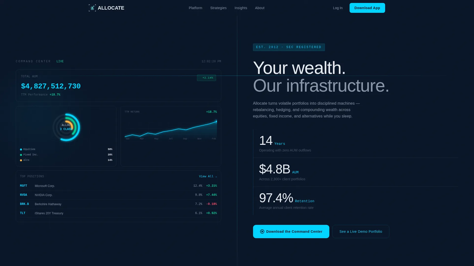
The left panel of the header shows a live-updating portfolio view. It includes a seven-figure AUM counter ticking upward, asset allocation rings rendered in cyan and slate, and a trailing twelve-month performance line with subtle breathing animation. This makes the first impression feel like a working product, not a brochure.
Proof Metrics Right Panel
The right header panel displays the firm headline in thin, wide-tracked sans-serif type alongside three stacked proof metrics. Each number is sized for impact and readable from across a room. Years operating, assets under management, and average client retention rate are presented with no clutter.
Scrolling Feature Matrix
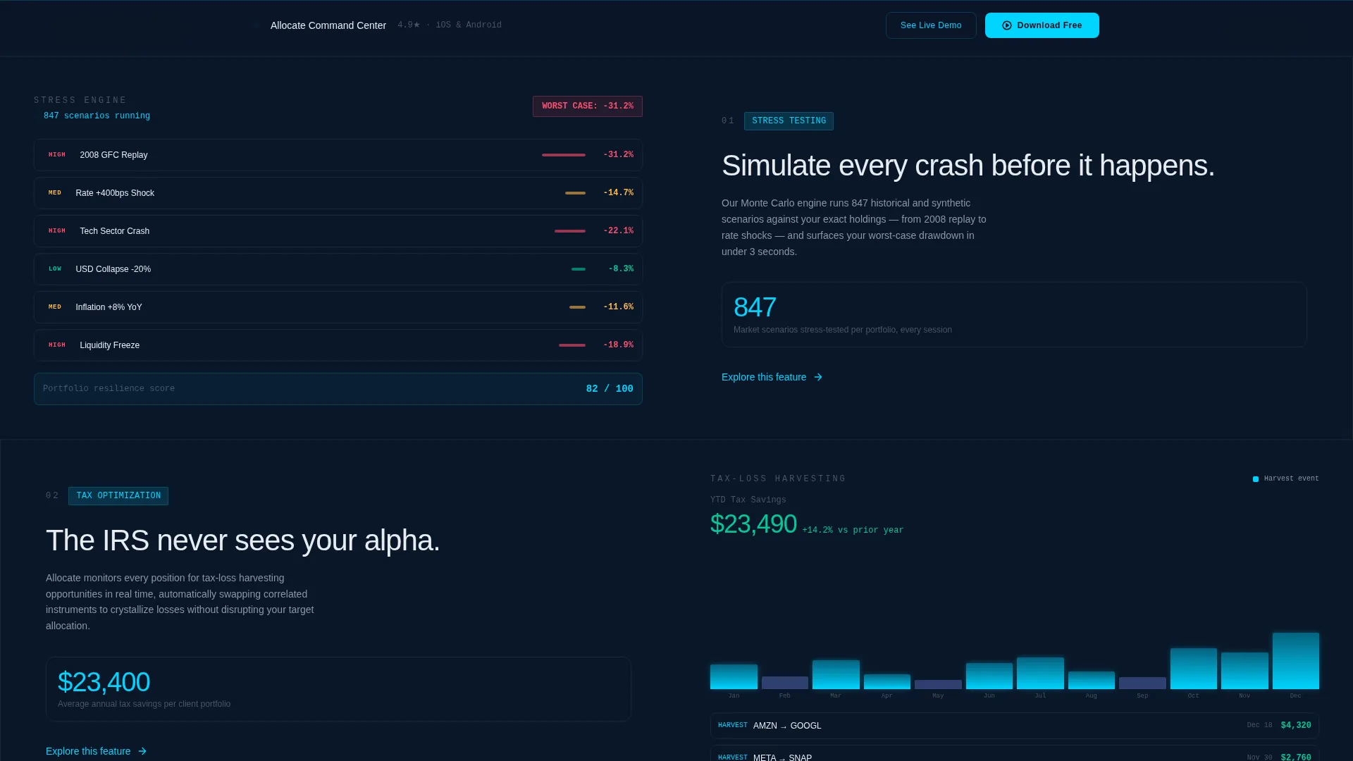
Below the header, alternating 50/50 split-screen rows present each firm capability. The left side shows the feature in action through real interface screenshots. The right side delivers a two-sentence explanation paired with a single supporting metric. The scroll sequence escalates from basic allocation to multi-entity estate structuring.
Progressive Visitor Qualification
The page is structured so that the deeper a visitor scrolls, the more sophisticated the content becomes. This mirrors the visitor's own complexity back at them. By the time they reach the call to action, only the most qualified prospects remain engaged.
App Download Conversion Section
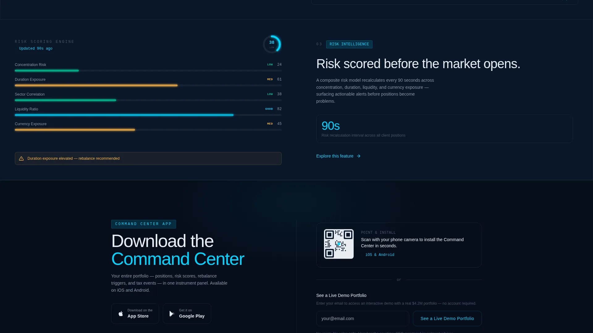
The primary call to action is "Download the Command Center" with paired App Store and Google Play badges. A secondary path, "See a Live Demo Portfolio," opens an interactive preview that requires only an email address. Both paths are served from the same final section.
Sticky QR Code Bar
A persistent sticky bar sits at the bottom of the page on desktop. It contains a QR code so visitors can point their phone and install the app in seconds. This removes the handoff friction between desktop browsing and mobile installation.
Page sections overview
| Section | Purpose |
|---|---|
| Stats metrics header | Opens with live-style AUM dashboard and firm proof metrics side by side |
| Feature row one | Introduces portfolio stress-testing with screenshot and supporting metric |
| Feature row two | Presents tax-loss harvesting capability with interface visual |
| Feature row three | Shows real-time risk scoring in action with paired explanation |
| Feature row four | Covers multi-entity estate structuring for advanced visitor qualification |
| App download section | Delivers primary call to action, App Store and Play badges, and demo portfolio path |
| Sticky QR bar | Persistent desktop-to-mobile install shortcut floating at page bottom |
Design & branding system
The visual identity follows a Data Command theme built entirely on a Midnight Blue color system. Every color choice is intentional and load-bearing, not decorative. The palette is designed to feel like the glow of terminal screens in a professional trading environment.
- Deep terminal navy (#0A1628) and tactical slate (#1B2A4A) form the background layers
- Signal white (#E8ECF1) handles body text and structural labels for clean legibility
- Live-wire cyan (#00D4FF) is reserved exclusively for interactive elements and real-time data pulses
Mobile & speed optimization
The template is structured to translate the split-screen desktop experience into a clear, readable single-column flow on smaller screens. The sticky QR code bar and app download badges are designed to remain prominent regardless of viewport. Lightweight animation choices keep the visual polish intact without creating load drag.
- Animated elements use subtle, low-cost motion patterns to stay smooth on mobile devices
- The sticky bar and call to action buttons remain accessible at all scroll positions on all screen sizes
- Interface screenshots in feature rows are sized to remain legible on compact viewports
How this template helps you convert
The page is engineered as a qualification funnel. Every scroll depth serves a conversion purpose, and the final section removes every remaining barrier to the app install.
- The metrics header establishes trust instantly by showing real-looking data before a single word of copy is read.
- The escalating feature matrix filters visitors by sophistication, so only genuinely interested prospects reach the call to action.
- The dual conversion path at the bottom captures both ready-to-install users and research-stage visitors who need one more proof point before committing.
Other information about this template
This template sits at the intersection of financial services software design and high-conviction conversion strategy. It is built for the Technology category with a Financial Services Asset Management niche focus. The structure, pacing, and visual system work together as a single coherent argument for the product.
- The template style is Split Screen (50/50) throughout, with no deviation from that layout principle
- The creative direction is Feature Matrix, meaning every row is a capability demonstration, not a marketing claim
- The header concept is Stats and Metrics, prioritizing data credibility over narrative introduction
- The landing page direction is App Download, and every design decision upstream supports that single outcome
- The theme is Data Command, a visual language borrowed from professional trading and portfolio management environments
Theme
Data Command
Creative direction
Feature Matrix
Color system
Midnight Blue
Style
Split Screen (50/50)
Direction
App Download
Page Sections
Animated Portfolio Dashboard Header
Stacked Proof Metrics Panel
Scrolling Feature Matrix Layout
Dual Conversion Path Section
Sticky Desktop QR Code Bar
Related questions
Who is this template designed for?
Can I adapt the feature matrix rows for my own firm's services?
What is the primary conversion goal of this template?
Does this template include the animated dashboard as a working component?
Is this a single-page layout or a multi-page site?



