FinOps Technology Professional Website Template
Allocate is a Bold Brutalist bento grid landing page template built for a FinOps newsletter and community. It pairs a dark full-bleed header with electric-blue accent highlights and a sharp comparison layout that makes the cost of not subscribing feel measurable. Designed for cloud finance professionals, it drives sign-ups through urgency, contrast, and kinetic tile animation.
by Rocket studio
Quick summary
Allocate is a single-page bento grid landing page template for a FinOps newsletter and community. It uses a Bold Brutalist visual identity, a Slate and Sky color system, and a Comparison/Versus layout to convert platform engineers, FinOps practitioners, and cost-conscious CTOs into subscribers. Every design choice prioritizes urgency, clarity, and action.
Who this template is for
This template is built for cloud finance and infrastructure professionals who have something sharp to say about cloud spend. It fits newsletter creators and community builders operating in the FinOps space who need a landing page that matches the intensity of their audience.
- Platform engineers who live inside cloud cost and usage report files and need a page that speaks their language
- FinOps practitioners defending reserved instance strategies to leadership and looking for a community resource
- CTOs and technical leaders managing unpredictable cloud bills who want a concise, credible sign-up destination
What problem this template solves
Most newsletter landing pages feel generic. They do not communicate urgency, and they do not give a specialist reader a reason to trust the offer in the first ten seconds. For a FinOps audience, that trust gap kills conversions before the call to action is even seen.
- Practitioners currently learn from scattered vendor docs, solo CUR file analysis, and expensive trial and error with no peer context
- Without a strong comparison frame, visitors cannot feel the difference between what they have now and what the newsletter provides
- Generic templates lack the visual intensity and technical tone that make a cost-focused audience stop scrolling
What you get with this template
You get a fully structured bento grid landing page with every section, tile, and copy frame already in place. The template is built to launch fast and customise with minimal friction.
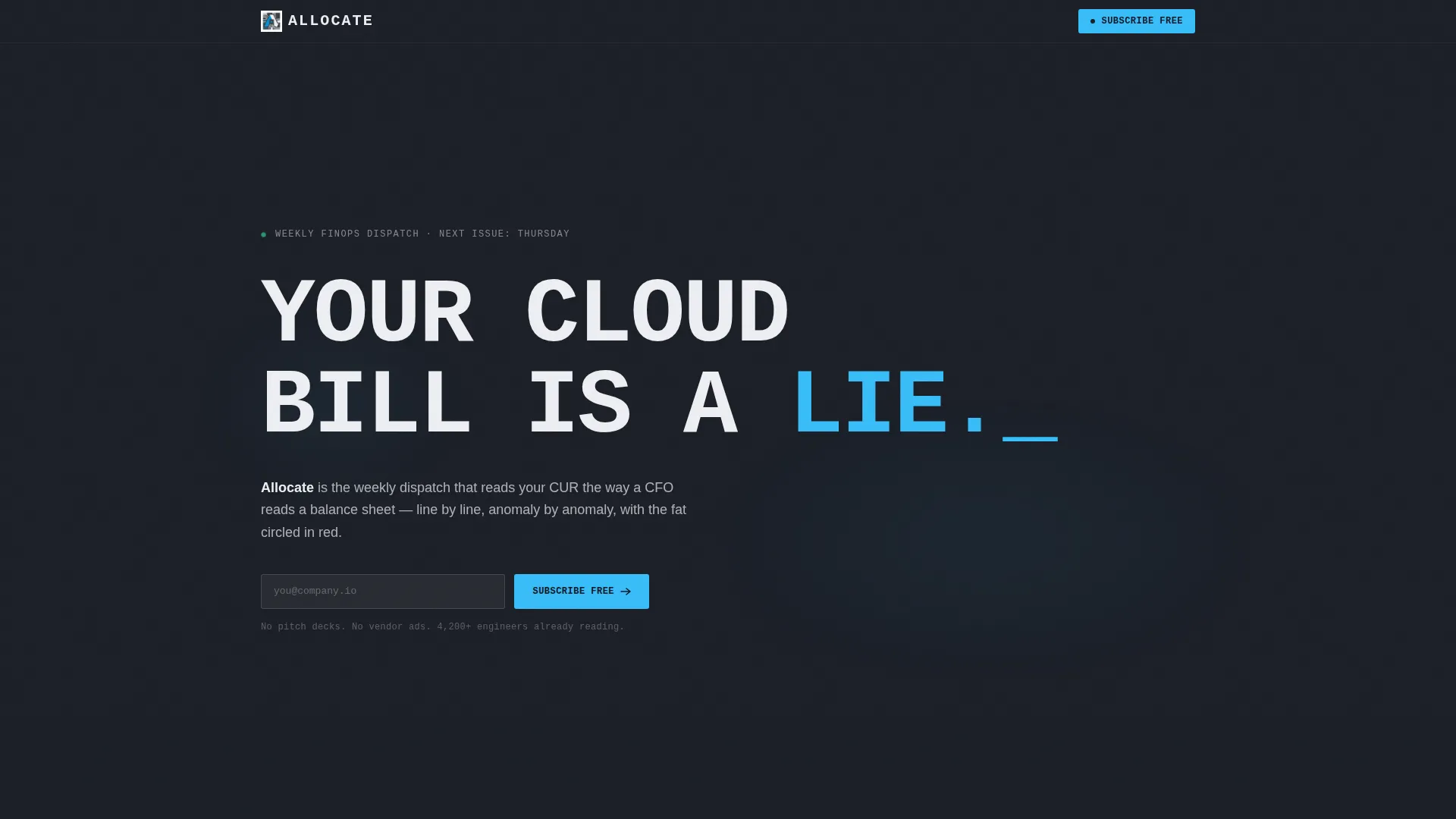
- A dark full-bleed header with an electric-sky-blue glow effect, oversized monospaced headline, and chalk-white subhead
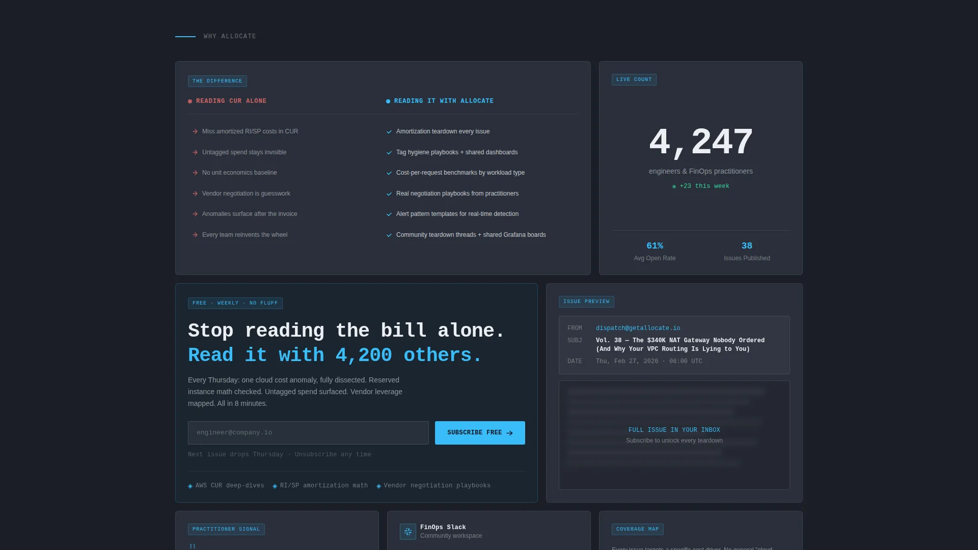
- A multi-tile bento grid below the fold featuring a versus comparison table, a redacted issue preview tile, a live subscriber count tile, and primary and secondary call-to-action tiles
- A sticky mobile bottom bar repeating the primary subscribe call to action alongside the main grid layout
Feature list
This template delivers a focused set of components grounded in the source brief. Each one serves a specific conversion or engagement purpose.
Dark Full-Bleed Header with Glow Pulse
The header spans edge to edge in deep gunmetal slate with a single electric-sky-blue glow pulsing softly behind the headline. No imagery, no illustration. Just type, light, and negative space that commands attention from the first pixel.
Oversized Brutalist Typography Stack
The headline is set in oversized monospaced type, brutally stacked for maximum visual weight. A smaller sans-serif subhead beneath it names the newsletter and its weekly cadence. The typographic hierarchy does the work that most pages hand off to imagery.
Bento Grid with Staggered Animation
The bento grid below the fold uses tiles of varying sizes that snap into view with staggered entrance animation. The layout creates a kinetic, product-drop energy that drives scroll momentum and keeps each tile feeling like a distinct reason to subscribe.
Comparison Versus Table Tile
One dedicated tile presents a side-by-side comparison: the lonely, manual way practitioners currently work versus what the newsletter and community provide. Specific left-column pain points such as missed amortization, untagged spend, and absent unit economics are matched against right-column resources including teardown threads, shared dashboards, and vendor-negotiation playbooks.
Redacted Issue Preview Tile
A separate tile shows a blurred preview of an actual newsletter issue with the subject line visible. This creates curiosity and credibility at the same time, letting visitors sense the content depth without seeing it in full.
Sticky Mobile Subscribe Bar
On mobile, a sticky bottom bar repeats the primary call to action with the email field and subscribe button always in reach. The single-field form keeps the friction as low as the conversion bar is high.
Page sections overview
| Section | Purpose |
|---|---|
| Full-Bleed Header | Establishes urgency and brand identity with dark background and glow headline |
| Headline Typography Block | Delivers the primary hook using oversized monospaced stacked type |
| Bento Grid Layout | Houses all conversion tiles below the fold with staggered animation |
| Versus Comparison Tile | Contrasts current practitioner pain with newsletter and community value |
| Redacted Issue Preview | Builds curiosity and content credibility through a blurred issue tile |
| Subscriber Count Tile | Adds social proof with a live-style ticking subscriber number |
| Primary call to action Tile | Contains the subscribe form and Thursday drop urgency message |
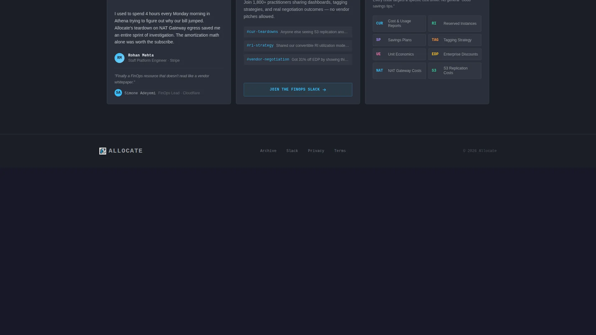
| Slack Community Tile | Offers a secondary path for readers who want community before content |
| Sticky Mobile Bar | Keeps the subscribe call to action accessible on all scroll positions |
Design & branding system
The visual identity is Bold Brutalist. Every colour and type choice is functional, not decorative. The palette feels like a monitoring dashboard at midnight: dark, industrial, and alive only where the data demands it.
- Deep gunmetal slate (#1B1F27) as the primary background, storm-cloud gray (#3A3F4B) for card surfaces, electric sky blue (#38BDF8) as the accent that signals urgency, and chalk white (#EDEFF3) for body text
- Oversized monospaced type for the headline and sans-serif for supporting copy, creating a clear two-level typographic hierarchy
- Blue is used only as an alert signal, never as decoration, keeping every accent appearance meaningful and attention-commanding
Mobile & speed optimization
The template is built with a mobile-first conversion path. The sticky bottom bar ensures the call to action is always reachable, and the single-email-field form removes every unnecessary interaction step.
- Sticky subscribe bar fixed to the bottom of the screen on mobile so the call to action never disappears during scroll
- Single email input field keeps the conversion form as light and frictionless as possible
- Bento grid layout adapts to narrower viewports while preserving the tile hierarchy and staggered animation intent
How this template helps you convert
The Comparison/Versus structure is the core conversion engine. Instead of listing features, it makes the cost of not subscribing feel measurable and specific. Every tile is a reason, and they arrive fast.
- The versus comparison table puts the current pain directly beside the community solution, making the value gap impossible to ignore before the call to action appears
- The redacted preview tile and live subscriber count together build simultaneous curiosity and social proof, lowering the perceived risk of subscribing
- The primary call-to-action tile is the largest tile in the grid, and the Thursday drop framing adds a time-based reason to act now rather than later
Other information about this template
This template is suited to any FinOps-focused newsletter or community product that needs a launch-ready, high-intensity landing page. It is built on a bento grid structure that can support content refreshes as the newsletter grows.
- The template is categorised under Technology and FinOps Technology, making it relevant to cloud cost management, cloud spend analysis, and infrastructure finance use cases
- The creative direction is Launch Energy, which means the animation and layout timing are designed to feel like a product drop rather than a static brochure page
- The header concept is Dark Full-Bleed plus Glow, a deliberate design choice that positions the newsletter as a technical authority rather than a content marketing asset
- The landing page direction is Comparison/Versus, a structure proven to work with specialist audiences who need to justify a decision, not just feel good about one

Theme
Bold Brutalist
Creative direction
Launch Energy
Color system
Slate & Sky
Style
Bento Grid
Direction
Comparison/Versus
Page Sections
Dark Full-bleed Header with Glow Pulse
Oversized Brutalist Typography Stack
Bento Grid with Staggered Animation
Versus Comparison Table Tile
Redacted Issue Preview Tile
Sticky Mobile Subscribe Bar
Related questions
Who is this landing page template designed for?
Can I use this template for a community as well as a newsletter?
What makes the comparison tile effective for a FinOps audience?
Does this template work well on mobile devices?
How customisable is the bento grid layout?



