Nonprofit Organization Professional Website Template
Allocate is a dashboard and data grid landing page template built for nonprofit organizations. It pairs a full-viewport product screenshot header with a Stats-First Impact scroll flow and an eight-row comparison grid. The Monochrome Steel color system and Data Command theme make complex financial metrics feel sharp, credible, and immediately persuasive to board members and funders.
by Rocket studio
Quick summary
Allocate is a single-page landing page template designed for nonprofit operations platforms. It leads with a dense, readable product screenshot, delivers oversized impact metrics before any explanation, and anchors the value case in a side-by-side comparison grid. The design is built to earn trust fast and move decision-makers toward action.
Who this template is for
This template is built for teams that need to prove financial accountability and program impact to people who ask hard questions. It speaks directly to the professionals who carry the weight of reporting, compliance, and funding decisions every day.
- Development directors managing overlapping grant reporting deadlines
- Executive directors presenting impact metrics to board members
- Program managers who must demonstrate measurable outcomes before quarterly funding reviews
What problem this template solves
Nonprofit operations teams often struggle to communicate financial clarity and program performance in a way that builds funder confidence. Scattered spreadsheets and manual reporting cycles make it hard to show exactly where donated dollars go. This template is designed to close that credibility gap before the conversation even starts.
- Replaces vague capability claims with specific, readable operational metrics
- Closes the gap between what the platform does and what skeptical funders need to see
- Gives visitors a reason to act before they ever request a demo
What you get with this template
This template delivers a fully structured, single-page layout built around three core persuasion layers: a proof-first header, a metrics-driven scroll flow, and a direct comparison engine. Every section is designed to do specific conversion work.
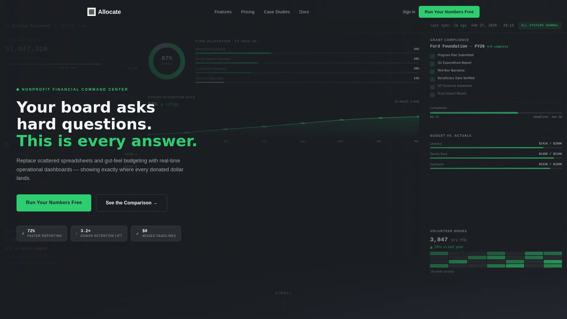
- Full-viewport product screenshot header showing a live-style fictional dashboard with real labels and readable data
- Stats-First Impact scroll pattern with oversized single metrics anchoring each section
- Eight-row animated comparison grid contrasting operational states before and after the platform
Feature list
This template includes purpose-built sections and design decisions that work together to communicate platform value with precision and visual authority.
Full-Viewport Dashboard Header
The header stretches edge to edge and displays a fictional nonprofit dashboard mid-fiscal-year. It includes a donut chart splitting program spend versus overhead at 87 to 13, a grant compliance tracker with four of six milestones marked complete, and a donor retention line graph rising from 41 percent to 68 percent over eighteen months. The density of real, readable data is the primary sell. A cold white headline overlays the top-left corner: "Your board asks hard questions. This is every answer."
Stats-First Impact Scroll Flow
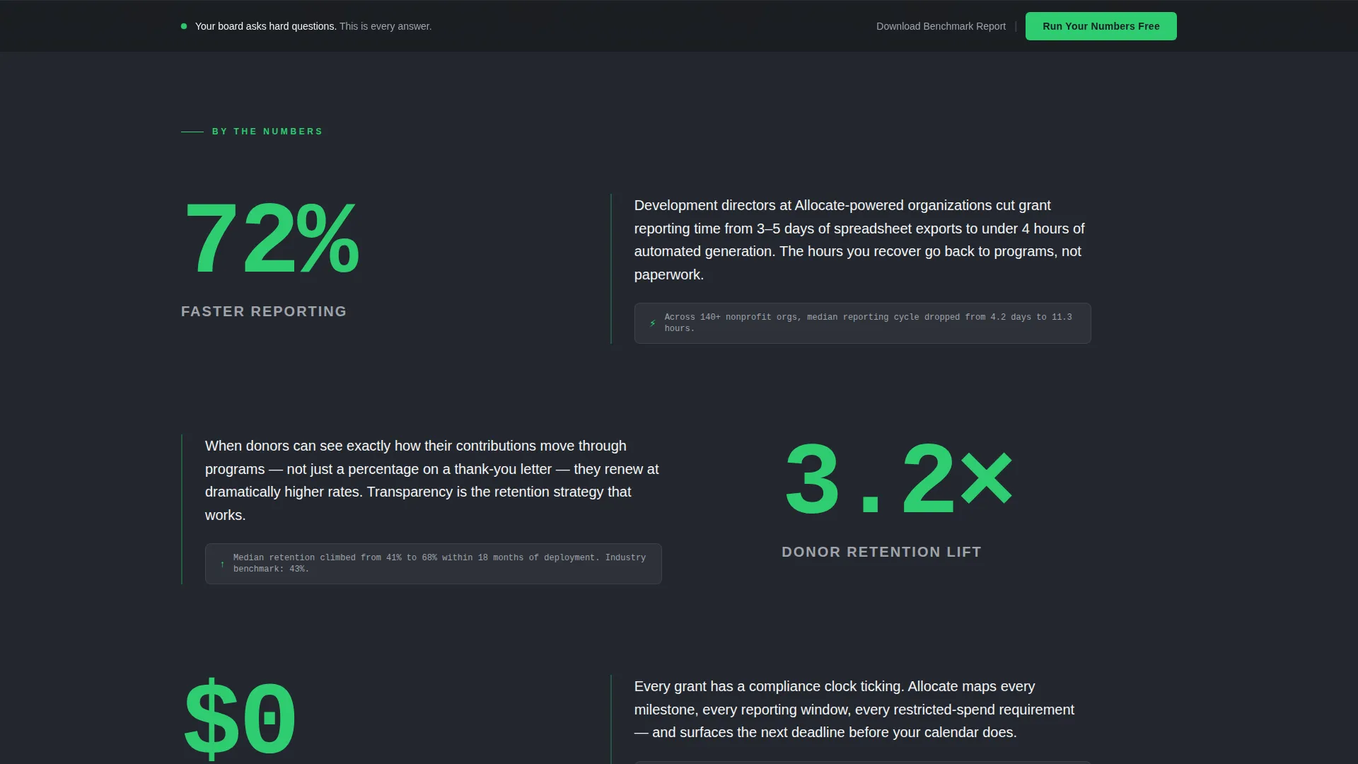
Each content section opens with a single oversized metric rendered at display scale before any supporting copy appears. Examples include 72 percent faster reporting, a 3.2 times donor retention lift, and zero dollars in missed compliance deadlines. The visitor absorbs the number first, then reads the paragraph that gives it context.
Eight-Row Animated Comparison Grid
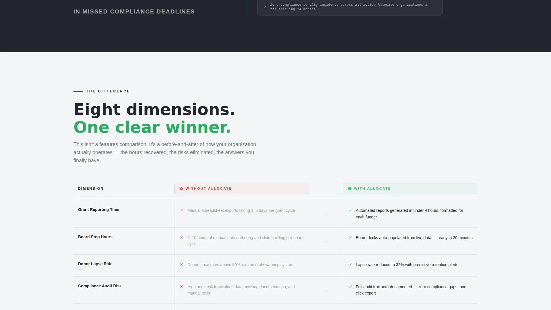
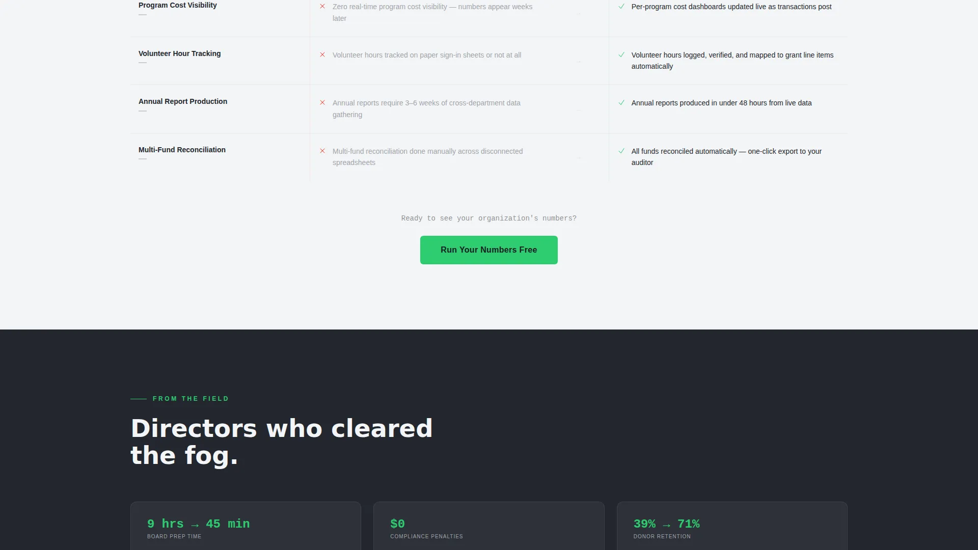
A fixed two-column data grid places "Without Allocate" on the left and "With Allocate" on the right. It covers eight operational dimensions: grant reporting time, board preparation hours, donor lapse rate, compliance audit risk, program cost visibility, volunteer hour tracking accuracy, annual report production, and multi-fund reconciliation. Each row animates on scroll. The left column renders in aluminum gray with red warning icons. The right column renders in cold white with signal green checkmarks.
Dual Call-to-Action Architecture
The primary call to action, "Run Your Numbers Free," anchors directly below the comparison grid and repeats as a sticky bar after 60 percent scroll depth. A secondary path offers a gated "Download the Benchmark Report" requiring email and organization size. This captures leads who want the data but are not yet ready to book a demo.
Signal Green Indicator System
Signal green at hex value #2ECC71 is reserved exclusively for positive-delta indicators and primary call-to-action buttons. It appears on checkmarks in the comparison grid and on every primary action element. Nothing else uses this color, so attention is never diluted.
Page sections overview
| Section | Purpose |
|---|---|
| Full-viewport header | Anchors credibility with a dense, readable dashboard screenshot and a bold headline |
| Metric impact opener | Delivers the first oversized stat before any explanatory copy |
| Stats section one | Contextualizes 72% faster reporting with supporting paragraph |
| Stats section two | Presents 3.2x donor retention lift with supporting detail |
| Stats section three | Highlights zero missed compliance deadlines with context copy |
| Comparison grid | Contrasts eight operational dimensions with animated row reveals |
| Primary call to action block | "Run Your Numbers Free" anchors directly below the grid |
| Gated secondary call to action | "Download the Benchmark Report" form capturing email and org size |
| Sticky call to action bar | Repeats primary action after 60 percent scroll depth |
Design & branding system
The visual identity follows a Data Command theme using a Monochrome Steel palette. Every color decision is intentional and functional, not decorative. The result feels like the inside of a mission control room: precise, focused, and authoritative.
- Gunmetal base (#23272E) and cold white panels (#F4F5F7) alternate as section backgrounds, with brushed aluminum (#A0A4AB) reserved for data labels and secondary text
- Signal green (#2ECC71) appears only on positive-delta indicators and primary call-to-action elements, ensuring it always commands attention
- No warm tones, gradients, or decorative elements distract from the data; the only visual reward is green progress
Mobile & speed optimization
The layout is structured to remain scannable and functional across screen sizes. The Stats-First scroll pattern and the comparison grid are designed to reflow clearly on smaller viewports without losing hierarchy.
- Oversized metric figures remain legible at reduced screen widths, preserving the impact of each Stats-First section
- The sticky call-to-action bar activates at 60 percent scroll depth and functions as a persistent conversion anchor on both desktop and mobile
How this template helps you convert
This template is built around a specific persuasion sequence. It earns trust with data, surfaces the cost of inaction, and then presents a clear next step. Nothing is left to chance.
- The header screenshot does conversion work on arrival by showing a real, readable dashboard instead of a vague illustration, establishing platform credibility before a single word is read.
- The Stats-First scroll pattern primes each section with a single hard number, so visitors arrive at the comparison grid already holding proof that the platform delivers measurable results.
- The dual call-to-action architecture meets visitors wherever they are in their decision process, either driving them to act immediately with "Run Your Numbers Free" or capturing them as leads with the gated benchmark report.
Other information about this template
This template is categorized under nonprofit organization website templates in the Technology category. It is specifically designed for the nonprofit organization services page niche, making it a strong fit for platforms that serve development teams, executive leadership, and program staff.
- The template style is Dashboard and Data Grid, which reflects the operational tone expected by finance-literate and compliance-focused nonprofit audiences
- The intersection match between the Data Command theme, Monochrome Steel color system, Stats-First Impact creative direction, and the Comparison/Versus landing page direction is a deliberate design strategy for this niche
- This template is built as a single-page landing page, not a multi-page website structure
Theme
Data Command
Creative direction
Stats-First Impact
Color system
Monochrome Steel
Style
Dashboard/Data Grid
Direction
Comparison/Versus
Page Sections
Full-viewport Dashboard Header
Stats-first Impact Scroll Flow
Eight-row Animated Comparison Grid
Dual Call-to-action Architecture
Signal Green Indicator System
Related questions
Who is this template designed for?
Can I customize the comparison grid rows?
Why does the header use a dense dashboard screenshot instead of a simple illustration?
How does the secondary call to action capture leads?
Is this a single-page layout or a multi-page website structure?



