FinOps Technology Complete Professional Website Template
Allocate is a split-screen landing page template built for open-source cloud cost visibility tools. It pairs a live syntax-highlighted code snippet with a real-time dashboard output panel, guiding visitors from raw infrastructure chaos to a clean deploy path. The design uses an Acid Digital color palette to feel native to the engineers who will actually use it.
by Rocket studio
Quick summary
Allocate is a single-page, split-screen landing page template designed for open-source FinOps projects. It uses a Problem to Solution Arc structure, moving visitors through escalating cost pain points and immediate resolutions. The Acid Digital color system keeps every section sharp, technical, and on-brand for the cloud engineering audience it serves.
Who this template is for
This template was built for teams launching open-source cloud cost management tools who need a landing page that speaks directly to technical buyers. It skips soft marketing language and shows working code, real output, and a fast deploy path instead.
- Platform engineers who deal with Cost and Usage Report files daily and need to show real capability fast
- FinOps practitioners building showback dashboards who want a page that validates their tooling choices
- CTOs and engineering leads who have experienced unexpected cloud spend spikes and are evaluating open-source solutions
What problem this template solves
Most landing pages for developer tools rely on abstract benefit statements. This template solves the trust gap by showing real code and real output before the visitor scrolls past the header. It replaces vague promises with concrete proof of capability.
- Engineers distrust marketing copy, so the template leads with a syntax-highlighted
helm installcommand and a live YAML config block instead - Teams waste time explaining tool value in meetings, but this layout gives stakeholders a visual before-and-after from spreadsheet chaos to automated cost alerts
- Cloud cost anomalies are often invisible until the monthly invoice, and this page communicates that the tool surfaces them in real time
What you get with this template
You get a fully structured, single-page layout built around five content sections and a sticky call-to-action bar. Every section is designed to carry a specific job in the conversion flow, from first impression to final click.
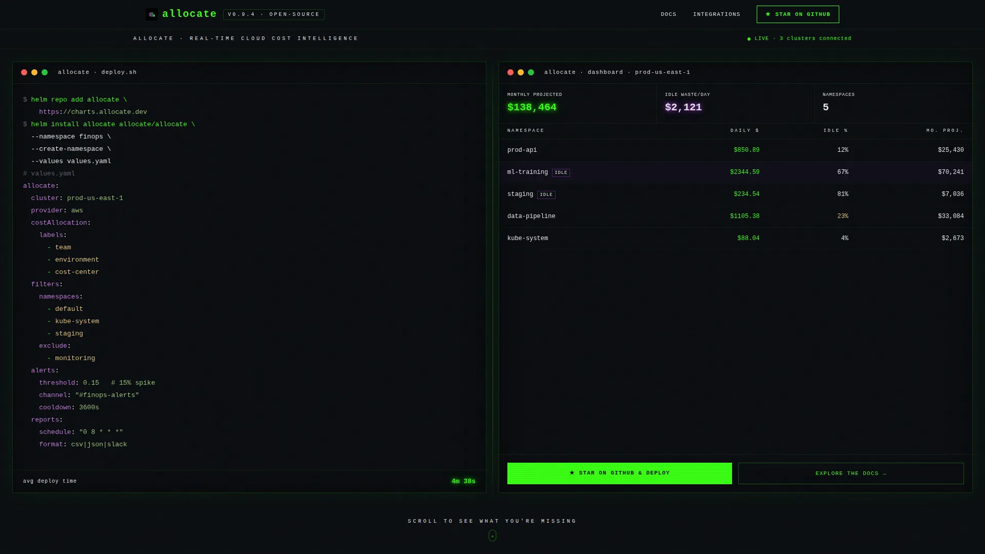
- A split-screen header with a code snippet panel on the left and a live dashboard output panel on the right, including a primary call-to-action button
- Three problem-to-solution content blocks covering raw data overload, workflow automation, and a multi-cloud integration directory
- A sticky bottom bar that resurfaces the primary call-to-action after the second scroll section
Feature list
This template is built around six practical design and layout features derived directly from the source brief.
Split-Screen Header with Live Output Panel
The header divides equally into two columns. The left side displays a syntax-highlighted helm install command followed by a YAML config block with cost-allocation labels, cluster filters, and threshold alert settings. The right side renders a minimal dashboard table showing namespaces, daily spend, idle percentage, and projected monthly totals in phosphor green.
Problem to Solution Arc Scroll Structure
The page is structured as three escalating tension-and-release cycles. Each scroll step first shows the cost visibility problem in a raw, confronting form, then immediately resolves it with a concrete capability or output. The rhythm accelerates as visitors move down the page.
Multi-Cloud Integration Directory Section
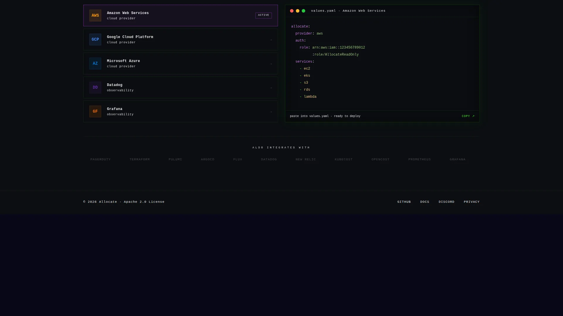
A dedicated section presents a directory of cloud and monitoring platform integrations. Each integration is displayed as a split layout with the provider logo on one side and a corresponding configuration snippet on the other, making compatibility immediately clear.
Sticky Call-to-Action Bottom Bar
After the second scroll section, a persistent bottom bar appears and stays visible as the visitor continues reading. It repeats the primary call-to-action so the path to the repository is always one click away, without interrupting the reading flow.
Acid Digital Color System
The entire template uses a four-color system: void black for all backgrounds, terminal phosphor green for live data and primary actions, electric violet for savings figures and anomaly highlights, and signal white for body text. Monospaced typography is applied where technical clarity matters most.
Before and After Workflow Contrast Blocks
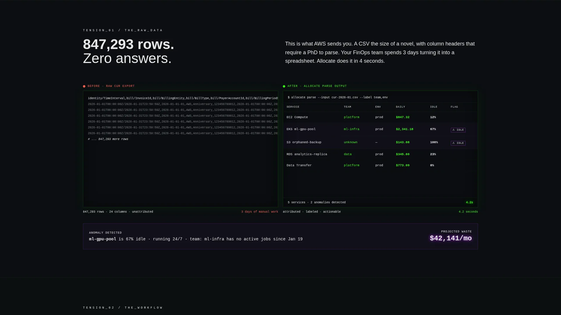
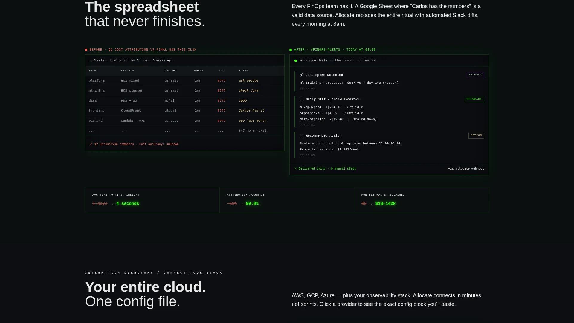
Two content sections use direct before-and-after visual comparisons. The first shows raw Cost and Usage Report data beside a parsed summary table. The second contrasts manual spreadsheet workflows with automated cost anomaly alerts delivered via messaging platforms.
Page sections overview
| Section | Purpose |
|---|---|
| Split-Screen Header | Introduces the tool with live code and dashboard output side by side |
| Raw Data Contrast | Shows unreadable cost report data next to a clean parsed summary |
| Workflow Before-After | Contrasts spreadsheet overhead with automated anomaly alerting |
| Integration Directory | Lists multi-cloud and monitoring platform config snippets |
| Sticky call to action Bar | Keeps the primary repository link visible after the second section |
Design & branding system
The visual identity is rooted in an Acid Digital theme that feels native to a terminal environment. Every color choice is deliberate: black dominates, neon accents carry meaning, and nothing competes with the data itself.
- Void black (#0B0E11) fills every background, electric violet (#BF40FF) marks savings values and anomaly flags, terminal phosphor green (#39FF14) signals live data and active states, and signal white (#E8E8E8) keeps body text legible
- Monospaced typefaces are used in code panels and dashboard output cells to reinforce technical authenticity
- No stock imagery is used anywhere; the code snippet and dashboard table are the visual anchors throughout
Mobile & speed optimization
The template layout is built with a vertical stacking behavior in mind for smaller screens, so the split-screen sections reflow gracefully without losing the code-to-output pairing that drives comprehension.
- The split-screen columns collapse to a single-column stacked layout on mobile, keeping code snippets above their corresponding output panels
- The sticky call-to-action bar is designed to remain visible and tappable at the bottom of the mobile viewport throughout the scroll
How this template helps you convert
The page is click-through optimized with a single primary conversion goal: sending visitors to the GitHub repository. Every structural decision supports that goal without relying on forms or gated content.
- The header places the primary "Star on GitHub and Deploy" call-to-action directly beside the live dashboard output, so the first visible proof of capability is immediately adjacent to the action button
- The sticky bottom bar reintroduces the call-to-action after the visitor has absorbed two full problem-solution cycles, targeting the moment when intent is highest
- A secondary "Explore the Docs" call-to-action gives technically cautious visitors a lower-commitment next step, reducing drop-off from those who want more detail before committing
Other information about this template
This template is categorized under FinOps Technology within the broader Technology category and is specifically matched to the open-source FinOps project niche. It pairs well with projects that use cloud cost allocation tooling, Kubernetes spend tracking, or multi-cloud observability dashboards as their primary capability.
- The Directory and Discovery theme makes this template reusable for any open-source tool that benefits from an integration catalog section
- The template style is Split Screen (50/50), making it a strong fit for developer tools that have both a code interface and a visual output to show simultaneously
- The creative direction follows a Problem to Solution Arc, a structure proven effective for technical audiences who evaluate tools by understanding the pain they remove before the features they add
Theme
Directory & Discovery
Creative direction
Problem→Solution Arc
Color system
Acid Digital
Style
Split Screen (50/50)
Direction
Click-Through
Page Sections
Split-screen Header with Code and Output
Problem to Solution Arc Layout
Multi-cloud Integration Directory
Sticky Bottom Call-to-action Bar
Acid Digital Color System
Before and After Workflow Contrast Blocks
Related questions
Is this a single landing page or a multi-page site template?
Does this template include a contact form or email capture?
Can I use this template for a FinOps tool that is not Kubernetes-specific?
How many calls-to-action does this template include?
What visual style does this template use?



