AI for Nonprofit Cost Calculator Website Template
Dispatch is a dashboard-style nonprofit AI voice assistant landing page built for shelter directors, food bank coordinators, and disaster response teams. It opens with a full-viewport product screenshot mid-conversation, leads immediately into an interactive ROI calculator, and drives app downloads through an iridescent data-command visual system that makes the tool feel indispensable before the scroll even begins.
by Rocket studio
Quick summary
Dispatch is a single-page template for a nonprofit AI voice assistant. It opens with a live product screenshot as the hero, then pulls visitors into an ROI calculator before revealing a full mission-control dashboard layout. The visual system uses void black, holographic violet, and shifting teal to make data feel alive. Every section is built to convert program managers and field coordinators into app downloads.
Who this template is for
This template is designed for nonprofits and social impact organizations that operate in fast-moving, high-stakes environments. It speaks directly to the people managing operations under pressure, not administrators sitting at desks.
- Shelter directors and food bank coordinators managing real-time volunteer logistics
- Disaster response teams who need instant answers without touching a screen
- Executive directors and program managers juggling multiple crises simultaneously
What problem this template solves
Nonprofit operations staff are overwhelmed. They coordinate volunteers, track donations, and file grant reports, all while physically moving between sites. Traditional software assumes a desk and two free hands. This template presents a solution for people who have neither.
- Staff spend hours each week on administrative coordination that could be handled by voice
- Field workers cannot safely look at a screen while handling physical operations
- Organizations lose impact capacity to manual data tasks instead of direct service delivery
What you get with this template
This template delivers a complete, single-page layout built around a dashboard and data grid visual structure. Every section functions like a mission-control module, giving visitors a clear picture of what the voice assistant does before they ever tap a download button.
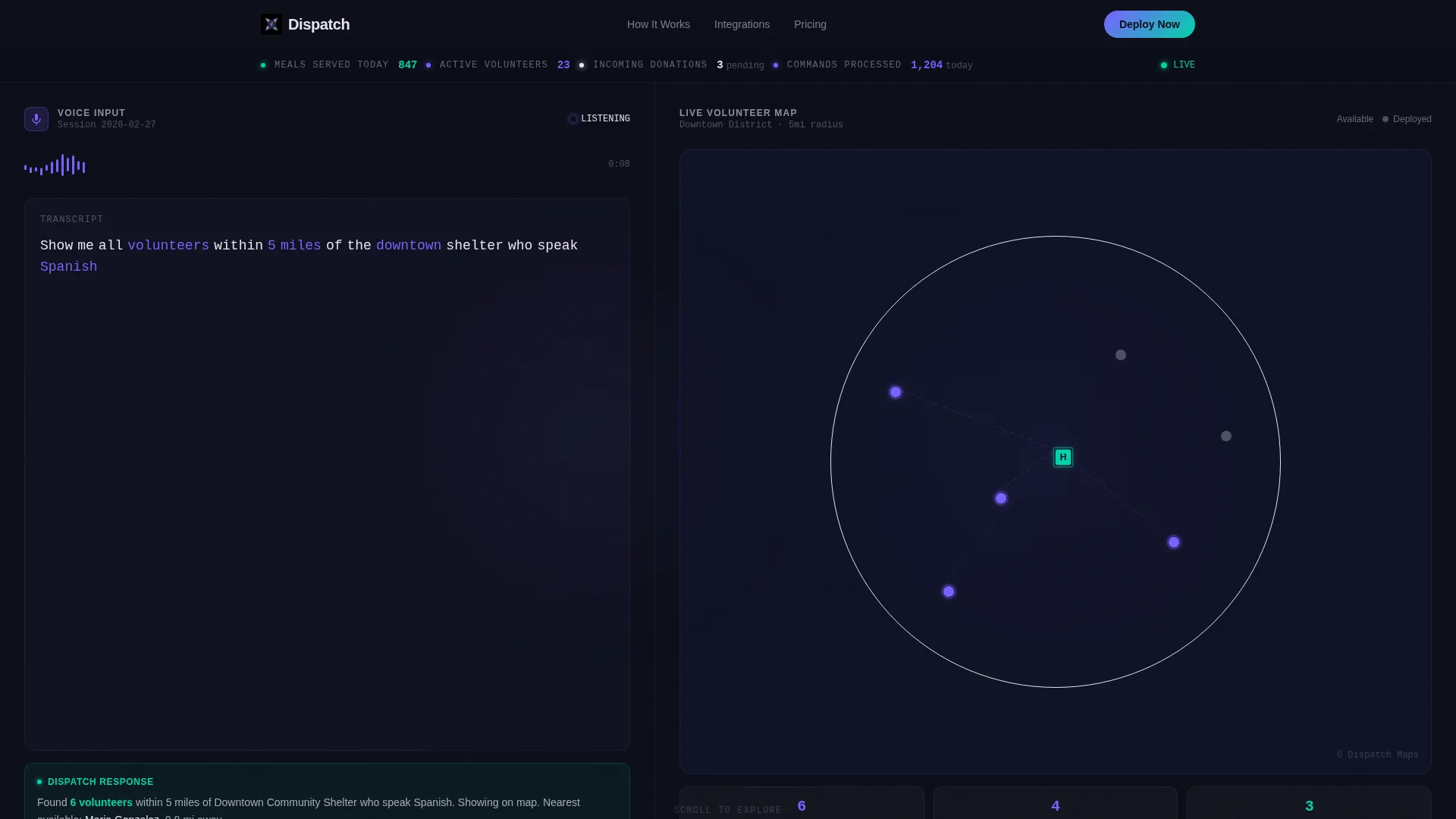
- A full-viewport product screenshot header showing the assistant mid-conversation with live map and metrics ribbon
- An interactive ROI calculator that renders personalized data cards in an animated iridescent grid
- A sticky mobile bottom bar and platform selector flow designed specifically for app download conversion
Feature list
This template includes purpose-built sections that work together to demonstrate the product, build trust, and drive downloads. Each section doubles as both a conversion tool and a product proof point.
Full-Viewport Product Screenshot Header
The hero is the assistant's dashboard caught mid-conversation. A voice transcript panel sits on the left, a live map populates pins on the right, and a metrics ribbon across the top displays real operational data like meals served, active volunteers, and incoming donations. A gently pulsing waveform animation runs beneath the transcript.
Interactive ROI Calculator
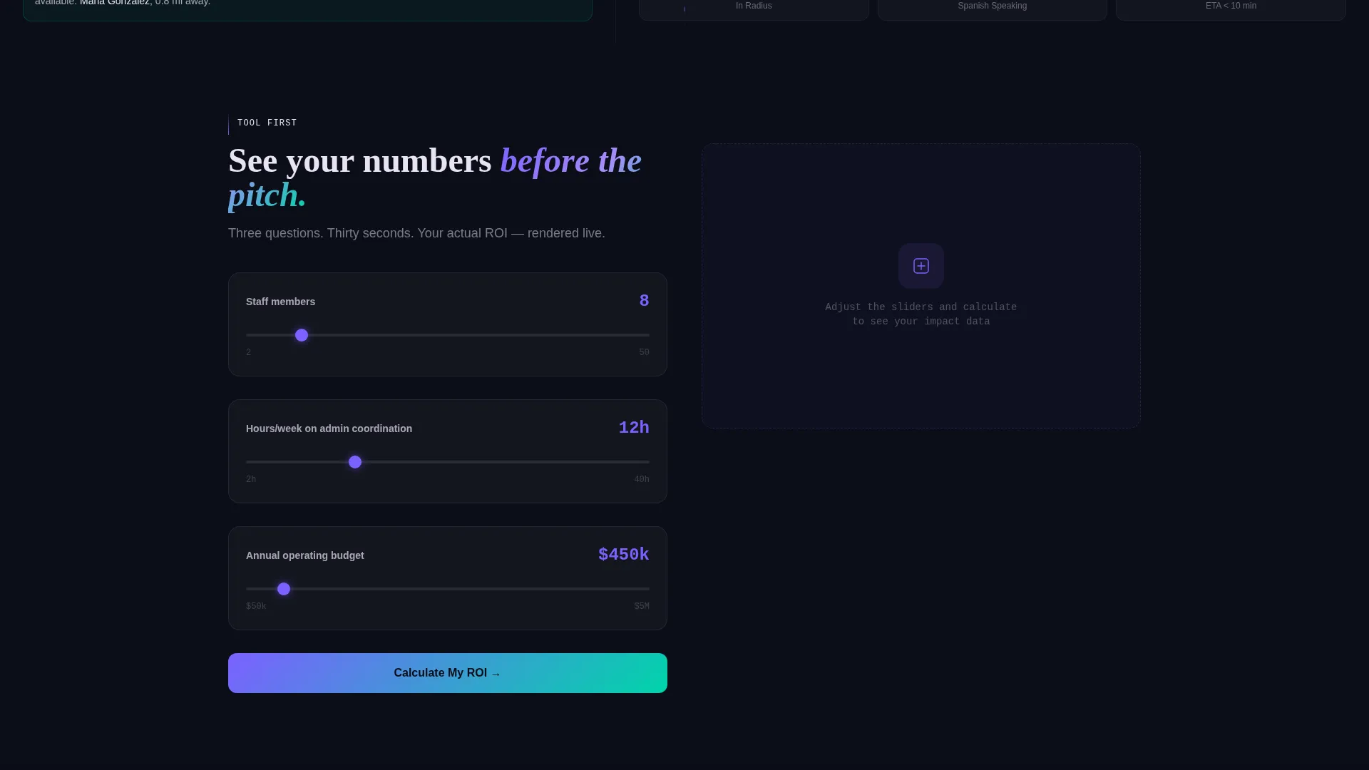
Before any pitch copy appears, visitors answer three questions: staff count, weekly hours spent on administrative coordination, and annual operating budget. The tool instantly renders a data card showing hours reclaimed, dollar equivalent saved, and additional beneficiaries served. Results animate into the dashboard grid as live tiles.
Voice Command Library Module
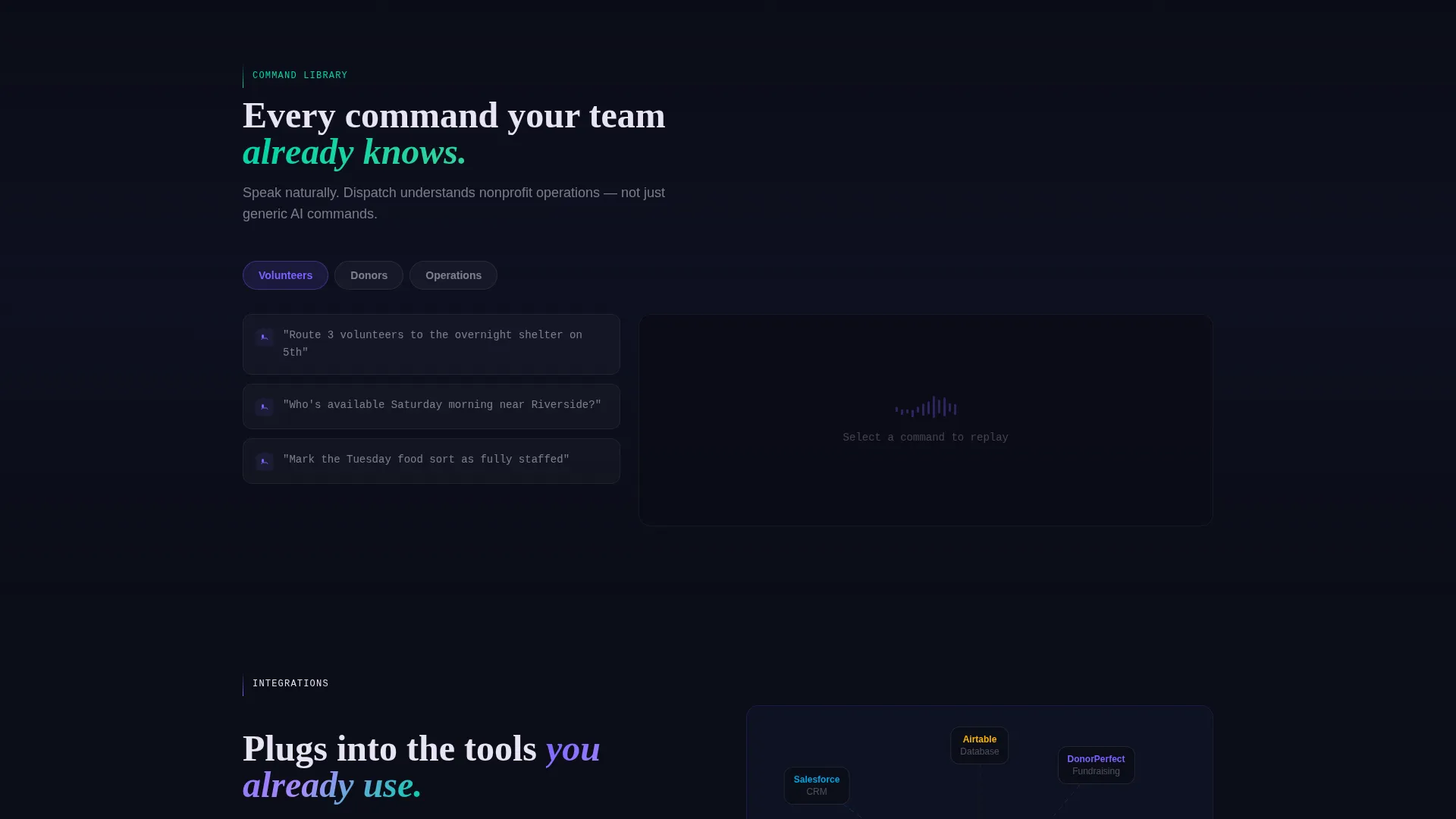
A dedicated dashboard section displays a browsable library of voice commands the assistant understands. This gives skeptical visitors immediate confidence in the product's scope and helps coordinators visualize real daily use cases before committing to a download.
Integration Map Section
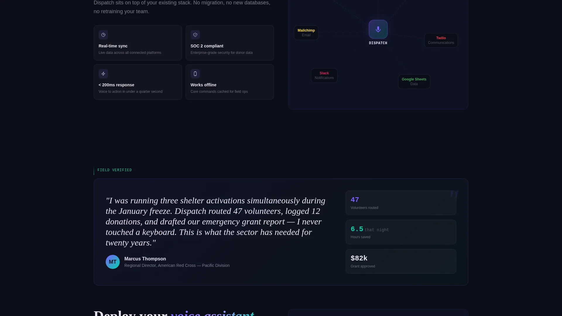
A visual map shows the connector ecosystem the assistant operates within. This section communicates technical reach and workflow compatibility in a format that feels like a dashboard panel rather than a feature bullet list.
Real-Time Transcript Replay
Visitors can watch a transcript replay that demonstrates how a spoken command translates into dashboard action. This section closes the gap between abstract capability and concrete proof by showing the product working, not just describing it.
Embedded Live Demo Simulator
A secondary conversion path lets visitors speak a sample command and watch the dashboard respond in real time. This interactive element removes hesitation and lets the product sell itself through direct experience.
Page sections overview
| Section | Purpose |
|---|---|
| Hero Product Screenshot | Show the assistant mid-conversation at full viewport scale |
| Metrics Ribbon Bar | Display live operational stats across the top of the dashboard |
| Voice Waveform Animation | Visualize active listening beneath the transcript panel |
| ROI Calculator Tool | Capture personalized savings data before any sales copy |
| Animated Results Card | Render reclaimed hours and dollar value as live dashboard tiles |
| Primary Download call to action | Drive app downloads immediately after calculator result |
| Voice Command Library | Demonstrate command breadth and build product confidence |
| Integration Map | Show ecosystem connectors in a visual dashboard panel |
| Transcript Replay Module | Prove the product works through a real command sequence |
| Testimonial Card | Add credibility via a field-level director quote |
| Live Demo Simulator | Let visitors speak a command and see the dashboard respond |
| Platform Selector Flow | Guide iOS, Android, and Desktop users to the right install link |
| Sticky Mobile call to action Bar | Keep the download prompt visible throughout the mobile scroll |
Design & branding system
The visual identity follows a Data Command theme rendered in an AI Iridescent color system. The palette is intentionally dark and precise, designed to make data pop without visual noise. Every color choice has a functional role in the interface.
- Void black (#0B0D17) as the primary background so data and interface elements command full attention
- Holographic violet (#7B61FF) on active states, voice waveforms, and interactive highlights
- Shifting teal (#00D4AA) for confirmation signals, success metrics, and positive data states
- Pale opal (#E8E3F3) for all typography and data labels to ensure legibility against the dark background
Mobile & speed optimization
The template is structured to deliver the full mission-control experience on mobile without sacrificing usability. Field workers accessing the page from a phone between site visits get the same conversion flow as desktop users.
- A sticky bottom bar keeps the "Deploy Your Voice Assistant" call to action visible throughout the entire mobile scroll
- The platform selector flow adapts to mobile context, offering iOS, Android, and Desktop paths from a single tap
- The ROI calculator and animated results card are designed to render cleanly within the dashboard grid on smaller screens
How this template helps you convert
The conversion architecture is built around a principle of earned trust. Visitors are shown proof before they are asked to act. The calculator makes the value personal and specific before the download button ever appears.
- The full-viewport product screenshot immediately communicates what the tool does and who it is for, removing ambiguity in the first second of the visit.
- The ROI calculator transforms abstract product claims into personalized numbers, making the download feel like claiming a result the visitor has already calculated for themselves.
- The embedded live demo simulator removes final hesitation by letting visitors experience a voice command response before committing to installation.
Other information about this template
This template sits at the intersection of the Technology category and the AI for Nonprofit subcategory, making it a strong fit for organizations evaluating modern voice-driven operations tools. The niche focus on nonprofit AI voice assistants means the copy, layout, and conversion flow are all calibrated for mission-driven buyers, not general SaaS audiences.
- The template style is Dashboard and Data Grid, which reflects the operational reality of the target user
- The creative direction is Calculator First, meaning the ROI tool is the lead conversion mechanism, not hero copy
- The header concept is a Product Screenshot, avoiding stock photography entirely and letting the interface serve as the visual hero
- The landing page direction is App Download, with a dual-path flow covering both direct download and live demo entry points
- Integration references within the page include connectors for Salesforce, DonorPerfect, and Twilio as shown in the integration map section
Theme
Data Command
Creative direction
Calculator/Tool First
Color system
AI Iridescent
Style
Dashboard/Data Grid
Direction
App Download
Page Sections
Full-viewport Product Screenshot Hero
Interactive ROI Calculator
Voice Command Library Module
Integration Map Visual Panel
Embedded Live Demo Simulator
Platform Selector and App Download Flow
Related questions
Who is this template designed for?
What is the primary call to action on this landing page?
Can visitors try the product before downloading?
What does the ROI calculator ask and what does it return?
Does this template use stock photography or human faces?



