Premium App Intelligence Landing Page Template
The Metric Bold Brutalist Mobile Analytics landing page template is a high-contrast, split-screen landing page built for mobile analytics platforms. It opens with a live retention and revenue calculator, then walks visitors through a systematic comparison layout. The design embraces raw brutalist aesthetics: exposed borders, monospaced fonts, and a deep terminal black and teal color system. No gradients, no stock images, no softness.
by Rocket studio
Quick summary
The Metric Bold Brutalist Mobile Analytics landing page template is a single-page, split-screen layout built for mobile analytics software. It leads with a live calculator that proves value in seconds, then scrolls into a prosecutorial comparison structure. The design is raw, bold, and machine-precise, with no decorative elements and every section earning its space.
Who this template is for
This template is built for teams that need their landing page to do real work. If your product lives in the data-dense world of mobile analytics, this layout speaks your audience's language without softening the message.
- Growth product managers at Series B startups tracking Day-7 retention drops
- Indie mobile developers diagnosing post-onboarding uninstall patterns
- Mobile gaming studios optimizing ad-waterfall revenue down to fractions of a cent
What problem this template solves
Most analytics software landing pages bury the value. They open with a hero image, a vague tagline, and a "Book a Demo" button that visitors ignore. This template flips that process entirely.
- Visitors see a working calculator before they read a single pitch line
- Comparison sections expose the gap between vague vanity metrics and real cohort data
- The layout builds a visible, step-by-step case against every alternative, section by section
What you get with this template
You get a fully structured, single-page brutalist landing page with five core sections, two font systems, a defined color palette, and high-interactivity components coded and ready to customize. Every element is presented with purpose.
- A hero calculator section with live inputs and a real-time SVG bar chart output
- Three sequential comparison sections covering data accuracy, integration speed, and pricing transparency
- A minimal conversion form and a sticky bottom bar with a competitor dropdown selector
Feature list
This template ships with a focused set of features. Each one is drawn directly from the brief and designed to serve a specific role in the conversion flow.
Live Retention and Revenue Calculator
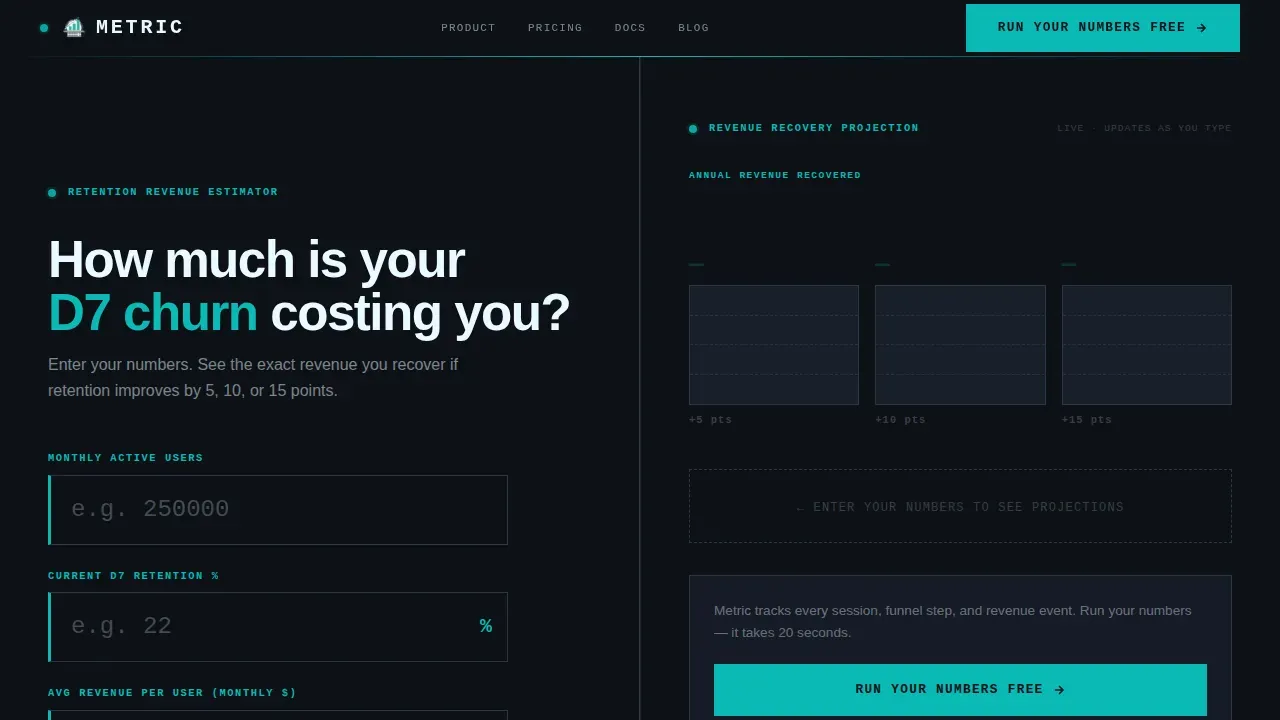
The hero section is a 50/50 split-screen calculator. Left panel holds three brutalist input fields for Monthly Active Users, current Day-7 retention percentage, and average revenue per user. Right panel renders a stepped bar chart in teal on black, showing projected revenue recovered at three improvement thresholds. Numbers update as visitors type. The tool is the first impression, and it earns attention before the page says a word about the product.
Comparison Versus Layout
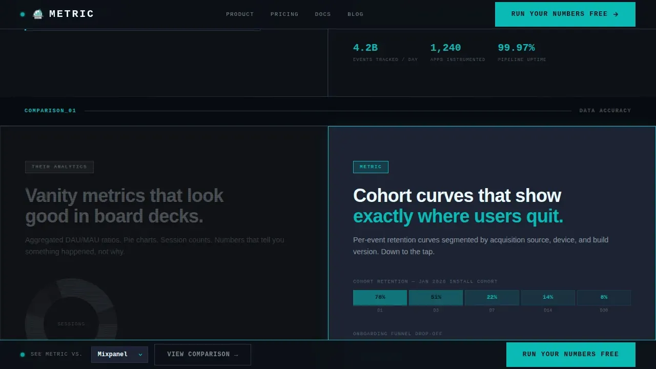
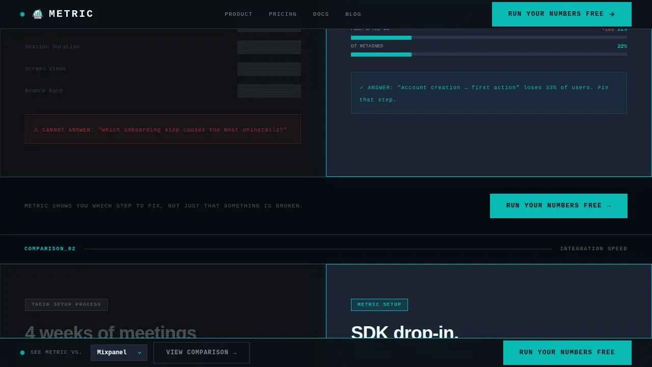
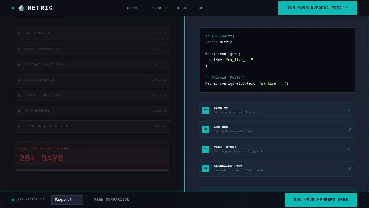
After the calculator, the page transitions into a structured comparison architecture. Each section splits the screen: left side shows the competitor approach in a grayed-out, redacted visual style. Right side shows the Metric approach with sharp, teal-lit cohort curves and funnel data. Three comparisons are built in: data accuracy, integration speed, and pricing transparency. The contrast between each pair is intentional and escalates across the scroll.
Sticky Competitor Dropdown Bar
A persistent bottom bar stays visible as visitors scroll. It offers a "See Metric versus. [Competitor]" prompt with a dropdown selector listing named alternatives. This keeps the comparison idea alive throughout the page without interrupting the main scroll flow.
Brutalist High-Contrast Design System
The design embraces web brutalism fully. Exposed borders, zero border-radius, monospaced labels using JetBrains Mono, and Manrope for bold headings. No gradients, no polished card shadows. The high-contrast color system uses deep terminal black as the background, primary teal as the signal color, graphite for card surfaces, and high-voltage white for typography. Every color is functional, not decorative.
Minimal Conversion Form
The call-to-action form collects exactly two fields: work email and app store URL. Nothing else. The primary button reads "Run Your Numbers Free." It appears first inside the calculator output panel, then repeats after each comparison section. The form is designed to simplify the decision and reduce friction to the lowest possible point.
Transition Animations and Scroll Reveals
The template includes high-interactivity behavior: real-time calculator updates, SVG bar chart morphing as inputs change, and scroll-reveal animations for comparison sections. Transition animations are coded to feel mechanical and precise, consistent with the brutalist design direction. There are no soft easing curves or decorative motion effects.
Page sections overview
| Section | Purpose |
|---|---|
| Hero Calculator | Live retention and revenue estimator, split 50/50 |
| Data Accuracy Comparison | Vanity metrics versus cohort curves and funnel data |
| Integration Speed Comparison | 4-week setup versus 4-hour SDK drop-in |
| Pricing Transparency Comparison | Surprise overages versus flat per-event pricing |
| Conversion Form | Work email and app store URL, minimal call to action |
| Sticky Bottom Bar | Persistent competitor dropdown selector |
Design & branding system
The design style is bold brutalist, characterized by raw structural honesty. The term "brutalism" originates from the French "béton brut," meaning raw concrete, and that philosophy shapes every layout decision here. No element is decorative. Every shape, border, and typographic choice conveys information.
- Color palette: deep terminal black (#0D1117) background, primary teal (#0ABAB5), muted graphite (#1C2333) for card surfaces, high-voltage white (#EAFAFF) for body typography
- Typography: JetBrains Mono for all data labels and input fields, Manrope for headings; bold typography is used throughout with no serif or script fonts
- Visual rules: no gradients, no rounded corners, no stock images; visible gridlines and exposed borders define every component
Mobile & speed optimization
The template is built desktop-first, reflecting the reality that growth product managers work on laptops and the calculator needs horizontal space to function. A mobile fallback layout is included for smaller device sizes, stacking the split-screen panels vertically.
- The calculator JavaScript is deferred to keep first paint fast
- No images are used anywhere in the layout, removing the largest typical performance cost
- The CSS is kept lean and direct, consistent with the brutalist principle of minimal styling overhead
How this template helps you convert
The conversion strategy is built into the layout sequence. Visitors do not encounter a sales pitch first. They encounter a tool that shows them a real number about their own product.
- The calculator opens with three raw inputs and returns a dollar figure instantly, proving the platform's value before any copy is read
- Each comparison section ends with a repeated "Run Your Numbers Free" call-to-action button, reinforcing the next step after each damaging contrast is presented
- The sticky bottom bar keeps the competitor comparison concept visible at all times, capturing visitors who scroll past the inline form but are still evaluating alternatives
Other information about this template
This template sits within a broader ecosystem of creative brutalist web design approaches. Brutalism in web design emerged as a direct reaction against polished, overly aesthetic digital products, and it has inspired a strong range of brutalism website examples across the web.
- Sven Soric's personal website combines brutalism and minimalism with a clean case list; Luca Porracchia's portfolio features a two-column brutalist layout showcasing design projects and images
- Umami Ware uses huge monospaced typography and hover interactions; Schoener's design studio site creates an immersive scrolling experience with large typography and hover effects; Fuse Blog showcases projects with draggable interactive brutalist elements
- Lazyeyes guides users through project images using arrow keys with no traditional navigation; Chrissie Abbott's portfolio uses shaking elements; Department Artmuseum lets users interact with cement blocks; Amazonnaws uses floating elements and animations; Brave New Word presents content on a noticeboard layout with colorful sticky notes
- Notable brutalist templates in the ecosystem include the "Brutal" template by Michael Palmer, a highly-regarded minimalist award-winner; the "Brutalist Site" Webflow template with raw, high-contrast aesthetics; and the Contra AI/SaaS Template featuring bento grids, terminal animations, and dot-grid backgrounds
- The Brutalist AI and SaaS Template uses Geist Pixel typography, dot-grid backgrounds, live terminal animations, and bento feature grids with an industrial dark theme; the Minimalist Brutalist Web Template focuses on strong typography and unconventional layouts that emphasize function over form
- Brutalist templates typically require minimal design skills to customize; users can change colors and fonts without writing complex code, and many brutalist website builders provide this as a core feature
- Rocket.new is an AI-powered platform that lets users build websites from natural-language prompts, representing a newer approach to how developers and non-technical clients create and deploy brutalist web projects
- Brutalist landing page templates with bold typography and a white background accent option, or using bright colors as high-contrast signals, are increasingly common across portfolio and software product pages
- Brutalist web design is often seen as a way for younger generations to embrace authenticity online, making a bold visual statement that polished corporate aesthetics cannot replicate
- Brutalist website builders often let developers and clients redesign and redeploy pages efficiently, because the simplicity of the design style reduces the amount of code and CSS required
Theme
Bold Brutalist
Creative direction
Calculator/Tool First
Color system
Teal Catalyst
Style
Split Screen (50/50)
Direction
Comparison/Versus
Page Sections
Live Retention and Revenue Calculator
Comparison Versus Section Architecture
Bold Brutalist Design System
Sticky Competitor Dropdown Bar
Minimal Two-field Conversion Form
Scroll-reveal Transition Animations
Related questions
Is this template suitable for a non-analytics product?
Can I customize the color system without coding?
Does this template include the calculator logic?
How does the competitor dropdown work?
Is this a single landing page or a multi-page website?



