Real-Time Flavor Metrics Landing Page Template
The Scoop real time flavor velocity analytics comparison landing page template is purpose-built for frozen novelty distribution teams who need to stop guessing and start acting on real data. It pairs a terminal-style hero, a scroll-revealing 12-dimension comparison table, VP-level social proof, and a sticky lead capture bar to turn analytical skeptics into demo requests.
by Rocket studio
Quick summary
This comparison landing page template drops visitors straight into the operational clarity that frozen novelty supply chain leaders have been missing. A live-style code snippet opens the page, a scrolling comparison table makes the gap between spreadsheets and real analytics embarrassingly clear, and a sticky call to action bar captures leads the moment conviction peaks. The whole point is a single, focused conversion: run your first flavor report.
Who this template is for
This template is built for B2B SaaS teams selling into the frozen food distribution and supply chain space. It speaks the language of operators who manage hundreds of stock-keeping units and need to justify every reorder decision with hard data, not instinct. The page is designed desktop-first, matching how VP-level buyers and portfolio managers actually work during business hours.
- VP Supply Chain leads at national creameries managing 200 to 2,000 stock-keeping units who are data-driven but tool-starved
- Regional frozen dessert distributors handling 200-plus retail accounts who compare options before committing to any analytics service
- Private-equity portfolio managers running acquisition diligence on frozen novelty company targets who need fast, credible data
What problem this template solves
Most frozen distribution teams are making expensive reorder decisions based on gut feel, not velocity data. Generic business intelligence tools and ERP bolt-ons were never designed for SKU-level cold chain compliance or seasonal demand modeling in this vertical. The result is wasted margin, over-stocked slow movers, and under-supplied closers. These are the exact pain points this comparison landing page is designed to surface and resolve.
- Operators cannot compare their current tools against a purpose-built analytics platform without a structured format that lays everything side by side
- Landing pages that bury the value proposition lose potential customers in the first five seconds; this template leads with the data finding immediately
- Visitors need to see their own blind spots reflected in a clear side by side comparison before they trust a free consultation offer
What you get with this template
You get a fully structured, single-page lead generation landing page built around a 12-dimension comparison table and a dual-path conversion system. Every section is sequenced to build analytical credibility before asking for anything. The template is ready to customize with your brand colors, live data examples, and company-specific copy without rebuilding the layout from scratch.
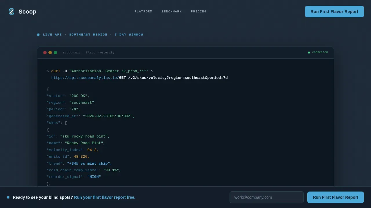
- A terminal-style hero section with a syntax-highlighted code snippet, animated JSON response cascade, and a humanized insight line that grounds the data in plain language
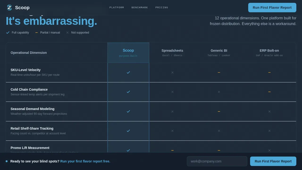
- A scroll-reveal comparison table covering twelve operational dimensions across four competitor categories, with the winning column highlighted in sensor blue and losing columns faded to freezer fog white
- A sticky lead generation bar with a three-field form sequence and a secondary gated PDF download path, both designed to capture email marketing leads at different stages of the buying process
Feature list
This template is built around features that match the decision making process of senior supply chain buyers. Each component earns trust before asking for a conversion.
Terminal Hero with Live API Snippet
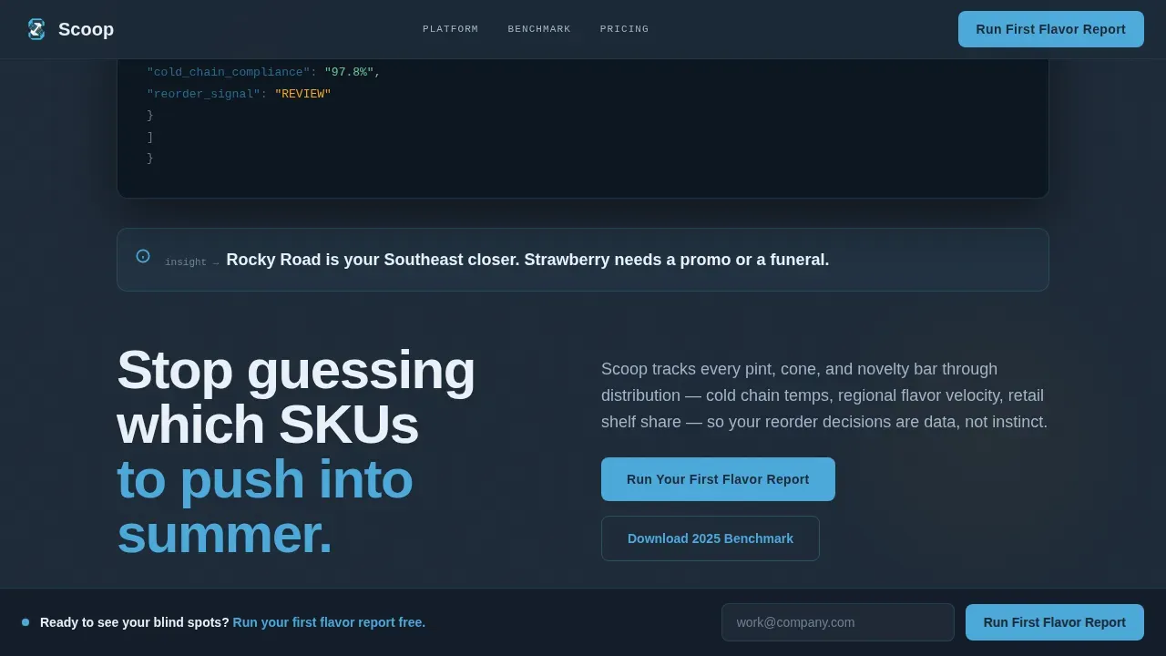
The header opens with a styled code block displaying a live-style API call: GET /v2/skus/velocity?region=southeast&period=7d. The JSON payload cascades in with a blinking cursor, syntax-highlighted in slate and sky tones. A single humanized insight line renders below the snippet in clean sans-serif, translating the data into a plain-English verdict that guides visitors immediately into the comparison narrative.
Scroll-Reveal Comparison Table
The core of this comparison landing page is a 12-row table that stacks SKU-level velocity, cold chain compliance, seasonal demand modeling, retail shelf-share tracking, promo lift measurement, waste forecasting, distributor scorecarding, route optimization signals, new flavor test reads, margin-per-facing analysis, weather-demand correlation, and reorder automation into a single, scannable comparison. Each row reveals on scroll. The winning column stays highlighted in sensor blue while competing columns gray to fog white. The cumulative visual effect makes the competitive advantage self-evident by the final row.
Data Findings Bento Grid
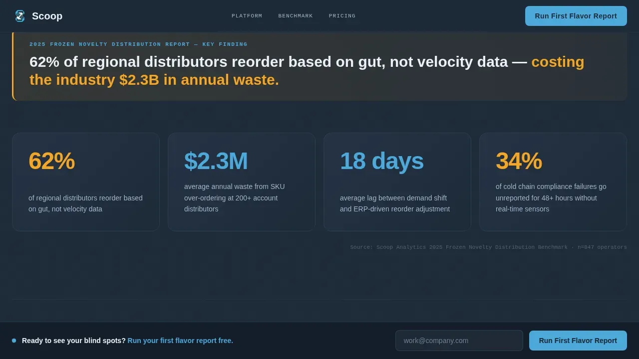
Below the hero, a bold statistical callout anchors the page: "62% of regional distributors reorder based on gut, not velocity data." A bento box layout then organizes four supporting metrics into a clean grid. This approach is effective for presenting diverse data points covering flavor velocity, location performance, seasonal timing, and reorder accuracy in a format that is fast to scan and hard to dismiss.
Sticky Lead Capture Bar
A sticky bar activates after the visitor scrolls past the third comparison row. It locks to the top of the viewport and holds the primary call to action: "Run Your First Flavor Report." The three-field form sequence asks for company name, number of stock-keeping units currently managed, and work email. Keeping the form to three fields is intentional: every additional form field reduces conversions, so the template keeps the ask minimal and the promise specific.
Dual Conversion Path with Gated PDF
Visitors not ready to demo have a secondary path: "Download the 2025 Frozen Novelty Benchmark." This gated PDF download captures email and distribution volume tier, feeding a separate email marketing track. Two conversion paths at different commitment levels allow the page to serve both immediate demo-ready buyers and potential customers still in the research phase of the buying process.
VP-Level Testimonial Blocks
Two customer testimonials from VP-level contacts appear with company-type specificity and operational metrics. Social proof at this seniority level is a key element for SaaS companies selling into enterprise supply chain roles. Highlighting customer testimonials with role specificity and concrete results enhances credibility and influences decision making far more than generic praise.
Page sections overview
| Section | Purpose |
|---|---|
| Terminal Hero Block | Opens with syntax-highlighted API snippet and humanized insight line |
| Data Findings Grid | Bold stat callout plus four-metric bento grid anchoring the industry report narrative |
| Comparison Table | Twelve scroll-reveal rows comparing the platform against spreadsheets, generic BI tools, and ERP bolt-ons |
| Testimonial Pair | Two VP-level quotes with company-type and operational metric specificity |
| Dual call to action Block | Primary demo form and secondary gated benchmark PDF download |
| Sticky Lead Bar | Three-field form locked in viewport after scroll threshold, always visible |
| Footer Row | Linear single-row footer with minimal navigation |
Design & branding system
The visual identity follows a Data Command theme built entirely around the Slate and Sky color system. The palette evokes the glow of a monitoring station at midnight: cool fluorescent light bouncing off stainless steel, every number legible at a glance. Bold typography using JetBrains Mono for terminal blocks and Manrope for headings and body copy creates clear visual separation between raw data and human insight. Contrasting colors between the deep slate background and sensor blue accent make the winning comparison column impossible to miss, while melt-alert amber appears only on KPI callouts and interactive hover states to draw attention precisely when something demands it.
- Color system: deep operations slate (#1E2A38) for backgrounds, sensor-readout blue (#4DA8DA) for accents and winning columns, freezer-fog white (#EAF0F7) for light backgrounds and grayed competitors, melt-alert amber (#F5A623) for KPI callouts and hover states
- Typography: JetBrains Mono for all terminal and code elements, Manrope for headings and body text, delivering clean layout separation between analytical and editorial content
- White space is used deliberately throughout to keep the page sharp and uncluttered, improving readability and focus across the comparison table and bento grid sections
Mobile & speed optimization
The template is desktop-first by design, reflecting how VP and private equity users interact with analytical tools during working hours. Full mobile responsiveness is included so the page does not lose potential customers arriving from email marketing links or organic search on mobile devices. Poor mobile design on a B2B landing page can silently kill future conversions before the comparison table even loads.
- Responsive design scales the comparison table and bento grid cleanly across screen sizes, preserving the visual hierarchy that makes the data readable
- Static server components handle non-interactive layout sections for fast initial load; client-side components power the terminal animation, scroll-reveal table rows, and sticky bar activation
- Mobile optimization ensures the sticky lead capture bar, form sequence, and gated PDF path all function correctly on smaller viewports without sacrificing conversion rate
How this template helps you convert
This comparison landing page is structured so that every scroll builds conviction before the primary call to action appears. The page earns the click by proving analytical depth first. A well-structured comparison page controls the narrative by drawing conclusions and pulling out data for the reader, rather than leaving interpretation to chance.
- The terminal hero and data findings section surface the core pain points immediately, so visitors recognize their own operational gaps in the first five seconds and keep reading instead of leaving
- The 12-row scroll-reveal comparison table functions as a comprehensive comparison that systematically closes every objection across twelve operational dimensions, making competitors look increasingly inadequate row by row until the competitive advantage is undeniable
- The sticky bar activates at the precise moment conviction peaks, presenting a minimal three-field form that guides visitors to conversion without friction, while the secondary PDF path captures leads from potential customers not yet ready to commit to a demo
Other information about this template
This template is a strong page example for SaaS companies operating in data-heavy verticals where buyers compare multiple tools before making a decision. It demonstrates how competitive comparison pages can control the narrative by combining industry report creative direction with a high-density, visual-first layout. The page is a good example of how product comparison pages can translate complex data into compelling value propositions that drive user action.
- Comparison landing pages built on this structure perform well in organic search because they directly match the search intent of buyers actively evaluating analytics tools; search engines reward this relevance with stronger visibility in search results
- The Industry Report creative direction drives content marketing depth into every section, making this a useful reference for teams looking for more inspiration on how to create competitor comparison landing pages that feel authoritative rather than aggressive
- The template supports high converting landing pages by following established conversion rate optimization principles: single objective focus, minimal form fields, social proof placement, and a clean layout that encourages visitors to stay and compare rather than bounce
- This is a useful case study in high performing landing pages for B2B SaaS: the dual conversion path serves both the sales funnel entry point (demo request) and a softer lead capture track (benchmark PDF), broadening reach without diluting the primary objective
- From a content marketing and email marketing perspective, the gated benchmark PDF creates a second list segment, enabling follow-up sequences calibrated to distribution volume tier, which supports future conversions over a longer sales cycle
- The structured format of the comparison table makes it straightforward to adapt for other comparison pages in adjacent food and beverage analytics verticals, or for any company that needs to compare its platform against spreadsheets, generic BI tools, and ERP systems
- For teams reviewing other comparison pages as references, this template offers a complete blueprint: terminal hero for immediate credibility, comparison table for structured persuasion, customer testimonials for social proof, and a dual call to action system for conversion optimization across multiple buyer readiness levels
- Scoop real time flavor velocity analytics comparison landing page template is the full name used for this template in the marketplace; it can be located and licensed directly through the platform for teams ready to build or adapt this layout for their own sales and marketing campaigns
- The design features, interactive components, and conversion architecture of this template can support e commerce adjacent use cases in food distribution, though the core layout is optimized for B2B SaaS lead generation in the frozen novelty and cold chain analytics space
- Teams in markets such as San Diego and other high-volume distribution hubs where frozen novelty distribution is competitive will find the comparison table format especially effective for converting visitors arriving from paid search and content marketing channels; it speaks directly to operators who already know their current tools are falling short and are actively searching for a better service
- The versatile event space of the dual call to action block can accommodate private events link placements or private events promotional offers within the footer or secondary call to action area if the platform operator chooses to extend the page for regional campaign use cases
- Loyal customers and warm prospects who arrive via email marketing or case studies will recognize the benchmark PDF as a credible signal of analytical authority, reinforcing trust before they enter the primary sales conversion path
Theme
Data Command
Creative direction
Industry Report
Color system
Slate & Sky
Style
Comparison Table
Direction
Lead Generation
Page Sections
Terminal Hero with Animated API Snippet
Dimension Scroll-reveal Comparison Table
Bento Grid Data Findings Section
Sticky Activation Bar with Sequenced Form
Dual Conversion Path Architecture
Vp-level Social Proof Blocks
Related questions
Who is this comparison landing page template designed for?
Can I customize the comparison table dimensions?
How does the dual conversion path work?
Does this template support mobile devices?
How does the sticky bar know when to appear?



