Real-Time Sports Dashboard Landing Page Template
Pulse is a dark-mode sports analytics dashboard landing page built for analysts, coaches, and front-office staff who need data at a glance. The template uses a card grid layout with stagger animations, a particle-dot hero, and a pinned call-to-action bar. It is designed to earn clicks by making visitors feel the product before they ever sign up.
by Rocket studio
Quick summary
Pulse is a single-page sports analytics dashboard landing page template built on a card grid layout. It is designed for data-heavy SaaS products targeting NBA analysts, college athletic directors, and fantasy-league builders. Every section leads with a number, every hover fires a cyan accent, and one pinned call-to-action bar keeps the conversion goal visible from scroll start to finish.
Who this template is for
This template is built for teams and individuals who present complex performance data to audiences who only read charts. The layout fits SaaS products, analytics apps, and sports intelligence platforms.
- Front-office analysts and coaching staff who evaluate player metrics before draft day
- Athletic directors who need a landing page that justifies recruiting budgets with hard data
- Fantasy-league builders and prop-bet researchers who want real time insights at a glance
What problem this template solves
Most analytics landing pages explain the product first and show data second. Visitors lose interest before they trust the tool. This template flips that sequence.
- Cards lead with massive glowing numbers so visitors understand performance value instantly
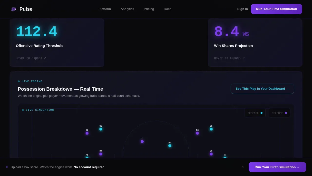
- A live simulation card auto-plays a possession breakdown, proving the app works before any click
- The pinned call-to-action bar keeps the next step visible without interrupting the data story
What you get with this template
You get a fully designed, ready-to-customize landing page built around a Stats-First Impact creative direction. Every section is structured to move a data-curious visitor toward one clear action.
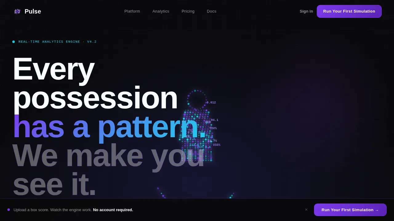
- A full-bleed void hero with a particle-dot player silhouette and animated stat orbits
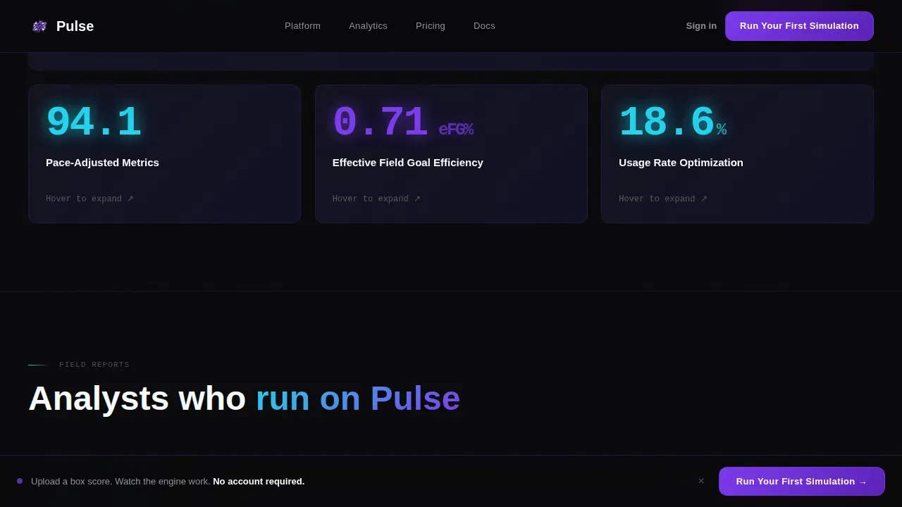
- A modular card grid with stagger scroll animations and hover-reveal stat details
- A pinned bottom bar with a primary call-to-action that stays on screen after the third card enters view
Feature list
This section covers the core built-in capabilities of the Pulse landing page template.
Particle-Dot Hero Section
The header fills the full viewport with a void-black background. A player silhouette is rendered entirely from particle data points, each pulsing from violet to cyan as live stat values orbit the figure. No photography is used; the glow is the data.
Stats-First Bento Card Grid
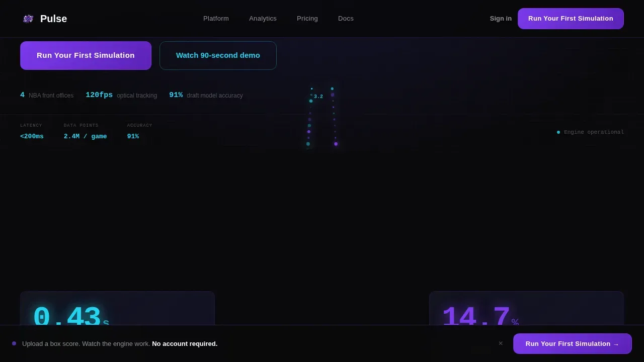
Cards are designed with an asymmetric modular layout. Each card opens with a massive leading number, such as reaction-time or shot-probability figures, before any label appears. Cards stagger-animate on scroll in a quick, rhythmic sequence.
Live Simulation Card
One card auto-plays a possession breakdown across a half-court schematic. Player movement is rendered as glowing trails. This section is designed to let visitors evaluate the tool in action before they connect with the demo.
Pinned Call-to-Action Bar
After the third card enters view, a slim bar pins to the bottom of the screen. It glows violet on void with a cyan pulse on hover. No form is required; the click routes directly to an interactive demo session.
Social Proof Block
Named analyst quotes with specific use-case metrics are displayed alongside text-only organization references. This section is designed to report credibility through real outcomes, not generic endorsements.
Minimal Footer
A clean, extreme-minimal footer keeps the page focused. It is designed to avoid visual noise after the call-to-action has already been placed.
Page sections overview
| Section | Purpose |
|---|---|
| Full-Bleed Hero | Introduce brand and data identity |
| Stats-First Grid | Surface performance metrics immediately |
| Live Simulation Card | Demonstrate dashboard in real time |
| Social Proof Block | Report analyst credibility with specifics |
| Pinned call to action Bar | Drive demo clicks after engagement |
| Minimal Footer | Close page without distraction |
Design & branding system
The Void and Violet color system is built around four precise values. The palette is designed to feel like a stadium scoreboard glowing in absolute darkness.
- Backgrounds use true void black (#09090B) and deep-space indigo (#1E1B4B); cards surface at a slightly lighter elevation with violet (#7C3AED) border glows
- Cyan (#22D3EE) is reserved for live data accents and hover states, so every interaction feels deliberate
- Typography uses Manrope for ultra-bold tight-tracked headings and DM Sans for body copy
Mobile & speed optimization
The template is desktop-first by design, reflecting the primary use case of analysts working at workstations during late-night data sessions. It is also built to stay stable and readable on tablets.
- Animations use GPU-accelerated transforms to keep motion smooth across devices
- The card grid reflows responsively so metrics and insights remain easy to scan on smaller screens
How this template helps you convert
This landing page is designed to remove the distance between a visitor's curiosity and a demo click. Every design decision serves that goal.
- The above-the-fold content is designed so users grasp the core value within seconds, following the principle that clarity at the top of any landing page drives faster decisions
- The live simulation card catches visitors at peak engagement and offers a secondary call-to-action, "See This Play in Your Dashboard," exactly when interest is highest
- The pinned bar keeps "Run Your First Simulation" visible without a form, lowering the friction between insight and action
Other information about this template
This template is a strong fit for any app landing page in the sports software and SaaS space. It works equally well as a fitness app landing page framework when adapted for athlete performance tracking tools.
- The layout is easy to adapt for a fitness app landing scenario, such as workload monitoring for athletes, where daily report cards and session summaries are central to the product story
- Designers can select a different color set and choose new typography while keeping the card grid structure intact
- The template is open to extension: add pages for pricing, a deeper report view, or a date-filtered data explorer as the product grows
- The number of sections can scale up or down to match any analytics app scope, from a simple fitness app to a full multi-sport dashboard
- The Pulse real time sports analytics dashboard landing page template is also referenced in the sports tech community alongside platforms that deliver branded event insights reports within days of each event, making it a relevant model for any analytics-forward product launch
Theme
Dynamic Motion
Creative direction
Stats-First Impact
Color system
Void & Violet
Style
Card Grid (Modular)
Direction
Click-Through
Page Sections
Particle-dot Hero with Stat Orbits
Stats-first Modular Card Grid
Auto-playing Live Simulation Card
Pinned Conversion Bar
Social Proof with Analyst Quotes
Minimal Void Footer
Related questions
Can I use this template for a fitness app landing page?
Does this template include real data or live API connections?
What sections can I customize or remove?
Is this template designed for desktop or mobile first?
How does the pinned call-to-action bar work?



