Certified Advanced Tech & AI Platforms Comparison Website Template
Annotate is a split-screen landing page template built for data annotation platforms. It pairs a raw-versus-labeled image header with a scrollable feature matrix, guiding machine learning engineers and computer vision teams from capability proof to app download. The glassmorphic dark theme communicates precision and control from the first pixel.
by Rocket studio
Quick summary
Annotate is a single-page template designed for data annotation platforms targeting machine learning and computer vision teams. It opens with a dramatic split-screen header comparing raw and fully labeled imagery, then walks visitors through a structured feature matrix before landing on a clear app download call to action.
Who this template is for
This template is built for teams and founders who need to communicate the depth and reliability of an annotation platform to a technically demanding audience. Visitors arrive with mental checklists, and the template is designed to check every box before asking for a click.
- Machine learning engineers managing large volumes of unlabeled image, video, or LiDAR datasets
- Computer vision leads at autonomous vehicle companies working toward validation milestones
- AI startup founders who need to demonstrate ground-truth data quality quickly and credibly
What problem this template solves
Technical buyers do not respond well to vague marketing claims. They want evidence, structure, and specificity. Most landing pages for data tools either under-explain capabilities or bury the proof behind walls of generic copy. This template solves that gap directly.
- Visitors leave before reaching the call to action because the page fails to earn trust early
- Capability claims feel unsupported without a structured, spec-driven feature presentation
- The gap between raw data and labeled output is never made visually clear to first-time visitors
What you get with this template
You get a fully structured, single-page layout that carries visitors from first impression to download decision. Every section is purposefully ordered to build confidence before presenting the call to action.
- A 50/50 split-screen header with raw versus annotated image panels inside frosted glass containers
- An alternating feature matrix that presents interface mockups alongside detailed capability spec sheets
- A dual-path call-to-action section with a primary app download prompt and a secondary browser-based sandbox option
Feature list
This template delivers a focused set of layout and visual components grounded in the source brief. Each feature serves the goal of converting a skeptical technical visitor into an engaged downloader.
Split-Screen Dashboard Header
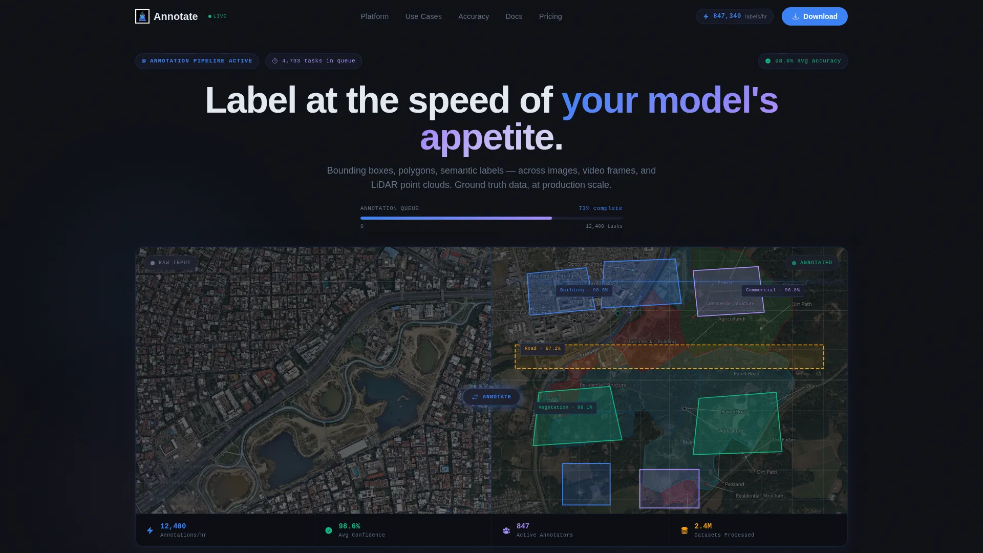
The header divides cleanly down the center. The left panel displays a raw, unlabeled satellite image dense with rooftops and roads. The right panel shows the identical image covered in color-coded polygons, bounding boxes, and confidence scores reading 98.6%. Both panels sit inside frosted glass containers with subtle drop shadows. A live-updating task counter ticks upward in the top-right corner, and a miniature progress bar below the headline mimics an annotation queue draining in real time.
Headline with Fade-In Animation
The primary headline, "Label at the speed of your model's appetite," fades in over the split-screen header. This motion draws the eye to the core value proposition without distracting from the visual comparison happening beneath it.
Alternating Feature Matrix Layout
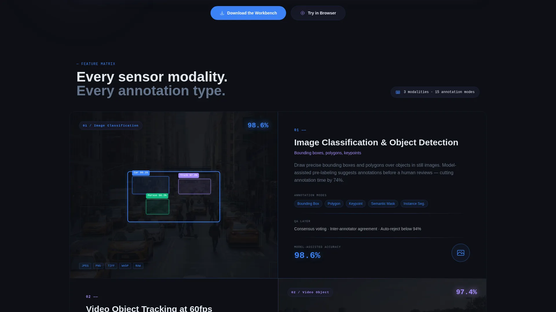
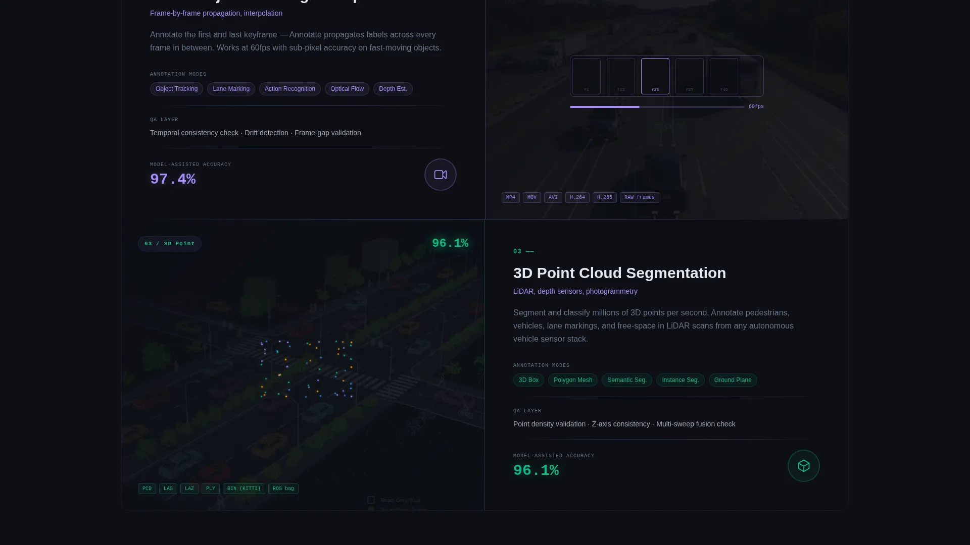
The body of the page uses alternating left-right split pairs to present each capability. The left side shows the feature inside a glass-panel interface mockup. The right side delivers the spec sheet: supported data types, annotation modes, quality assurance layers, and model-assisted pre-labeling accuracy figures. Complexity escalates deliberately, moving from image classification to three-dimensional point cloud segmentation to video object tracking at 60 frames per second.
Dual-Path Call-to-Action Section
The primary call to action reads "Download the Workbench" with platform toggle pills for macOS, Windows, and Linux. A secondary path offers "Try in Browser," directing visitors to a sandbox environment preloaded with a sample dataset. Both paths are presented together so visitors at different readiness levels each have a logical next step.
Glassmorphic Panel System
Every content card and interface mockup uses the frosted glass panel treatment: a deep background layer at #1A1D2E with 60% opacity and a 12-pixel blur. This creates visual depth without noise, making data values and annotation highlights feel like they float above the page surface.
Live Progress Bar Component
A miniature progress bar component sits below the hero headline and fills in real time, visually suggesting an annotation queue being processed. It reinforces the platform's core promise of speed and throughput without requiring any explanatory copy.
Page sections overview
| Section | Purpose |
|---|---|
| Split-Screen Header | Show raw versus annotated imagery side by side |
| Hero Headline Block | Deliver the core value statement with fade-in motion |
| Live Progress Bar | Visualize annotation queue speed below the headline |
| Feature Matrix Rows | Present capabilities in alternating spec-driven pairs |
| App Download call to action | Drive installs with platform-specific toggle pills |
| Browser Sandbox Path | Offer a no-install fallback conversion option |
Design & branding system
The visual identity follows a Dashboard Pro theme built on a glassmorphic color system. The palette is designed to feel like a control room at 2 AM, dark and purposeful, where every glow is a signal and every color carries meaning.
- Core colors: deep workspace black (#0D0F14) as the base, frosted glass panel (#1A1D2E at 60% opacity with 12-pixel blur), electric annotation blue (#3B82F6) for active states and selection highlights, soft label lilac (#A78BFA) as a secondary accent, and crisp readout white (#E2E8F0) for typography and data values
- Frosted glass containers with drop shadows give content panels a sense of depth and elevation above the dark background
- Typography uses the readout white tone to keep data values and labels crisp and legible against the dark workspace palette
Mobile & speed optimization
The split-screen layout is designed to adapt to narrower viewports while preserving the visual contrast between raw and annotated content panels. The glassmorphic treatment remains intact at smaller sizes, keeping the interface feel consistent across devices.
- Frosted glass panels reflow cleanly for tablet and mobile breakpoints without losing the depth effect
- The feature matrix alternating layout collapses into a stacked single-column flow on smaller screens
- Platform toggle pills in the call-to-action section remain tappable and clearly labeled at mobile scale
How this template helps you convert
The page is structured to remove doubt before it asks for anything. By the time a visitor reaches the download button, they have already worked through a complete capability review.
- The split-screen header immediately proves the platform's output quality with a visual before-and-after comparison, establishing credibility in the first scroll position
- The feature matrix escalates from simple to complex capabilities, matching the mental checklist a technical buyer builds while evaluating tools, so the call to action feels like a natural conclusion rather than a sales push
Other information about this template
This template is category-matched for the advanced technology and AI platforms space, specifically the data annotation platform niche. It suits any team building a product page that needs to speak credibly to a machine learning or computer vision audience.
- The template style is a 50/50 split screen, making it well suited for visual before-and-after comparisons common in annotation and labeling platform marketing
- The header concept is a Dashboard Preview, which communicates product maturity and operational readiness at first glance
- The creative direction is a Feature Matrix, a pattern that works well for technical buyers who evaluate tools by comparing capabilities rather than reading narrative copy
- The landing page direction targets app download as the primary conversion goal, with a secondary browser-based sandbox path for visitors earlier in the decision process
- The template fits within the Dashboard Pro theme and glassmorphic design language used across high-end AI tooling and developer-facing product pages
Theme
Dashboard Pro
Creative direction
Feature Matrix
Color system
Glassmorphic
Style
Split Screen (50/50)
Direction
App Download
Page Sections
50/50 Split-screen Header
Alternating Feature Matrix
Live Progress Bar Component
Dual-path Conversion Section
Glassmorphic Panel System
Fade-in Hero Headline
Related questions
Who is this landing page template designed for?
What call-to-action options does this template include?
Can I use this template to present multiple annotation data types?
What design style does this template use?
Does this template work for a platform that supports video annotation?



