Specialist Sports Digital Presence Comparison Website Template
Stat is a modular, card-grid sports landing page template built for the data-obsessed. It puts an interactive head-to-head stat comparison widget front and center, uses a matte Carbon Fiber color system with phosphor-green live accents, and walks visitors through a versus-style scroll that makes the case for your sports site through proof, not promises.
by Rocket studio
Quick summary
Stat is a high-performance sports landing page template designed around a Calculator/Tool First approach. The visitor interacts with a live stat-comparison widget before they ever scroll. A dark, Carbon Fiber visual identity and a Comparison/Versus page architecture make the template's value obvious without a single word of hype.
Who this template is for
This template is built for people who take sports data seriously and need a site that reflects that. It is equally useful for the solo blogger and the small operation that wants a professional look without an agency budget.
- Fantasy league commissioners who want a draft-board-ready hub that looks and feels purpose-built.
- Sports bloggers who have outgrown generic blog themes and need a design that treats statistics as the main event.
- Small-market beat reporters who need a credible, data-forward site that holds up on any screen.
What problem this template solves
Most sports site themes treat statistics as an afterthought. They rely on stock stadium photography, slow load patterns, and layouts that bury numbers inside paragraph text. Stat is built to fix exactly that.
- Generic themes slow down around live data, making score updates feel like breaking news from last week.
- Visitors leave before they engage when a site leads with a hero image instead of something they can actually use.
- Customizing a standard sports theme to look data-dense usually means layering plugins until the whole thing buckles.
What you get with this template
You get a fully structured, modular landing page that leads with an interactive experience and earns the conversion through visible proof. Every section is built to show, not tell.
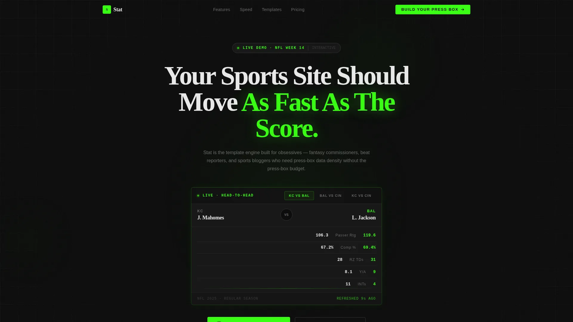
- A dark full-bleed header with a phosphor-green radial glow and a live, draggable head-to-head stat comparison widget loaded with two NFL quarterback profiles.
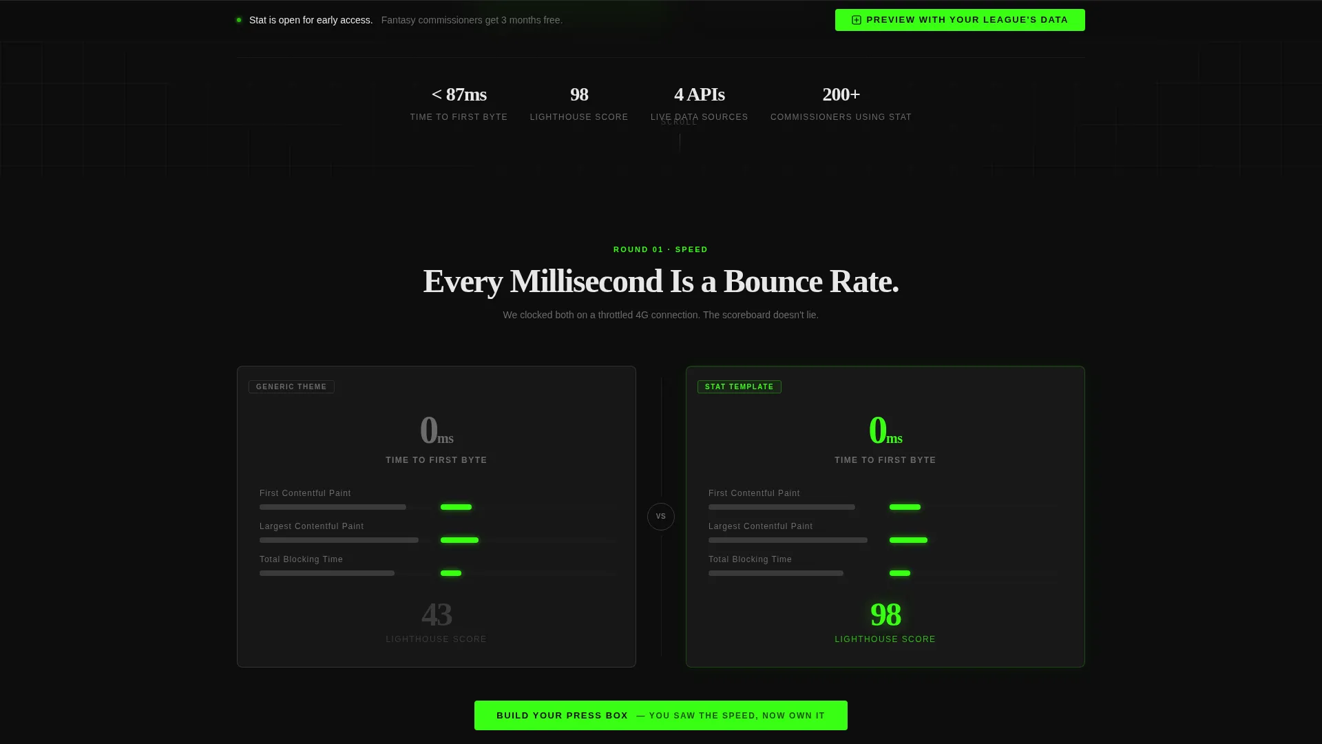
- A versus-architecture scroll that pairs a generic sports theme card against a Stat template card across four key dimensions: load speed, mobile responsiveness, stat integration, and customization depth.
- A sticky bottom bar holding a secondary call to action that opens a three-field modal configured like a cockpit, asking for sport type, team count, and primary stat focus.
Feature list
This section covers the core capabilities built into the template, each grounded in what the source brief describes.
Interactive Head-to-Head Stat Widget
The header widget loads two NFL quarterback profiles side by side, displaying passer rating, completion percentage, and red-zone touchdowns. The widget is draggable and swappable, making the product itself the hero of the page rather than decorative imagery.
Comparison/Versus Card Grid
Every scroll section is a modular two-card comparison. The left card shows a generic sports theme; the right card shows the Stat template. Each pair targets one dimension, so visitors can judge speed, responsiveness, stat display, and customization in isolation without reading a single marketing claim.
Contextual Repeating Call to Action
The primary call to action, "Build Your Press Box," repeats after every third comparison card. Each instance carries a unique contextual subline that references the section just passed, keeping the prompt relevant without feeling repetitive.
Data-Configured Preview Modal
The secondary call to action opens a modal that asks three focused questions: sport type, team count, and primary stat focus. It feels less like a form and more like configuring a display panel, which reduces friction and increases perceived relevance.
Phosphor-Green Interactive Accents
The phosphor-green color (#39FF14) is reserved strictly for interactive elements: toggles, live score indicators, and calls to action. Because it only fires on actionable elements, every green signal carries real meaning and draws the eye without visual noise.
Modular Card Layout System
The template is built on a card-grid structure. Sections are self-contained modules that can be reordered or swapped without breaking the overall layout, giving builders the flexibility to adjust the page for different sports, leagues, or editorial angles.
Page sections overview
| Section | Purpose |
|---|---|
| Dark Full-Bleed Header | Introduces the stat widget and headline in a matte black, glow-lit viewport |
| Head-to-Head Widget | Lets visitors interact with a live QB comparison before scrolling |
| Speed Comparison Cards | Contrasts load time with millisecond counters between themes |
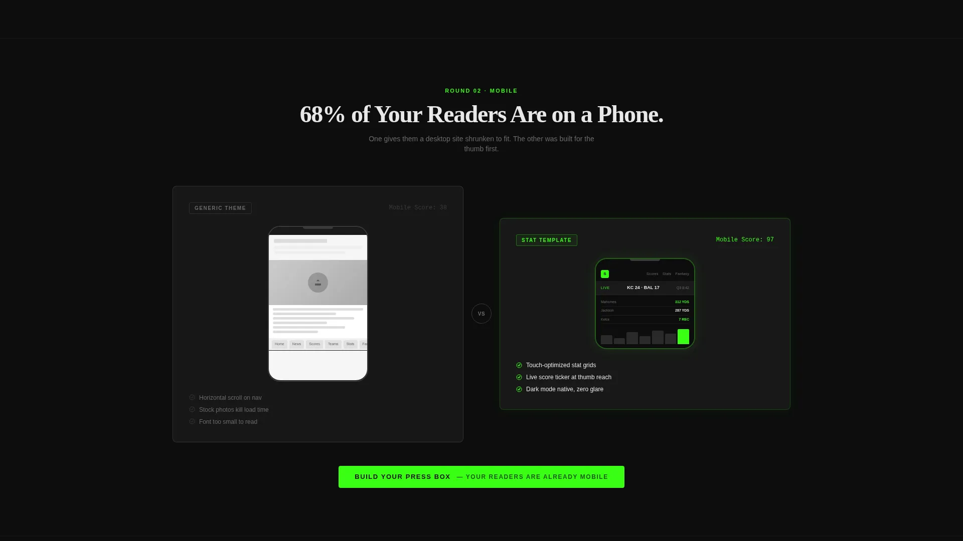
| Mobile Responsiveness Cards | Shows device mockups side by side for layout comparison |
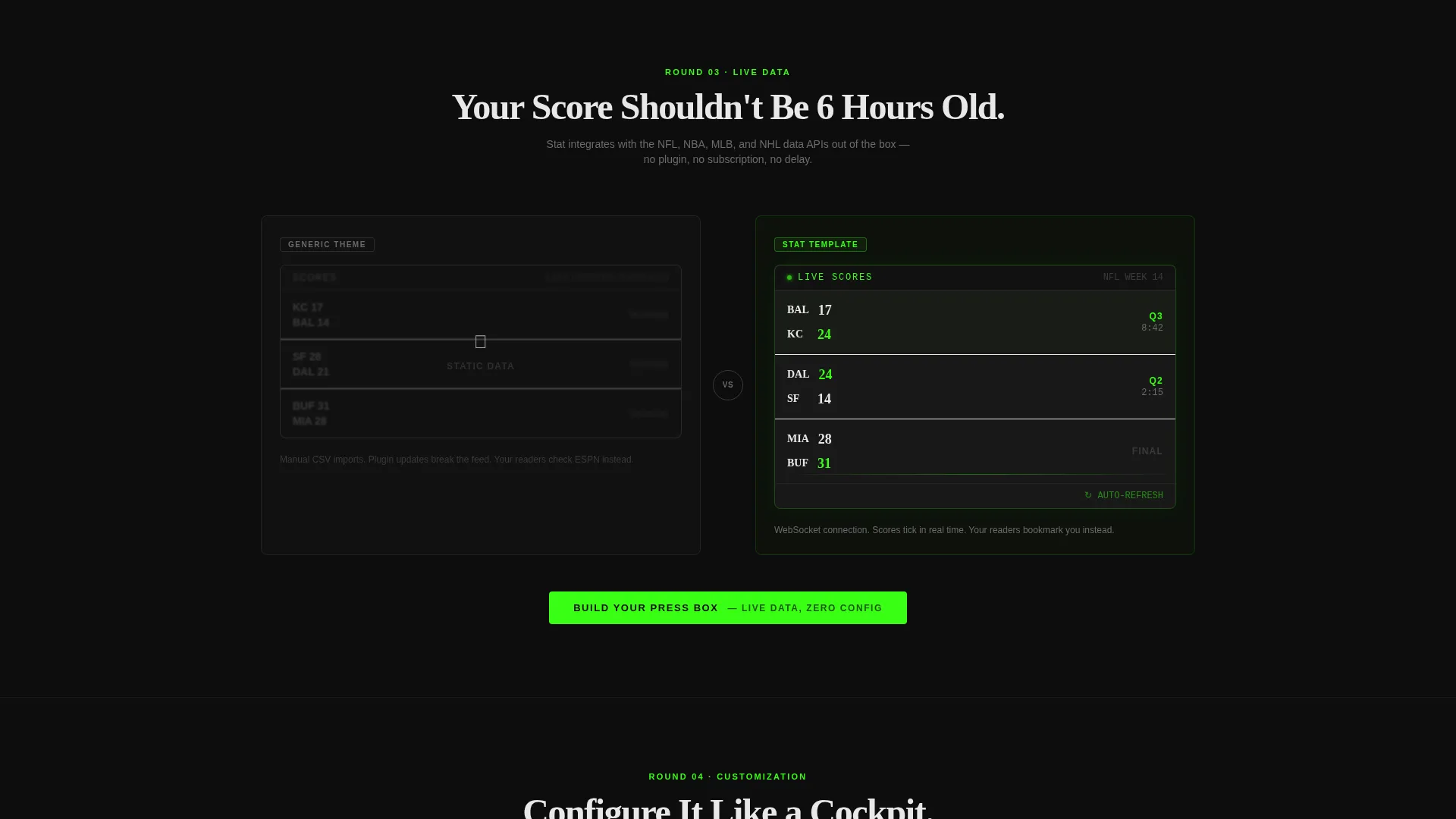
| Stat Integration Cards | Compares live widget previews against static screenshot displays |
| Customization Depth Cards | Features a clickable color-theme toggle the visitor can use directly |
| Primary call to action Block | "Build Your Press Box" with contextual subline after each card group |
| Sticky Bottom Bar | Holds the secondary call to action for persistent, low-friction access |
| Data Preview Modal | Three-field cockpit-style form triggered by the secondary call to action |
Design & branding system
The visual identity follows a Data Command theme built on the Carbon Fiber color system. Every design decision removes decoration and amplifies information.
- Background surfaces stay in the deep carbon black range (#0D0D0D to #1A1A1A), with cards floating on titanium mid-gray (#3A3A3C) borders and cool white (#E8E8E8) used for stat text and labels.
- Phosphor green (#39FF14) appears only on interactive elements, so it functions like a signal light rather than a style choice, giving every green element immediate authority.
- Typography uses condensed white type for the main headline, keeping the visual hierarchy tight and letting the widget carry the visual weight of the page.
Mobile & speed optimization
The template is structured to remain clear and functional on smaller screens. The card-grid module system adapts naturally to narrow viewports without losing the versus-architecture logic.
- Device mockups are embedded directly inside the mobile responsiveness comparison cards, so visitors see the mobile layout in context rather than having to imagine it.
- The modular card system means individual sections load and render independently, which supports a cleaner experience on lower-bandwidth connections.
How this template helps you convert
The conversion logic in this template is built on earned trust. The visitor earns the right to see the call to action by interacting first.
- The header widget puts a live, working tool in front of the visitor immediately. Interaction happens before any scroll, which builds product confidence before a single marketing claim appears.
- The versus-card architecture lets the visitor reach their own conclusion across four measurable dimensions. By the time the primary call to action appears, the case has already been made visually.
- The sticky bottom bar keeps the secondary call to action visible at all times without interrupting the scroll, so the visitor can convert the moment they are ready rather than hunting for a button.
Other information about this template
This template fits naturally into a sports digital presence workflow where the goal is a data-forward site that looks built for the sport, not adapted from a general-purpose theme.
- The template style is Card Grid (Modular), which means each section functions as a standalone unit and can be reconfigured for different league types, stat categories, or editorial structures.
- The header concept is Dark Full-Bleed with Glow, a deliberate design choice that signals the press-box atmosphere described in the brief before any content is read.
- The pricing section is intentionally withheld until the visitor has engaged with at least one interactive widget, following the earn-the-click principle rather than leading with cost.
- This template is categorized under Technology, specifically within the Sports Digital Presence subcategory, making it a strong fit for sports website template buyers who want a professional, data-centered starting point.
Theme
Data Command
Creative direction
Calculator/Tool First
Color system
Carbon Fiber
Style
Card Grid (Modular)
Direction
Comparison/Versus
Page Sections
Interactive Head-to-head Stat Widget
Versus-architecture Card Grid
Contextual Repeating Call to Action
Cockpit-style Preview Modal
Phosphor-green Signal Accents
Modular Card Layout System
Related questions
Can I replace the NFL quarterback data with stats from a different sport?
Does the template include the modal form logic, or is that a separate setup?
Is the versus card grid fixed, or can I add more comparison categories?
Who is the primary buyer for this template?
Will the phosphor-green accent color work if I want to use a different primary color?



