Salesforce Developer Blog Bento Grid Landing Page
Apex is a bento grid landing page template built for Salesforce developer blogs. It pairs a Dynamic Motion visual theme with an Electric Indigo color system to create a dark, code-focused reading experience. The layout runs a Problem-to-Solution arc across escalating bento rows, closing with an app download call to action. Every section is designed to earn trust through working code first.
by Rocket studio
Quick summary
Apex is a single-page bento grid template for Salesforce developer blogs. It opens with an animated stats header, walks readers through a Problem-to-Solution arc across escalating code complexity, and closes with an app download call to action. The visual system feels like a dark-mode code editor, focused, alive, and built for developers who read with intent.
Who this template is for
This template is built for the people who live inside Salesforce tooling. Whether you write occasional triggers or architect multi-org deployments, this layout matches your workflow and your readers' expectations.
- Solo admins writing their first Apex trigger and sharing what they learn
- Mid-level developers running a debug-focused blog or documentation site
- Solution architects publishing patterns around trigger frameworks, platform events, and managed packages
What problem this template solves
Most developer blog templates feel generic. They are built for lifestyle content, not for an audience that spots a bad SOQL query on sight. Salesforce readers need layouts that respect code, reward depth, and get out of the way.
- Standard blog layouts bury code examples inside walls of prose, making patterns hard to scan
- There is no natural way to show a broken implementation alongside its fix without custom design work
- Generic call-to-action sections feel disconnected from a technical content arc that earns trust gradually
What you get with this template
You get a fully structured bento grid landing page designed around the rhythm of Salesforce development. Every section has a defined role, and the visual system ties everything together without distraction.
- An animated stats header with scrolling Apex code in the background and headline delivery after counters finish
- A bento grid body that escalates from simple direct manipulation language operations through trigger frameworks, platform events, and managed packages
- An app download section with App Store and Google Play buttons, an email capture field, and a mobile-pinned layout for the call to action
Feature list
This section covers the core built-in capabilities that define the Apex template.
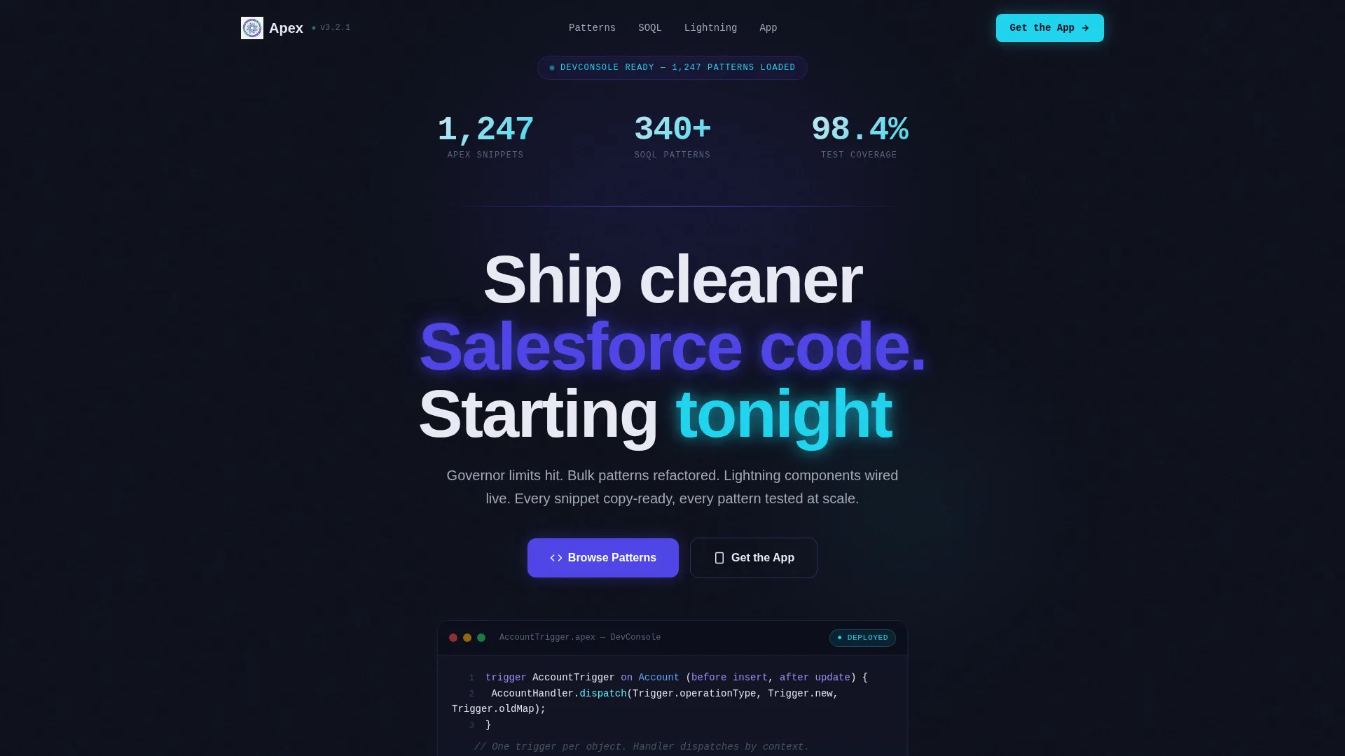
Animated Stats Header
The header opens with three live-feeling counters: "1,247 Apex snippets," "340+ SOQL patterns," and "98.4% test coverage across all examples." Numbers animate upward like a deployment counter. Behind them, faint lines of real Apex trigger syntax scroll vertically, creating a Matrix-style code rain effect. The headline appears only after the counters finish, rewarding readers who pause.
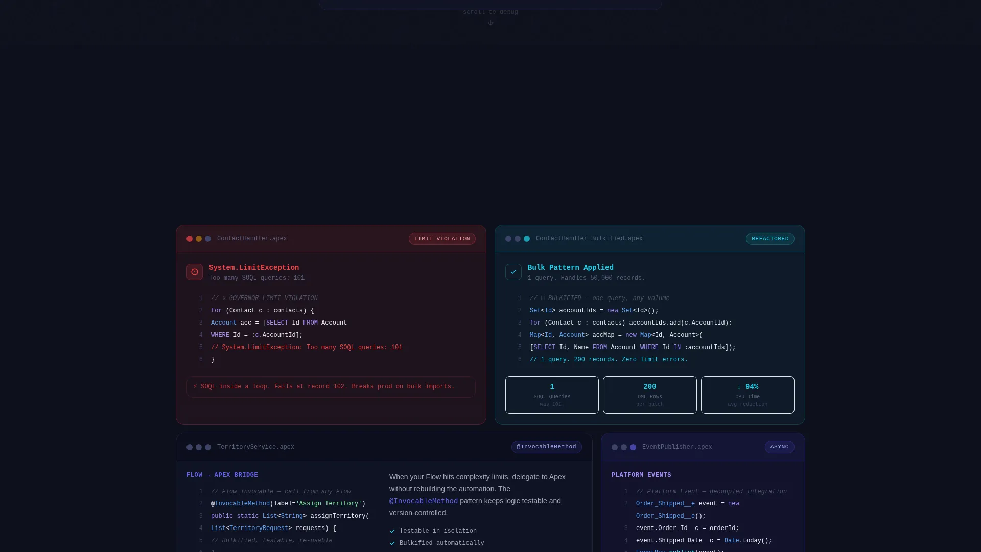
Problem-to-Solution Bento Arc
Each bento row pairs a problem card with a solution card. The first card shows a governor limit violation in red with real error text. The next card reveals the bulkified fix. Complexity escalates row by row: simple direct manipulation language, then trigger frameworks, then platform events, then managed packages. Solution cards slide into view only after the problem card is fully visible, mimicking a real debugging session.
Dynamic Motion Card Behavior
Cards shift subtly on scroll. Code blocks expand on hover. This motion system is not decorative, it maps directly to the mental rhythm developers use when reading logs and evaluating patterns. The grid breathes without distracting from the content.
App Download Call to Action
The call to action reads "Get the Apex Companion App" with a secondary line describing offline snippets, a governor limit calculator, and a deployment checklist. App Store and Google Play buttons sit side by side. On desktop, a single email field lets visitors request the download link for later. On mobile, the call to action is pinned to the bottom of the viewport.
Copy-Ready Code Blocks
Every code snippet in the template is styled for immediate use. Patterns are presented as tested, production-ready examples. Readers can copy directly from any block without reformatting. This removes friction for developers who land on the page looking for a working solution, not a tutorial to read start to finish.
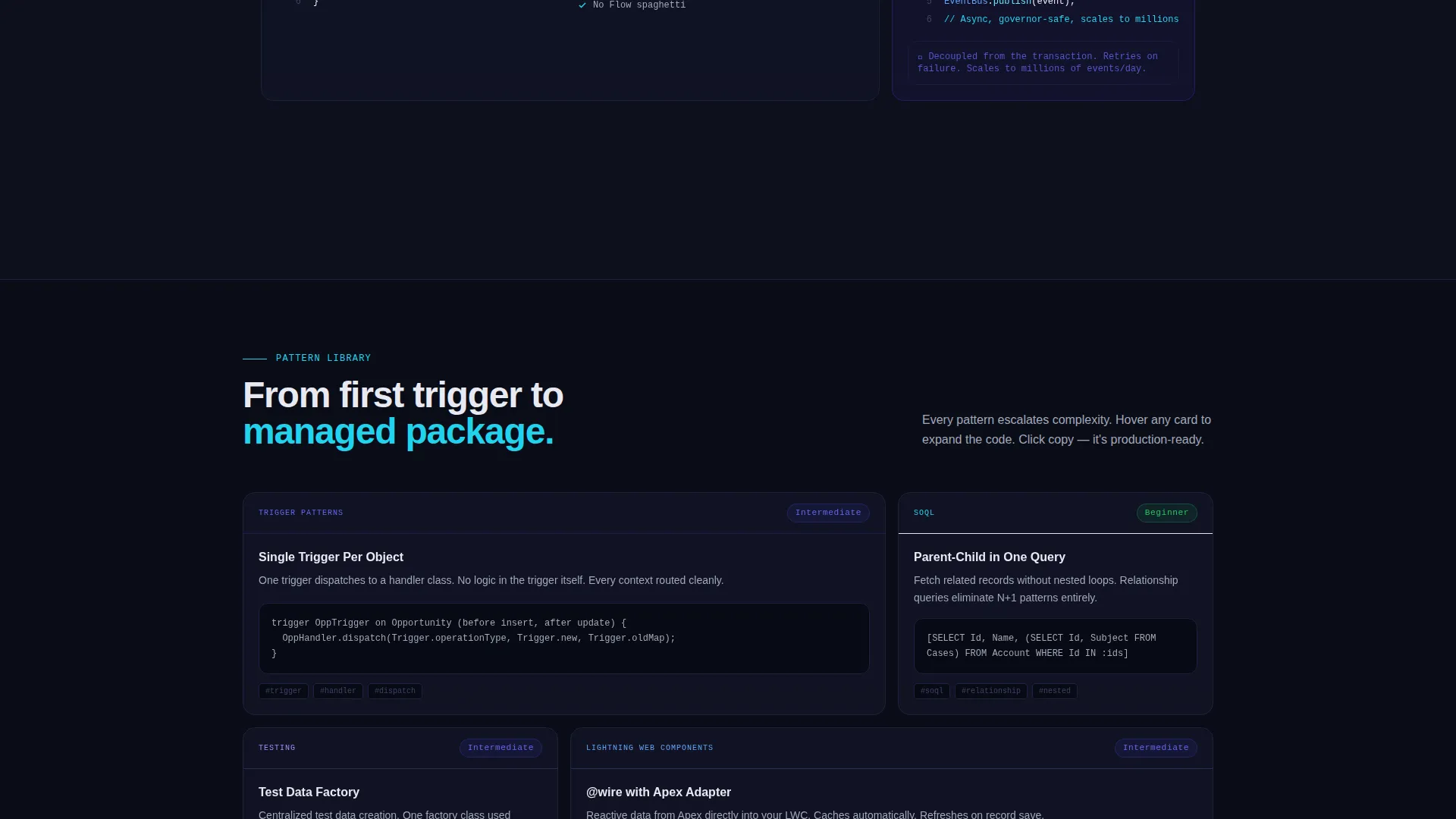
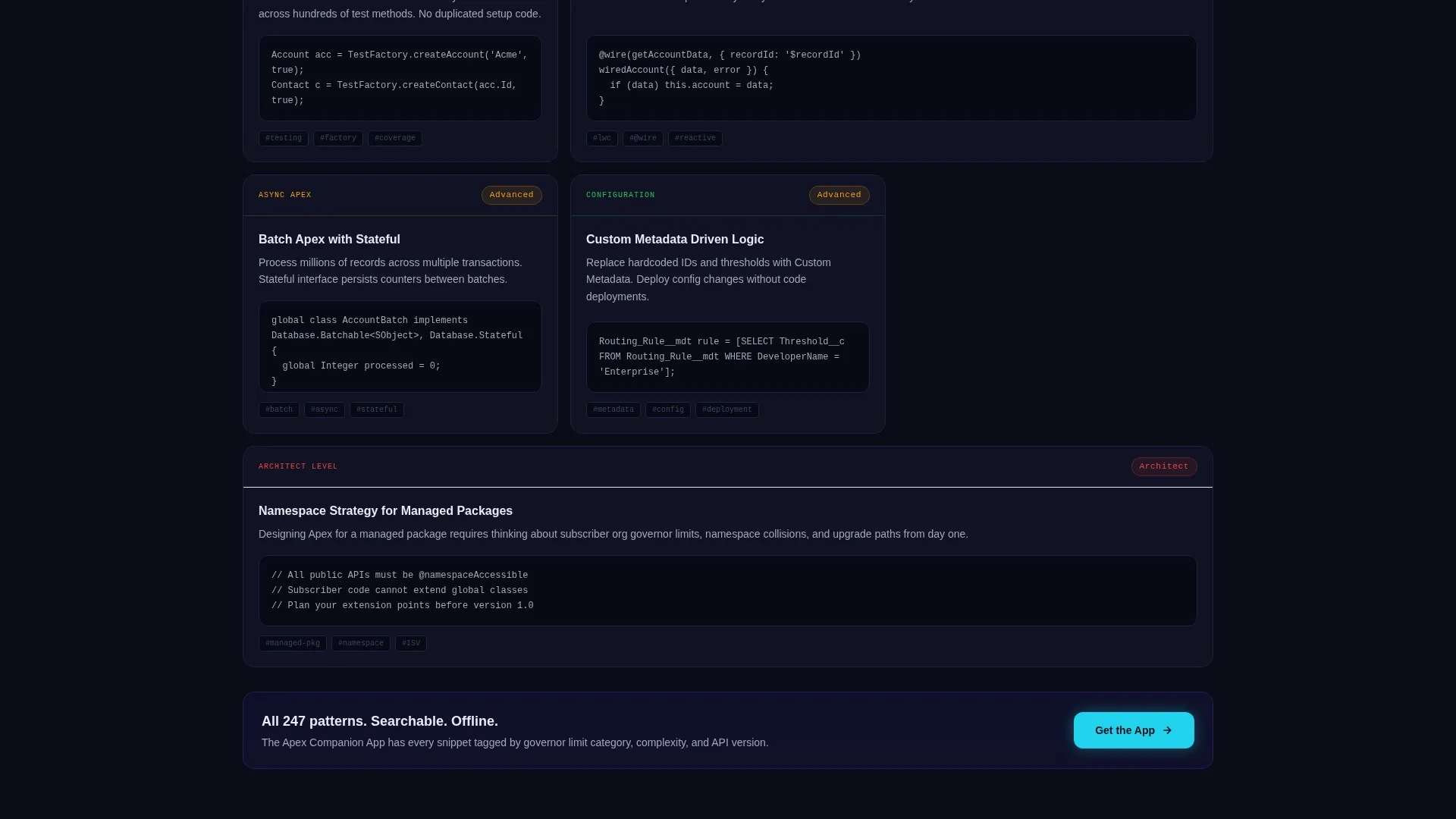
Escalating Complexity Grid Layout
The bento grid is structured so that complexity increases with every row. Early rows handle simple cases. Later rows cover more advanced scenarios like platform events and managed packages. This structure lets readers enter at their skill level and stay engaged as the content matches their growing context.
Page sections overview
| Section | Purpose |
|---|---|
| Animated Stats Header | Opens with counters, code rain background, and delayed headline |
| Problem Card Row | Presents governor limit violation with real red error text |
| Solution Card Row | Reveals bulkified fix after problem card is fully visible |
| Trigger Framework Row | Escalates complexity to trigger framework patterns |
| Platform Events Row | Covers platform event architecture with problem and solution pair |
| Managed Packages Row | Addresses managed package scenarios at highest complexity tier |
| App Download call to action | Drives app installs with store buttons and email capture field |
Design & branding system
The visual identity follows a Dynamic Motion theme built around an Electric Indigo color system. The palette is modeled after a versus Code window open late at night, dark, signal-driven, and alive only where it needs to be.
- Deep terminal black (#0D0F1C) for backgrounds, electric indigo (#4F46E5) pulsing across card borders and hover states, and cool syntax gray (#A3A8B8) for body text
- Hot deploy green (#22D3EE) reserved strictly for success states and call-to-action elements, so it reads as a clear signal every time it appears
- Motion behavior built into the grid: cards shift on scroll, code blocks expand on hover, and solution cards animate into frame only after their paired problem card clears the viewport
Mobile & speed optimization
The template is designed with mobile developer readers in mind. The app download call to action has a specific mobile treatment that keeps the conversion moment always visible.
- The App Store and Google Play buttons are pinned to the bottom of the viewport on mobile, keeping the download action accessible without requiring a scroll back up
- The bento grid reflows naturally for smaller screens, preserving the problem-solution pairing that defines the content arc
- The email capture field for desktop visitors who prefer to install later is hidden on mobile, reducing clutter and keeping the tap target clean
How this template helps you convert
The conversion logic in this template is built into the content sequence itself. Readers are not asked to act before they have seen proof of value.
- The stats header establishes credibility immediately with specific, animated numbers before the reader scrolls a single section
- The Problem-to-Solution arc delivers working code at every row, so by the time the app download call to action appears, the reader has already experienced the template's value three or more times
- The email capture field and pinned mobile buttons give readers two low-friction paths to the app, matching how developers actually behave on desktop versus mobile devices
Other information about this template
This template sits inside the Documentation and Support category under the Salesforce Documentation subcategory, with a niche focus on Salesforce developer blogs. A few additional details are worth noting for anyone evaluating the template for that context.
- The template style is Bento Grid, which suits content-heavy developer pages where each topic benefits from its own contained, scannable card
- The header concept is Stats and Metrics, a proven entry point for technical audiences who evaluate credibility through numbers before reading prose
- The creative direction is a Problem-to-Solution Arc, which aligns naturally with how Salesforce developers already think: identify the error, isolate the cause, ship the fix
- The landing page direction is App Download, meaning the entire scroll sequence is oriented toward a single measurable action at the end
Theme
Dynamic Motion
Creative direction
Problem→Solution Arc
Color system
Electric Indigo
Style
Bento Grid
Direction
App Download
Page Sections
Animated Stats Header with Code Rain
Problem-to-solution Bento Arc
Dynamic Motion Card Behavior
App Download Call to Action Section
Copy-ready Code Blocks
Mobile-pinned Call to Action Layout
Related questions
Who is the target reader for a blog using this template?
Can I use this template if my blog covers both beginner and advanced Salesforce topics?
Does the template include the Apex Companion App itself?
How does the Problem-to-Solution Arc work inside the bento grid?
Is the email capture field part of the app download section?


