Field Ops Landing Page Template
Dispatch is a bento grid landing page template built for home services order management platforms. It targets operations managers running mid-size fleets of 15 to 80 trucks. The design follows a Data Command theme with an Electric Indigo color system, and the page leads with an interactive scheduling cost calculator that turns visitor pain into personalized numbers before a single sales claim appears.
by Rocket studio
Quick summary
Dispatch is a single-page bento grid template designed for home services scheduling and work order platforms. It opens with a live cost estimator, flows through an industry-report-style data briefing, and closes with a side-by-side comparison tool. Every section is built to show operations managers exactly what chaotic scheduling is costing them right now.
Who this template is for
This template is built for software companies and SaaS founders selling platforms to the home services industry. If your buyers are operations managers juggling multiple trucks, dispatchers, and work orders, this template speaks their language directly.
- Operations teams at mid-size home services companies running 15 to 80 trucks
- SaaS founders and product marketers in the field service and home services software space
- Agencies building conversion-focused landing pages for scheduling or dispatch tools
What problem this template solves
Home services operations managers often manage their day across whiteboards, shared spreadsheets, and verbal communication from dispatchers. That fragmented setup creates scheduling gaps, unbilled hours, and double-booked technicians. A generic landing page cannot communicate the real cost of that chaos.
- Visitors do not feel the pain clearly enough to act, because abstract feature lists do not translate to dollars lost
- Comparison with current tools is left to the buyer's imagination, reducing trust and slowing decisions
- Short forms that feel like sales traps push qualified buyers away before they convert
What you get with this template
You get a fully structured bento grid landing page that leads with data and earns trust before asking for anything. The layout is designed to guide a skeptical operations manager from "I'm curious" to "I need to see this side by side with my current tool."
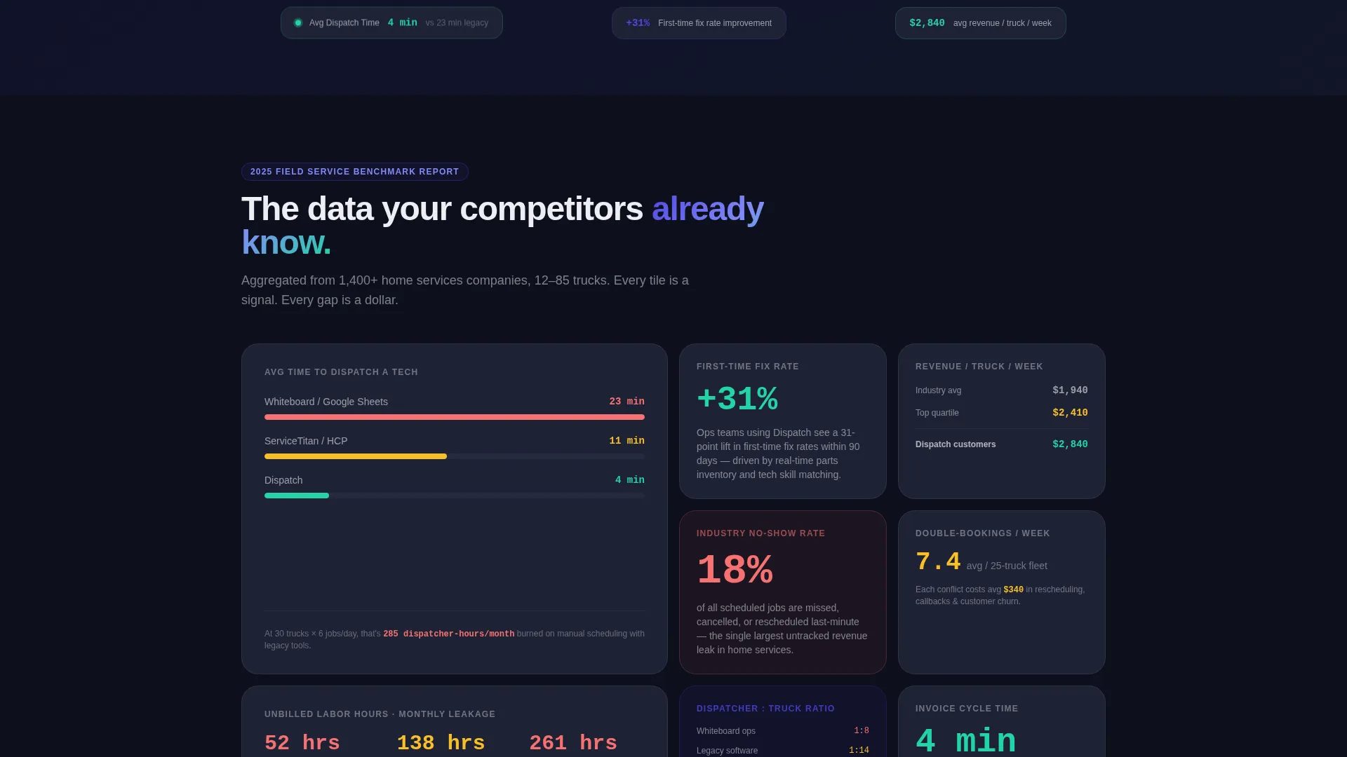
- An interactive header calculator that surfaces personalized cost estimates based on truck count, jobs per day, and no-show rate
- A scrollable industry-report-style grid of metric tiles, stat comparisons, and mini case study panels
- A sticky comparison bar, a three-field intake form, and a gated PDF benchmark report download path
Feature list
This section covers the core functional components built into the Dispatch template.
Interactive Cost Estimator Header
The header is a working calculator, not a hero image. Visitors input their truck count, average jobs per day, and current no-show rate. The tool instantly surfaces estimated dollars lost to scheduling gaps, unbilled hours, and double-booked technicians. Numbers render in large indigo type and update live as sliders move.
Bento Grid Data Briefing Layout
The scroll experience follows an industry report structure. Small metric cards display single stats. Larger tiles expand into mini case studies showing fleet size and return-on-investment timelines. The rhythm mirrors a well-designed benchmark report, with each data point building urgency around the visitor's current workflow.
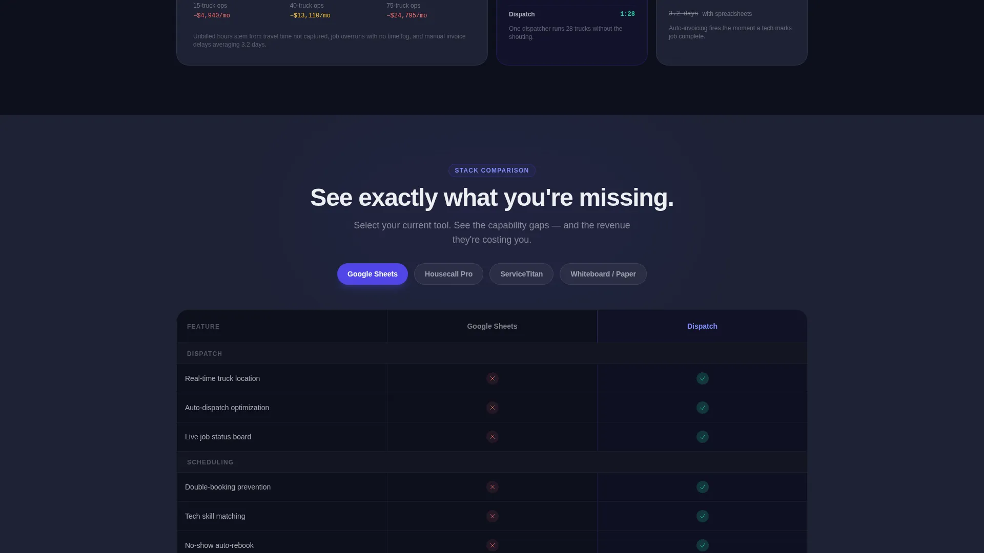
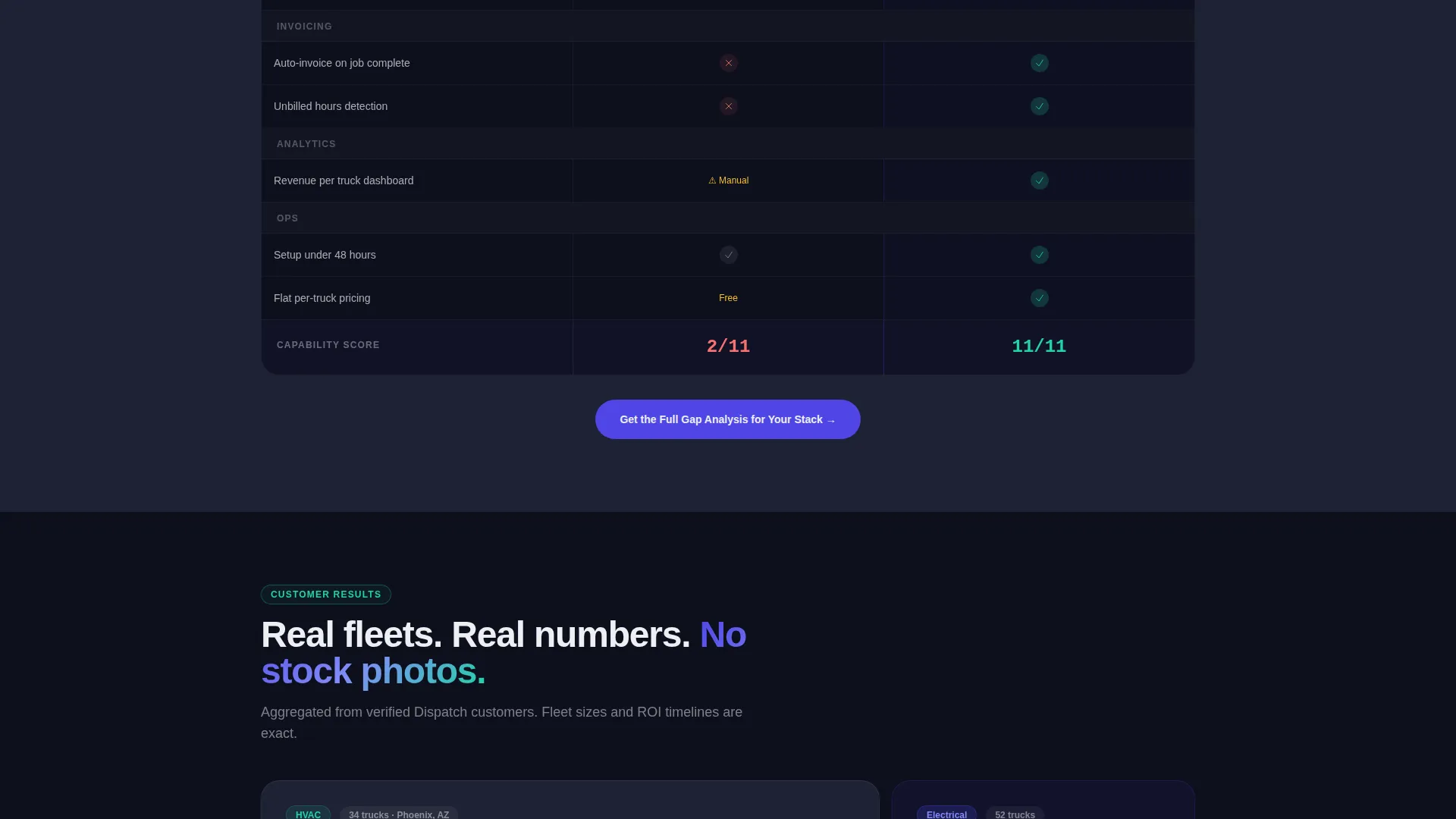
Persistent Sticky Comparison Bar
A sticky bar stays visible during the entire scroll. It carries the call to action "See Your Stack Side-by-Side" and links to a feature comparison tool. Visitors select their current software category and see a live capability gap matrix in response.
Three-Field Conversion Form
The primary intake form asks only for company name, truck count, and current tool. Three fields designed to feel like answering a quick survey rather than submitting to a sales funnel. This low-friction entry point is central to the template's conversion strategy.
Gated PDF Benchmark Report
A secondary conversion path offers a downloadable PDF benchmark report. It is gated behind an email address, targeting visitors who are still doing research and are not yet ready to book a demo. This path captures intent early without forcing a sales conversation.
Electric Indigo Visual System
The entire template uses a consistent dark-field color system. Deep navy, live-wire indigo, cool interface gray, signal-white text, and volt-green status indicators combine to create a control-room aesthetic. The visual language feels functional and serious, matching the mindset of an operations manager at the start of a shift.
Page sections overview
| Section | Purpose |
|---|---|
| Calculator Header | Personalizes cost of scheduling gaps using live slider inputs |
| Metric Stat Cards | Displays single benchmark stats in compact bento tiles |
| Mini Case Studies | Expands into fleet-size and return-on-investment panels |
| Sticky Comparison Bar | Keeps the side-by-side call to action visible throughout the scroll |
| Comparison Tool | Shows capability gap matrix based on selected current tool |
| Three-Field Form | Captures company name, truck count, and current tool used |
| PDF Gated Download | Offers benchmark report in exchange for an email address |
Design & branding system
The Dispatch template uses a Data Command visual theme built around an Electric Indigo color system. The palette is designed to feel like a live dispatch center at the start of a workday, with screens already active and data already moving.
- Core colors: deep control-room navy (#0D0F1C), live-wire indigo (#4F46E5), cool interface gray (#1E2235), and signal-white text (#EDEEF2)
- Volt-green (#22D3A7) is reserved exclusively for positive metrics and active status indicators
- No stock photography or hero illustrations are used; large numerical displays and data tiles carry the visual weight
Mobile & speed optimization
The bento grid layout is built to adapt from wide desktop displays down to smaller screens without losing its data-forward hierarchy. Interactive elements are sized for touch input, and the sticky comparison bar remains functional across viewport sizes.
- Bento tiles reflow into a single-column stack on smaller screens, keeping each metric card readable and tappable
- The calculator header scales its slider inputs and live number displays for mobile interaction without layout breakage
How this template helps you convert
The Dispatch template is engineered around a specific buyer journey: hook with personalized financial pain, build credibility through data, then offer a low-friction entry point.
- The live cost estimator makes the problem personal before any feature claim appears, giving the visitor a number they calculated themselves and cannot easily dismiss.
- The sticky comparison bar and side-by-side tool remove the mental work of evaluating alternatives, making the gap between the visitor's current setup and the platform immediately visible.
- Two distinct conversion paths, a short form and a gated PDF download, meet buyers at different stages of readiness without forcing either group into the wrong funnel.
Other information about this template
The Dispatch template is a strong fit for the home services software market, where buyers are practical, time-short, and deeply skeptical of feature-list marketing. The template's industry-report creative direction is specifically chosen to match how operations professionals consume information.
- The template style is a bento grid, which suits data-dense presentations without feeling cluttered
- The header concept is a Calculator/Estimator, a proven format for field service and home services order management tools that need to justify switching costs
- The landing page direction is Comparison/Versus, which aligns with buyers who are actively evaluating their current stack against alternatives
- This template can support use cases across plumbing, electrical, and HVAC (heating, ventilation, and air conditioning) dispatch software, as well as broader field service management platforms

Theme
Data Command
Creative direction
Industry Report
Color system
Electric Indigo
Style
Bento Grid
Direction
Comparison/Versus
Page Sections
Live Cost Estimator Calculator
Bento Grid Industry Report Layout
Sticky Side-by-side Comparison Bar
Low-friction Three-field Form
Gated PDF Benchmark Download
Data Command Color System
Related questions
Who is this template designed for?
Can I use this template if I do not have real benchmark data yet?
How does the cost calculator section work?
What are the two conversion paths in this template?
Is this template suitable for other field service categories beyond home services?


