High Converting Estate Landing Page Template
Pulse is a real estate newsletter landing page template built for solo agents, team leads, and investor-focused brokers. It uses a dark, data-forward visual style to make weekly market updates feel sharp and professional. A comparison table, stats-first scroll rhythm, and a single friction-free call to action work together to move visitors toward their first template preview.
by Rocket studio
Quick summary
Pulse is a single-page newsletter template built for real estate professionals who want their weekly market digests to look like they came from a prop-tech startup. The layout opens with a live dashboard preview, moves through a stats-first scroll, and closes with a comparison table that makes every alternative look dated by contrast.
Who this template is for
This template is designed for real estate professionals who send regular market updates and want their emails to match the quality of their brand.
- Solo agents building a personal brand through weekly neighborhood newsletters
- Team leads distributing Monday market wraps to rosters of up to forty agents
- Investor-focused brokers packaging off-market deal flow into curated subscriber digests
What problem this template solves
Most real estate email newsletters still look like they were assembled from a clip-art folder. The visual gap between what agents send and what subscribers expect from modern communication tools is widening every year.
- Agents spend too long building newsletters from scratch with general-purpose design tools
- Legacy CRM email blasts lack the visual credibility that builds subscriber trust over time
- Hiring a designer for a weekly send is expensive and hard to scale consistently
What you get with this template
You get a fully structured, single-page comparison landing page built specifically to promote a real estate newsletter template. Every section is pre-arranged to guide a visitor from first impression to a confident click.
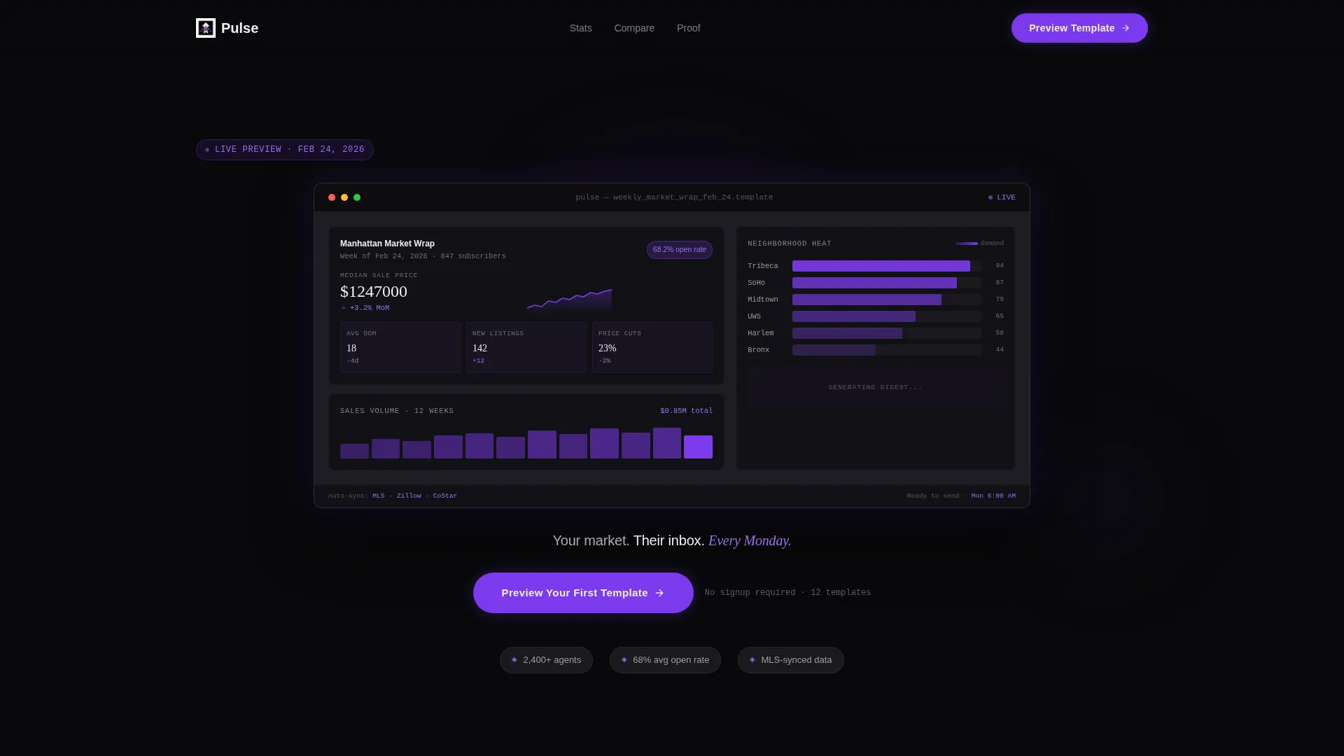
- A dashboard hero section showing a newsletter mid-composition with live-style data elements
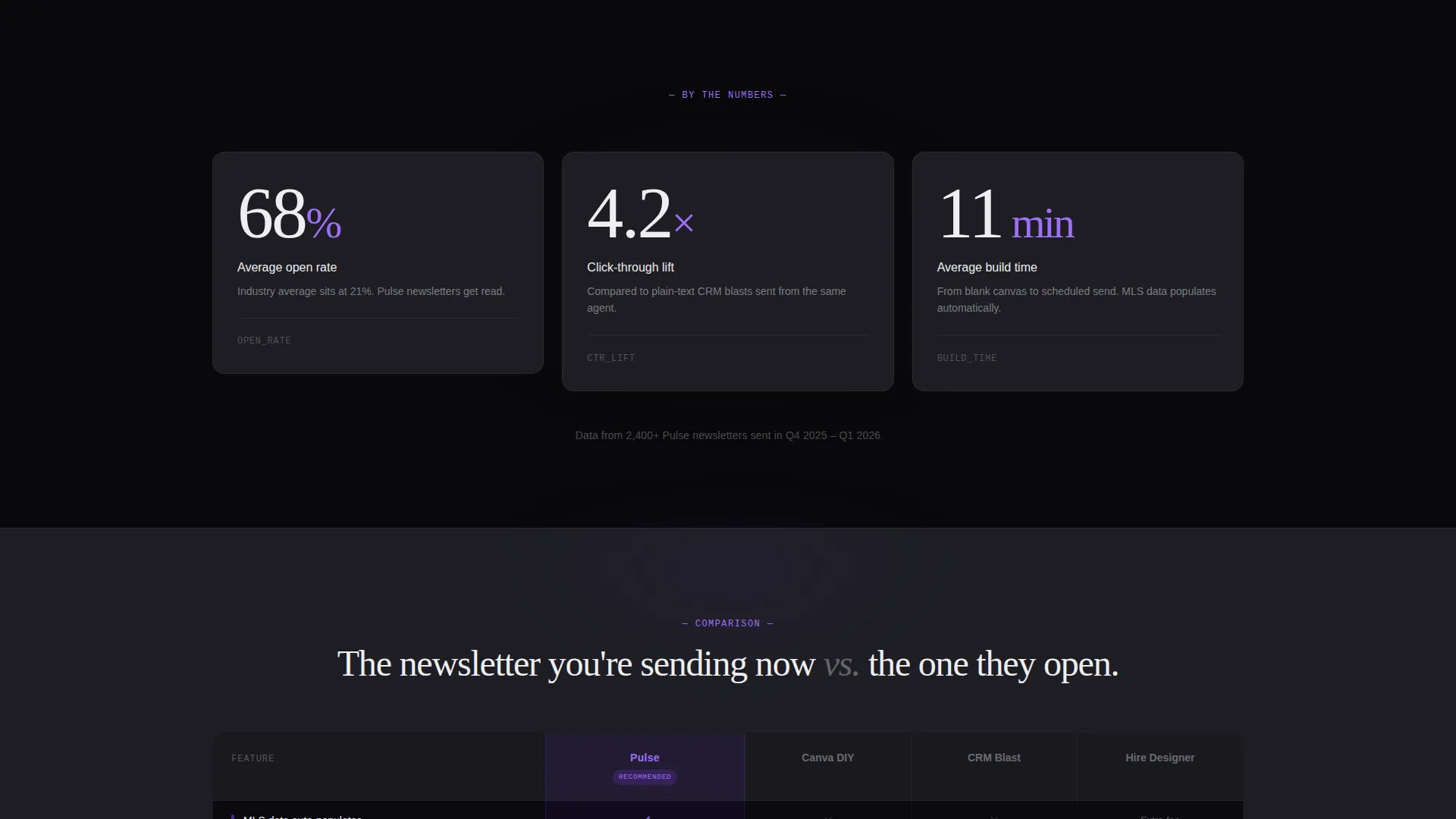
- A stats-first scroll pattern that surfaces open rates, click-through lifts, and build times before explanations arrive
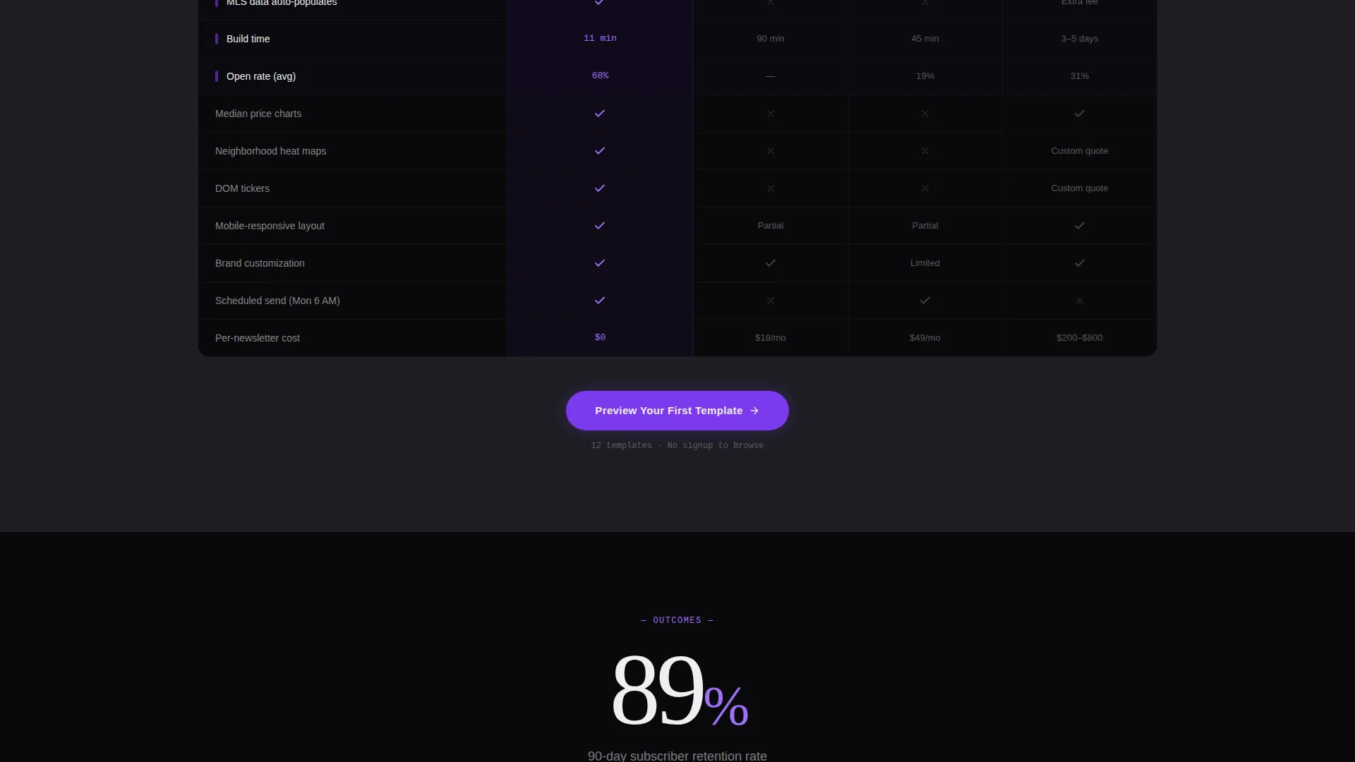
- A three-tier comparison table with violet checkmarks that makes competing approaches look outdated by design
Feature list
This template ships with several purpose-built components that reflect the Pulse newsletter's prop-tech aesthetic and conversion focus.
Dashboard Hero Preview
The header renders a pixel-perfect newsletter mid-composition floating against void black. It includes real median-price charts, DOM tickers, and a neighborhood heat map with violet gradient overlays. One stat counter animates upward and an open-rate badge pulses softly, making the product itself the headline.
Stats-First Scroll Rhythm
Each content section opens with a single oversized number before any explanation arrives. Figures like a 68 percent open rate, a 4.2 times click-through lift, and an 11-minute average build time anchor every scroll step. The rhythm is number-then-proof, repeated consistently down the page.
Three-Tier Comparison Table
The comparison table runs three columns side by side with features stacking row by row. Competing approaches occupy the left columns while the Pulse tier carries violet checkmarks against a void background. The layout makes the value gap visible at a glance without requiring any explanation.
Triple-Placed Primary Call to Action
The primary call to action, "Preview Your First Template," appears three times across the page. It floats after the dashboard hero, anchors the comparison table, and closes the page above a final testimonial. There is no form on this page; the click leads directly into a live template gallery.
Testimonial Close Block
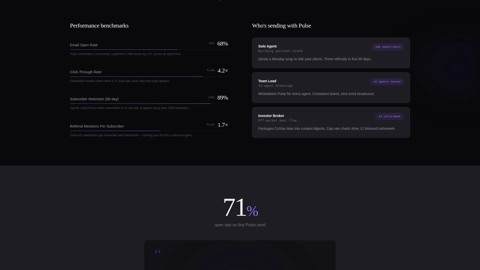
A single agent testimonial sits above the final call to action, citing a specific open-rate improvement. The placement gives late-scrolling visitors one last credibility signal before they commit to the click.
Page sections overview
| Section | Purpose |
|---|---|
| Dashboard Hero | Showcase newsletter mid-composition with live data visuals |
| Animated Stat Bar | Surface open-rate, click-through, and build-time figures |
| Comparison Table | Contrast Pulse against legacy and DIY alternatives |
| call to action Anchor Block | Reinforce the primary call to action mid-page |
| Testimonial Close | Deliver a final credibility signal before the exit call to action |
Design & branding system
The visual identity follows a Startup Velocity theme built around a Void and Violet color system. The palette feels like a Bloomberg terminal redesigned by a startup founder: dark, dense, and addictively readable.
- Core colors are absolute void black (#09090B), deep ultraviolet (#7C3AED), muted graphite (#1E1E24), and phosphor white (#EEEEF0)
- Violet activates across hover states, toggle switches, and chart accents, creating a sense of live interactivity
- Data labels and stat figures use phosphor white to stay crisp and legible against dark backgrounds
Mobile & speed optimization
The landing page layout is designed to maintain its data-dense visual character across screen sizes. Stat blocks, comparison columns, and the dashboard preview are all structured to reflow cleanly on smaller viewports.
- The comparison table adapts its column layout so all three tiers remain readable on mobile screens
- Oversized stat figures and short caption lines scale naturally without breaking the stats-first reading rhythm
How this template helps you convert
The page has one job: make the click feel inevitable. Every structural decision points toward that single outcome.
- The dashboard hero removes the need for a headline by making the product the first thing a visitor sees, establishing desire before a single word of copy is read.
- The stats-first scroll builds progressive urgency, with each new data point making the visitor feel further behind for not already using the template.
- Placing the call to action three times across the page means every visitor, regardless of scroll depth, reaches a click opportunity at the exact moment their interest peaks.
Other information about this template
Pulse fits naturally within the growing category of real estate email templates built for the modern, digitally active agent. It is designed to support use cases ranging from weekly market digests to investor deal-flow summaries.
- The template is categorized under Technology with a subcategory focus on real estate email templates
- It is particularly relevant for professionals exploring real estate newsletter template options that go beyond standard CRM formatting
- The no-form page structure is intentional: friction is deferred to the gallery step, keeping bounce risk low on the landing page itself
- The caption line "Your market. Their inbox. Every Monday." is baked into the hero section as the sole written headline
Theme
Startup Velocity
Creative direction
Stats-First Impact
Color system
Void & Violet
Style
Comparison Table
Direction
Click-Through
Page Sections
Dashboard Hero with Live Data Visuals
Stats-first Scroll Architecture
Three-tier Comparison Table
Triple-placed Call to Action
Agent Testimonial Close Block
Related questions
Who is the Pulse landing page template designed for?
Does this landing page include a sign-up form?
How many times does the call to action appear on the page?
Can I use this template for an investor-focused newsletter?
What makes the comparison table effective in this layout?



