Healthcare Software Advanced Professional Website Template
Triage is a healthcare patient management landing page template built around a modular card grid layout and a data-driven Stats/Metrics header. Designed for clinic staff and practitioners, it showcases scheduling, e-prescribing, patient portal, insurance verification, telehealth, and analytics capabilities through a clean Dashboard Pro interface in a Midnight Blue color system.
by Rocket studio
Quick summary
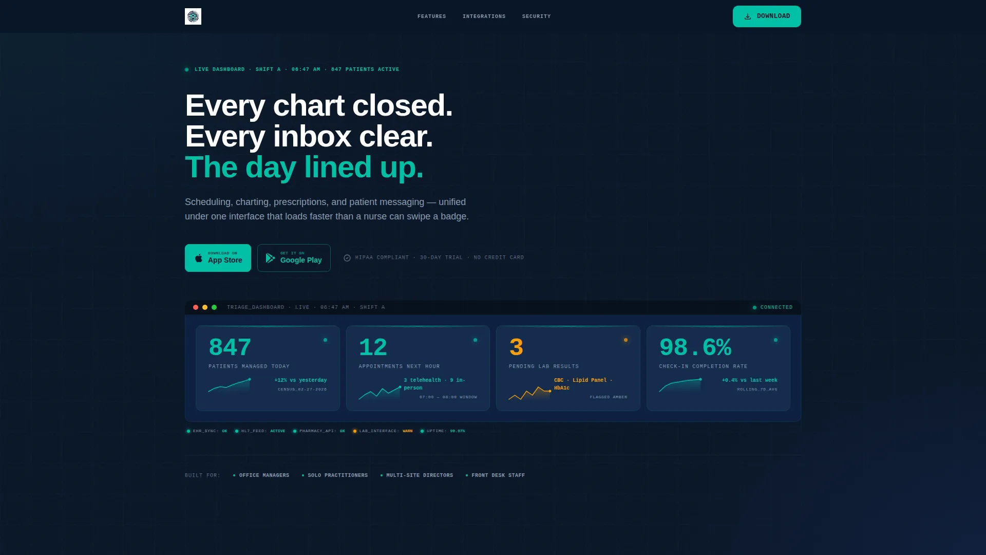
Triage is a single-page, card grid landing page template for healthcare patient management platforms. The header opens with a live-style metrics dashboard showing real operational numbers. Below it, modular capability cards stack in a clinical spec-sheet rhythm. Three strategically placed app download call-to-action blocks drive installs throughout the scroll.
Who this template is for
This template is built for teams and builders who need a no-nonsense, data-first landing page for a healthcare software product. It speaks the language of clinical operations without relying on generic stock imagery or vague promises.
- Office managers handling high volumes of referrals, scheduling, and patient intake
- Solo practitioners who need to consolidate multiple legacy workflows into one interface
- Multi-site clinic directors who require real-time census and operational visibility across locations
What problem this template solves
Healthcare software landing pages often lead with marketing language instead of operational proof. Clinical buyers are skeptical. They need to see evidence before they act. This template solves the credibility gap by leading with specific metrics and stacking capability specs before asking for any commitment.
- Fragmented tools and faxed referrals make it hard to present a unified value proposition
- Generic landing page designs fail to communicate clinical-grade specificity and trust
- Most app download pages bury the call to action instead of placing it where attention is highest
What you get with this template
You get a fully structured, single-page layout designed around a healthcare software product's core capabilities. Every section serves a conversion purpose, and the visual system is already configured to feel clinical, precise, and trustworthy.
- A viewport-wide Stats/Metrics header with live-style patient data, completion rates, and micro-sparkline trend cards
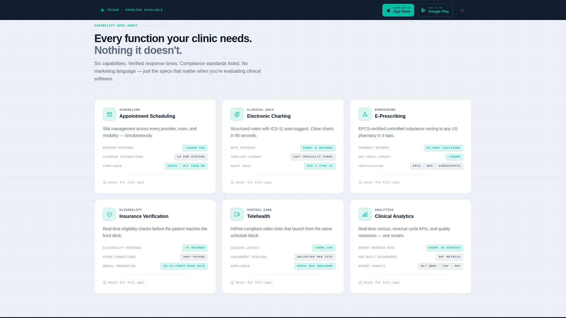
- Six modular capability cards covering appointment scheduling, e-prescribing, patient portal, insurance verification, telehealth, and analytics
- Three app download call-to-action placements including header, mid-scroll, and a sticky bottom bar that activates after 40 percent scroll depth
Feature list
This template includes purpose-built components that reflect real clinical software needs. Each element earns its place on the page.
Live Metrics Header Dashboard
The header spans the full viewport width and displays operational data as frozen mid-shift stats. It shows 847 patients managed, 12 upcoming appointments, 3 flagged lab results, and a 98.6 percent check-in completion rate. Each metric sits inside its own card with a micro-sparkline graph showing weekly trends.
Modular Capability Card Grid
Six uniform-height cards each isolate a single platform capability. Every card carries one icon, one feature name, and three concrete specs covering response time, integration count, and compliance standard. A hover-expand interaction reveals a secondary detail layer, keeping the layout clean while rewarding curiosity.
Tri-Placement App Download calls to action
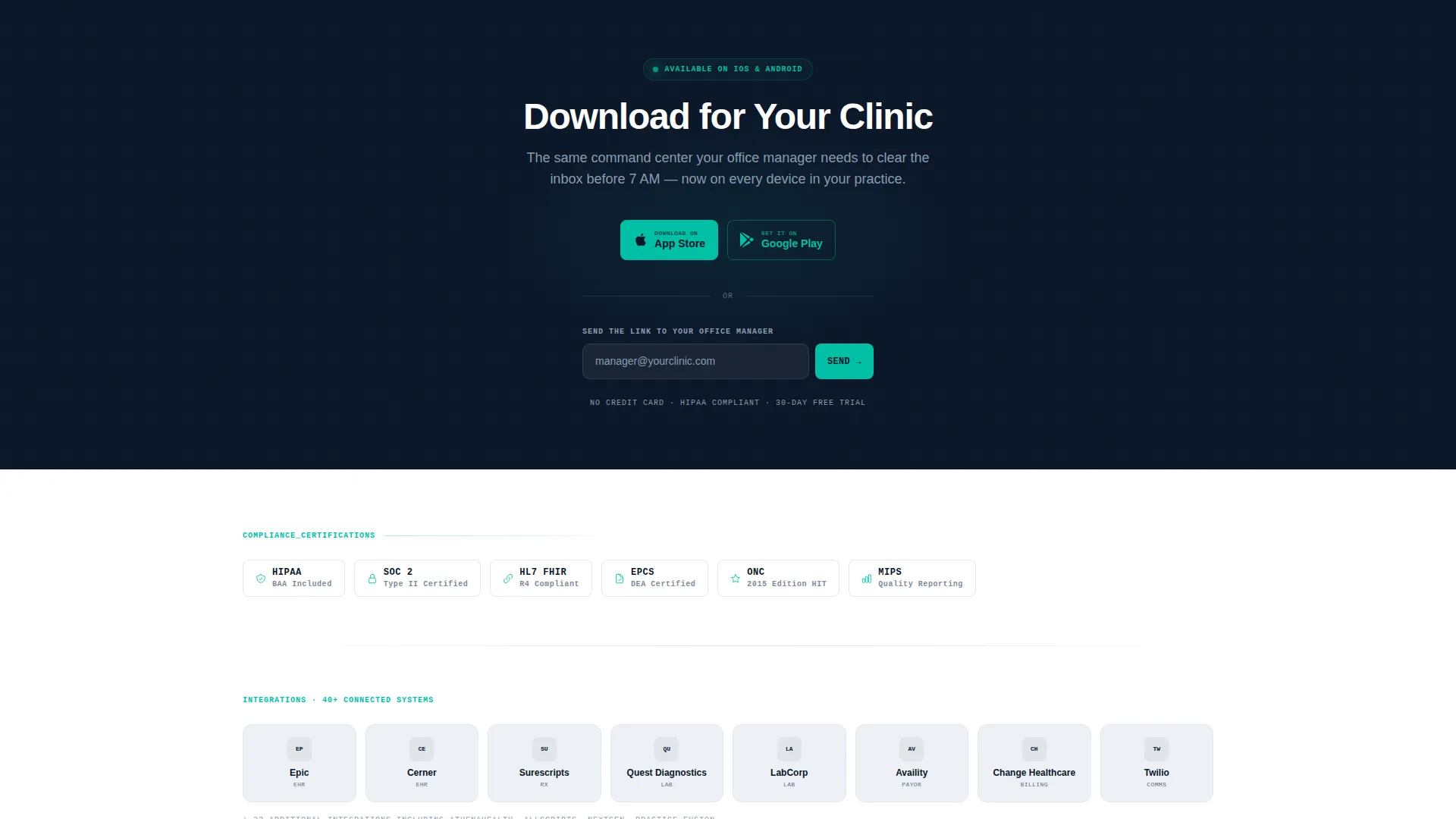
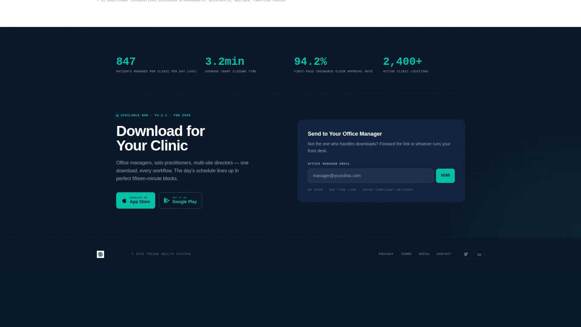
The primary call to action reads "Download for Your Clinic" and appears three times across the page. Paired App Store and Google Play badges accompany each placement. A single-field email input labeled "Or send the link to your office manager" sits alongside the primary download block.
Sticky Bottom Bar
A persistent bottom bar activates after the user scrolls past 40 percent of the page. It surfaces the app download action without interrupting the browsing flow. This placement captures visitors who have read enough to decide but have not yet tapped.
Spec Sheet Card Rhythm
Each capability card follows the same visual structure, making the page scannable like a drug label. No persuasion copy, no lifestyle imagery. The cumulative weight of stacked evidence is the conversion mechanism.
Clinical Dashboard Pro Visual System
The Midnight Blue color palette applies deep navy backgrounds, sterile interface-white card surfaces, muted steel for secondary text, and pulse-point teal exclusively for active buttons, live metrics, and notification badges. The result is a layout that feels like a real clinical operations interface.
Page sections overview
| Section | Purpose |
|---|---|
| Stats/Metrics Header | Opens with live-style patient data to establish operational credibility immediately |
| Scheduling Capability Card | Highlights appointment scheduling specs in a scannable single-card format |
| E-Prescribing Card | Presents e-prescribing capability with response time and compliance detail |
| Patient Portal Card | Communicates patient-facing self-service features in uniform card format |
| Insurance Verification Card | Details insurance check workflow specs within the modular grid |
| Telehealth Card | Covers telehealth capability with mid-scroll app download call to action below it |
| Analytics Card | Closes the capability grid with reporting and census visibility specs |
| Mid-Scroll App call to action | Reinforces the download action after the telehealth card for high-intent visitors |
| Sticky Download Bar | Persistent bar activating at 40 percent scroll depth to capture decided visitors |
| Email Capture Input | Single-field input lets users forward the app link to their office manager |
Design & branding system
The visual identity follows a Dashboard Pro theme built on the Midnight Blue color system. Every color has a defined role, and nothing decorative is added. The palette feels like a hospital corridor at midnight, fluorescent calm with everything labeled.
- Deep clinical navy (#0A1628) anchors all backgrounds; sterile interface white (#EDF0F5) surfaces every card
- Muted steel (#5E6E82) handles secondary text and dividers throughout the layout
- Pulse-point teal (#00BFA6) is reserved exclusively for active-state buttons, live metric figures, and notification badges
Mobile & speed optimization
The modular card grid layout is structured to reflow cleanly from desktop to smaller screens. The sticky bottom bar and tri-placement calls to action maintain their function across device sizes, keeping the download action reachable at every scroll point.
- Uniform card heights and a single-column reflow keep the capability grid readable on mobile viewports
- The sticky bar activates by scroll depth percentage, which works consistently regardless of screen height
- No stock photography or image-heavy hero sections keep the visual payload lean and layout-dependent
How this template helps you convert
This template earns the tap before it asks for it. The conversion architecture moves through proof, depth, and repeated low-friction action points.
- The Stats/Metrics header delivers specific operational numbers in the first viewport, replacing vague promises with data that clinical buyers recognize as real
- Modular capability cards stack evidence progressively, letting visitors self-qualify by scanning the specs most relevant to their workflow
- Three app download placements at header, mid-scroll, and sticky bar meet the visitor wherever they decide, without forcing a scroll back to the top
Other information about this template
This template is a strong fit for teams building or marketing a healthcare patient management platform that distributes primarily through mobile app channels. It prioritizes clinical specificity over lifestyle branding at every design decision.
- The template style is Card Grid (Modular), meaning individual capability sections can be reordered or removed without breaking the layout
- The creative direction is a Spec Sheet, which is intentionally persuasion-free and relies on evidence accumulation rather than emotional copy
- The header concept is Stats/Metrics, which sets a data-first tone that persists throughout the scroll
- The landing page direction is App Download, making this template particularly suited for products distributed via App Store and Google Play
Theme
Dashboard Pro
Creative direction
Spec Sheet
Color system
Midnight Blue
Style
Card Grid (Modular)
Direction
App Download
Page Sections
Live Metrics Header Dashboard
Modular Capability Card Grid
Tri-placement App Download Ctas
Sticky Scroll-activated Bottom Bar
Email Capture for Office Managers
Clinical Dashboard Pro Visual System
Related questions
Who is this template designed for?
Can I customize the capability cards for my specific features?
Does the template include the app download badge graphics?
How does the sticky bottom bar work?
Is the Stats/Metrics header editable?



