Pharmacy Software Professional Website Template
Dispense is a pharmacy patient management landing page template built for independent pharmacy owners, hospital outpatient pharmacists, and small-chain operators. It uses a modular card grid layout with a dark monochrome steel palette and pharmacy green accents to present refill queues, interaction alerts, and insurance reconciliation in one calm, scannable screen.
by Rocket studio
Quick summary
Dispense is a single-page pharmacy patient management template designed to showcase a platform where refill queues, drug interaction alerts, and insurance reconciliation live together. Built on a modular card grid, it uses a surgical dark palette with pharmacy green accents to feel precise, trustworthy, and quietly high-tech.
Who this template is for
This template speaks directly to pharmacy professionals who need to present a complex workflow tool in a clear, credible way. If you are building or marketing a pharmacy management platform, this layout does the heavy lifting.
- Independent pharmacy owners processing high daily prescription volumes
- Hospital outpatient pharmacists coordinating discharge medication workflows
- Small-chain operators who need to move beyond manual claim reconciliation
What problem this template solves
Managing prescriptions, interactions, and insurance claims across a busy dispensary is stressful. A scattered or generic landing page fails to earn trust from a clinically trained audience. This template solves that credibility gap.
- Fragmented workflow tools lack a single view that pharmacy staff can trust at a glance
- Generic software landing pages do not reflect the real operational pace of a dispensary
- Prospective users need to see the product working before they commit to a demo or plan
What you get with this template
You get a fully structured, single-page layout purpose-built for pharmacy software marketing. Every section is designed to answer a specific objection and move the visitor toward action.
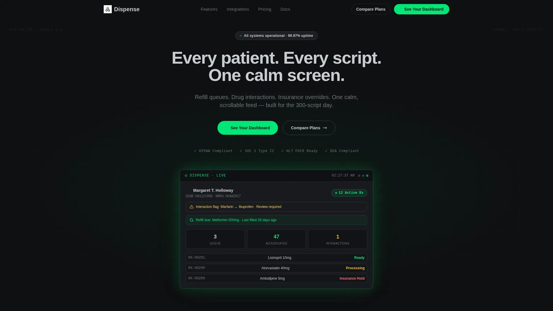
- A dark full-bleed header with a glowing patient dashboard mockup and a headline that types itself in
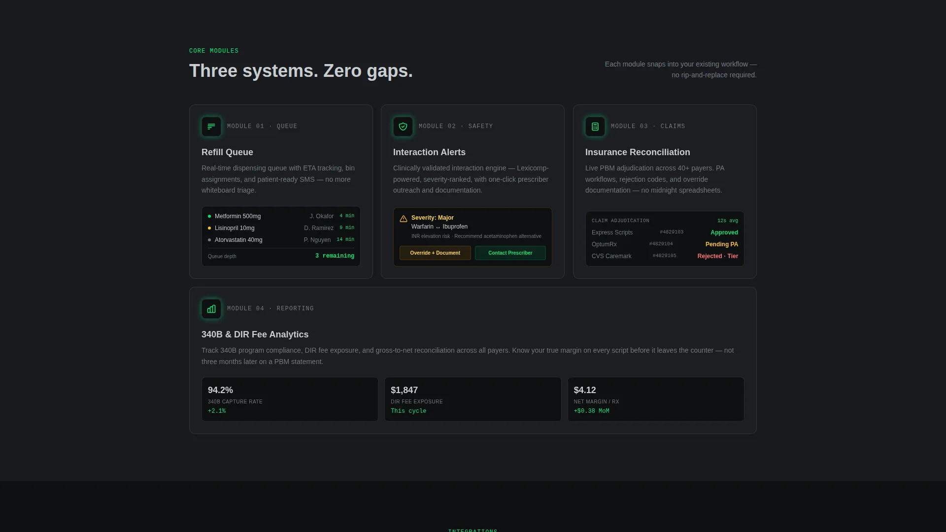
- A three-row card grid covering features, integrations, and live performance metrics
- Dual call-to-action paths: a primary glowing pill button and a ghost-outlined secondary button
Feature list
This template includes purpose-built layout components drawn directly from real pharmacy workflow scenarios. Each card module is designed to mirror what dispensary staff actually see and trust.
Animated Hero Dashboard Mockup
The header centers a softly glowing wireframe mockup of a patient dashboard. It shows a patient name, an active prescription count badge, a refill-due alert, and an interaction flag. The glow emanates from screen edges in pharmacy green, simulating a live monitor in a dark dispensary.
Modular Feature Card Row
Three feature cards occupy the first content row: Refill Queue, Interaction Alerts, and Insurance Reconciliation. Each card carries a glowing green icon that pulses once as it enters the viewport, giving the grid a sense of a system coming online.
Integration Showcase Card
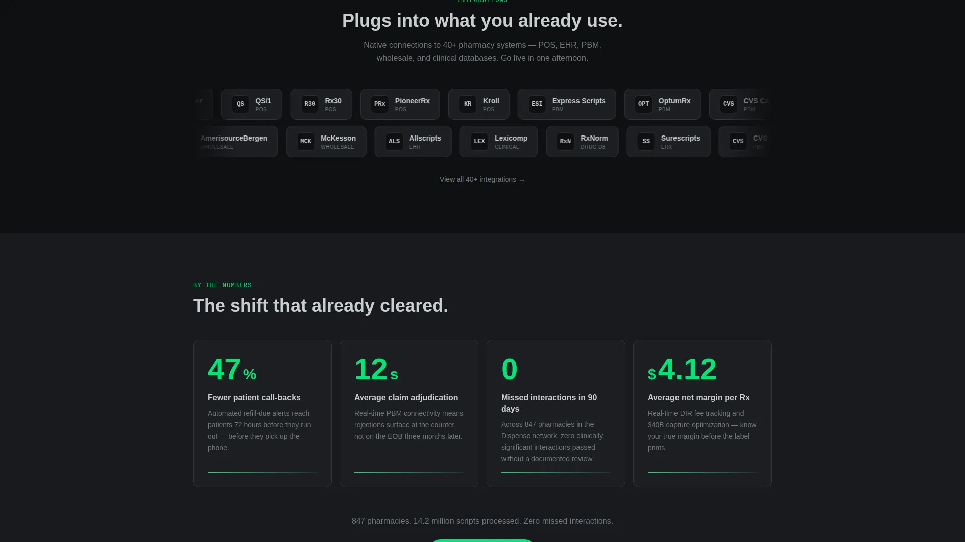
A wider card in the second row tiles pharmacy point-of-sale and electronic health record logos across its surface. This visual reinforces that the platform connects with tools already in use, reducing perceived switching friction.
Metric Counter Cards
The third row displays three performance metrics: 47 percent fewer call-backs, 12-second average claim adjudication, and zero missed interactions in 90 days. Each number counts up as it scrolls into frame, making the data feel live rather than static.
Layered Call-to-Action System
The primary call to action, "See Your Dashboard," appears as a glowing green pill-shaped button in the header. It reappears after the metric row and again as a sticky bottom bar on mobile. A secondary "Compare Plans" ghost button sits alongside for visitors already past the discovery phase.
Testimonial Card with Credential Display
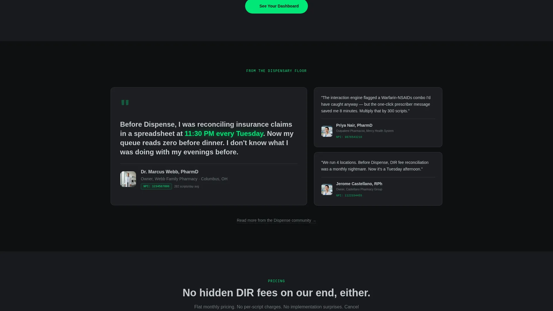
A pharmacist testimonial card includes the reviewer's National Provider Identifier credential, adding clinical authority to social proof. It sits near the bottom of the page, reinforcing trust just before the final call to action.
Page sections overview
| Section | Purpose |
|---|---|
| Dark Hero Header | Introduces the platform with a glowing dashboard mockup and typed headline |
| Feature Card Row | Presents Refill Queue, Interaction Alerts, and Insurance Reconciliation modules |
| Integration Showcase | Shows compatible point-of-sale and electronic health record logos |
| Metric Counter Row | Displays live-style performance statistics with scroll-triggered count-up animation |
| Live Demo Preview | Delivers an animated interface fragment to let visitors see the product in action |
| Pharmacist Testimonial | Builds trust with a real-world quote and National Provider Identifier credential |
| Primary call to action Section | Repeats the "See Your Dashboard" call to action after the metric row |
| Sticky Mobile Bar | Anchors the primary call to action at the bottom of the screen on mobile |
Design & branding system
The palette is built around a Monochrome Steel system that feels surgical, trustworthy, and quietly high-tech. Every color choice is intentional and restrained.
- Base backgrounds alternate between surgical black (#0E0F11) and near-black charcoal (#181A1E); card surfaces sit at instrument steel (#71797E) with subtle 1px borders
- Body text renders in clinical matte (#C8CDD0) for comfortable readability against dark backgrounds
- Pharmacy green (#00E676) appears exclusively on interactive states, live-data pulses, and calls to action, so every green glow carries weight
Mobile & speed optimization
The template is structured to deliver a focused, distraction-free experience on smaller screens without losing the visual hierarchy that makes the desktop version compelling.
- The sticky mobile bottom bar keeps the primary call to action within thumb reach throughout the entire scroll
- Card modules reflow cleanly into a single-column stack on mobile, preserving the row-by-row objection-handling logic
- Scroll-triggered micro-animations are scoped to individual card entries, keeping the experience smooth on touch devices
How this template helps you convert
Every layout decision in Dispense is built around removing doubt and shortening the path to action. The page earns the click before it asks for one.
- Visitors see real interface fragments in the hero mockup before they read a single feature bullet, building immediate product confidence
- The metric counter row answers the "does this actually work?" question with specific, scroll-animated numbers tied to real dispensary outcomes
- The layered call-to-action system ensures that no matter where a visitor drops off, a clear next step is always visible
Other information about this template
This template is part of a Directory and Discovery theme family, using a Launch Energy creative direction that turns scrolling into an unveiling sequence. It is matched to the pharmacy software subcategory under the broader technology category.
- The template style is Card Grid (Modular), making individual sections easy to reorder, replace, or extend
- The header concept is Dark Full-Bleed with a green edge glow, suited to platforms that want a clinical, high-trust first impression
- The landing page direction is Click-Through, routing the primary call to action to a personalized demo environment rather than a static form
- The Intersection Match Score for this niche and template combination is 13, reflecting a strong alignment between the pharmacy patient management use case and the chosen layout and visual system
Theme
Directory & Discovery
Creative direction
Launch Energy
Color system
Monochrome Steel
Style
Card Grid (Modular)
Direction
Click-Through
Page Sections
Animated Hero Dashboard Mockup
Modular Feature Card Grid
Integration Showcase Card
Scroll-triggered Metric Counters
Layered Call-to-action System
Credentialed Pharmacist Testimonial
Related questions
Who is this landing page template designed for?
Can I edit the metric numbers and testimonial details?
Does the template include the scroll animations described in the preview?
What call-to-action paths does this template include?
Is this template suitable for an early-stage pharmacy software product?



