Cloud Architecture Landing Page Template
Architect is a dynamic cloud architecture landing page template built for engineers who think in systems. It combines a live-animated infrastructure diagram, an interactive card grid, and a dark Void & Violet visual identity to give cloud tools an interface that feels as precise as the work itself. The primary call to action drives app downloads across Mac, Linux, and Windows.
by Rocket studio
Quick summary
Architect is a single-page, card-grid landing page template for cloud architecture tools. It opens with a self-assembling infrastructure diagram, escalates through interactive feature cards, and closes with a segmented app-download button. The Void & Violet color system and Dynamic Motion theme make it feel like a live mission-control dashboard rather than a static product page.
Who this template is for
This template is built for teams and individuals who build, teach, or sell cloud infrastructure tooling. It speaks directly to technically fluent audiences who want to see capability before they commit to a download.
- Platform engineers building infrastructure-as-code modules at scale
- Startup founders and CTOs mapping their first cloud topology
- DevOps leads onboarding junior engineers to visual infrastructure workflows
What problem this template solves
Most landing pages for developer tools rely on screenshots and bullet-point feature lists. That approach asks engineers to imagine the experience rather than feel it. Architect solves this by embedding real tool mechanics directly into the page.
- Visitors interact with live micro-demos inside individual cards before they ever reach a download button
- The page removes the friction of blind installs by letting engineers touch the product first
- A secondary "Try in Browser" path keeps skeptical visitors in the funnel without requiring commitment
What you get with this template
You get a fully structured, single-page layout designed around one goal: earning the app download. Every section, animation, and interactive element is scoped to that outcome.
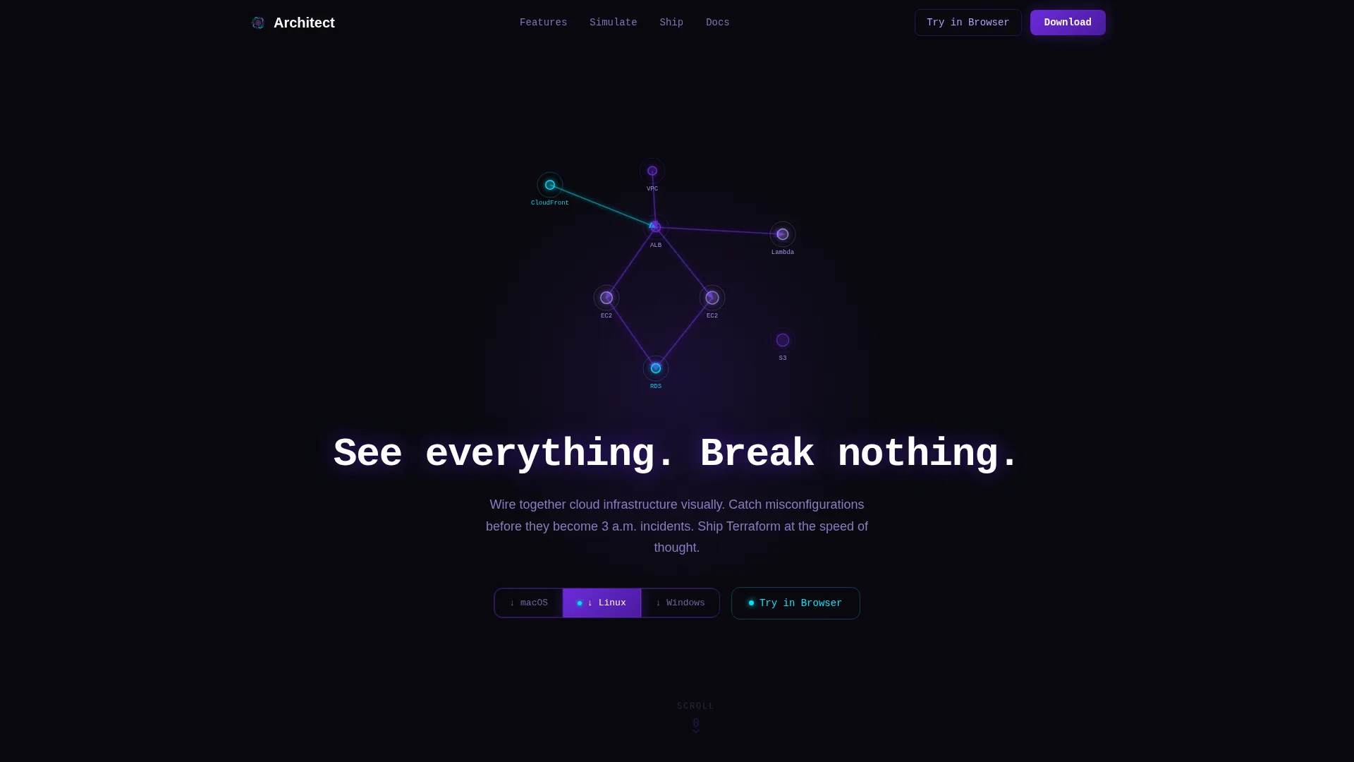
- A dark full-bleed header with a real-time, self-assembling cloud topology animation
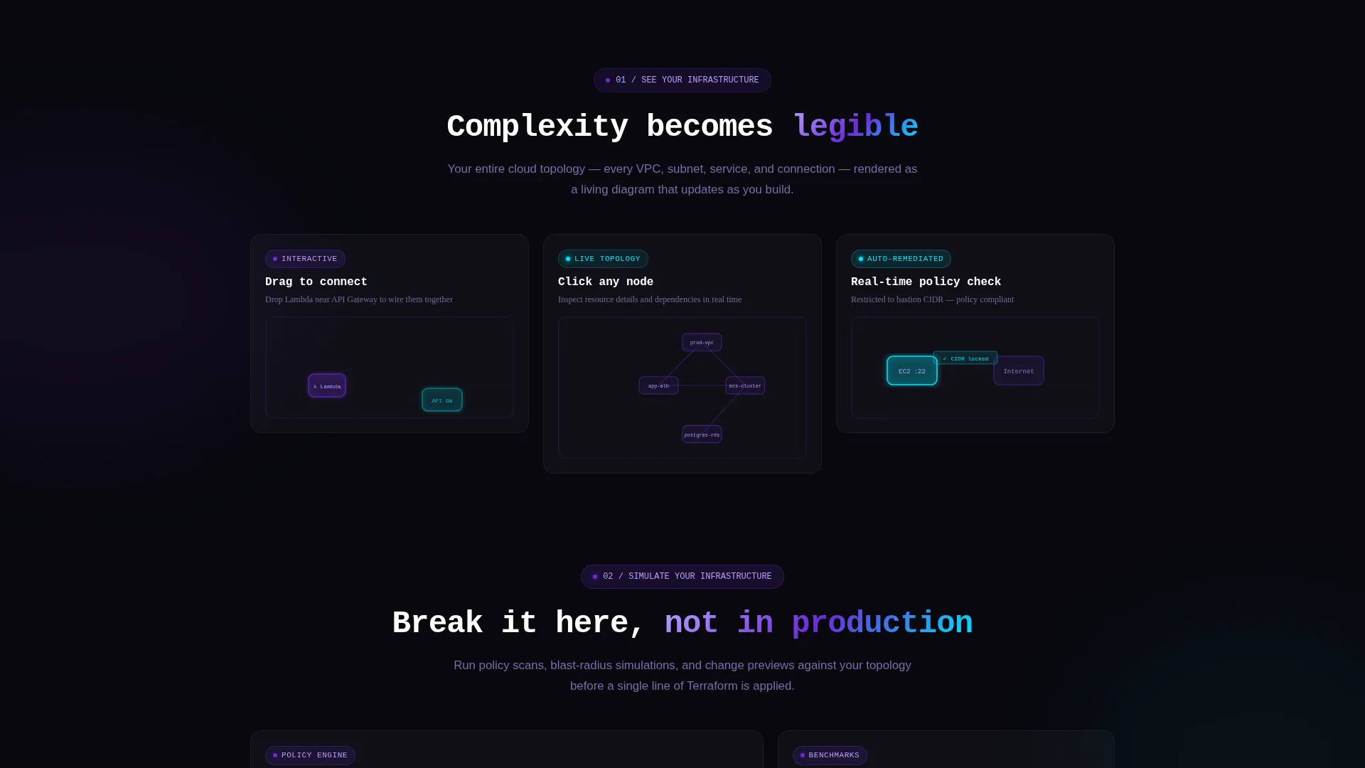
- A modular card grid where each card functions as a self-contained interactive feature demo
- A segmented download button that auto-detects operating system, plus a floating persistent call-to-action bar
Feature list
This template ships with a focused set of interactive and visual capabilities drawn directly from the design brief.
Live Topology Header Animation
The header opens on a void-black full-bleed canvas. A cloud architecture diagram assembles itself in real time: nodes pulse into existence and edges animate between them with violet glow trails. The topology expands outward like a living organism, and the glow from active connections reflects onto the headline text.
Monospace Typewriter Headline
A single headline types itself in monospace font at the center of the header: "See everything. Break nothing." The typewriter effect ties directly to the animation timing, so the words appear as the diagram lights up around them.
Interactive Modular Card Grid
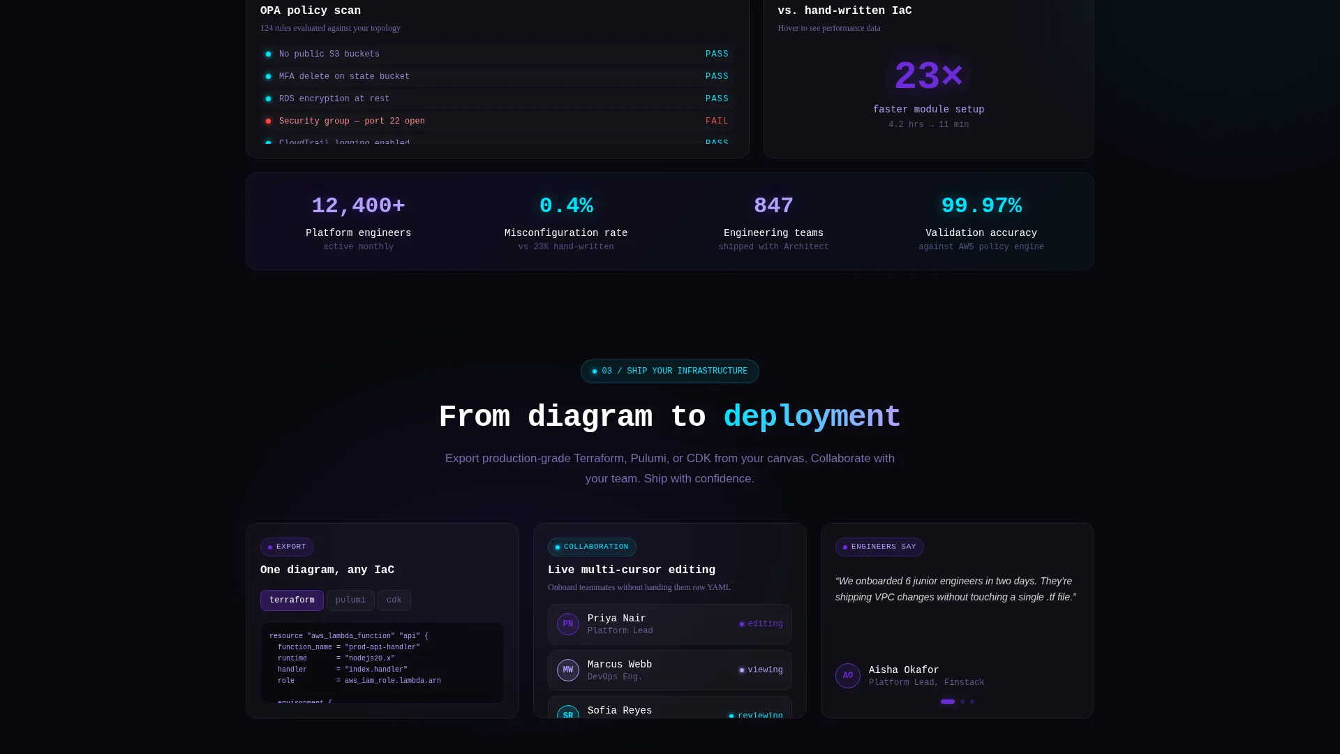
Each card in the grid is a self-contained mini-demo. One card lets a visitor drag a Lambda node onto a micro-canvas and watch it auto-connect to an API Gateway. Another plays a looped animation of a misconfiguration being caught and highlighted in real time. A third card flips on hover to reveal performance benchmarks against hand-written infrastructure-as-code.
Escalating Scroll Narrative
The page is structured so capability compounds as the visitor scrolls. The first row of cards introduces visibility ("see your infra"), the second introduces simulation ("simulate your infra"), and the third drives toward action ("ship your infra"). Card glow intensity increases with each row, reinforcing the sense of growing power.
OS-Detecting Segmented Download Button
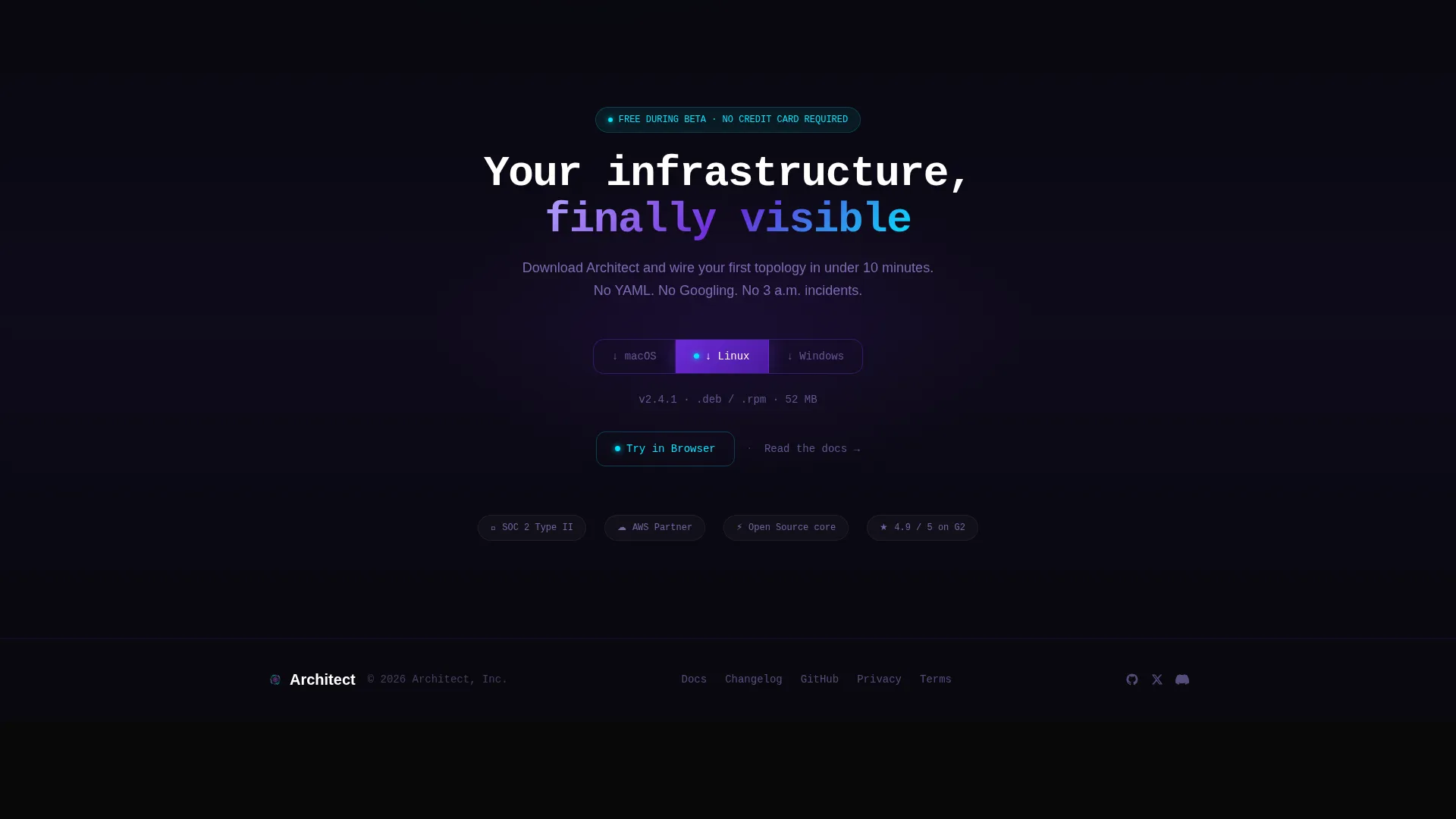
The primary call to action is a segmented button reading "Download for Mac / Linux / Windows." It auto-detects the visitor's operating system and highlights the correct option, while keeping the other two options one click away. The button appears beneath the header and again in a persistent floating bar that slides in after the third card row.
Spring-Physics Micro-Interactions
Every element on the page eases in with spring physics. Cards tilt subtly on cursor proximity. Cyan sparks appear only on confirmed interactions, such as button presses and live-state changes, rewarding touch with light without overloading the visual field.
Page sections overview
| Section | Purpose |
|---|---|
| Full-Bleed Header | Launches live topology animation and typewriter headline |
| Scroll Invite | Downward-pulse animation prompts initial page scroll |
| Card Row One | Introduces infrastructure visibility through interactive demos |
| Card Row Two | Demonstrates real-time misconfiguration detection loop |
| Card Row Three | Shows simulation and performance benchmark flip cards |
| Primary call to action Block | OS-detecting segmented download button below the fold |
| Floating call to action Bar | Persistent download bar that slides in after card row three |
| Browser Try Path | Secondary link to sandboxed web version with demo topology |
Design & branding system
The visual identity uses the Void & Violet color system, a palette designed to feel like a deep-space monitoring dashboard. Darkness is intentional here: it signals depth and precision rather than absence.
- Absolute void black (#09090F) forms the canvas background; deep nebula violet (#6C2BD9) drives primary actions and glow effects; spectral lavender (#B4A0FF) handles secondary text and hover states
- Sharp signal cyan (#00E5FF) appears exclusively on interactive confirmations and live-state indicators, so every cyan moment carries meaning
- Violet gradients bleed softly behind cards like distant nebulae, and card tilt on cursor proximity adds tactile depth without visual noise
Mobile & speed optimization
The Dynamic Motion theme is built with intentional restraint. Motion is constant but never chaotic, so the page remains readable and responsive across screen sizes.
- Spring-physics animations and card tilts are scoped to pointer-capable devices, keeping the mobile experience clean and focused
- The modular card grid reflows naturally for smaller viewports without breaking the escalating scroll narrative
- The floating call-to-action bar is positioned to remain visible and tappable on mobile without obscuring the card content beneath it
How this template helps you convert
The page earns the download before it asks for it. Every structural decision points toward reducing doubt and increasing confidence in the tool.
- The interactive card demos let visitors use real product mechanics inside the page itself, so they arrive at the download button already familiar with the tool's behavior
- The OS-detecting segmented button removes a small but real decision from the download moment, lowering friction at the final step
- The "Try in Browser" secondary path keeps engineers who will not install before touching the product inside the funnel, giving them a direct route to a sandboxed demo
Other information about this template
This template is categorized under Cloud Architecture Technology and is suited for any cloud architecture tool, visual infrastructure-as-code editor, or developer-platform product that needs to demonstrate capability rather than describe it.
- The template style is Card Grid (Modular), making it straightforward to add, remove, or reorder feature cards without rebuilding the layout
- The header concept follows a Dark Full-Bleed with Glow pattern, which is well suited to infrastructure monitoring tools, cloud platform dashboards, and similar developer-facing products
- The creative direction is Interactive Explorer, meaning the page is designed to reward curiosity and hands-on engagement rather than passive reading
- This template aligns with landing pages for tools in the broader cloud infrastructure space, including visual topology editors, infrastructure-as-code frameworks, and platform engineering utilities
Theme
Dynamic Motion
Creative direction
Interactive Explorer
Color system
Void & Violet
Style
Card Grid (Modular)
Direction
App Download
Page Sections
Live Self-assembling Topology Header
Interactive Feature Card Grid
Escalating Scroll Narrative
Os-detecting Download Button
Persistent Floating Call to Action Bar
Spring-physics Micro-interactions
Related questions
Can I customize the card content for a different cloud tool?
Does the OS-detecting download button require custom code?
Is the topology animation in the header editable?
Who is the secondary 'Try in Browser' path intended for?
Can this template support a SaaS product page instead of a direct app download?



