Master Builder Landing Page Template
Scaffold is a construction workflow automation landing page template built for platforms that connect scheduling, submittals, RFIs (Requests for Information), daily logs, and punch lists into one automated pipeline. The template leads with a live cost calculator, a side-by-side comparison table, and oversized customer-data statistics, designed to make the cost of manual workflows impossible to ignore.
by Rocket studio
Quick summary
Scaffold is a single-page comparison landing page template purpose-built for construction workflow automation platforms. It opens with an interactive cost estimator, cascades through a data-heavy comparison table, and punctuates each section with real customer statistics. The visual identity runs on a Carbon Fiber color system that feels technical and site-hardened from the first scroll.
Who this template is for
This template is built for mid-size commercial construction firms and the software platforms that serve them. It speaks directly to the people who feel the daily pain of disconnected project management tools.
- Project managers who juggle too many open tabs across scheduling, submittals, and RFI (Request for Information) tracking
- Superintendents who type the same project update into three separate apps every morning
- Operations directors at commercial firms who lose two or more hours each day to copy-paste workflows
What problem this template solves
Construction teams rarely lose time to one big failure. They lose it to dozens of small, redundant manual steps that nobody ever formally designed. This template makes that invisible cost visible, immediately and personally.
- Visitors arrive without a clear sense of what disconnected tools actually cost them in hours and dollars each month
- Generic feature lists and marketing copy fail to create urgency for buyers who are already used to working around broken workflows
- No standard landing page format lets a prospect see their own numbers reflected back at them before asking for a click
What you get with this template
The template delivers a fully structured, section-led landing page with every layout block a construction software platform needs to convert a skeptical project manager into an active trial user.
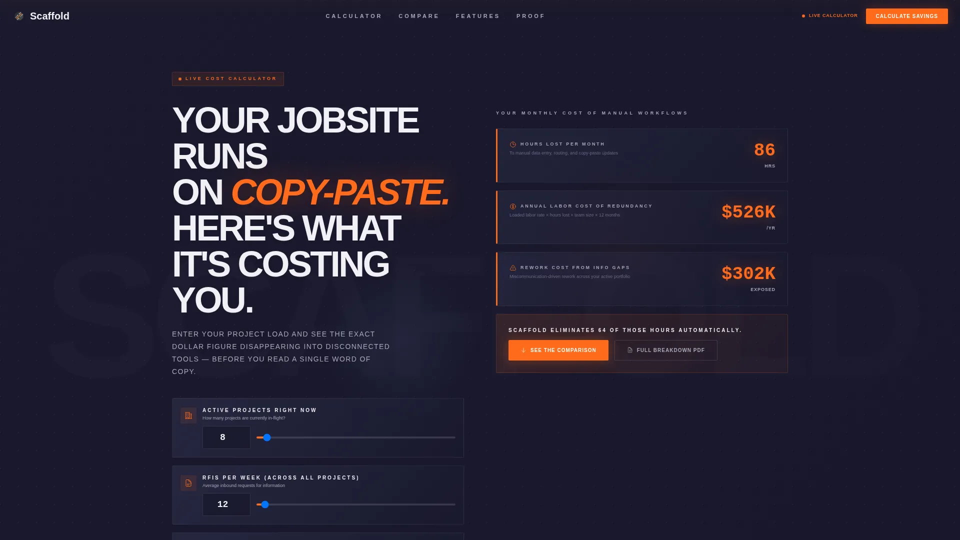
- An interactive calculator header with three input fields and animated, real-time output counters
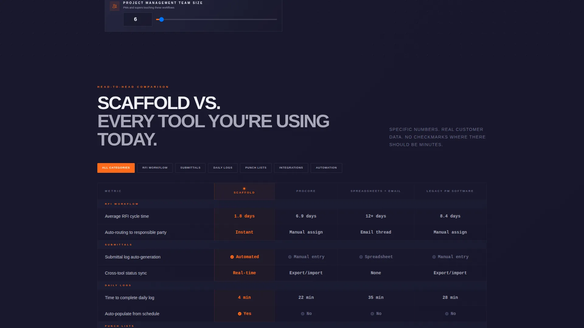
- A multi-row comparison table that benchmarks the platform against competing approaches using specific numbers in every cell
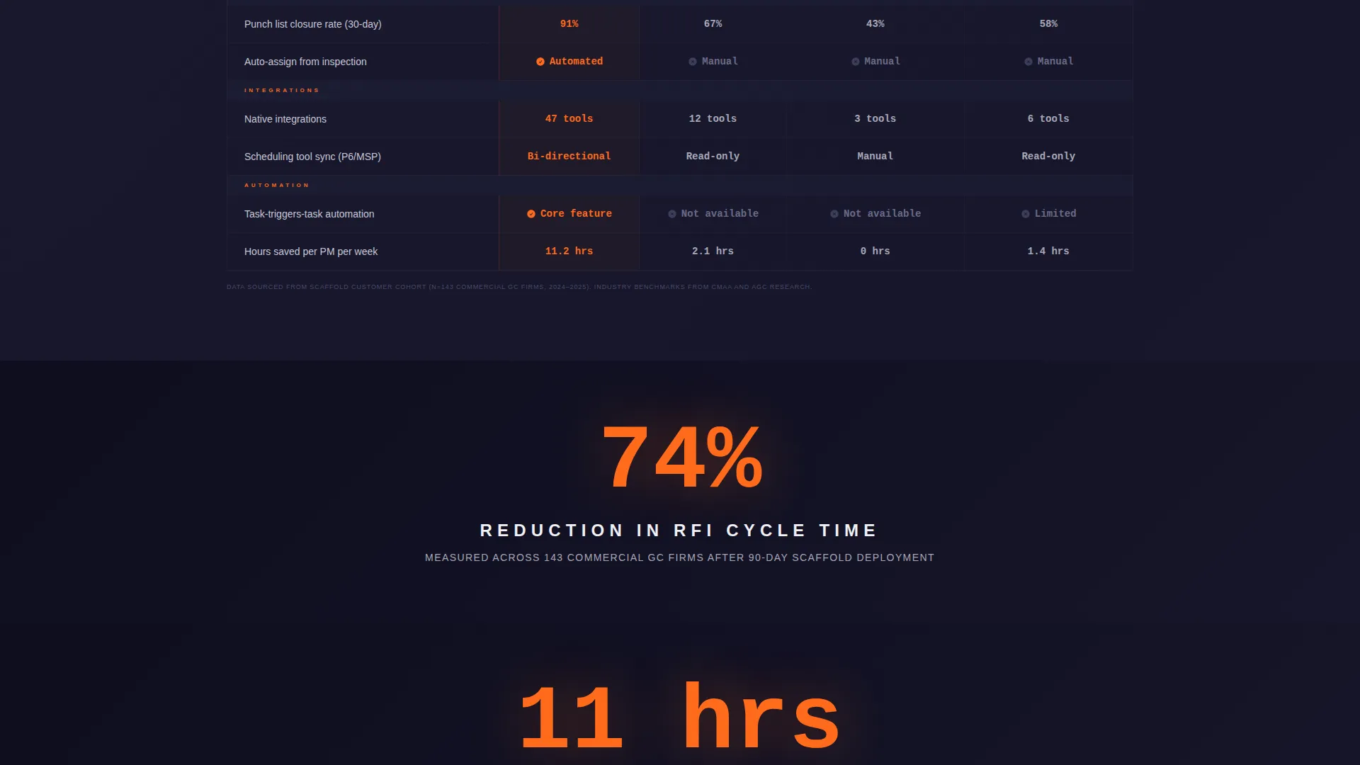
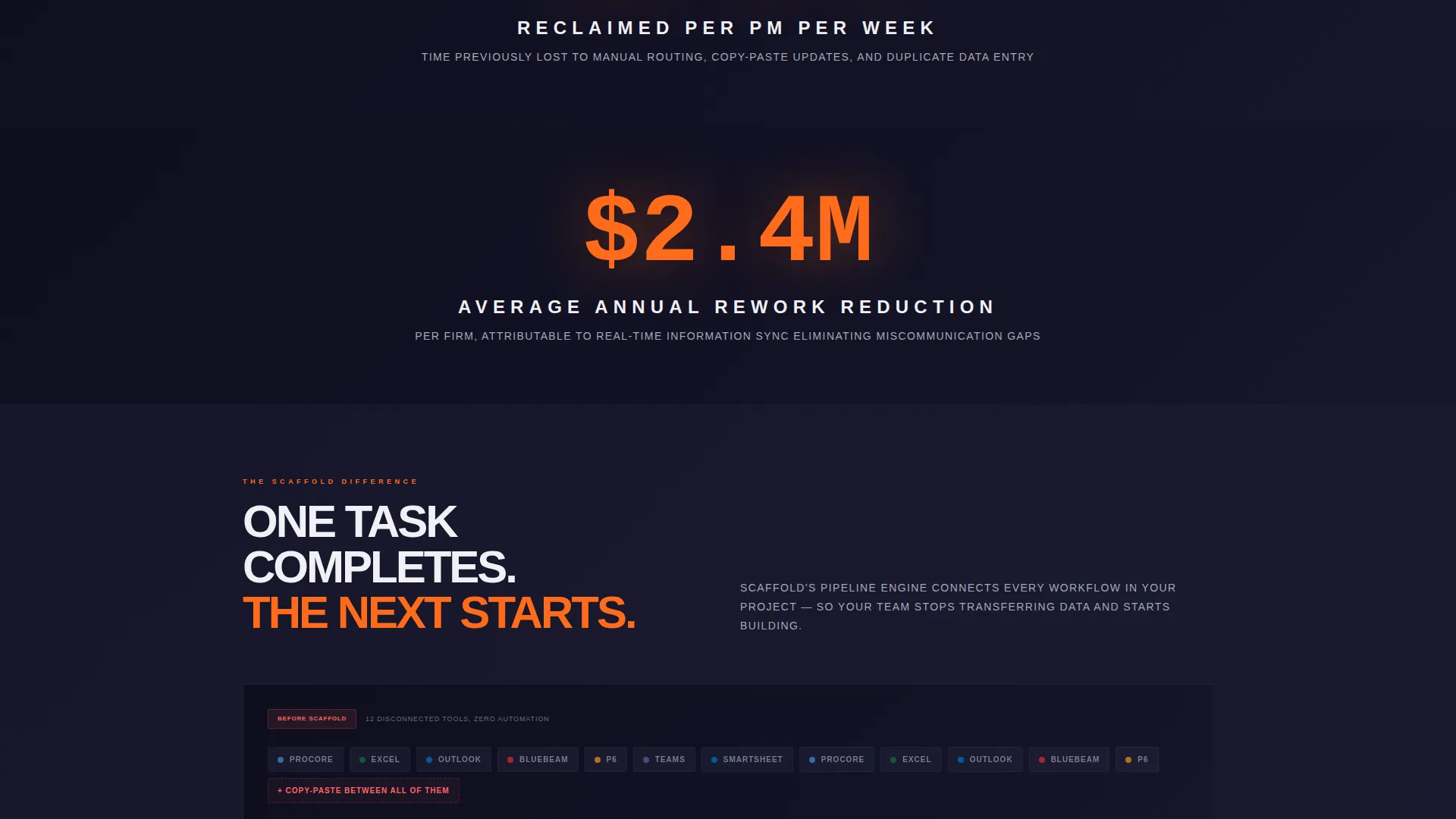
- Oversized customer-data stat panels that interrupt the scroll with proof points like "74% reduction in RFI cycle time" and "11 hours reclaimed per PM per week"
Feature list
This section describes the key functional and design components built into the Scaffold template.
Live Cost Estimator Header
The page opens above the fold with an interactive calculator, not a hero image or a tagline. Visitors enter three values: number of active projects, average RFIs per week, and team size. Animated counters in safety orange instantly display hours lost per month, projected annual cost of redundant data entry, and a dollar figure for rework caused by miscommunication. The numbers land before a single paragraph of copy is read.
Side-by-Side Comparison Table
A structured comparison table pins the platform against competing approaches row by row. Rows cover automated submittals, RFI routing time, daily log generation, punch list closure rate, and integration count. Every cell contains a specific number or clear result rather than a vague checkmark. Active row highlights use safety orange so the platform's advantages are visually instant.
Stat-Panel Scroll Rhythm
Between each table section, a single full-width stat panel displays one oversized customer-data figure against a carbon-black background. This table-stat-table-stat rhythm builds a cumulative evidence wall. By the time the visitor reaches the primary call-to-action, the conclusion feels data-driven rather than persuasive.
Sticky Call-to-Action Bar
After the first scroll, a sticky bottom bar carries the primary call-to-action: "Calculate Your Savings." It stays anchored to the viewport throughout the scroll. This means the conversion prompt is always accessible without requiring the visitor to scroll back to the top.
Gated Secondary Call-to-Action
A secondary call-to-action, "See the Full Breakdown," is built into the page. It opens a gated flow that collects work email and company name before delivering a detailed feature-by-feature PDF comparison. This creates a lead-capture mechanism that sits naturally inside the comparison context.
Carbon Fiber Visual System
The entire template runs on a four-color Carbon Fiber palette. Deep graphite black and woven carbon gray form the background gradient. Steel rivet silver and white handle body text. Safety orange is reserved exclusively for calls-to-action, active table highlights, and winning checkmarks, ensuring every conversion element is visually dominant.
Page sections overview
| Section | Purpose |
|---|---|
| Calculator Header | Personalizes cost of inaction with live animated output |
| Primary Comparison Table | Benchmarks platform against competing tool stacks |
| First Stat Panel | Anchors scroll with oversized RFI cycle-time reduction figure |
| Secondary Table Rows | Covers daily log, punch list, and integration comparisons |
| Second Stat Panel | Displays hours reclaimed per project manager per week |
| Sticky call to action Bar | Keeps "Calculate Your Savings" accessible throughout scroll |
| Gated PDF call to action | Captures lead data via secondary "See the Full Breakdown" prompt |
Design & branding system
The visual language of Scaffold is built to feel like a professional construction site, precise, high-contrast, and built to communicate fast under pressure. Every color choice is functional, not decorative.
- Background layers use a graphite-to-carbon gradient (#1A1A2E to #3D3D5C), with body text in steel rivet silver (#A8A8B8) and white (#F0F0F5) for clear hierarchy
- Safety orange (#FF6A1A) appears only on calls-to-action, active table row highlights, and winning comparison checkmarks to direct the eye instantly
- Interactive elements pulse with safety orange, creating a visual rhythm that consistently signals where to click or act next
Mobile & speed optimization
The Scaffold template is structured to remain clear and functional on smaller screens. The comparison table and calculator are the two most complex layout elements, and both are designed with mobile legibility in mind.
- The comparison table uses a layout that allows horizontal scrolling or column prioritization on narrow viewports without losing the platform's winning data points
- The sticky call-to-action bar is sized and positioned for thumb-reach on mobile, keeping the primary conversion prompt easy to tap throughout the scroll
- Animated counter elements in the calculator header are designed to render clearly on mobile displays without layout overflow
How this template helps you convert
Scaffold is built around a specific conversion logic: show visitors the cost of their current situation before asking them to consider an alternative. Every layout decision serves that sequence.
- The calculator header makes the cost of inaction personal and specific, visitors see their own numbers before they read a single marketing claim, which creates immediate relevance and urgency.
- The comparison table reframes the platform not as a new purchase but as a correction to a workflow problem the visitor already knows they have, backed by row-by-row evidence using real figures.
- The gated PDF call-to-action collects qualified lead data at the moment of highest intent, when the visitor has already absorbed the comparison evidence and wants to go deeper.
Other information about this template
Scaffold is categorized under Technology, within the Construction Software subcategory and the Construction Workflow Automation niche. It is built using the Directory and Discovery theme, which typically suits platforms that position themselves through structured comparison and clear category differentiation. The template style is a Comparison Table format, and the header concept is a Calculator or Estimator, a combination that suits platforms where the cost of inaction is quantifiable and the platform's value is measurable in time and money saved.
- The creative direction is Stats-First Impact, meaning every visual hierarchy decision prioritizes data over narrative
- The landing-page direction is Comparison and Versus, making this template particularly well suited to platforms launching against established tools in the construction project management category
- This template works within a niche where platforms compete against legacy systems and fragmented tool stacks, so the comparison table format has natural alignment with how buyers in this category already evaluate alternatives
Theme
Directory & Discovery
Creative direction
Stats-First Impact
Color system
Carbon Fiber
Style
Comparison Table
Direction
Comparison/Versus
Page Sections
Live Interactive Cost Calculator
Multi-row Comparison Table
Oversized Stat Panels
Sticky Bottom Call to Action Bar
Gated PDF Lead Capture
Carbon Fiber Color System
Related questions
What type of platform is this template designed for?
Can I customize the calculator input fields and output metrics?
How does the gated secondary call-to-action work?
Who is the primary audience this landing page speaks to?
Is the comparison table limited to a fixed number of rows or competitors?



