Architecture Project Management Landing Page Template
Architect is a comparison table landing page built for architecture management software. It puts a live micro-dashboard in the header, walks visitors through an eight-row before-and-after workflow comparison, and closes with a three-field lead capture form. The template is designed to help mid-size architecture firms feel the value of the product before they ever reach the sign-up step.
by Rocket studio
Quick summary
Architect is a single-page, section-led landing page template for architecture project management software. It opens with an interactive dashboard preview, moves visitors through a structured workflow comparison table, and ends with a focused lead generation form. The design uses a near-black cockpit palette with phosphor green status indicators to make every critical element stand out instantly.
Who this template is for
This template is built for software teams selling vertical SaaS tools to mid-size architecture firms. It speaks directly to the daily realities of construction administration, consultant coordination, and billing oversight.
- Project architects managing multiple buildings through the construction administration phase simultaneously
- Office managers tracking consultant insurance certificates, submittals, and Request for Information (RFI) logs across active projects
- Principals who need a fast read on which projects are over budget on hours before monthly billing review
What problem this template solves
Architecture firms running three or more active projects often rely on scattered spreadsheets, email threads, and sticky-note reminders to manage drawing revisions, RFIs, submittals, and punchlist items. That fragmentation costs time and creates risk. This template gives software makers a persuasion-first page that lets prospects feel the cost of their current workflow before they read a single feature headline.
- Visitors experience the "before" state through micro-animations of multiplying email threads and turning spreadsheet cells, making the pain visceral rather than abstract
- The interactive comparison table removes the need for lengthy feature copy by showing contrast in real time
- The three-field sign-up form arrives after the persuasion work is already done, reducing friction at the conversion moment
What you get with this template
The template delivers a complete, single-page lead generation flow built around one core interaction: a scrollable product tour disguised as discovery.
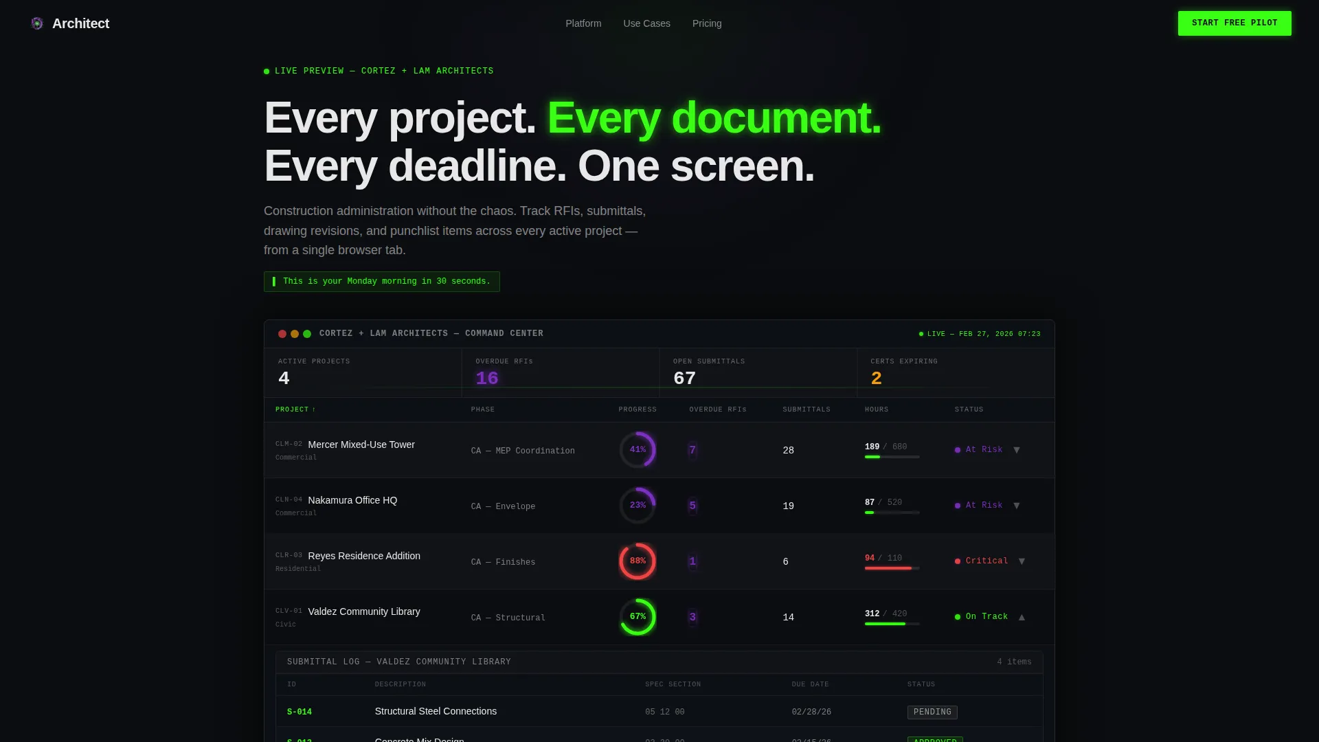
- An interactive header micro-dashboard showing a fictional firm with four live projects, percent-complete arcs, overdue RFI counts, and an expandable submittal log
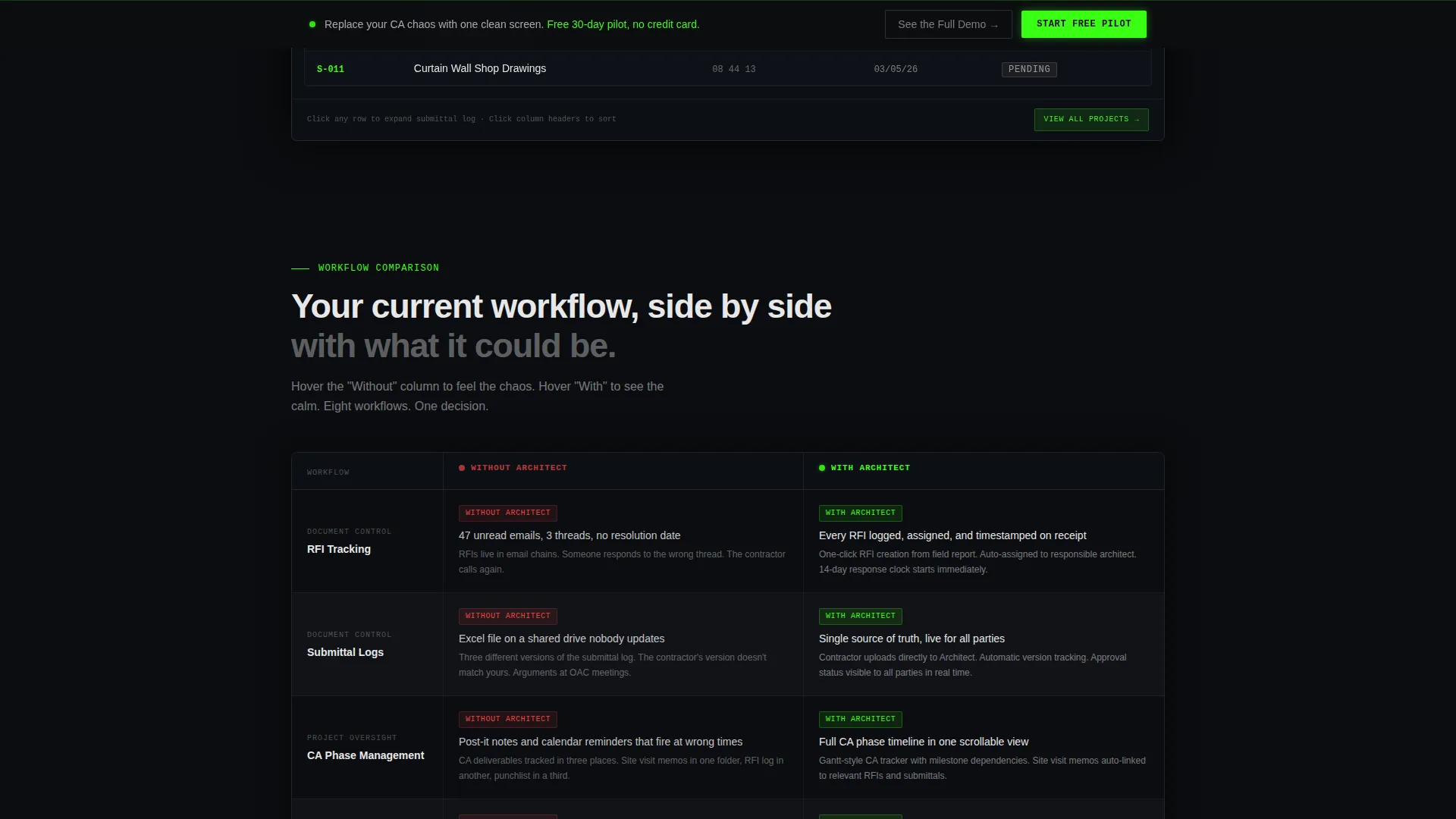
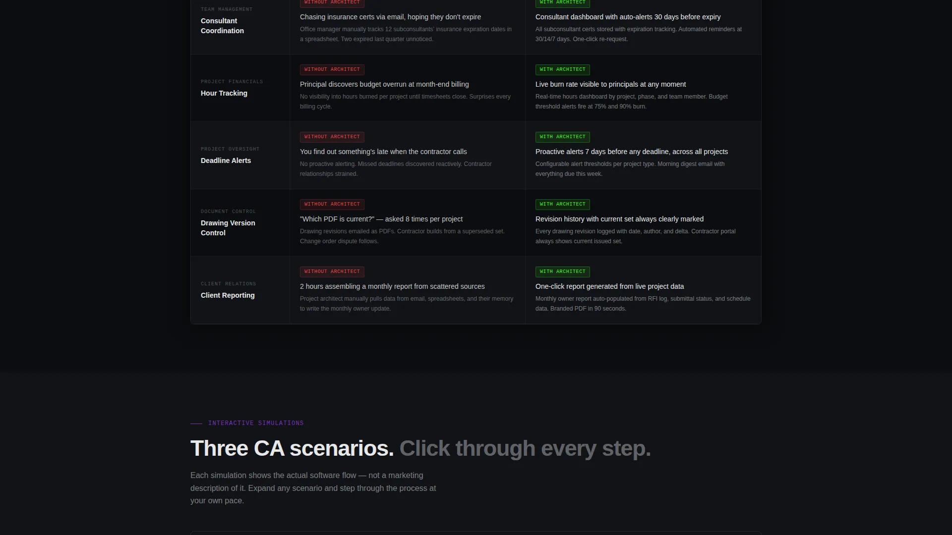
- An eight-row comparison table contrasting "Without Architect" and "With Architect" workflows, with hover-triggered animations on every row
- Three expandable project simulations walking through a full construction administration phase, plus a sticky bottom-bar call to action and a final-section lead capture form
Feature list
This section describes the core built-in components and interaction patterns included in the template.
Interactive Header Dashboard
The header embeds a functioning micro-dashboard for a fictional firm called "Cortez + Lam Architects." It displays four active projects with percent-complete arc indicators, overdue RFI counts that pulse in UV violet, and a submittal log visitors can click to expand. Columns re-sort on click, and cursor movement makes the data respond in real time.
Animated Workflow Comparison Table
The comparison table covers eight workflow rows: RFI tracking, submittal logs, construction administration (CA) phase management, consultant coordination, hour tracking, deadline alerts, drawing version control, and client reporting. Hovering the "Without" column triggers a chaos micro-animation. Hovering the "With" column reveals a calm dashboard snippet. The contrast is felt, not just read.
Expandable Project Simulations
Below the comparison table, three interactive project cards let visitors click through a fictional CA phase from RFI receipt to project closeout. Each step shows the software interface in motion, giving prospects a hands-on feel for the workflow before they commit to a demo or sign-up.
Sticky Lead Capture Bar
A sticky bottom bar appears after the header section and persists through the scroll. It carries the primary call to action: "Start Your Free Pilot." The bar stays visible so the conversion path is always one click away without interrupting the product tour experience.
Three-Field Sign-Up Form
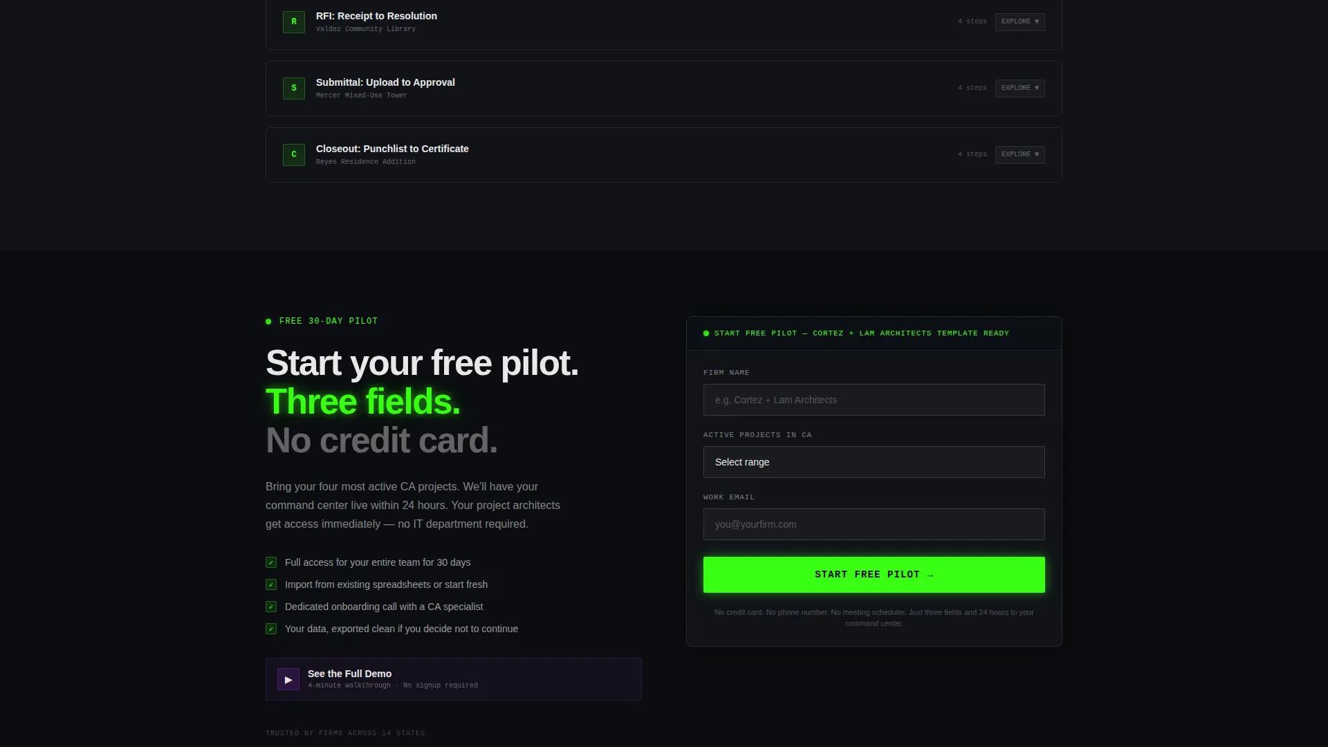
The final section centers a lead generation form asking for firm name, number of active projects (dropdown options: 1 to 5, 6 to 15, or 16 and above), and work email. No phone number field and no meeting scheduler are included. A secondary link reads "See the Full Demo," pointing to a gated four-minute video walkthrough.
Secondary Demo Path
The "See the Full Demo" link provides a lower-commitment conversion option for visitors who are not ready to start a pilot. It routes to a gated four-minute video walkthrough, giving the page two distinct exit points for different buyer readiness levels.
Page sections overview
| Section | Purpose |
|---|---|
| Interactive header dashboard | Shows live project data and draws visitors into the product experience immediately |
| Workflow comparison table | Contrasts before-and-after states across eight project management categories |
| Expandable CA simulations | Walks visitors through a full construction administration phase interactively |
| Sticky call to action bar | Keeps the primary sign-up action visible throughout the entire scroll journey |
| Lead generation form | Captures firm name, project count, and work email with minimal friction |
| Secondary demo link | Offers a lower-commitment path to a gated four-minute video walkthrough |
Design & branding system
The visual identity follows a Dashboard Pro theme built on an Acid Digital color system. The palette is intentionally minimal, so every glowing element signals something that matters.
- Void black (#0B0D10) sets the primary background; comparison table rows alternate between #0B0D10 and #111318 to maintain depth without distraction
- Phosphor green (#39FF14) is used sparingly for live-status indicators and primary action elements, so it snaps the eye like a notification worth reading
- UV violet (#7B2FBE) marks secondary data layers and hover states, including the pulsing overdue RFI counts in the header dashboard; terminal white (#E8E8E8) handles all body text and table borders
Mobile & speed optimization
The template is built with a scroll-based interaction model that adapts well to smaller viewports. The cockpit-style layout keeps information density high without overwhelming narrower screens.
- The sticky bottom call to action bar remains functional and visible on mobile, keeping the conversion action accessible without requiring a scroll back to the top
- Hover-triggered animations in the comparison table are designed as discrete row-level interactions, which makes them straightforward to translate into tap interactions on touch devices
How this template helps you convert
The page is structured so that persuasion happens through interaction, not through reading. By the time a visitor reaches the form, they have already experienced the contrast between their current workflow and the product.
- The interactive header dashboard creates an immediate "aha" moment by putting real-looking project data in front of visitors within the first viewport, before any feature copy appears
- The eight-row animated comparison table does the persuasion work row by row, so each hover builds the case incrementally and the visitor arrives at the form already convinced
- The two-path conversion design (pilot sign-up plus demo video) matches different buyer readiness levels, keeping high-intent and research-stage visitors moving forward without dead ends
Other information about this template
This template is categorized under Technology, specifically the Architecture Vertical SaaS subcategory, and is designed for teams positioning architecture management software to mid-size firms.
- The template style is a Comparison Table layout, and the creative direction follows an Interactive Explorer approach where scroll becomes a self-guided product tour
- The header concept is an Interactive Preview, a live micro-dashboard rather than a static screenshot or mockup, which sets it apart from conventional software landing pages
- The lead generation direction is optimized for pilot program sign-ups, with the form intentionally kept to three fields to minimize drop-off at the final conversion step
- The Intersection Match Score for this template is 13, indicating strong alignment between the Dashboard Pro theme, Acid Digital color system, and the architecture management software niche
Theme
Dashboard Pro
Creative direction
Interactive Explorer
Color system
Acid Digital
Style
Comparison Table
Direction
Lead Generation
Page Sections
Interactive Header Micro-dashboard
Eight-row Animated Comparison Table
Expandable CA Phase Simulations
Sticky Bottom Call to Action Bar
Minimal Three-field Lead Form
Dual Conversion Path Design
Related questions
Can I replace the fictional firm data in the header dashboard with my own project names?
Does the comparison table work for comparing my product against competitors instead of workflow states?
What happens when a visitor clicks the secondary demo link?
Who is this landing page template designed for?
How many form fields does the lead capture section include?



