School Landing Page Template - Studio
A zigzag architecture school landing page built around evidence and story. The header leads with live metrics, alternating sections follow real student journeys from first sketch to built work, and an interactive seven-question quiz matches each visitor to the right program concentration before asking for a single piece of contact information.
by Rocket studio
Quick summary
This is a single-page architecture school landing page built on an Institutional Authority theme. It opens with a kinetic stats wall, moves through three escalating case study narratives in a zigzag layout, and closes with a guided quiz that maps each applicant to one of four program concentrations before presenting a soft application request.
Who this template is for
This template is designed for architecture schools and studio-based design programs that need to attract serious applicants. It speaks directly to people who arrive with intent and need evidence to commit.
- High school seniors with an art or design portfolio ready for a five-year professional program
- Working professionals pivoting from fields such as engineering or graphic design who need accreditation clarity
- International applicants seeking a program with NAAB accreditation so their license transfers to their home country
What problem this template solves
Most architecture school pages lead with campus photography and generic mission statements. They fail to show prospective students what the program actually produces or whether it is the right fit. This template flips that structure entirely.
- It replaces sentiment-driven hero images with real institutional metrics that signal program strength immediately
- It substitutes vague curriculum descriptions with three concrete student journeys that show progression from admission sketch to constructed building
- It removes the cold generic inquiry form and replaces it with a value-first quiz that gives applicants genuine self-knowledge before asking for their contact details
What you get with this template
The template delivers a complete, conversion-focused single-page layout that covers every stage of the applicant decision journey. Every section is designed to advance trust, not just fill screen space.
- A full zigzag alternating layout with a stats-wall header, three narrative case study sections, and an interactive quiz component with a results and application capture flow
- A deeply considered Electric Indigo color system covering background, dividers, interactive states, and content panels
- A guided quiz structure spanning seven questions, four result states, personalized curriculum previews, and a light-touch application kit request form
Feature list
This template was built around four core capabilities drawn directly from the brief. Each one serves a specific role in moving an architecture school applicant from curiosity to commitment.
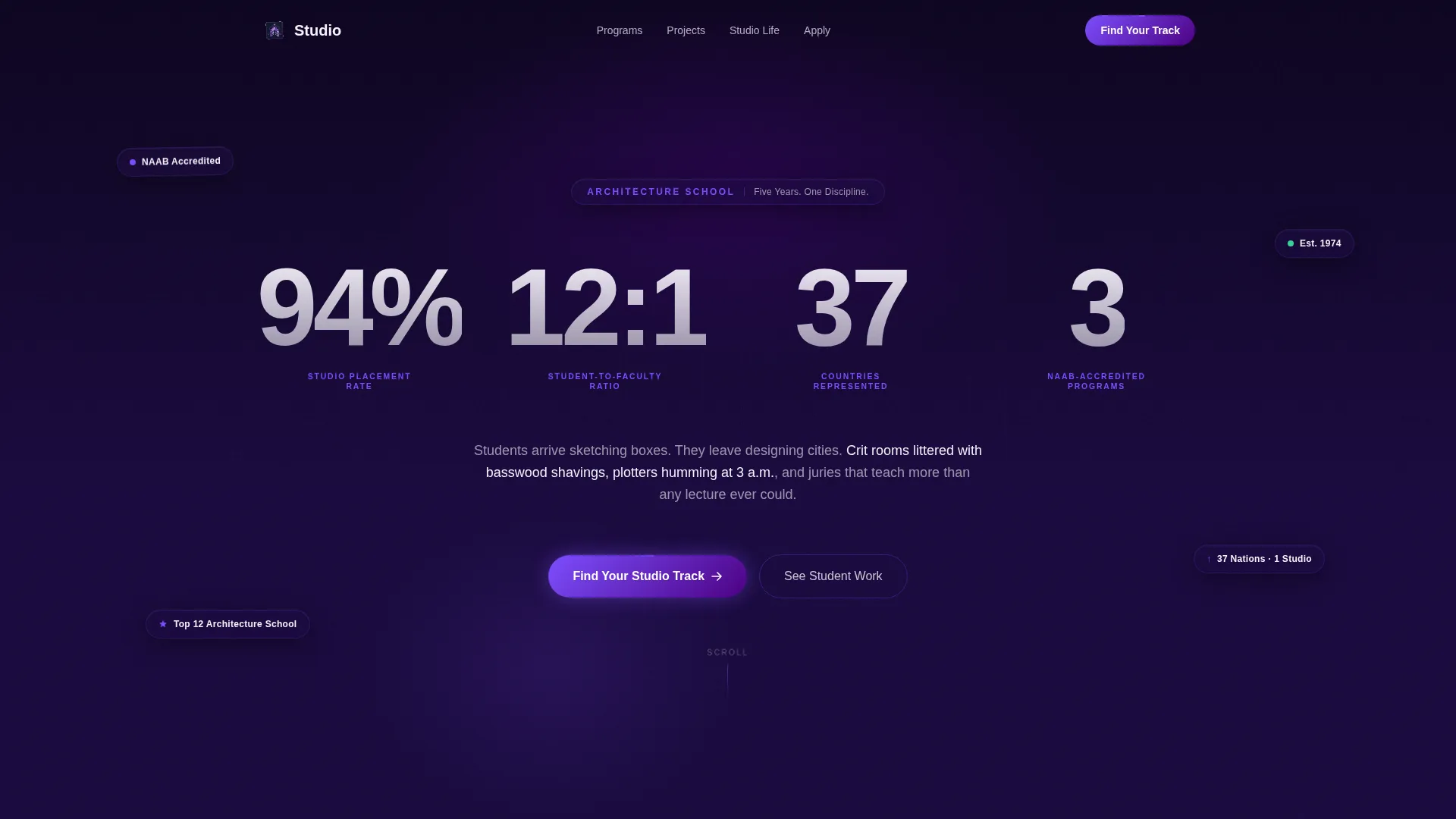
Kinetic Stats Header
The header presents four institutional metrics as oversized animated counters against a deep navy background. Each figure ticks upward on load, set in a condensed grotesque typeface at display scale. A single violet spark descriptor line sits beneath each number. There is no hero image. The data is the visual.
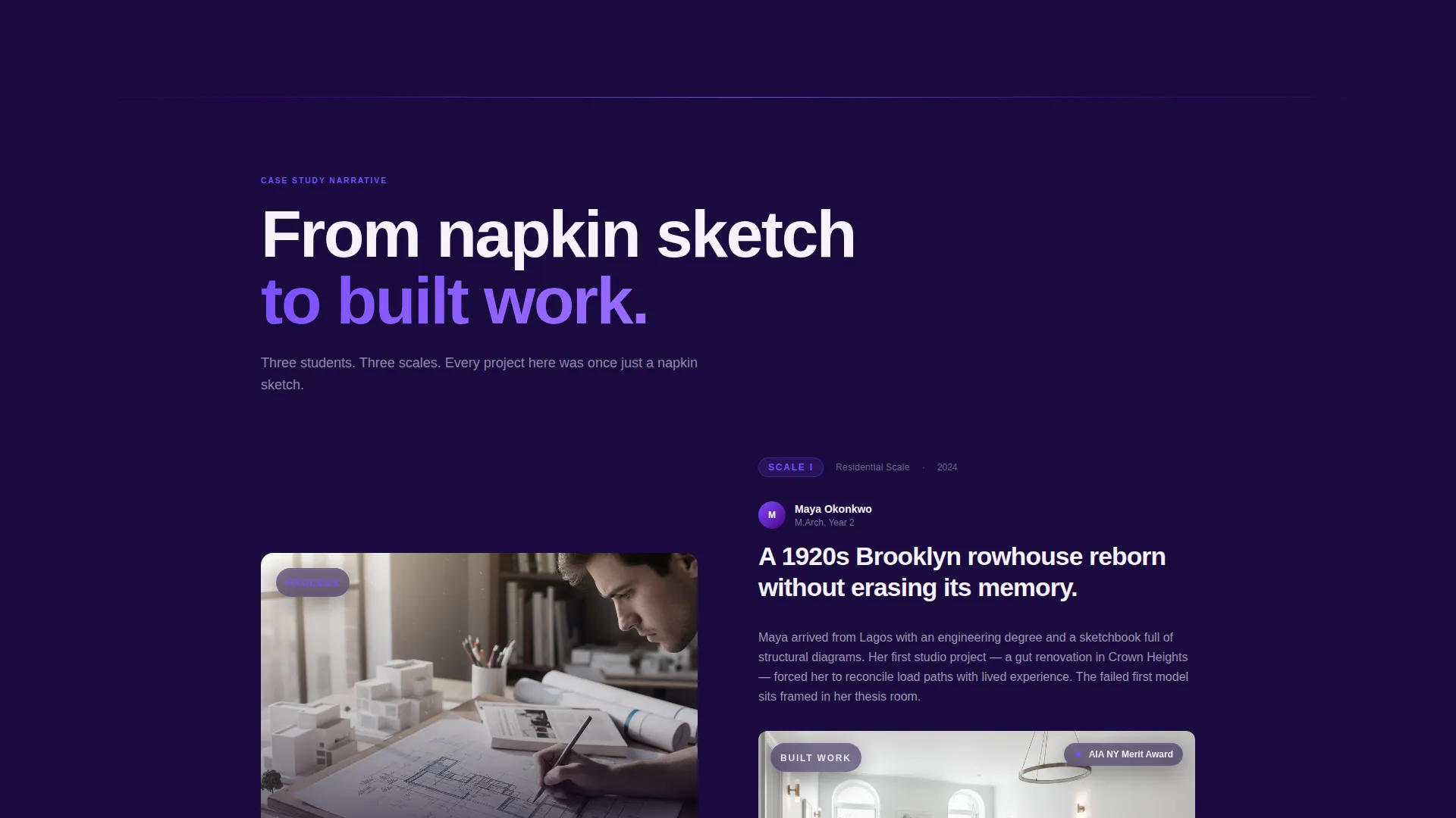
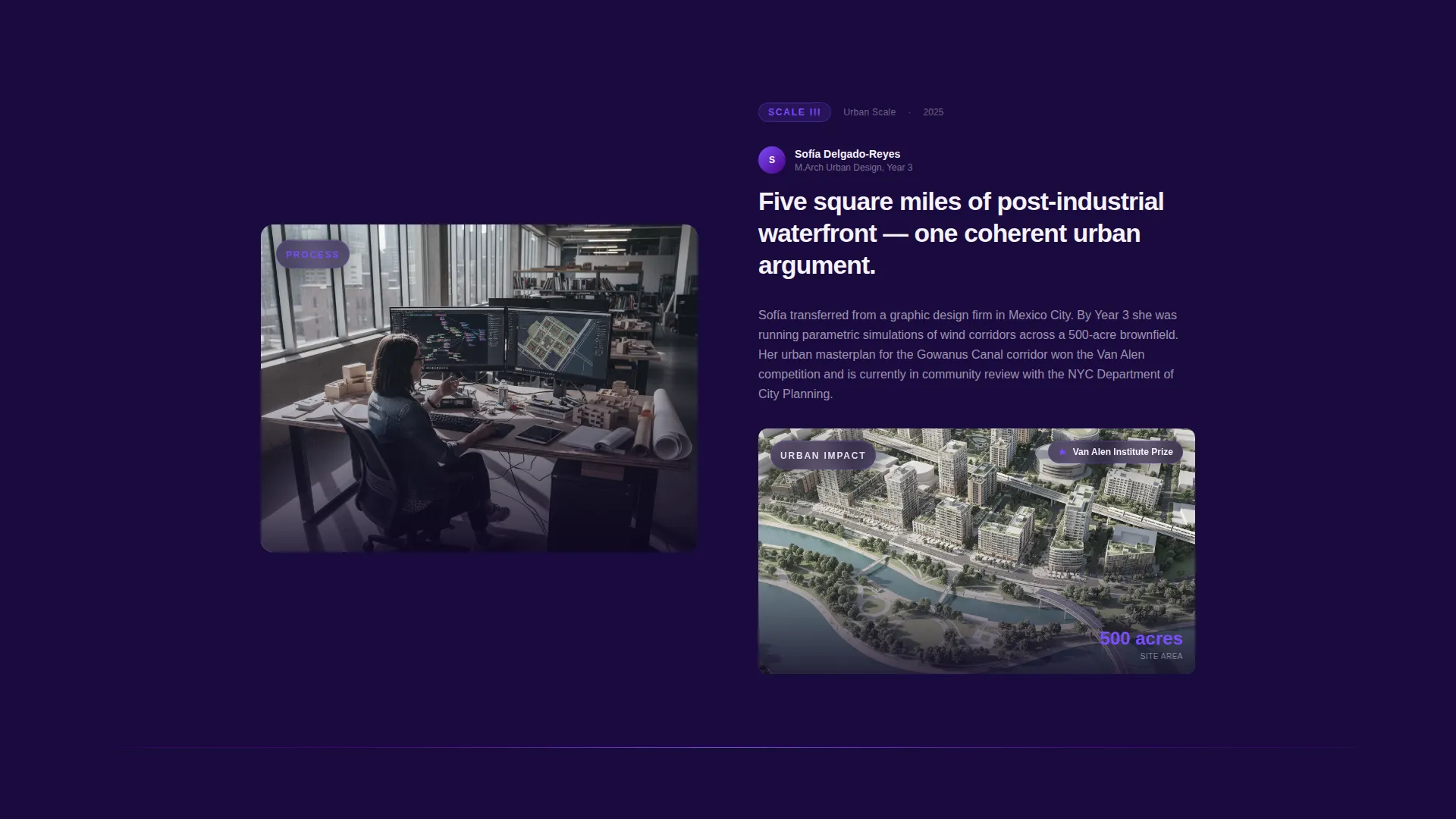
Zigzag Case Study Sections
Three alternating left-right sections each follow one student from admission process material to completed work. The left panel shows process artifacts such as hand drawings, failed physical models, and redlined plans. The right panel shows outcomes including rendered perspectives, awards, and photographs of constructed buildings. The scroll sequence escalates in project scale from residential renovation to civic library to urban masterplan.
Seven-Question Program Quiz
The primary call to action launches a diagnostic quiz that appears one question at a time. Each question uses illustrated answer cards in violet and indigo. The quiz covers design experience level, portfolio medium, area of interest, and career goal. Results map to one of four program concentrations and display a personalized curriculum preview.
Personalized Results and Application Flow
After the quiz, each visitor receives a result tied to a specific program concentration. A secondary call to action then requests name, email, and intended start term. The contact ask comes only after the quiz has already delivered value, reducing friction and increasing trust at the point of conversion.
Electric Indigo Visual System
The full color system is defined and applied consistently across all sections. Deep academic navy forms the primary background. Charged indigo marks section dividers and hover states. Bright violet spark highlights calls to action and interactive elements. Drafting-paper white fills content panels, keeping body text readable throughout.
Page sections overview
| Section | Purpose |
|---|---|
| Stats metrics header | Opens with four kinetic counters establishing program authority through evidence |
| Case study one | Follows a student through a residential renovation from sketch to built outcome |
| Case study two | Escalates the narrative with a civic library project showing design growth |
| Case study three | Completes the arc with an urban masterplan demonstrating city-scale capability |
| Quiz introduction | Frames the seven-question diagnostic and invites the visitor to find their track |
| Quiz question flow | Delivers one illustrated question at a time across design experience and interest axes |
| Quiz results panel | Maps answers to one of four concentrations with a personalized curriculum preview |
| Application kit request | Closes with a light-touch form capturing name, email, and intended start term |
Design & branding system
The visual identity follows an Institutional Authority theme. The palette is described in the brief as a blueprint illuminated under ultraviolet light, where scholarly weight is electrified by creative ambition.
- Four-color Electric Indigo system: deep academic navy (#1A0A3E) for backgrounds, charged indigo (#4B0082) for dividers and hover states, bright violet spark (#7C4DFF) for calls to action and highlights, and drafting-paper white (#F5F2FA) for content panels
- Typography uses a condensed grotesque typeface at display scale for all metric figures, paired with readable body type on the white content panels
- The overall aesthetic mirrors a final review environment with pinned-up boards, long shadows from physical models, and the charged atmosphere of a studio at deadline
Mobile & speed optimization
The zigzag layout and animated counter header are designed with a responsive structure in mind. Stacked sections on smaller screens preserve the narrative arc without losing the case study rhythm.
- Alternating left-right panels reflow to vertical stacks on mobile so process and outcome images remain paired correctly
- The quiz one-question-at-a-time format is naturally suited to smaller touch screens, keeping interaction focused and uncluttered
- The stats header scales from display-size counters on desktop down to bold but readable figures on narrow viewports without losing visual impact
How this template helps you convert
The conversion logic is built into the page sequence itself. Every section earns the next click before asking for anything in return.
- The stats header establishes program credibility in the first viewport, so the visitor already has a reason to keep scrolling before reading a single line of copy
- The three escalating case studies build emotional and rational buy-in by showing a real progression of student work, making the program outcome feel concrete and achievable
- The quiz inverts the usual inquiry funnel by giving applicants a personalized program recommendation and curriculum preview before the school ever asks for name, email, or start term
Other information about this template
This template was built for the architecture school niche within the broader art and design school category. It reflects the real culture of a five-year studio program, from crit rooms and basswood model-making to plotters running overnight and thesis jury presentations.
- The four program concentrations surfaced in the quiz results cover urban design, residential practice, computational design, and preservation, reflecting genuine specialization paths in professional architecture education
- The NAAB accreditation focus is woven into the header metrics and the quiz interest-area questions, making it directly relevant to international applicants who need licensure portability
- The 12:1 student-to-faculty ratio and 94% studio placement rate displayed in the header are drawn from the source brief and represent the kind of evidence-led positioning this template is designed to support
- The template style is zigzag alternating, the header concept is a stats and metrics wall, the creative direction is a case study narrative, and the primary call-to-action direction is a quiz and assessment flow

Theme
Institutional Authority
Creative direction
Case Study Narrative
Color system
Electric Indigo
Style
Zigzag/Alternating
Direction
Quiz/Assessment
Page Sections
Kinetic Stats Wall Header
Zigzag Case Study Narrative
Seven-question Program Quiz
Personalized Concentration Results
Electric Indigo Color System
Related questions
Who is this landing page template designed for?
What does the quiz component actually do?
Do I need to replace the case study content to use this template?
Can the stats in the header be updated to match our school's data?
Is this a single-page layout or a multi-page website?


