Storage Digital Presence Specialist Professional Website Template
Vault is a split-screen landing page template built for enterprise storage knowledge bases. It combines an interactive storage lookup tool in the header with a scrollable feature matrix that contrasts old workflows against structured results. Designed for storage administrators, solution architects, and presales engineers, it drives early-access sign-ups through a clean, data-center-inspired monochrome layout.
by Rocket studio
Quick summary
Vault is a single-page lead generation template for enterprise storage knowledge base products. The split-screen layout pairs an interactive lookup tool on the left with live structured results on the right. A feature matrix scroll section makes the case for switching from vendor PDFs to a centralized reference. The monochrome steel visual system gives every section the authority of precision-engineered hardware.
Who this template is for
This template is built for teams launching or marketing a searchable storage knowledge base to a technical audience. It speaks directly to the people who need fast, accurate answers about enterprise storage arrays.
- Storage administrators managing petabyte-scale SAN (Storage Area Network) environments
- Solution architects specifying hybrid cloud migrations and hardware compatibility
- Presales engineers who need instant protocol and capacity answers during live customer calls
What problem this template solves
Engineers waste time digging through vendor PDFs, outdated wikis, and Slack threads when they need a simple answer fast. A mid-outage is no time for a document hunt. This template presents a knowledge base product as the credible, structured alternative.
- Scattered spec sheets and compatibility matrices slow down critical decisions
- Vendor documentation is often version-mismatched and hard to query quickly
- Long-form signup friction drives technical buyers away before they see the value
What you get with this template
You get a fully structured single-page layout designed around two conversion paths and one clear visual identity. Every section is purposeful and tied to the lead generation goal.
- A split-screen header with a vendor-and-array lookup tool and a live results panel
- A scrollable feature matrix comparing old workflows to knowledge base equivalents
- Two lead capture paths: a gated "Request Early Access" form and a lower-friction PDF download prompt
Feature list
This template ships with six purpose-built sections and components drawn directly from the creative brief.
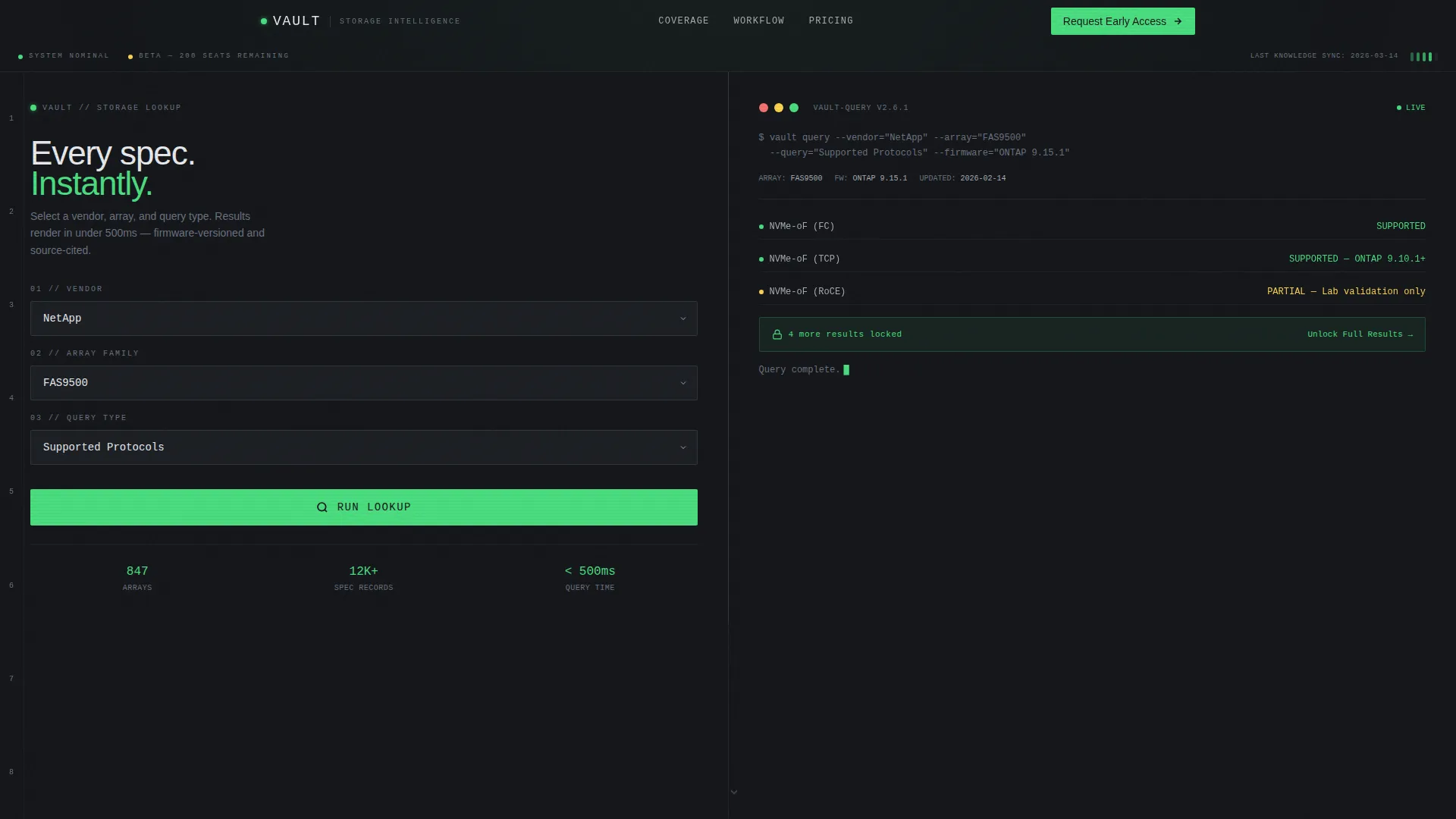
Interactive Storage Lookup Header
The header splits 50/50. The left panel lets visitors select a vendor, choose an array family, and pick a query type such as compatibility, maximum capacity, or supported protocols. The right panel renders structured results instantly in a monospaced typeface that reads like terminal output, delivering real value before the visitor scrolls at all.
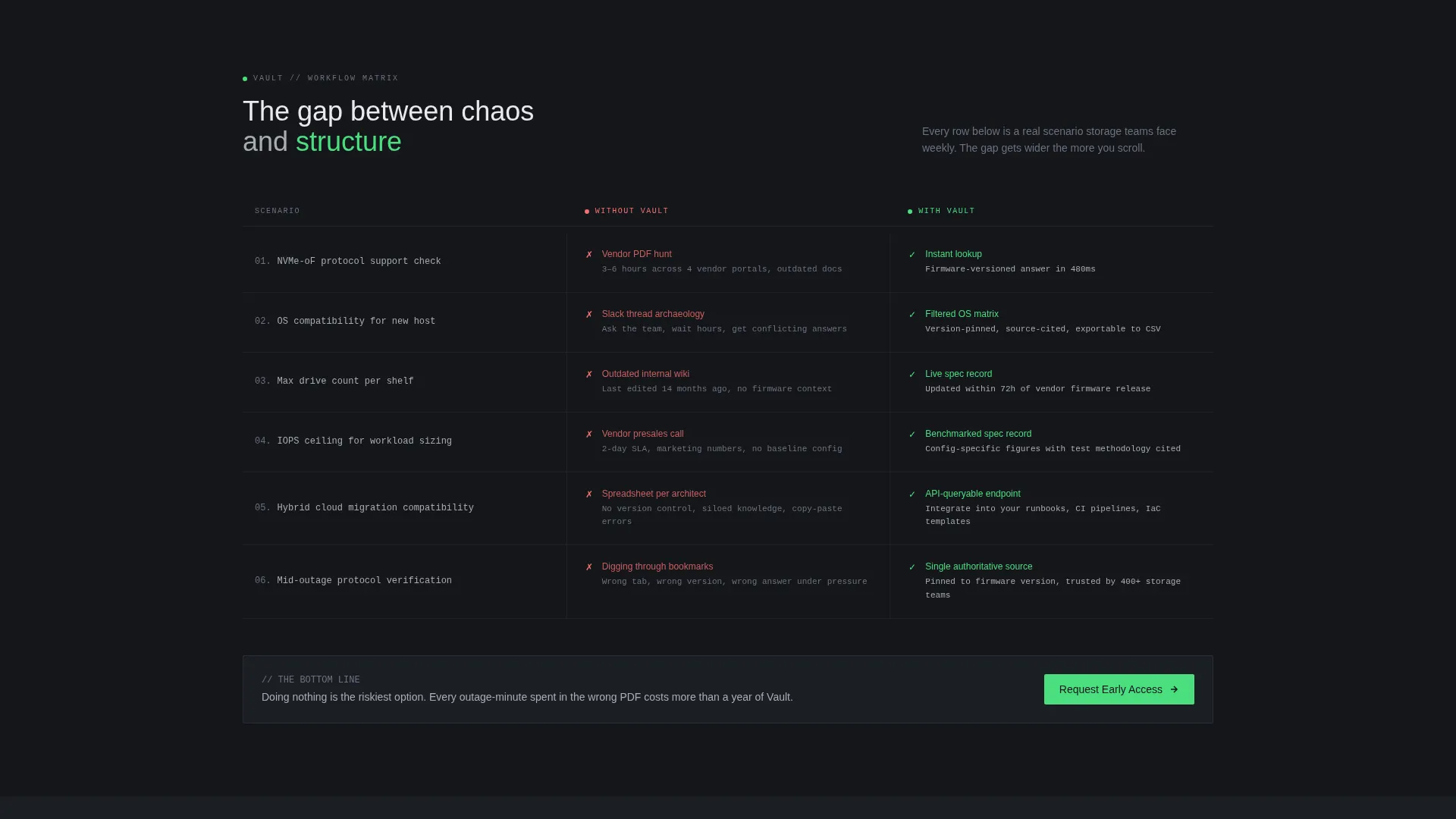
Scrollable Feature Matrix
Each scroll step presents a two-column comparison grid. The left column shows the old workflow: vendor PDF hunts, outdated wikis, Slack thread archaeology. The right column shows the knowledge base equivalent: instant filtered results, version-pinned accuracy, and queryable endpoints. The gap between chaos and structure widens with every row.
Gated Early Access Form
After the first successful lookup in the header, a subtle "unlock full results" prompt introduces the primary conversion point. The form captures work email, storage environment size (under 500 TB, 500 TB to 5 PB, or 5 PB and above), and primary vendor. It is repeated at the final section of the page.
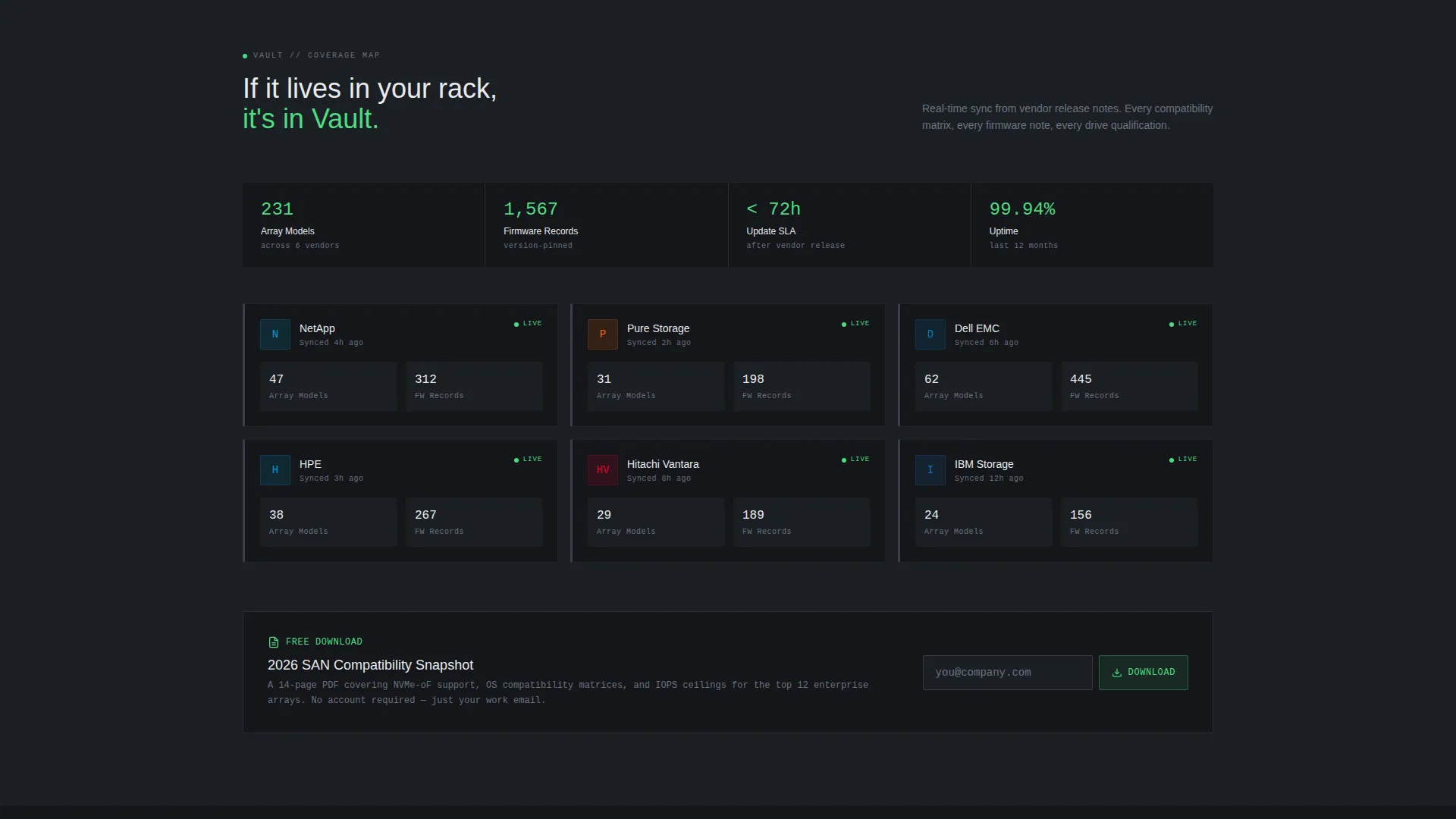
Ungated PDF Download Path
A secondary conversion path offers a "Download the Compatibility Snapshot" option. It asks for an email address only. This lower-friction entry point is designed specifically for engineers who distrust long forms but will exchange an address for a useful reference document.
Monochrome Steel Visual System
The color palette uses gunmetal chassis (#3B3F45), brushed aluminum (#A8ADB3), deep rack-black (#14161A), and status-green (#4ADE80) reserved exclusively for interactive highlights and active states. Typography relies on a monospaced typeface in results panels to reinforce the precision and authority of the data.
Dashboard Pro Theme Layout
The Dashboard Pro theme structures every section as a clean, scannable grid. Spacing, alignment, and contrast follow the logic of a well-organized equipment rack: every element is labeled, every region has a clear purpose, and nothing competes for attention unnecessarily.
Page sections overview
| Section | Purpose |
|---|---|
| Split-screen header | Hosts the interactive storage lookup tool and live results panel |
| Feature matrix scroll | Compares old workflows against knowledge base equivalents row by row |
| Early access form | Captures work email, environment size, and primary vendor |
| PDF download prompt | Offers low-friction email capture via compatibility snapshot |
| Final call to action section | Repeats the "Request Early Access" call to action to close the page |
Design & branding system
The visual identity is built around a Monochrome Steel color system that references the physical environment of a climate-controlled data center. There is no warmth, no decoration, just the quiet authority of precision hardware.
- Core palette: gunmetal chassis (#3B3F45), brushed aluminum (#A8ADB3), and deep rack-black (#14161A) for structure and backgrounds
- Status-green (#4ADE80) appears only on interactive highlights and active states to keep the user interface reading like live instrumentation
- Monospaced typeface used in results panels reinforces the terminal-output aesthetic throughout the lookup section
Mobile & speed optimization
The split-screen layout is designed with responsive stacking in mind so each panel remains readable on smaller screens. The lean component set keeps the page load light by avoiding decorative assets that add weight without purpose.
- The 50/50 split reflows to a single-column layout on mobile, preserving the lookup tool and results panel in sequence
- Form fields and the PDF download prompt remain accessible without horizontal scrolling on any common viewport
- Monochrome palette and minimal imagery reduce asset overhead across the page
How this template helps you convert
The page is engineered around two distinct conversion paths that match the two types of technical buyers: those ready to commit and those who need a lower-stakes first step.
- The header lookup tool creates an immediate value moment. Visitors get a real result before they are asked for anything, which builds trust before the "unlock full results" prompt appears and makes the form feel earned rather than forced.
- The feature matrix scroll builds pressure without a single word of persuasion. Each row widens the gap between old workflows and the knowledge base solution, so by the time visitors reach the final call to action section, doing nothing feels like the riskiest available option.
Other information about this template
Vault is built on the Dashboard Pro theme and uses the Matched Intersection configuration of Split Screen (50/50) layout, Feature Matrix creative direction, Calculator/Estimator header concept, and Lead Generation page direction. These intersection fields are pre-matched to the Storage Knowledge Base niche under the Storage Digital Presence subcategory.
- The template sits in the Technology category and targets the Storage Knowledge Base niche
- The intersection match score for this configuration is 13, indicating a strong alignment between layout, direction, and audience intent
- Vendor options shown in the header lookup include storage brands common in enterprise environments, making the demo immediately recognizable to the target audience
Theme
Dashboard Pro
Creative direction
Feature Matrix
Color system
Monochrome Steel
Style
Split Screen (50/50)
Direction
Lead Generation
Page Sections
Split-screen Lookup Header
Scrollable Feature Matrix
Dual Conversion Path Design
Monochrome Steel Color System
Dashboard Pro Theme Structure
Terminal-style Results Panel
Related questions
Can I change the vendor options in the storage lookup tool?
Do both conversion paths collect the same information?
Can I add more rows to the feature matrix section?
Is this template suitable for a presales or demo context?
What layout style does this template use?


