Specialist Nonprofit Digital Presence Professional Website Template
Codex is a scroll reveal landing page template built for nonprofit teams that need fast, credible access to operational playbooks. The design follows a bold brutalist aesthetic with void black, electric violet, and exposed white. An interactive Knowledge Gap Assessment sits at the core, calculating a score and matching users to relevant resources before they ever see a sign-up form.
by Rocket studio
Quick summary
Codex is a single-page, scroll reveal landing page template purpose-built for nonprofit knowledge bases. It opens with a terminal-style code interface, moves immediately into an interactive assessment tool that helps users calculate their operational gaps, and progressively reveals playbook previews, proof metrics, and dual-path lead generation forms. The design is bold brutalist: heavy type, void black background, electric violet accents, zero decoration.
Who this template is for
This template is built for nonprofit professionals who carry operational weight without enough support. The landing page design speaks directly to people doing the work at midnight, not people admiring a polished marketing page.
- First-time executive directors searching for 990 filing guidance, board governance frameworks, and compliance checklists
- Development coordinators building their first major-gift pipeline who need grant writing playbooks and donor retention files
- Operations managers at mid-size organizations inheriting undocumented compliance tasks with no context from the person who left
What problem this template solves
Nonprofit organizations lose critical institutional knowledge every time a veteran staffer walks out the door. That knowledge rarely lives in shared documents. It lives in one person's head. The result is a repeating cycle of effort: new staff Googling answers, making avoidable mistakes, and rebuilding what already existed.
- Visitors arrive with urgent, specific questions and no clear place to navigate for answers
- Operational knowledge stays siloed, creating compliance risk and slowing team onboarding sessions
- Traditional landing page design models fail nonprofits because they promote aesthetic over clarity and function
What you get with this template
This template gives you a complete, production-ready landing page layout organized around a clear goal: turn a visitor's operational gap into a sign-up. Every section is load-bearing. Nothing decorative competes with the message. The landing page is designed to provide a direct path from problem awareness to committed action.
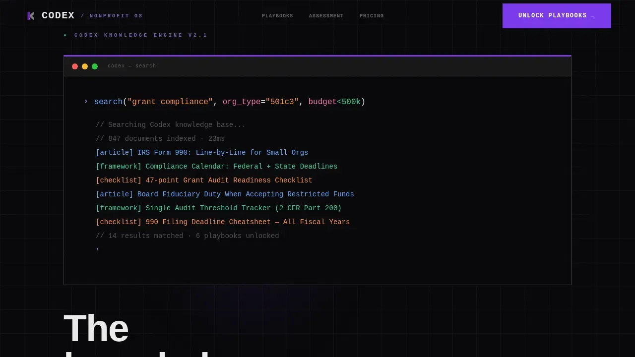
- A terminal-style hero with animated result lines, a blinking cursor, and syntax-highlighted code that displays the product working before any marketing copy appears
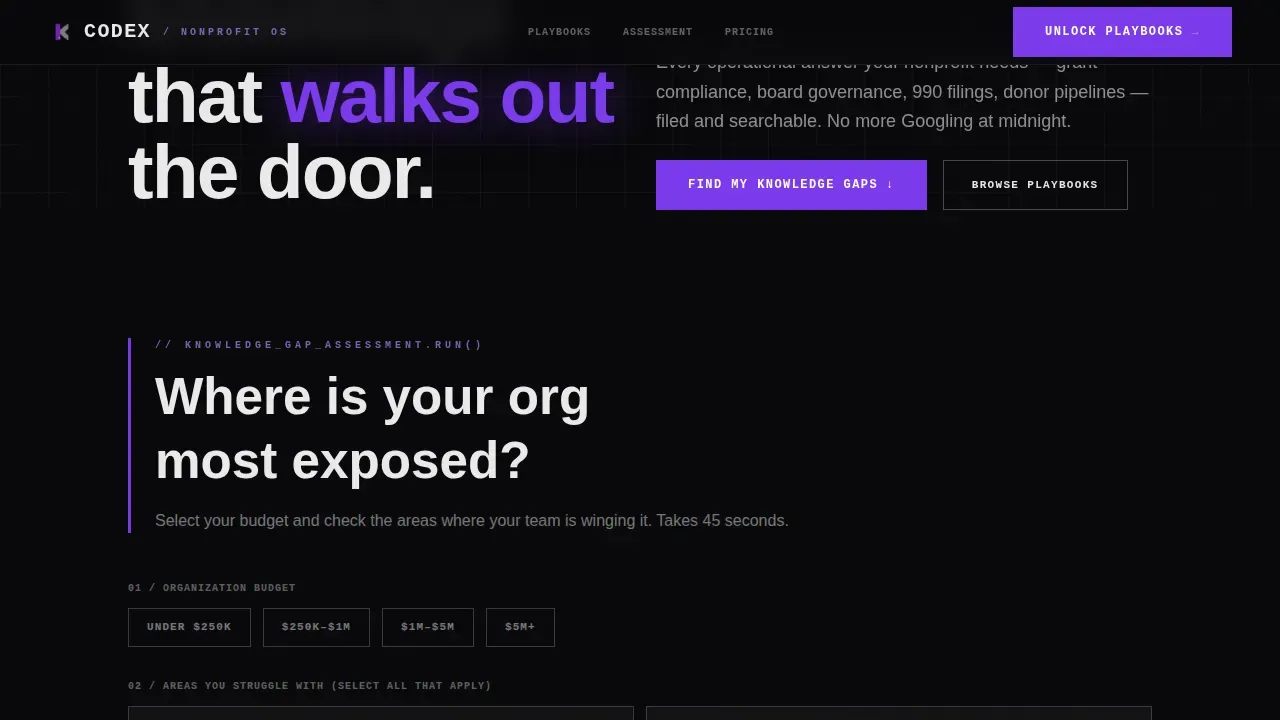
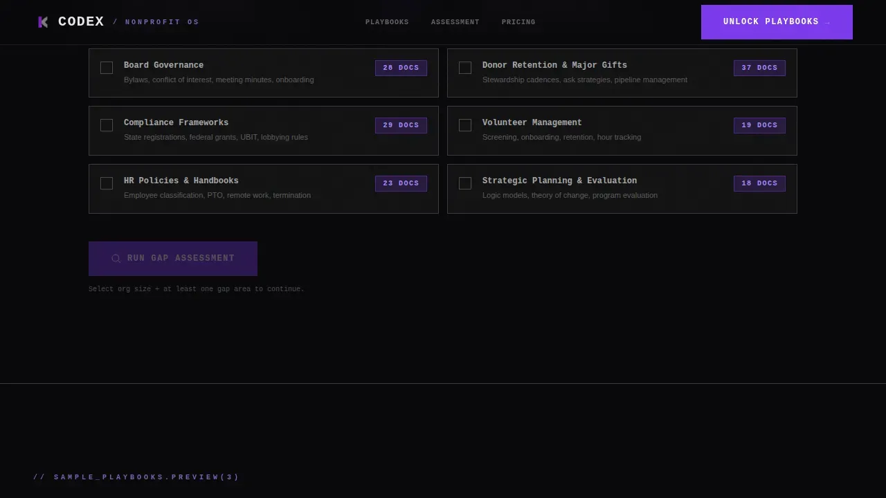
- An interactive Knowledge Gap Assessment tool that lets users select their organization size and operational struggle areas, then calculates an instant score with matched resource counts
- A dual-path lead generation section with a primary "Unlock Your Playbooks" call to action and a secondary free playbook download gated by email only
Feature list
This template packages each design and interaction layer as a deliberate, functional component. Every feature serves a specific role in the landing page's chain of persuasion.
Terminal Hero Interface
The landing page opens with a monospaced, syntax-highlighted code block styled like a live terminal query. Result lines animate one by one beneath the input, showing article titles, framework names, and checklist counts. The only motion element is a blinking cursor. There is no hero image, no stock photography. The product is the interface, and users see it running before reading a single line of pitch.
Knowledge Gap Assessment Tool
An interactive calculator sits immediately below the hero. Users select their organization size, then check the operational areas where they struggle: financial oversight, grant tracking, board onboarding, volunteer management. The tool calculates a live score and returns a count of resources that matches their specific gaps. By the time visitors see their score, they have already confirmed the need. This is the most important conversion tool in the layout.
Scroll Reveal Content Layers
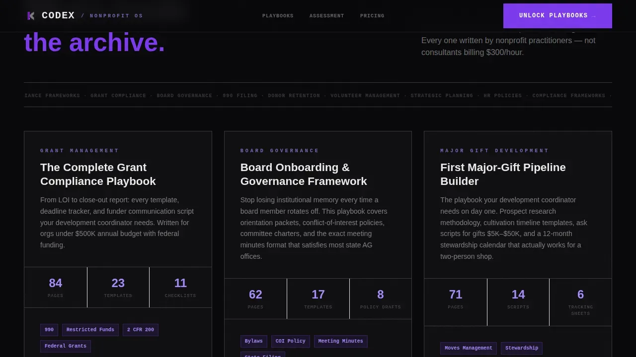
The page uses GSAP ScrollTrigger to progressively reveal content as users scroll. Playbook sample pages slide in from the edges like concrete slabs being placed. Proof metrics from similar organizations appear with increasing specificity. Each scroll step delivers more detail, rewarding attention and building confidence in the model. The effect makes the landing page feel like discovering a filed archive rather than reading a brochure.
Dual-Path Lead Generation Forms
The primary call to action, "Unlock Your Playbooks," appears after the assessment results and again at the base of the landing page. The form captures work email, organization name, and the gap areas already selected in the assessment tool, pre-filled to reduce input effort. A secondary path offers one free playbook gated by email only, catching visitors who are not yet ready to commit to full access. Both paths respond to different levels of intent.
Brutalist user interface Design System
The entire landing page design is built on a Void and Violet color system: absolute void black at #09090B, poured-concrete gray at #3A3A3C, electric violet at #7C3AED, and exposed white at #EAEAEA. Typography uses JetBrains Mono for terminal text, Manrope for headings, and DM Sans for body copy. There are no gradients, no decorative shadows, no ornamental patterns. The layout communicates through weight, contrast, and structure alone. This brutalist ui approach turns every element into a functional, load-bearing part of the design.
GitHub-Style Minimal Footer
The footer follows a single-row minimal layout. It includes copyright text and essential links, nothing more. The design keeps the background clean and avoids distracting from the primary call to action above it. The footer's restraint matches the overall energy of the page: every detail present has a purpose.
Page sections overview
| Section | Purpose |
|---|---|
| Terminal Hero | Display the product interface as a live code query with animated result lines and a blinking cursor |
| Knowledge Gap Assessment | Let users select org size and struggle areas, then calculate a gap score with matched resource count |
| Playbook Showcase | Reveal sample playbook pages using staggered slab motion effects triggered by scroll position |
| Proof Metrics | Present case-study numbers from comparable organizations to build credibility through specificity |
| Unlock Call to Action | Offer dual-path lead capture: full access form and single free playbook download by email |
| Minimal Footer | Deliver copyright and essential links in one clean, single-row layout |
Design & branding system
The design language for this landing page is bold brutalist. Brutalist design in web development rejects polished, pixel-perfect layouts in favor of high-contrast, honest, user-first experiences. Every visual decision here serves the message. The color system, the type stack, and the layout patterns all work together to create a single, unified effect: authority without performance.
- Color system: void black (#09090B) as the default background, concrete gray (#3A3A3C) for structural surfaces, electric violet (#7C3AED) as the high-contrast accent that draws the eye to critical interactions, and exposed white (#EAEAEA) for body text that punches through the darkness. No gradients. No shadows.
- Typography: JetBrains Mono for all terminal and code display text, Manrope for section headings, DM Sans for body paragraphs. The type stack is utilitarian. It signals thinking and precision, not decoration.
- Layout structure: a rigid column layout with bold lines separating content sections, visible grid logic, and no ornamental styling. Brutalist design emphasizes raw aesthetics, including unfinished-looking structure, exposed grid patterns, and purposeful lack of CSS polish. The result is a landing page that feels like a working tool, not a marketing artifact.
Mobile & speed optimization
This landing page template is designed desktop-first, reflecting the real behavior of its primary users: nonprofit professionals on laptops at midnight, running searches for deadline-sensitive compliance files and grant writing guidance. Full mobile support is included for all layout and interaction layers.
- Scroll reveal motion effects and the Knowledge Gap Assessment tool are implemented using client-side components, keeping static landing page sections fast through server-side rendering
- The minimal brutalist design approach, with no decorative image assets, no gradients, and no heavy background elements, supports a lean page weight that benefits all sessions
- All landing page sections reflow cleanly for smaller viewports, preserving the assessment tool's interactive prompts and the dual-path lead capture forms without layout breakage
How this template helps you convert
The landing page is structured as a progressive chain of commitment. Each section asks a small amount from the visitor, and each step moves them closer to signing up. The goal is not to overwhelm but to make signing up feel like the obvious next move.
- The terminal hero demonstrates the product's value without describing it, creating curiosity and reducing the effort required to understand the offer. Visitors explore the interface before encountering any ask.
- The Knowledge Gap Assessment tool is the primary conversion engine. It requires users to actively interact with the landing page and input their actual situation. By invoking their own gaps, users self-qualify. The tool then calculate their score and matches it to resources. At this point the case for sign-up is already made.
- The dual-path lead capture section provides two responses to different levels of readiness. The primary path captures committed users. The secondary path captures browsers who need a lower-stakes first step. Both paths promote the same platform through different levels of commitment.
Other information about this template
This section covers additional context about the template's technical background, supported build tools, and placement within the broader template category landscape.
The Codex brutalist nonprofit knowledge base landing page template is built for modern web projects using component-based architecture. It supports implementation with Next.js and Tailwind CSS, making it a strong model for teams that want to deploy a functional nonprofit landing page without writing everything from scratch. No-code platforms can also use it as a structured prompt model for generating landing page layouts through natural language prompts.
- The template's interactive assessment section is structured as a client component, keeping the landing page's static sections running on the server for better default rendering behavior. This separation supports a clean workflow for developers building on modern frameworks.
- Codex CLI users and teams exploring terminal-inspired ui patterns will find the header concept directly applicable to developer-facing nonprofit tools and knowledge-base projects. The landing page's code-first design language is introduced deliberately, not as decoration but as a description of the product's nature.
- Regular expressions and dynamic query parsing are referenced visually in the terminal header, where a syntax-highlighted search string uses filters like org_type and budget range to model real search behavior. This design detail signals to technical users that the platform understands their kind of thinking.
- The template is flexible enough to support a range of nonprofit projects, from small volunteer-run organizations with limited tokens of budget for web work to mid-size teams managing complex tasks across multiple departments. The landing page layout scales in detail and depth based on the content you provide.
- Background sections such as proof metrics and playbook previews are designed as editable content blocks. Teams can edit the placeholder details to match their own case studies, resource counts, and category descriptions without touching the core layout files.
- The temperature of the brutalist design system is intentionally cold and precise. Warm gradients and soft shadows have no place in this landing page. Every ui interaction, every motion effect, and every chain of visual elements reinforces the message: this is a serious tool for serious work.
- https links, sign-up form targets, and document download paths are left as configurable placeholders in the template files, ready for teams to connect to their own backend or hosting environment.
Theme
Bold Brutalist
Creative direction
Calculator/Tool First
Color system
Void & Violet
Style
Scroll Reveal (Progressive)
Direction
Lead Generation
Page Sections
Terminal Hero with Animated Results
Interactive Knowledge Gap Assessment
GSAP Scroll Reveal Motion Layers
Dual-path Lead Capture Forms
Void and Violet Brutalist User Interface System
Github-style Minimal Footer
Related questions
Can I edit the Knowledge Gap Assessment tool without writing custom code?
Does this template include real playbook content or just the layout?
Is the scroll reveal motion effect built in?
What happens to the gap data users enter in the assessment?
Does this template work for nonprofits outside the United States?



