Manufacturing Software Professional Website Template
Ledger is a comparison landing page template built for manufacturing donor management platforms. It uses a dark Tech Glass visual style, a Stats-First layout, and a 12-row feature comparison table to show giving managers exactly how purpose-built software outperforms manual tracking, generic tools, and legacy systems. The result is a page that earns every click with data, not decoration.
by Rocket studio
Quick summary
The Ledger manufacturing donor management comparison landing page template turns a complex software evaluation into a clear, data-driven case. It opens with an animated dashboard preview, moves through oversized impact metrics, and anchors the argument with a 12-row feature comparison. Every section is built to move corporate giving managers from skepticism to action in one focused scroll.
Who this template is for
This template is designed for B2B software teams selling donor management platforms into manufacturing environments. It speaks directly to the people who feel the pain of spreadsheet-based giving programs every quarter.
- Corporate giving managers at mid-market manufacturers tired of reconciling campaigns in Excel
- Plant HR directors running United Way campaigns without dedicated tools or time
- Foundation officers at family-owned industrial firms who report to boards expecting dashboards
What problem this template solves
Manufacturing giving programs are complex. They span multiple plants, shifts, fiscal years, and matching-gift rules. Generic tools were never designed for this environment, and the gap shows every time donation data is hand-entered, reconciled late, or reported incorrectly to a board.
- Giving managers lose hours to manual pledge tracking and end-of-campaign reconciliation
- Donors across shifts go unreminded, leading to lower participation and incomplete campaigns
- Finance teams receive donation data that is not audit-ready and does not map to reporting standards
What you get with this template
This template delivers a complete, single-page conversion experience. It is built around a Stats-First creative direction, meaning oversized metrics arrive before any explanation. The visitor understands the business case before they read a single feature bullet.
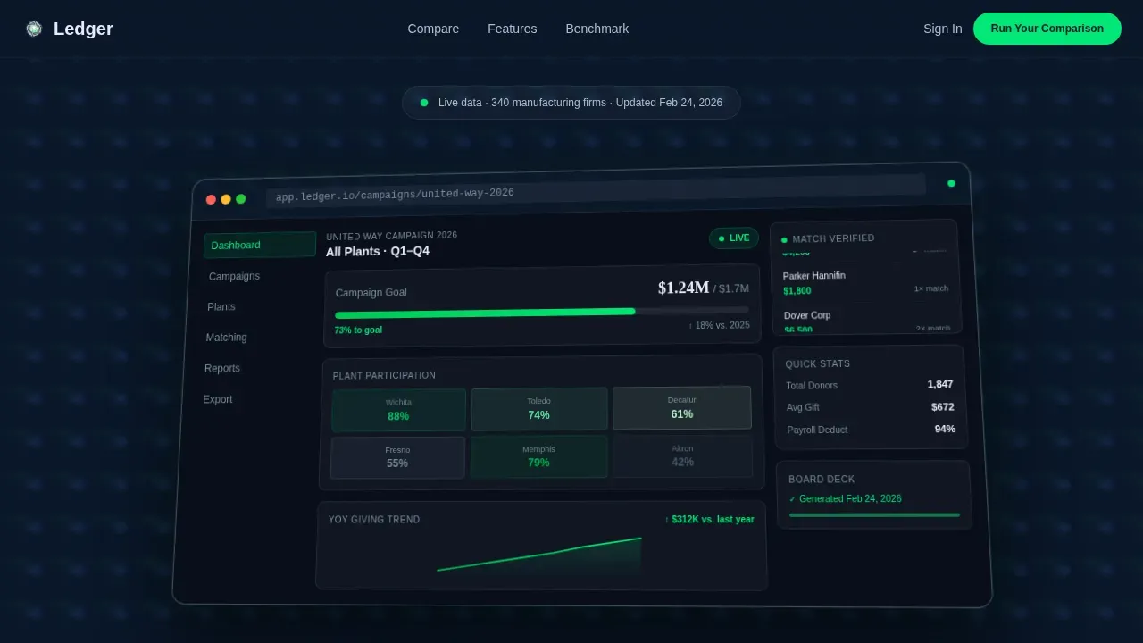
- An animated hero with a half-isometric dashboard preview floating over a deep navy background
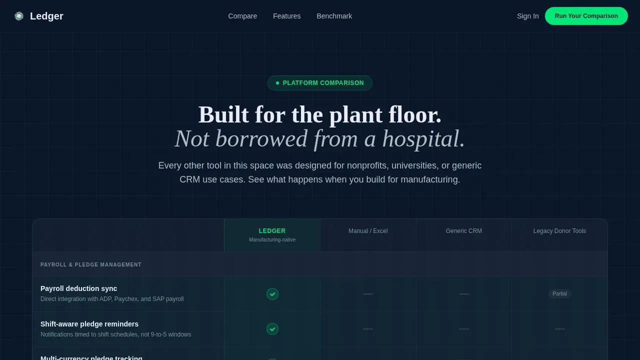
- A 12-row comparison table stacking the platform against manual tracking, generic CRMs, and legacy donor tools
- A dual call-to-action section with a diagnostic form and a gated benchmark report download
Feature list
This template is built around six core functional areas. Each one is grounded in the source brief and serves a specific role in the conversion flow.
Animated Dashboard Hero
The header section renders a half-isometric browser frame over the midnight navy background. Inside the frame, a campaign thermometer sits at 73%, a plant-by-plant participation heatmap shows six facilities, and a real-time matching-gift ticker displays live data. Specific numbers like "$1.24M matched" and "Wichita Plant: 88% participation" are readable at a glance. This compelling imagery lets potential donors and buyers immediately pattern-match against their own reality.
12-Row Feature Comparison Table
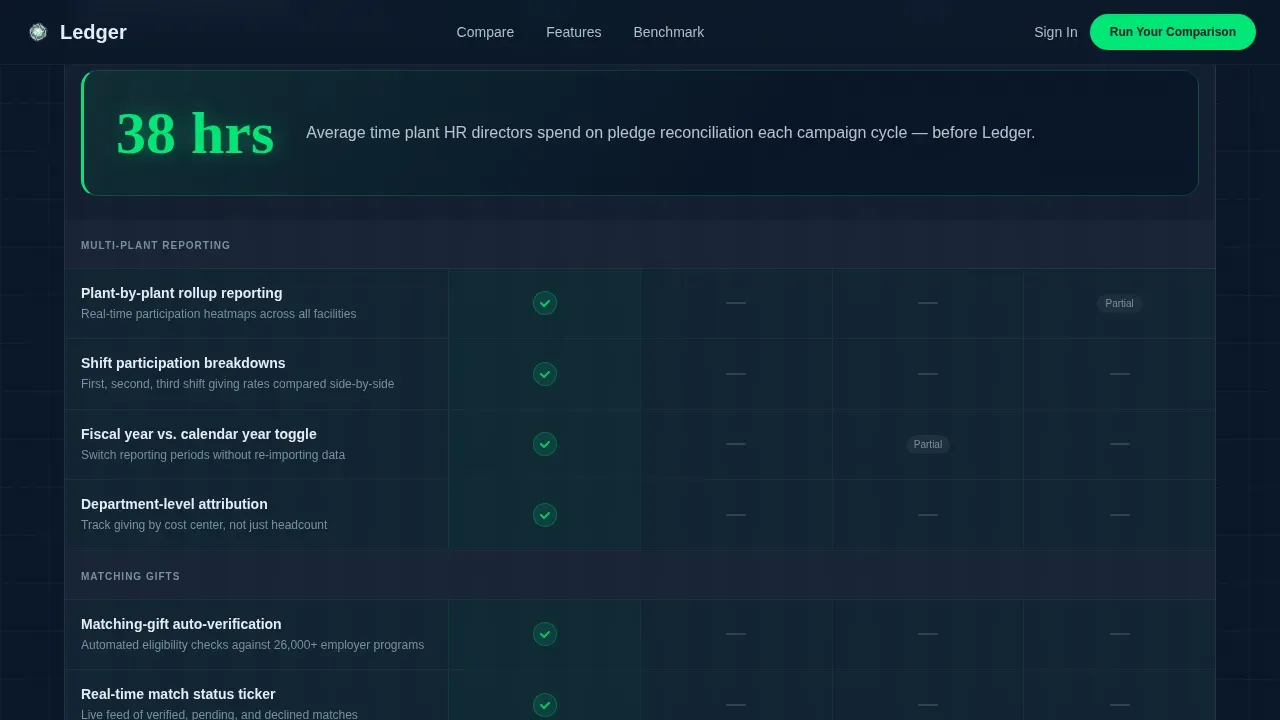
The comparison table is the structural centerpiece of this donation landing page template. It covers twelve capability rows including payroll deduction sync, shift-aware pledge reminders, multi-plant rollup reporting, matching-gift auto-verification, GAAP-ready export, and board deck generation. Green check icons pulse on the platform's column while gray dashes sit on competitor columns. Stat card interruptions between table sections reframe each capability gap as an industry-wide problem, not just a feature list.
Stats-First Impact Sections
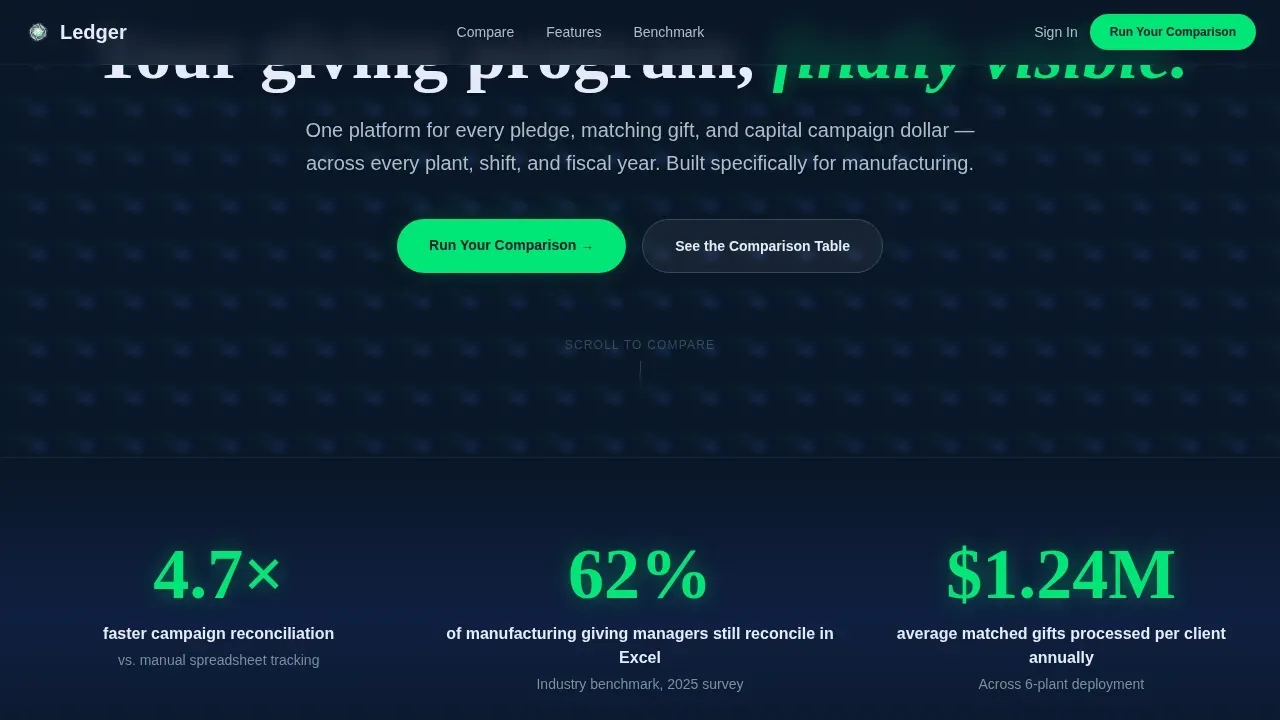
Every major section of this page opens with one oversized metric before any explanation. "4.7x faster campaign reconciliation" arrives first. "62% of manufacturing giving managers still reconcile in Excel" appears mid-scroll. These numbers create an emotional connection with the reader and build the case for change without requiring persuasive copy to do all the work.
Dual Conversion Path
The call to action section offers two distinct paths. The primary path is "Run Your Comparison," which links to a short diagnostic form collecting donor count range, number of facilities, matching-gift handling status, and a work email. The secondary path offers a Manufacturing Giving Benchmark Report, gated behind email only, capturing site visitors still in early research mode. Keeping mandatory fields minimal reduces friction and supports a higher conversion rate.
Stat Card Interruptions
Between table sections, full-width stat cards break the scroll with single-sentence industry benchmarks. These cards reassure donors and buyers that the problem is real and widely shared. They also serve as social proof moments, grounding the comparison in documented industry behavior rather than product marketing alone.
Tech Glass Visual System
The template uses a carefully calibrated dark design system. The background image is deep terminal navy. Status-green pulses on positive data. Frosted panel white surfaces card backgrounds. Every bright element earns its place by representing something meaningful, producing a visually appealing design that feels like a factory control room rebuilt by a fintech team.
Page sections overview
| Section | Purpose |
|---|---|
| Animated hero header | Establishes platform context with live dashboard preview |
| Stats bar row | Opens with three oversized impact metrics |
| Comparison table | Stacks platform against three competitor types across 12 rows |
| Stat card breaks | Reframes capability gaps as industry problems |
| Call to action section | Delivers diagnostic form and gated report download |
| Trust strip | Displays logos and social proof elements |
| Footer row | Single-row linear footer with minimal links |
Design & branding system
The visual identity follows a Tech Glass theme built on a Midnight Blue color system. The palette is dark, data-dense, and backlit, designed to feel like a factory SCADA screen rebuilt by a fintech team. Typography pairs DM Sans for body text with Fraunces for display numerics, giving data points a distinct visual weight.
- Colors: deep terminal navy (#0A1628), polished titanium (#B0BEC5), status-green (#00E676), and frosted panel white (#E8EAF6) for card surfaces
- Animations include pulsing green check icons, scroll-reveal table rows, fade-in metrics, and a thermometer animation in the hero
Mobile & speed optimization
This template is desktop-first by design, reflecting the control room monitor aesthetic of its target users. However, the layout is built to remain fully readable and functional on mobile devices, which matter for any donation landing page reaching donors across plant floors and remote facilities.
- Mobile responsiveness is built into the layout so that the comparison table, stat cards, and donation form adapt cleanly to smaller screens
- Mobile friendly form inputs and minimal mandatory fields ensure mobile users can complete the giving process without friction
How this template helps you convert
The page is engineered around a single conversion goal: move a skeptical manufacturing giving manager from recognition to action. Every design and copy decision supports that path.
- The hero dashboard preview creates an immediate emotional connection, showing the visitor exactly what clarity looks like before they read a single word of explanation
- The comparison table removes objections row by row, with green checks on twelve capabilities and industry stat cards that engage donors and buyers with documented proof
- The dual call to action keeps both ready-to-act and still-researching visitors on a forward path, with a diagnostic form for quick decisions and a gated benchmark report for future engagement
Other information about this template
This template is one example of a donation landing page designed specifically for a high-complexity niche. Most general-purpose landing pages and standard donation page templates are not built for multi-plant, shift-aware giving programs. The following context helps you understand where this template fits in the broader landscape of donation page tools and best practices.
- The best donation landing pages focus on a single clear action, avoid unnecessary distractions, and use persuasive copy tied to real data rather than generic claims
- Best donation pages in the nonprofit and corporate giving space share common traits: engaging content, a clear call to action, suggested donation amounts, and minimal form friction
- An effective donation form collects only what is needed. Every additional field reduces the conversion rate, so this template keeps mandatory fields to donor information essentials
- Donation amounts and gift amounts displayed as preset options simplify the giving process for donors and increase the likelihood that potential donors will complete a contribution
- The donation process in manufacturing giving programs often spans multiple pages of internal approvals. This template compresses external conversion into one page
- Online fundraising now accounts for roughly 12% of nonprofit revenue, making a well-designed donation landing page a crucial step for any organization prioritizing online giving
- An online donation page that includes social proof, transparent use of funds, and clear payment details helps reassure donors and builds the confidence needed to donate
- Recurring donations are a key metric for long-term program health. The best donation pages make it easy to opt into recurring giving options and display suggested donation levels clearly
- Donor data captured through the diagnostic form and benchmark report download supports future engagement and gives the platform team qualified leads segmented by program size
- The donation landing page template supports multiple payment methods by design philosophy, allowing donors to pay via their preferred payment method, including options like Google Pay, without friction
- A confirmation page or thank-you step after the donation process is a best practice for expressing gratitude to donors and fostering long-term relationships with recurring donors
- Processing fees and the option to cover processing fees can be surfaced in the form layer, giving donors transparency over exactly where each dollar goes
- Page examples from leading nonprofit organizations, such as Covenant House and the CARE donation form, demonstrate that a single, focused online donation page outperforms cluttered multiple pages with navigation distractions
- The St. Jude donation page and Girls Who Code page examples show that a streamlined donation form with a quick case for support at the top dramatically increase completion rates compared to text-heavy alternatives
- Feeding America uses a two-page donation flow where donors choose donation amounts and their payment method first, then add payment information, which reduces cognitive load at each step
- Doctors Without Borders leads their giving page with gratitude, which can encourage donors to complete a gift and creates a personal touch that standard form pages lack
- Donor management systems that connect giving data directly to accounting ledgers are essential for organizations with complex financials, and this template is designed to position exactly that kind of platform
- The top choices in 2026 for managing nonprofit donation data focus on streamlining revenue flow from donations into a general ledger, with direct integrations that avoid third-party syncing issues
- Tools like those highlighted for small and mid-size nonprofits for their ease of use demonstrate that a recommended donation workflow should feel simple for both the organization and its donors
- Allowing donors to opt into suggested donation tiers and give in just a few clicks is a principle that applies equally to corporate giving programs and traditional nonprofit donation pages
- A well-structured online giving experience builds an emotional connection with site visitors, helping the organization's mission feel tangible and urgent rather than abstract
- This template can support the nonprofit's mission communication through the stat card layer, where industry benchmarks and specific data points do the work of persuasive copy without overselling
Theme
Tech Glass
Creative direction
Stats-First Impact
Color system
Midnight Blue
Style
Comparison Table
Direction
Comparison/Versus
Page Sections
Animated Dashboard Hero Section
Row Feature Comparison Table
Stats-first Impact Layout
Dual Call-to-action Section
Stat Card Interruption Blocks
Tech Glass Dark Visual System
Related questions
Who is the Ledger comparison landing page template designed for?
What sections does this template include?
Can this template work for a nonprofit organization or nonprofit donation context?
How does the comparison table handle competitor positioning?
Does the template include the diagnostic form and benchmark report download?



