Accessible Documentation Landing Page Template
Aria is a split-screen landing page template built for accessibility documentation platforms. It opens with a live compliance estimator, then walks visitors through before-and-after code comparisons that build instant trust. Designed in a Tech Glass style with a high-contrast teal palette, Aria is purpose-built to generate leads from accessibility leads, government IT teams, and developers chasing compliance deadlines.
by Rocket studio
Quick summary
Aria is a single-page, split-screen landing page template for screen reader compatible documentation platforms. It leads with a live accessibility audit estimator and follows a Spec Sheet creative direction, showing raw broken markup beside clean, remediated output. The Teal Catalyst color system ensures every design choice serves both visual clarity and contrast compliance.
Who this template is for
This template speaks directly to people under real compliance pressure. Whether you are racing toward a WCAG deadline or shipping docs that a screen reader user can actually navigate, Aria is built around your specific situation.
- Accessibility leads at SaaS companies working toward WCAG 2.1 AA or WCAG 2.2 AAA compliance
- Government and public-sector IT teams bound by Section 508 or EN 301 549 requirements
- Independent developers who need to make their documentation fully navigable by assistive technology users
What problem this template solves
Technical documentation is often built without screen reader users in mind. Heading hierarchies break, ARIA (Accessible Rich Internet Applications) labels go missing, and data tables become walls of unsemantic markup. Accessibility leads and developers need a way to communicate the scope of this problem clearly and capture leads from visitors who feel that urgency.
- Visitors arrive without knowing how broken their current docs are, so they need an immediate, credible diagnostic experience
- Generic landing pages fail to show proof, leaving compliance-focused buyers skeptical before they ever reach a form
- Teams juggling multiple compliance standards need a page that addresses WCAG, Section 508, and EN 301 549 in one place
What you get with this template
Aria delivers a fully structured single-page layout designed to move accessibility-focused visitors from awareness to action. Every section is purposeful and prompt-ready for your specific platform and offer.
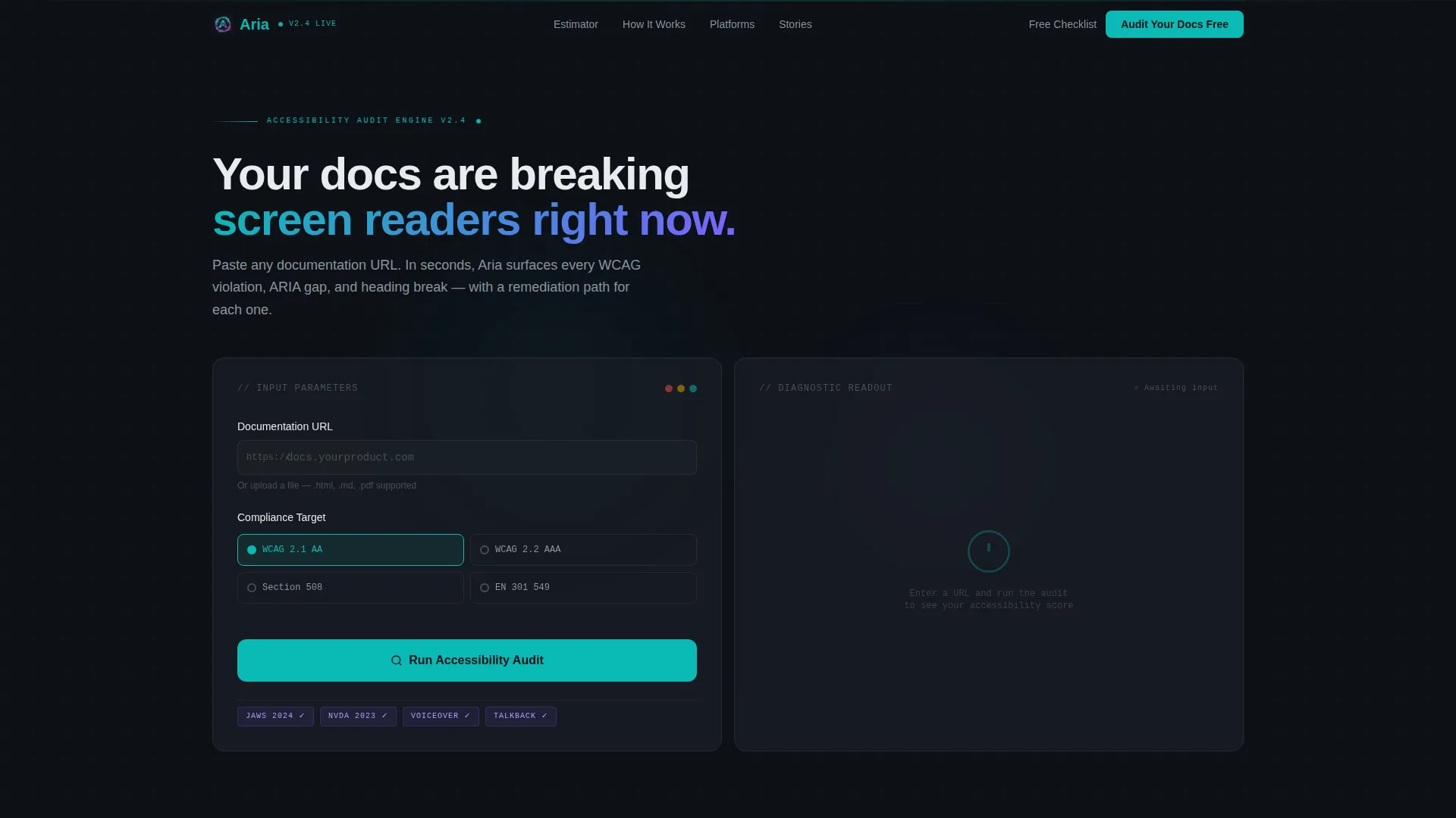
- A live split-screen accessibility estimator in the header that generates an audit score from a pasted URL or uploaded document
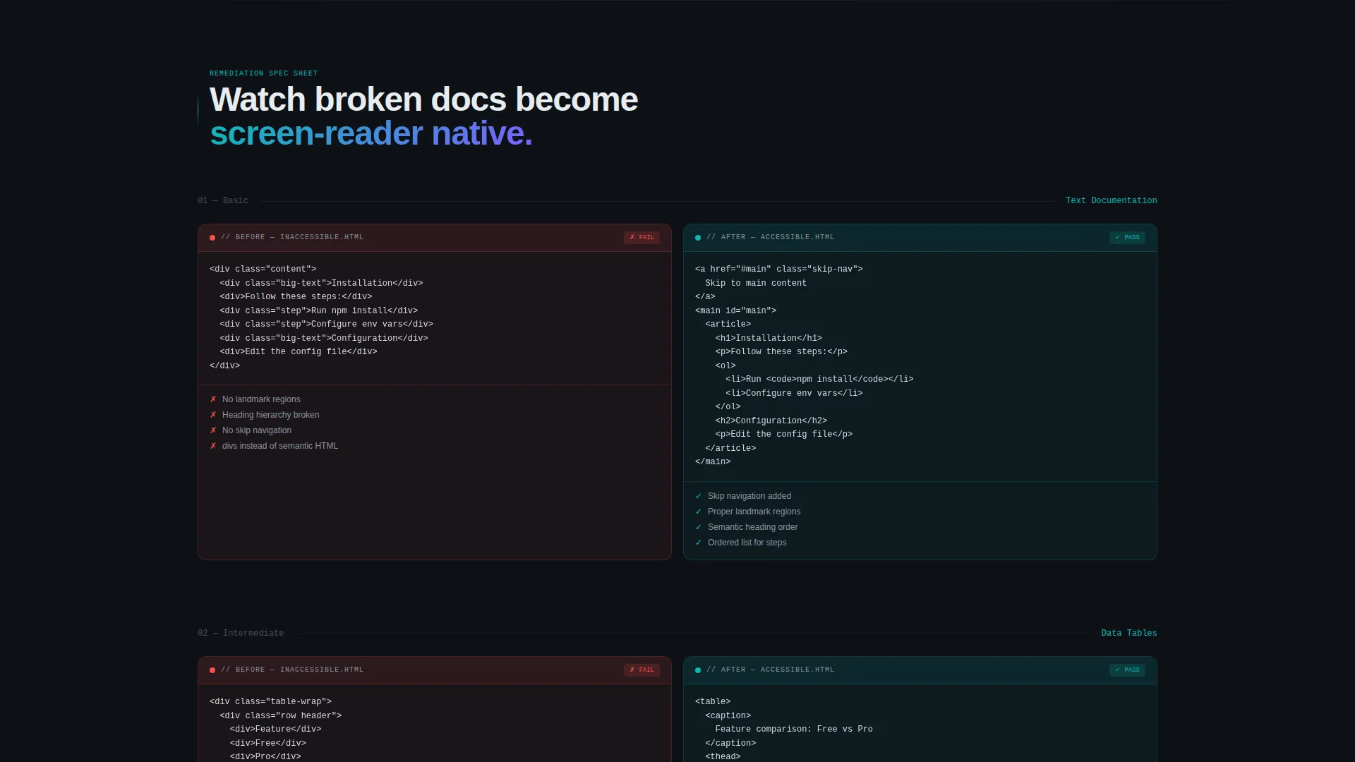
- Scrollable before-and-after Spec Sheet sections comparing broken markup to remediated semantic HTML output
- Two distinct lead generation paths: a full audit form and a gated checklist download for visitors not yet ready to commit
Feature list
This template is built around a focused set of high-impact components. Each one earns its place by serving either the visitor experience or the lead generation goal.
Live Accessibility Audit Estimator
The header splits into two panels. The left panel holds a form where visitors paste a URL or upload a document and choose their compliance target. The right panel renders an audit score as a glowing teal radial gauge with flagged issues listed beneath it, including missing alt text counts, heading hierarchy breaks, and ARIA label gaps.
Split-Screen Spec Sheet Sections
After the header, each scroll section divides the screen between a "before" document fragment on the left and the remediated version on the right. Broken heading order, missing landmarks, and unsemantic markup are highlighted in muted red on the left. Clean semantic HTML and proper ARIA roles glow on the right.
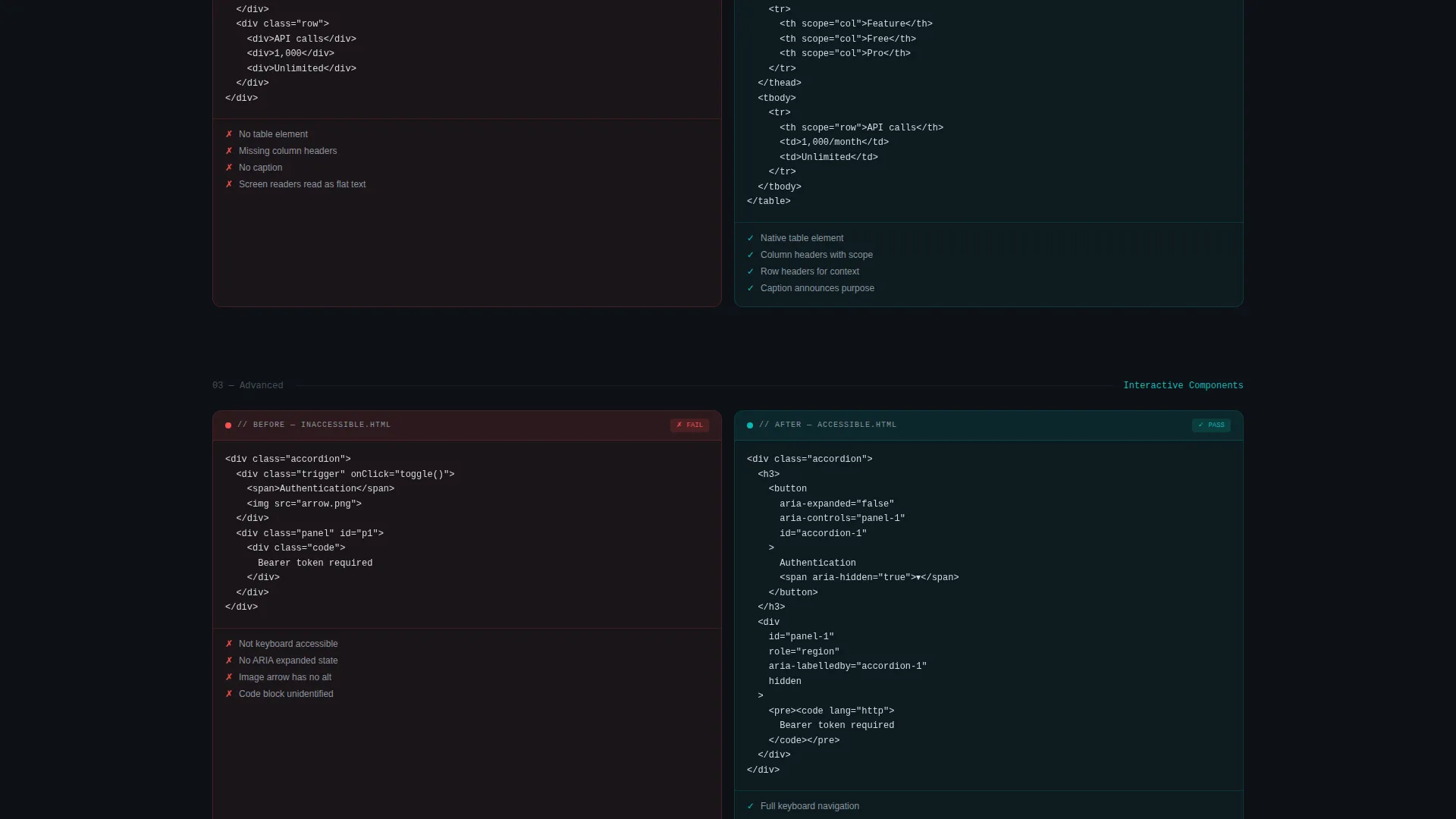
Escalating Complexity Proof Flow
The Spec Sheet sections build in complexity as visitors scroll. Simple text documents come first, then data tables, then interactive components. This progression builds confidence by showing remediation at every level of difficulty.
Primary Lead Capture Form
A full audit form anchored just after the estimator collects work email, documentation platform type (Markdown, Confluence, ReadTheDocs, or custom), estimated page count, and compliance deadline via a date picker. The estimator result primes visitors so they arrive at the form already convinced of the value.
Gated Checklist Download Path
A secondary conversion path offers a downloadable remediation checklist as a gated PDF. It captures only a name and email address, making it a low-commitment entry point that nurtures visitors toward the full audit offer.
Sticky Mobile call to action Bar
On mobile viewports, the primary call to action "Audit Your Docs Free" persists as a sticky bottom bar. This keeps the conversion prompt visible throughout the scroll experience without interrupting the content flow.
Page sections overview
| Section | Purpose |
|---|---|
| Estimator header | Live compliance audit tool acting as the hero unit |
| Audit score panel | Displays flagged issues as a real-time diagnostic readout |
| Before versus. after (text) | Compares broken plain-text docs to remediated semantic output |
| Before versus. after (tables) | Shows data table remediation with proper ARIA markup |
| Before versus. after (interactive) | Demonstrates complex component remediation at highest complexity |
| Primary audit form | Captures full lead details for the free audit offer |
| Checklist download | Secondary gated PDF path for early-stage visitors |
| Sticky mobile bar | Persistent call to action anchored to the bottom of mobile screens |
Design & branding system
The Tech Glass visual theme treats every layer of the interface as a polished, translucent surface. The Teal Catalyst color system is built for dark-mode readability, with each color chosen to carry both aesthetic weight and functional contrast.
- Deep interface black (#0D1117) as the base layer, reactive teal (#0ABAB5) for interactive and diagnostic elements, frosted glass white (#E8ECEF) for text and surface contrast, and signal violet (#7B61FF) reserved for focus states and active interface elements
- No stock photography or illustration; the estimator tool itself serves as the visual centerpiece
- Muted red highlights on broken markup and teal highlights on remediated output reinforce the before-and-after narrative directly through color
Mobile & speed optimization
The template is structured to deliver a clear, focused experience on smaller screens. The sticky call to action bar ensures the primary conversion action is never out of reach, even mid-scroll.
- Split-screen layout adapts for mobile viewports with the estimator panels stacking vertically for legibility
- Sticky bottom bar keeps "Audit Your Docs Free" persistently visible throughout the entire mobile scroll journey
- Spec Sheet comparison sections reflow cleanly so before-and-after code fragments remain readable on narrow screens
How this template helps you convert
Aria is designed so the estimator does the persuasion work before any form ever appears. Visitors arrive skeptical and leave with a specific, itemized picture of their documentation gaps.
- The live audit estimator creates a personalized diagnostic result in the header, making the value of the platform immediately concrete and specific to each visitor's own documents.
- The escalating Spec Sheet sections build credibility section by section, showing remediation proof across increasing levels of complexity before the primary form is ever presented.
- The two-path conversion structure captures visitors at different levels of readiness, with the full audit form for committed buyers and the gated checklist PDF for those who need more nurturing.
Other information about this template
Aria is a focused, single-purpose landing page template. It is designed to be customized for the specific compliance standards and documentation platforms your audience cares about most.
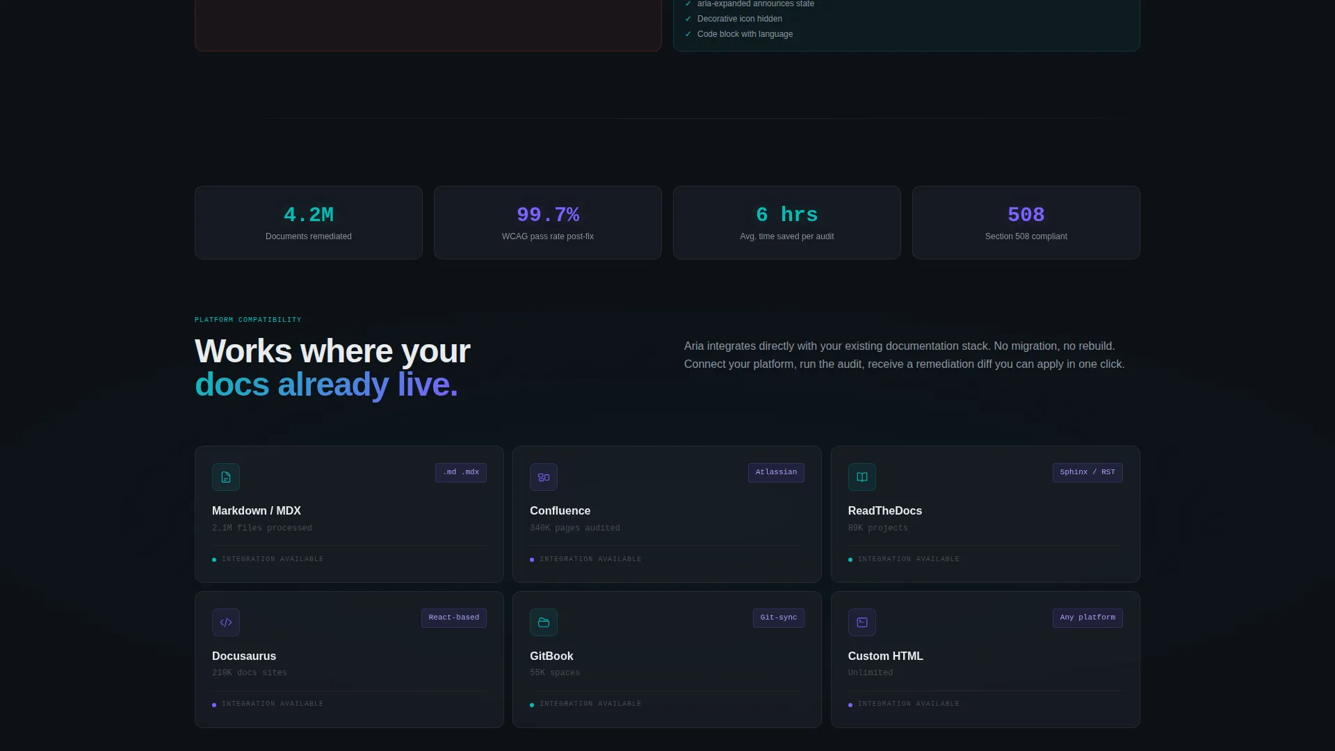
- The compliance target selector in the estimator is pre-configured for WCAG 2.1 AA, WCAG 2.2 AAA, Section 508, and EN 301 549
- The documentation platform field in the lead form references Markdown, Confluence, ReadTheDocs, and custom platform options as selectable choices
- This template suits any accessibility documentation service looking to convert compliance-driven buyers through proof rather than promises
Theme
Tech Glass
Creative direction
Spec Sheet
Color system
Teal Catalyst
Style
Split Screen (50/50)
Direction
Lead Generation
Page Sections
Live Compliance Audit Estimator
Split-screen Spec Sheet Layout
Escalating Complexity Proof Sections
Dual-path Lead Generation
Sticky Mobile Call-to-action Bar
Related questions
What is the main conversion goal of this landing page template?
Does the estimator actually run a live accessibility audit?
Which compliance standards does this template reference?
Can I customize the documentation platform options in the lead form?
Why does the template use a Spec Sheet layout instead of standard marketing sections?


