Opera Vertical SaaS Booking Website Template
Aria is a scroll-reveal landing page template built for opera CRM platforms. It combines a trust-building logo bar, an interactive revenue forecast calculator, and progressive data visualizations to guide visitors from curiosity to signup. The three-field freemium form and a secondary demo booking path make conversion feel natural, not forced.
by Rocket studio
Quick summary
Aria is a single-page, scroll-reveal landing page template designed for opera vertical SaaS products. It opens with institutional social proof, moves immediately into an interactive revenue tool, and progressively reveals platform capabilities as the visitor scrolls. Every section is built around one goal: earning the signup before the visitor leaves.
Who this template is for
This template is purpose-built for SaaS companies serving the performing arts sector. It speaks directly to the teams inside opera organizations who feel the daily pain of fragmented data.
- Development directors managing six-figure patron cultivation and donor pledge tracking
- Box office managers forecasting single-ticket sales against subscription renewal cycles
- Artistic administrators coordinating singer availability across multiple productions in repertory
What problem this template solves
Opera companies run on spreadsheets that do not talk to each other. Donor pledges live in one file, subscriber renewals in another, and artist contracts in a third. A general director trying to read season health has to synthesize three separate tools before making a single decision.
- No unified view of donor lifecycle, ticket velocity, and artist scheduling at once
- Revenue forecasting requires manual calculations that are slow and error-prone
- Enterprise buyers need proof of value before they will commit to a demo or trial
What you get with this template
Aria delivers a complete, production-ready landing page layout for an opera CRM platform. Every section is pre-designed and structured for scroll-reveal progressive disclosure.
- A logo bar header that immediately establishes credibility with recognizable opera house names
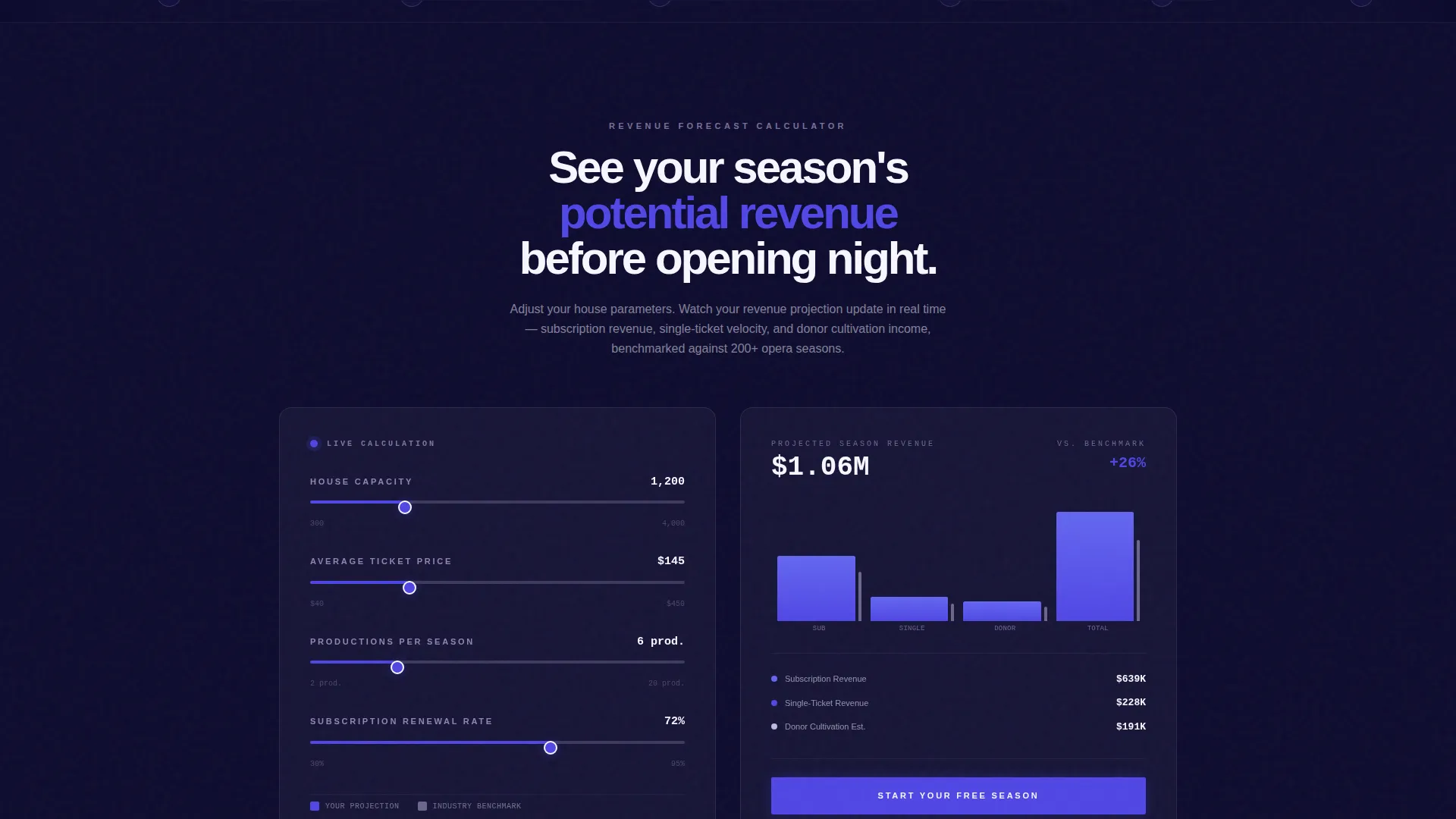
- An embedded interactive revenue forecast calculator that renders a projected season chart in real time
- A freemium conversion flow with a three-field signup form and a secondary enterprise demo booking path
Feature list
This template includes a focused set of purpose-built components, each serving a distinct role in the visitor journey from arrival to conversion.
Logo Bar Social Proof Header
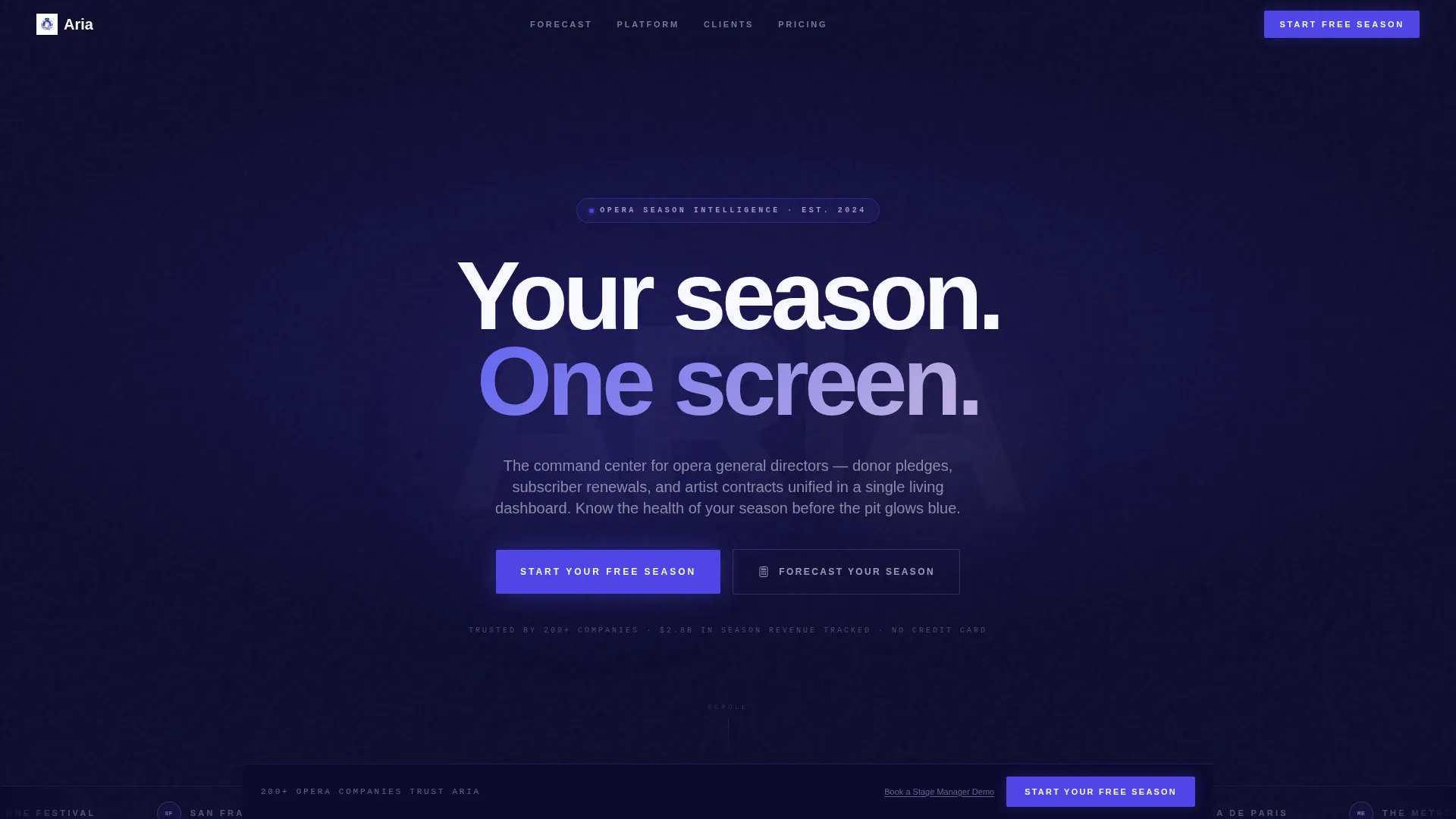
A slim horizontal ticker displays opera house crests and company wordmarks against a deep navy background. It answers the trust question before the visitor reads a headline, positioning social proof as the primary hero element.
Interactive Revenue Forecast Calculator
Visitors input house capacity, average ticket price, number of productions, and subscription renewal rate. The tool instantly renders a projected season revenue chart in electric indigo, with lilac comparison lines showing industry benchmarks alongside the visitor's own numbers.
Scroll-Reveal Progressive Disclosure
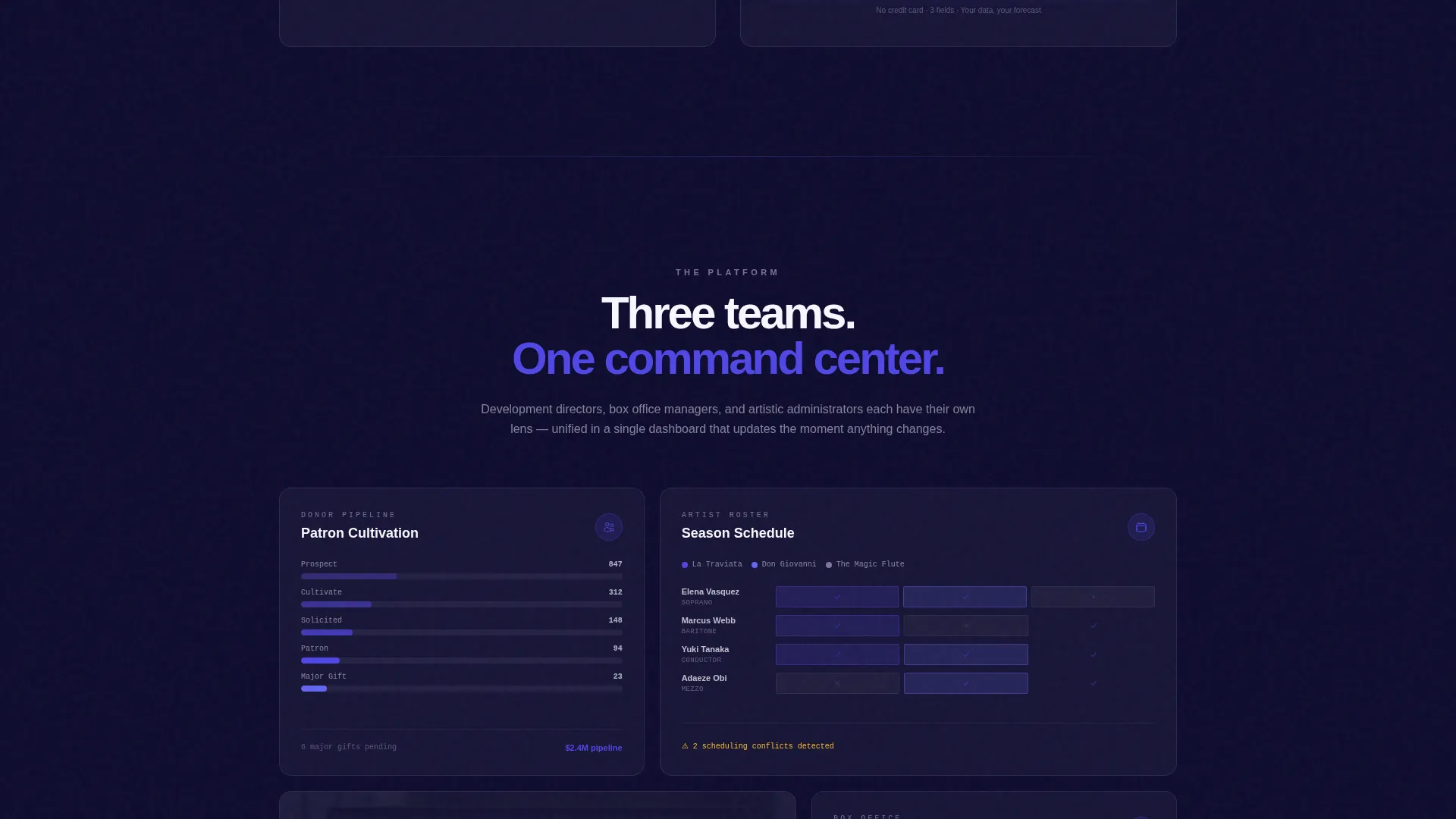
Each section of the page unlocks only as the visitor scrolls into it. Donor lifecycle visualization, artist roster Gantt charts, and single-ticket versus subscription mix analysis appear in sequence, mimicking an actual onboarding experience without requiring a login.
Persistent Freemium Conversion Bar
A "Start Your Free Season" call-to-action button is placed beneath the calculator results and again in a persistent bottom bar that activates after the second scroll-reveal. The signup requires only email, company name, and number of productions per season, with no credit card needed.
Secondary Enterprise Demo Path
A "Book a Stage Manager Demo" text link sits beneath the primary button for enterprise buyers who need migration support. This dual-path approach serves both self-serve and high-touch sales motions without cluttering the page.
Dashboard Pro Visual Data Surfaces
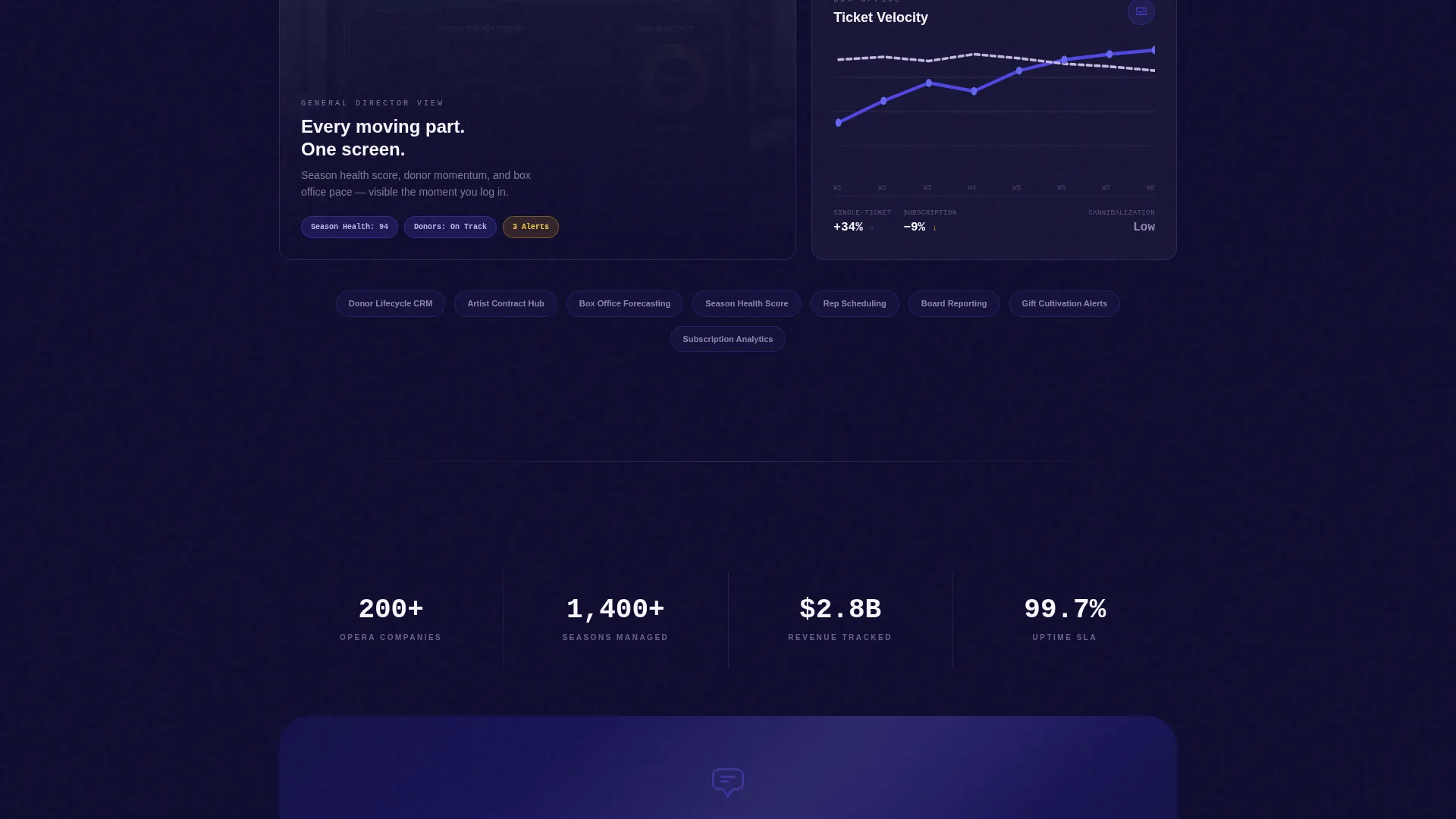
Metric cards, donor lifecycle panels, and Gantt chart layouts use the Dashboard Pro theme. White card surfaces, lilac graph lines, and indigo interactive states create a data-dense but visually clean presentation that communicates platform sophistication.
Page sections overview
| Section | Purpose |
|---|---|
| Logo Bar Header | Establish trust with recognizable opera institution names |
| Headline Reveal | Deliver the core value statement as a single fading line |
| Revenue Forecast Calculator | Give visitors an interactive projection tool before asking for anything |
| Donor Lifecycle Panel | Visualize patron cultivation stages and pledge progression |
| Artist Roster Gantt | Show singer availability and scheduling across productions in rep |
| Ticket Mix Analysis | Compare single-ticket velocity against subscription cannibalization risk |
| Primary call to action Section | Drive freemium signups with a three-field, no-credit-card form |
| Persistent Bottom Bar | Keep the primary call to action visible after the second scroll-reveal |
| Secondary Demo Link | Surface enterprise demo booking beneath the primary conversion button |
Design & branding system
The visual identity follows the Dashboard Pro theme using an Electric Indigo color system. The palette is built to feel like a modern opera house during a late-night tech rehearsal: precise, atmospheric, and never garish.
- Deep stage-dark navy (#0D0B2E) anchors full-bleed section backgrounds; electric indigo (#4F46E5) drives interactive states and live data pulses
- Soft silver-lilac (#C4B5E3) softens secondary text, graph lines, and dense table rows; bright curtain-call white (#F8F7FF) gives metric cards and data surfaces room to breathe
Mobile & speed optimization
The scroll-reveal architecture is designed to work progressively, so each section loads and animates as it enters the viewport rather than all at once. The layout adapts across screen sizes so that data-dense panels remain readable on smaller devices.
- Calculator inputs and chart outputs reflow to a single-column layout on mobile screens
- The persistent bottom call to action bar remains anchored and visible on all device sizes
How this template helps you convert
The conversion strategy is built on giving real value before asking for anything. By the time a visitor sees their own revenue projection, they already feel a sense of ownership over the data and the platform.
- The interactive calculator creates a personalized result that the visitor wants to keep, making the freemium signup feel like saving their work rather than starting a trial
- The persistent bottom bar and the dual conversion path (self-serve form plus enterprise demo link) ensure that no visitor leaves without a clear, low-friction next step
Other information about this template
Aria is built on a scroll-reveal single-page structure, making it well-suited for SaaS companies operating in the opera vertical or broader performing arts technology market. The template's progressive disclosure approach works particularly well for platforms where the product itself is data-rich and benefits from guided exploration.
- The template style is classified as Scroll Reveal (Progressive), following a Calculator/Tool First creative direction
- The landing page direction targets Freemium/Trial conversion, with the Logo Bar header concept handling initial credibility
- The Dashboard Pro theme and Electric Indigo color system are designed to translate across both light and dark presentation environments
- The three-field signup form (email, company name, productions per season) is intentionally minimal to reduce friction for first-time visitors
Theme
Dashboard Pro
Creative direction
Calculator/Tool First
Color system
Electric Indigo
Style
Scroll Reveal (Progressive)
Direction
Freemium/Trial
Page Sections
Logo Bar Trust Header
Interactive Revenue Forecast Calculator
Progressive Scroll-reveal Sections
Dual Conversion Path Design
Persistent Bottom Call to Action Bar
Dashboard Pro Data Surfaces
Related questions
What kind of company is this template built for?
Does the template include the actual calculator logic or just the layout?
Can I change the color palette to match my own brand?
What does the scroll-reveal behavior look like in practice?
Is the three-field signup form customizable?



