Smart App Store Optimization Landing Page Template
The Rank Precision App Store Optimization landing page template is a bento grid, Tech Glass landing page built for ASO agencies targeting mobile product managers, indie developers, and growth leads. It combines an interactive keyword tracking dashboard, scroll-activated bento cells, and a persistent audit call to action to turn visitor curiosity into qualified audit requests.
by Rocket studio
Quick summary
Rank is a precision-engineered, single-page landing page template built for app store optimization agencies. It uses a dark glassmorphism bento grid layout, an animated keyword tracking dashboard header, and interactive bento cells to communicate data intelligence before a single word of copy is read. The page drives one action: a free ASO audit request via a URL input field.
Who this template is for
This landing page is purpose-built for teams that live inside the data. It speaks the language of people who check app store rankings before their first coffee and feel genuine stress when a competitor gains ground on a branded term.
- Mobile product managers watching their app bleed position on terms they should own
- Indie developers whose well-built utility sits buried deep in app store search results, invisible to potential users
- Growth leads at funded startups who have exhausted paid budgets and need organic downloads to carry the next quarter
What problem this template solves
Most app marketers have a visibility problem, not a product problem. The app is good. The listing is not working. Generic agency websites bury the value proposition behind stock photos and vague promises, making it hard for visitors to trust the team or understand the method.
- App's visibility stalls because the listing page fails to show data intelligence in action
- Visitors leave before converting because the agency site reads like a brochure, not a precision tool
- Paid acquisition costs keep rising while organic search performance stays flat with no clear path forward
What you get with this template
You get a fully structured, high-interactivity landing page that functions like a live product demo. Every visual component is designed to show competence before a visitor reads a headline. The layout escalates logically from problem to method to proof.
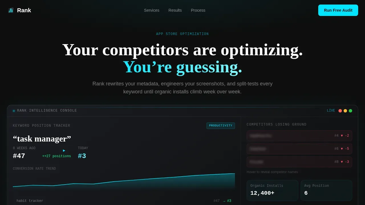
- A full-width animated dashboard header with odometer-style counters, a keyword climbing from position 47 to position 3, a conversion rate chart, and competitor tiles losing ground
- Three bento grid rows covering the problem, the method, and the proof, each with scroll-activated micro-interactions and hover-expansion effects
- A persistent floating call to action bar that activates at 40% scroll, featuring the same URL input field as the header so the audit action feels like using a tool
Feature list
This section covers the key features built into the Rank landing page template. Each component is drawn directly from the template brief.
Animated Keyword Tracking Dashboard Header
The header is a full-width interactive mockup of a keyword tracking console. Counters roll like odometers on page load, showing a keyword climbing from position 47 to position 3 over eight weeks. A conversion rate chart ticks upward alongside competitor tiles with blurred names losing ground. The primary call to action is embedded inside this dashboard as a URL paste field, making the first interaction feel like running a diagnostic rather than filling out a form. This approach puts the value proposition front and center before any body copy loads.
Bento Grid Row System with Scroll Activation
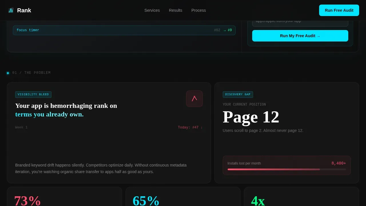
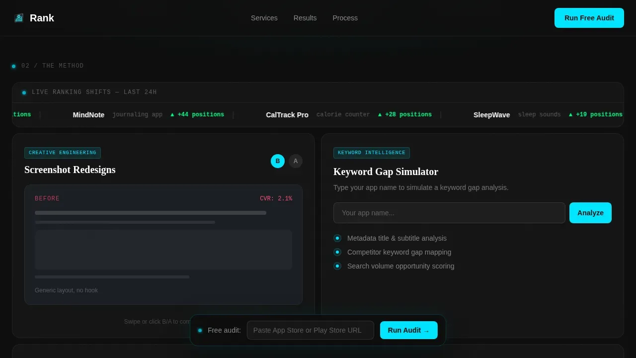
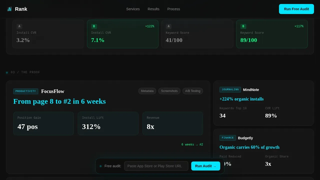
The page uses a three-row bento grid that escalates in complexity as the visitor scrolls. The first row surfaces the problem: lost visibility, keyword position bleed, and competitor gains. The second row demonstrates the method through an interactive metadata explorer, a screenshot before-and-after swipe module, and a live ticker of ranking shifts across categories. The third row delivers proof through case study metrics inside their own bento cards with micro-interactions. Each cell expands on hover, revealing depth beneath the glass surface.
Interactive Keyword Gap Simulator Cell
One dedicated bento cell lets visitors type their own app name and see a simulated keyword gap analysis. This is the template's most powerful trust-building element. It lets potential users touch the product experience before any commitment is made. Addressing user pain points through direct interaction is far more persuasive than a static claim, and this cell does exactly that.
Persistent Floating Audit call to action Bar
A floating call to action bar activates after the visitor scrolls 40% of the page. It carries the same URL input field as the dashboard header, reinforcing the audit action at the moment of peak engagement. There is no commitment language and no calendar booking flow. The design keeps the friction as low as possible while maintaining a single, focused conversion goal.
Screenshot Before-and-After Swipe Module
A dedicated bento cell cycles through before-and-after app screenshot redesigns using a swipe gesture. This module visually demonstrates the creative side of app store optimization, showing how improved app screenshots directly affect first impressions. Since most users decide within three to six seconds of viewing a listing, this cell makes the case for creative quality without a single word of explanation.
Tech Glass Dark Glassmorphism Design System
The entire landing page is built on a carbon fiber dark design system. Deep matte black, woven graphite panels, translucent glass card borders, and electric cyan pulse accents create an interface that feels like holding a flagship phone in a dark room. Typography uses DM Sans for interface copy and Fraunces as a display serif accent. GPU-accelerated transforms and IntersectionObserver-based activation keep animations smooth and purposeful.
Page sections overview
| Section | Purpose |
|---|---|
| Dashboard Header | Animated keyword tracker with embedded audit URL input |
| Bento Row One | Problem cards covering visibility loss and rank bleed |
| Metadata Explorer Cell | Interactive keyword gap simulator for visitor's own app |
| Screenshot Swipe Cell | Before-and-after creative redesign with swipe gesture |
| Live Rankings Ticker | Real-time style ticker of category ranking shifts |
| Case Study Bento Row | Proof metrics with micro-interactions per client result |
| Floating Audit Bar | Persistent URL field activating at 40% scroll depth |
| Footer Row | Linear single-row footer pattern |
Design & branding system
The Rank template uses a Tech Glass visual identity built on a carbon fiber color system. Every surface feels intentional, wet, and precision-machined. The aesthetic is designed to signal data mastery without a single word of explanation.
- Color palette: deep matte black (#0D0D0D) as the base, woven graphite (#1A1D23) for panels, translucent panel gray (white at 6% opacity) for glass card borders, and electric cyan (#00E5FF) pulsing on hover states and live data points
- Typography pairing: DM Sans handles all interface and body copy for clarity at small sizes; Fraunces serves as the display and serif accent for headlines, adding editorial weight to data-heavy sections
Mobile & speed optimization
The Rank landing page is designed desktop-first to support the dashboard aesthetic. The full keyword tracking console, bento grid expansions, and live ticker elements are built for wide-screen viewing. A mobile fallback ensures the core content and call to action remain accessible on smaller screens.
- Animations rely exclusively on GPU-accelerated transforms to avoid layout thrashing and maintain smooth frame rates even with high-interactivity elements running simultaneously
- Scroll-triggered cell activation uses IntersectionObserver, a browser-native approach that keeps the page performant by activating animations only when each bento cell enters the viewport
How this template helps you convert
The entire landing page is engineered around a single conversion goal: driving visitors to submit their app store or Google Play URL for a free ASO audit. Every design and interaction decision serves that goal.
- The dashboard header makes the audit action feel like using a real tool. Visitors paste a URL to "run" an audit rather than submit a lead form, which removes psychological resistance and increases the likelihood of follow-through from potential users who are already skeptical of agency promises.
- The interactive bento cells build trust progressively. By the time a visitor reaches the case study row, they have already interacted with a keyword gap simulator and seen before-and-after app screenshots. The social proof in the proof row lands with more weight because the visitor has already experienced a preview of the methodology, making the persistent floating call to action bar at 40% scroll a natural next step rather than an interruption.
Other information about this template
The Rank template is designed specifically for app store optimization (ASO) agency promotion, but the layout and interaction model are adaptable to any growth-marketing or data-intelligence service that benefits from showing methodology rather than just describing it.
- App store optimization ASO is an ongoing process. Static agency websites lose credibility as markets shift. This template is structured so that the proof row and case study bento cards can be updated regularly to reflect current results, keeping the page competitive.
- Keyword research is the cornerstone of a successful ASO strategy. The interactive keyword gap cell inside this template directly reinforces that message, letting visitors experience what thorough keyword research surfaces feel like before they engage with the agency.
- An effective app store optimization strategy aligns search intent, product positioning, and conversion optimization within a measurable framework. This landing page mirrors that philosophy structurally: the problem row maps to search intent, the method row maps to product positioning, and the proof row maps to conversion evidence.
- App store connect data, app radar signals, and apple ads performance indicators are the kind of live data this dashboard aesthetic is designed to evoke. The template communicates fluency with these tools through its visual language rather than by naming them in body copy.
- App store algorithms reward listings that maintain accurate metadata and regularly refreshed creative assets. The before-and-after screenshot swipe cell and the metadata explorer cell both reinforce this point visually, helping the agency communicate ongoing process value to prospects.
- App store reviews, app ratings, and social proof from existing users are critical ranking and conversion signals. The proof bento row is the right place to embed client testimonials, category ranking lifts, and specific percentage improvements as evidence of the agency's impact.
- Custom product pages on the Apple App Store and custom store listings on Google Play expand an app's visibility beyond the default listing. Agencies that offer this service can highlight it as a distinct capability within the method bento row.
- The template supports localization messaging. Reaching local users in their own language improves keyword coverage and conversion rates, and this positioning can be surfaced in the metadata explorer cell or a dedicated proof card.
- App preview videos and preview videos more broadly are high-leverage creative assets. The template's creative method row can showcase video optimization as a distinct deliverable alongside app screenshots and app icon work.
- In app purchases and premium features are conversion levers that affect both app store product page performance and post-install revenue. Agencies that optimize in app purchases as part of their service scope can add this as a case study metric in the proof bento row.
- Promotional text on the Apple App Store can be updated without a new app version submission. This makes it one of the fastest-iteration surfaces in a keyword optimization workflow, and it is worth calling out in the method row.
- App marketers working across mobile games and utility apps will find the bento proof row format flexible enough to display different vertical results side by side.
- A professional landing page serves as the first impression, sales pitch, and credibility statement for any agency. This template is built to make that impression feel like a live dashboard, not a marketing pamphlet.
Theme
Tech Glass
Creative direction
Interactive Explorer
Color system
Carbon Fiber
Style
Bento Grid
Direction
Click-Through
Page Sections
Odometer Dashboard Header with URL Audit Input
Three-row Escalating Bento Grid Layout
Interactive Keyword Gap Simulator Cell
Before-and-after Screenshot Swipe Module
Persistent Floating Audit Call to Action Bar
Tech Glass Carbon Fiber Visual System
Related questions
What type of agency or service is this landing page template built for?
Can I update the case study metrics and proof bento cards with my own client results?
Does this template include a live keyword analysis tool or just the interactive user interface?
Is this landing page optimized for mobile viewing?
How does the floating call to action bar activate and what does it show?



