Ascend — Smart Financial Advisor Landing Page Template
Ledger is a Bold Brutalist financial advisor directory landing page built on a split-screen layout. It uses a glassmorphic color system, an interactive header with live filter controls, and a problem-to-solution scroll narrative to help visitors find the right advisor fast. The click-through design removes friction and moves qualified users into the full directory with their filters already applied.
by Rocket studio
Quick summary
Ledger is a single-page financial services directory template built for clarity and speed. The split-screen layout pairs raw brutalist typography with frosted glassmorphic panels. An interactive header lets visitors filter advisors before they scroll. The page builds trust through a problem-to-solution narrative, then drives the click through a persistent call-to-action button.
Who this template is for
This template is designed for teams and founders building a curated financial services directory or listing site. It works best for anyone who needs to earn visitor trust quickly and guide them toward a match rather than a form.
- Financial services platforms listing advisors, brokers, and planners by specialty
- Product teams launching a directory for mid-career professionals, small business owners, or recent inheritors
- Designers and developers who want a high-impact landing page with a demo-first interaction model
What problem this template solves
Finding a financial advisor online feels overwhelming. Search engines return thousands of results with no real filter for fiduciary status, fee model, or specialty. Visitors arrive confused and leave without acting. This template turns that chaos into order from the first second on the page.
- The interactive header lets visitors filter by service type, fee model, and location before they commit to anything
- The problem-to-solution scroll arc addresses real visitor frustrations directly, then resolves each one with a visible feature
- The click-through model removes form anxiety by letting the product speak before asking for anything in return
What you get with this template
You get a fully structured single-page layout built around a curated directory experience. Every section has a defined role in moving the visitor from confusion to confidence.
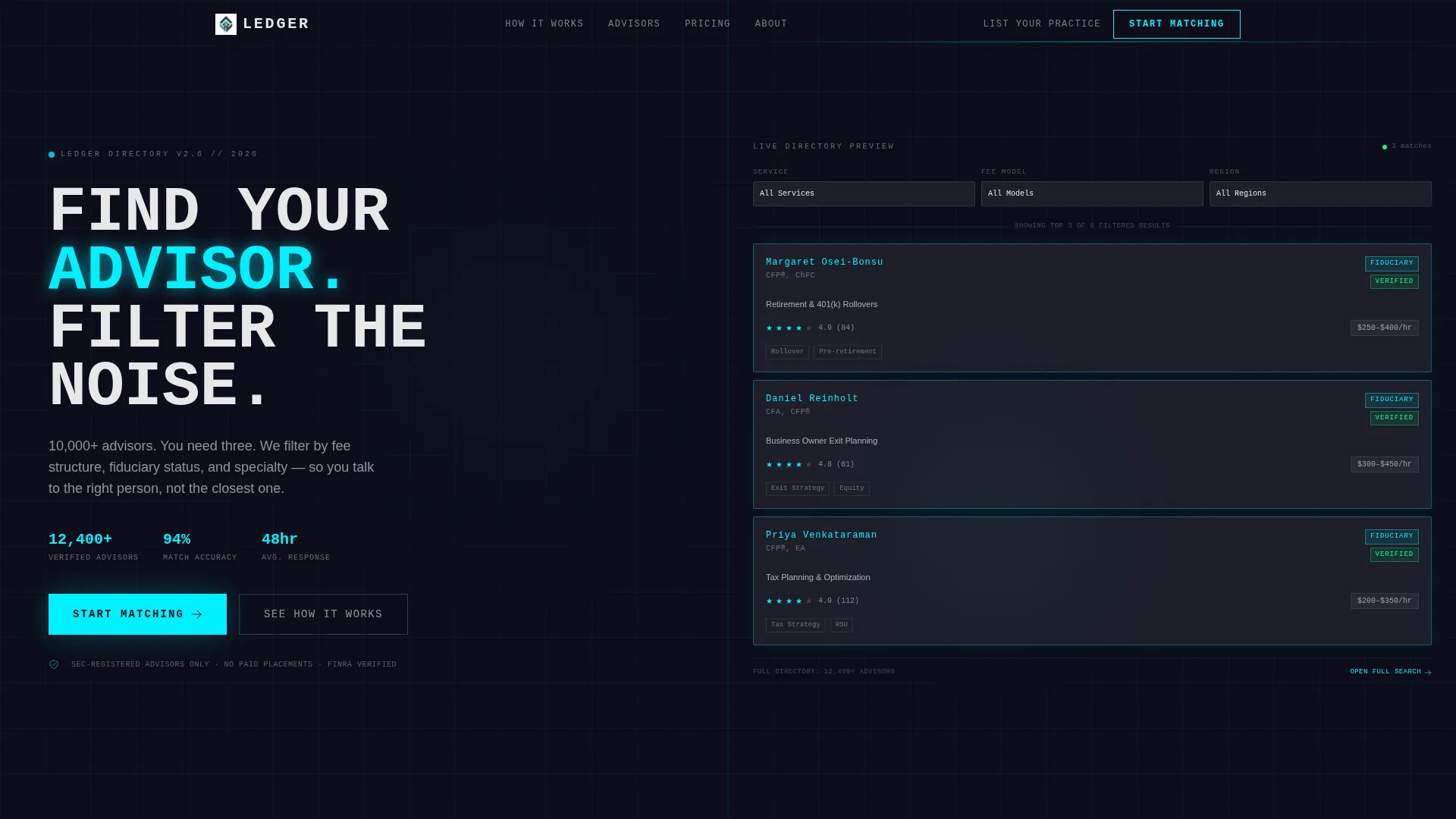
- A split-screen interactive header with three live filter dropdowns and three pre-populated advisor cards
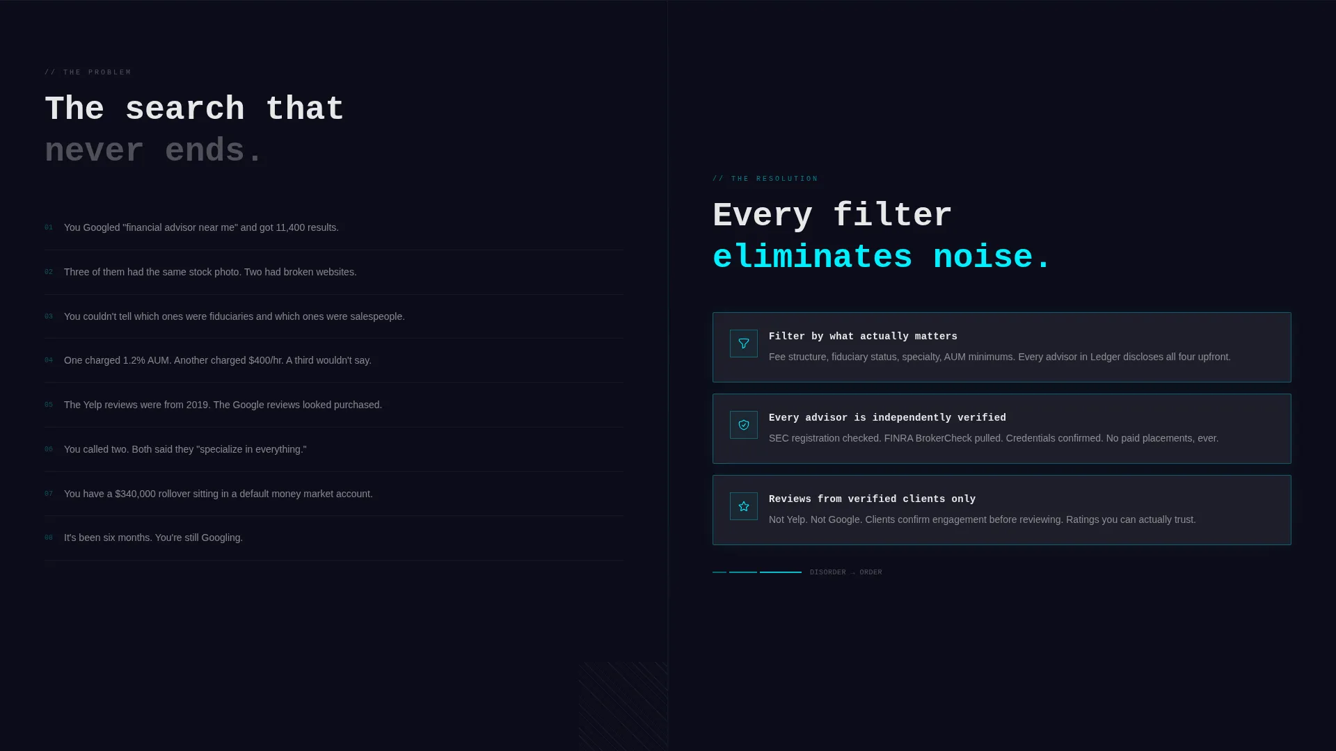
- A scrolling problem-to-solution narrative with left-side frustrations and right-side resolution panels
- A persistent floating call-to-action button and a secondary navigation link for advisors who want to be listed
Feature list
This template ships with a focused set of visual and interactive features, each grounded in the directory use case.
Interactive Header with Live Filters
The header is split 50/50. The left side holds a massive monospaced headline in brutalist typography. The right side is a functional mini-directory panel. Visitors can click three filter dropdowns, covering service type, fee model, and location, and watch the advisor cards reshuffle in real time.
Pre-Populated Advisor Cards
Three sample advisor cards appear inside the header panel from the moment the page loads. Each card displays ratings, specialties, and fee ranges. The cards glow at the edges with electric cyan, reinforcing the glassmorphic visual system while showing exactly what the full directory delivers.
Problem-to-Solution Scroll Arc
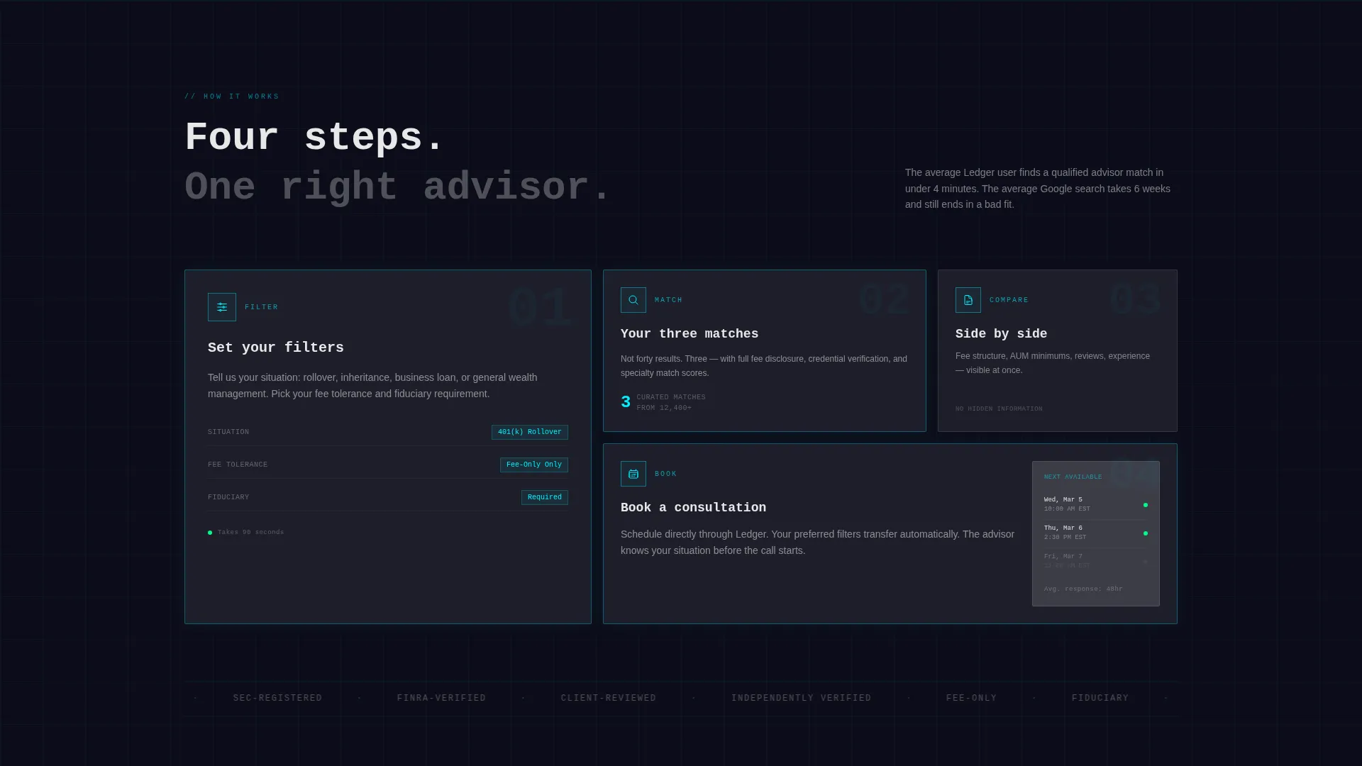
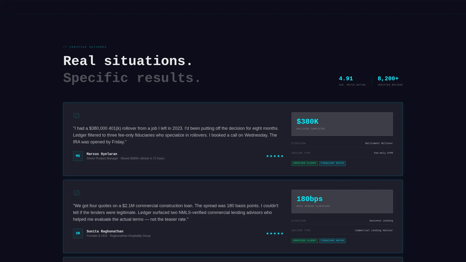
Below the header, the page unrolls a deliberate narrative. The left side presents raw, unstyled text listing real visitor frustrations. The right side stays empty at first, then resolution panels slide in from the right as the visitor scrolls. Each scroll beat escalates: finding advisors, comparing them, reading verified reviews, and booking a consultation.
Persistent Floating Call-to-Action
A floating cyan button labeled "Start Matching" appears after the second scroll section and stays visible as the visitor moves down the page. It carries the visitor through to the full directory with their pre-applied filters intact, reducing the number of steps between intent and action.
Dual Navigation Path
The top navigation includes a secondary text link, "List Your Practice," aimed at advisors who arrive on the page and recognize they should be listed. This dual-audience design handles two visitor types without splitting the page into separate destinations.
Bold Brutalist Glassmorphic Visual System
The design pairs deep charcoal backgrounds with frosted translucent panels, electric cyan borders, and sharp signal-white body text. Glassmorphic cards stack with visible depth. The result feels like a glass trading desk set into a concrete structure, combining cold geometry with softened light.
Page sections overview
| Section | Purpose |
|---|---|
| Split-Screen Header | Deliver the interactive filter demo and primary call-to-action |
| Problem Left Panel | Surface real visitor frustrations in raw, unstyled text |
| Solution Right Panels | Slide in frosted resolution cards as the visitor scrolls |
| Advisor Comparison Beat | Show side-by-side advisor comparison as the narrative escalates |
| Verified Reviews Beat | Present the verified client review system as a trust signal |
| Consultation Booking Beat | Introduce direct consultation booking as the final resolution step |
| Floating Action Button | Persist the "Start Matching" call-to-action across scroll depth |
| Top Navigation Bar | Anchor the "List Your Practice" link for advisor-side visitors |
Design & branding system
The visual identity is built on a Bold Brutalist theme expressed through a glassmorphic color system. Every color choice serves a functional purpose, not just an aesthetic one.
- Deep slab charcoal (#1A1A2E) anchors all backgrounds with the weight of poured concrete, while frosted panels at 12% white opacity float above it with blurred backdrops
- Electric cyan (#00F0FF) traces card borders, hover states, and the floating button, giving every interactive element a clear visual signal
- Sharp signal white (#E8E8E8) is used for body text throughout, ensuring readability against dark surfaces without softening the overall tone
Mobile & speed optimization
The template is structured for responsive adaptation. The split-screen layout and scroll-triggered panels are designed to translate clearly across screen sizes.
- The 50/50 split-screen stacks vertically on smaller screens so both the headline and the filter panel remain fully accessible
- Glassmorphic card depth and cyan edge glows are preserved on mobile, keeping the visual hierarchy intact without relying on hover-only states
How this template helps you convert
Conversion on this page is built into the structure, not bolted on at the end. Every design decision reduces the gap between arrival and action.
- The interactive header lets visitors use the product before they scroll, which builds trust through demonstration rather than claims
- The problem-to-solution scroll arc addresses specific visitor anxieties one by one, making the decision to click through feel like the logical conclusion rather than a leap of faith
Other information about this template
This template is part of a broader set of financial services digital presence templates built for the intersection of technology and financial services. A few additional details worth knowing:
- The page type is a click-through landing page, meaning no form lives on the page itself; the call-to-action carries visitors into the full directory
- The "List Your Practice" nav link creates a secondary conversion path for financial professionals who arrive as potential directory members
- The template is categorized under Technology with a subcategory of Financial Services Digital Presence, making it relevant for fintech-adjacent directory products as well as traditional advisory platforms
- The intersection match score for this template's niche alignment is 13, reflecting a strong fit between the Bold Brutalist theme, glassmorphic color system, and the financial services directory use case
Theme
Bold Brutalist
Creative direction
Problem→Solution Arc
Color system
Glassmorphic
Style
Split Screen (50/50)
Direction
Click-Through
Page Sections
Interactive Header with Live Filter Controls
Pre-populated Advisor Card Panel
Problem-to-solution Scroll Narrative
Persistent Floating Call-to-action Button
Dual-audience Navigation Design
Bold Brutalist Glassmorphic Visual System
Related questions
Who is the primary visitor this landing page is designed for?
Does this landing page include a contact form?
Can advisors use this template to get listed in the directory?
What does the interactive header actually do?
What visual style does this template use?



