Precision Analytics Landing Page Template
Assay is a Bold Brutalist landing page template built for a chemical analytics dashboard. It opens with a live-typed API code animation, flows into an interactive workflow comparison calculator, and drives visitors straight to a free sandbox demo. No forms, no friction, just raw data turned into a release decision, fast.
by Rocket studio
Quick summary
Assay is a single-page, click-through landing page template designed for a precision chemical analytics platform. It converts raw spectrometry, chromatography, and titration data into readable lab dashboards. The layout leads with a live code animation, drops into a brutalist comparison calculator, and routes visitors directly to a pre-loaded demo environment with one click.
Who this template is for
This template is built for technical SaaS products serving laboratory and scientific workflows. It speaks directly to the people making batch release and compliance decisions every day.
- QC chemists managing batch release in pharmaceutical manufacturing plants
- Environmental analysts tracking regulatory compliance deadlines across sample runs
- Research and development leads correlating formulation changes to purity outcomes
What problem this template solves
Lab data platforms often struggle to communicate precision and credibility on a landing page. Generic SaaS templates feel too polished and too vague for a scientifically literate audience. This template solves that mismatch directly.
- Visitors who live in spreadsheets and legacy systems need to see real workflow evidence, not feature bullet points
- The comparison calculator surfaces concrete metrics so buyers can self-qualify without a sales call
- The direct sandbox call to action removes the form-gate barrier that kills conversion for technical audiences
What you get with this template
This template delivers a fully structured, single-page layout with every section and interaction defined in the brief. No blank canvases, no guesswork about what goes where.
- A header section with a live-typed API code animation that morphs into a styled dashboard card
- An interactive comparison calculator with a sticky brutalist data table and stacked case study blocks
- Two distinct call-to-action placements routing visitors to a pre-loaded synthetic chromatography demo
Feature list
This template packages several purpose-built components into one cohesive layout. Each feature is designed around the specific needs of a technical, data-literate audience.
Live API Code Animation Header
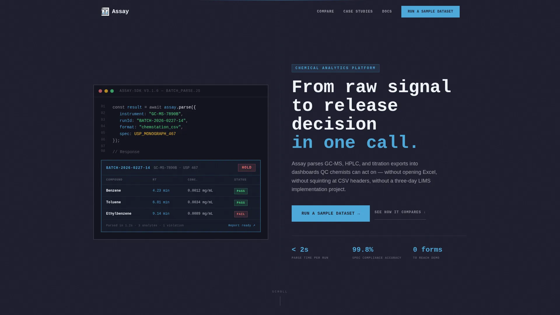
The header opens with a monospaced code block showing a real Gas Chromatography-Mass Spectrometry (GC-MS) API call. Lines animate as if typed live. When the response returns, the raw JSON object transforms into a styled dashboard card displaying compound name, retention time, concentration, and pass or fail status.
Interactive Workflow Comparison Calculator
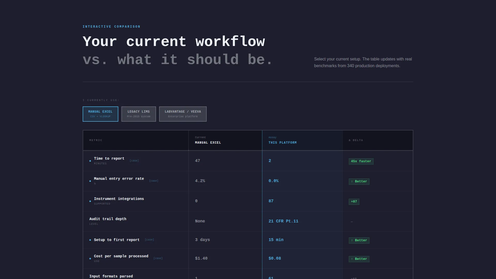
Visitors select their current workflow from three options: manual Excel, legacy Laboratory Information Management System (LIMS), or a competitor platform. The page immediately populates a brutalist comparison table with five concrete metrics: time-to-report, error rate, integrations supported, audit trail depth, and cost per sample.
Sticky Brutalist Comparison Table
As visitors scroll past the calculator, the comparison table locks into a sticky navigation bar. Rows use thick borders and oversized type with no rounded corners and no gradients. The visual treatment keeps the data legible and direct at every scroll depth.
Stacked Case Study Blocks
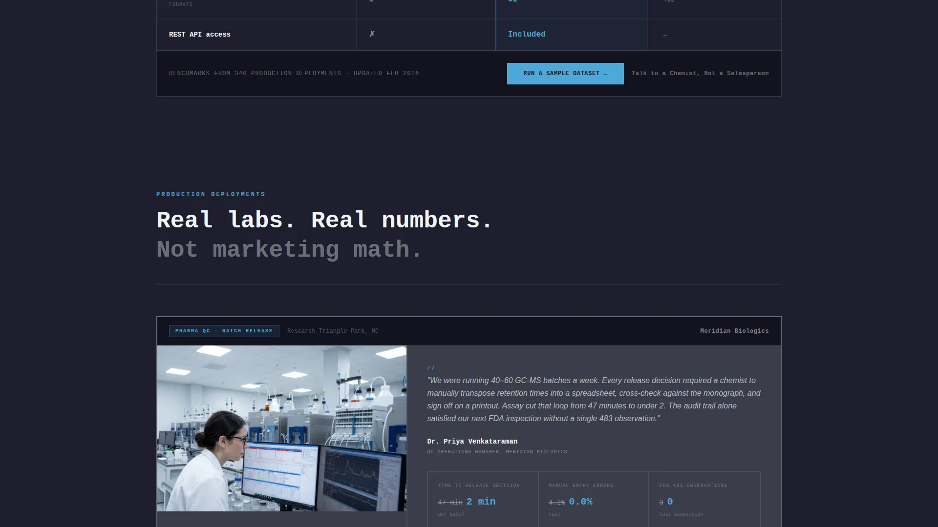
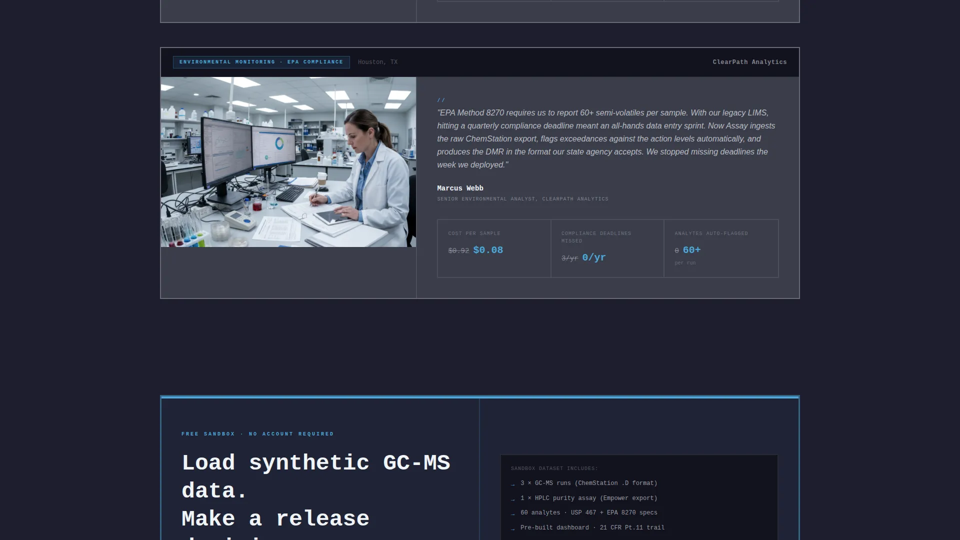
Case studies from pharmaceutical QC and environmental monitoring labs stack below the sticky table. Each case study is structurally tied to a single row in the comparison table, reinforcing a specific metric with real numbers from actual lab contexts.
Dual call to action Placement with No Form Gate
The primary call to action, "Run a Sample Dataset," appears twice: once inside the header animation and once pinned to the comparison table footer. A secondary text link, "Talk to a Chemist, Not a Salesperson," sits below for enterprise buyers who prefer a human conversation first.
Pre-loaded Sandbox Route
The primary button routes directly to a demo dashboard environment with synthetic chromatography data already visualized. Visitors enter an active, data-populated experience without filling out a single form field.
Page sections overview
| Section | Purpose |
|---|---|
| Code Animation Header | Opens with live-typed GC-MS API call that transforms into a dashboard card |
| Comparison Calculator | Lets visitors select their current workflow and generate a populated metrics table |
| Sticky Data Table | Locks comparison metrics into view as visitors scroll through case studies |
| Case Study Blocks | Reinforces each table row with specific numbers from pharma and environmental labs |
| call to action Footer | Pins the sandbox call to action and enterprise text link at the end of the comparison section |
Design & branding system
The visual identity follows a Bold Brutalist theme built around a Slate and Sky color system. Every design decision prioritizes clarity and data legibility over decoration.
- Deep graphite (#1E1E2E) as the dominant background, instrument-panel gray (#3A3D4A) for card surfaces, sky-break blue (#4DA8DA) for active states and data highlights, and reagent white (#F0F4F8) for text and table borders
- Monospaced typography in the header code block, oversized type in table rows, thick borders throughout, zero rounded corners, and zero gradients
Mobile & speed optimization
The layout is structured to remain legible and functional across screen sizes. The brutalist grid system naturally adapts to narrower viewports without losing its core visual logic.
- The sticky comparison table and oversized type scale with viewport width to stay readable on tablet and mobile screens
- Code animation and JSON-to-card transformation are designed as progressive visual elements that do not block the primary content hierarchy on smaller devices
How this template helps you convert
Every structural decision in this template is aimed at reducing buyer hesitation and shortening the path from curiosity to product experience.
- The live code animation establishes immediate technical credibility before a single marketing claim appears, so scientifically literate visitors trust the product on sight.
- The self-serve comparison calculator lets visitors build their own case for switching without needing a sales deck or a demo booking form.
- The no-form sandbox call to action removes the single biggest friction point for technical buyers, putting real chromatography data in their hands in one click.
Other information about this template
This template sits at the intersection of Chemical Vertical SaaS and the broader chemical analytics dashboard category. It is designed for a Calculator-Tool First creative direction, meaning the interactive element leads the conversion flow rather than sitting below the fold.
- The template uses a Click-Through landing page structure, meaning the goal is a direct route to the demo environment rather than a lead capture form
- The Code Snippet header concept is a deliberate choice for a platform audience that evaluates tools by looking at API design first
- The Comparison Table template style makes this layout particularly well suited to markets where buyers are actively evaluating multiple platforms side by side
- This template is categorized under Technology and Chemical Vertical SaaS, making it a strong fit for precision analytics tools targeting regulated industries such as pharmaceutical manufacturing and environmental compliance
Theme
Bold Brutalist
Creative direction
Calculator/Tool First
Color system
Slate & Sky
Style
Comparison Table
Direction
Click-Through
Page Sections
Live API Code Animation Header
Interactive Workflow Comparison Calculator
Sticky Brutalist Comparison Table
Stacked Case Study Blocks
Dual No-form Call to Action Placement
Related questions
Does this template include a working calculator or just the visual layout?
Can I change the workflow options in the comparison calculator?
Is the sandbox call to action button pre-configured to route somewhere?
Who is the secondary call to action aimed at?



