Powerful Quiz Builder | Free Website Template | Rocket
Assess is a card grid landing page template built for assessment and quiz platforms. It guides visitors through a Problem-to-Solution scroll, showcasing scored quizzes, timed skill tests, and lead-gen assessments. With an Acid Digital color system and interactive card demos, the page earns signups before visitors ever hit the call-to-action button.
by Rocket studio
Quick summary
Assess is a modular card grid landing page template designed for quiz and assessment platforms. It opens with social proof, moves through a Problem-to-Solution arc, and lets visitors interact with live card demos before they sign up. The freemium-first layout makes the value obvious early and keeps the conversion path frictionless.
Who this template is for
This template is built for teams and creators who turn knowledge into structured, measurable assessments. If your platform needs to communicate depth and interactivity quickly, Assess delivers that in the first scroll.
- Course creators who package skill checks and knowledge reviews into their curricula
- HR departments replacing unstructured interviews with standardized, scored skill benchmarks
- Growth marketers building lead-gen quizzes that capture segmented audience data
What problem this template solves
Most assessment platforms struggle to show what they actually do before asking for a signup. Visitors land, read feature bullets, and leave without understanding the real product experience.
- Take-home tests lose candidates because the value is never communicated upfront
- Lead magnet PDFs see low completion because the format feels passive and forgettable
- Course dropout rises when learners do not feel the material is interactive or engaging
What you get with this template
You get a fully structured, single-page layout built around the specific conversion needs of a quiz and assessment platform. Every section earns the next click before asking for commitment.
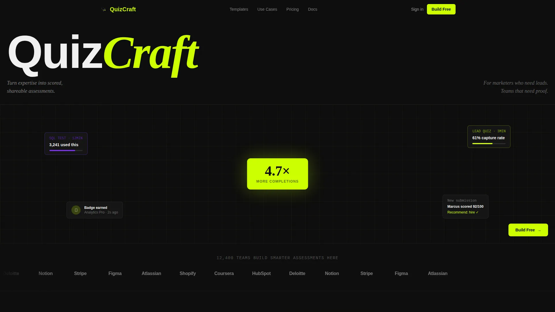
- A Logo Bar header with hover-activated brand logos and a social proof headline
- A Problem-to-Solution card grid that transitions from pain-point notifications to interactive quiz previews
- A floating freemium call-to-action button and a secondary template directory path
Feature list
This template is packed with purpose-built components that reflect how assessment platforms actually convert visitors into users.
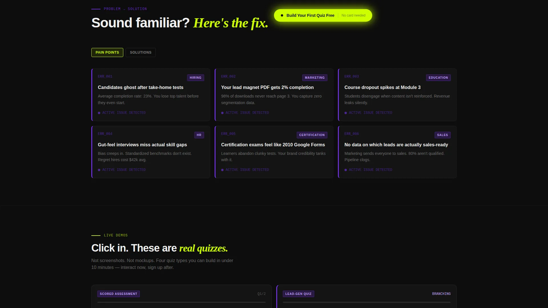
Problem-to-Solution Card Grid
The scroll begins with a set of pain-point cards styled as error notifications with violet left-borders. As the visitor scrolls, the grid rebuilds into solution cards showing interactive quiz-type previews. The arc moves from friction to resolution without a single long paragraph.
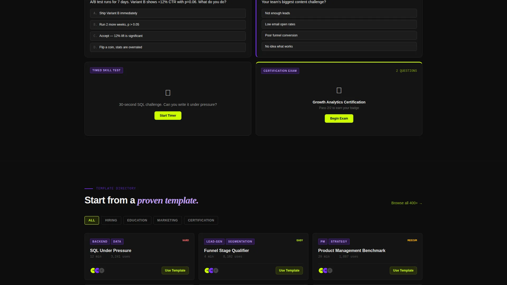
Interactive Quiz Preview Cards
Each solution card is a miniature demo, not a static screenshot. Visitors can click through scored assessments, branching logic quizzes, timed skill tests, and personality-style lead magnets. By the time they reach the call-to-action, they have already experienced the product.
Logo Bar with Hover Activation
The header opens with a horizontal scroll of desaturated brand logos. On hover, each logo flashes to full color with a lime underline. The effect establishes platform scale and trust before any feature is explained.
Floating Freemium Call-to-Action
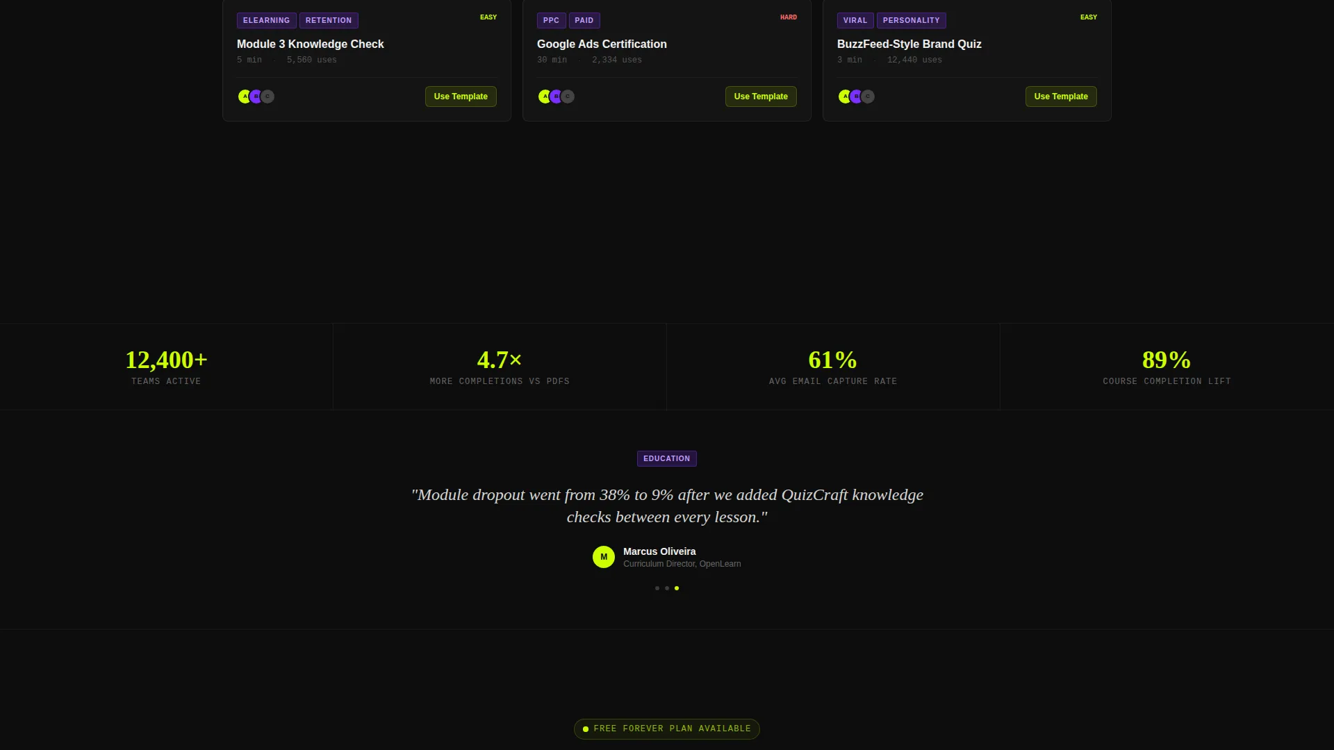
The primary call-to-action button reads "Build Your First Quiz Free" and appears first in the header bar. After the first scroll, it pins as a floating bottom button. No credit card is required, and no demo call is needed.
Filterable Template Directory Path
A secondary conversion path links to a template directory organized by use case. Categories include hiring, education, marketing, and certification. This gives exploratory visitors a structured next step without pressure.
Modular Card Grid Layout
The entire page is built on a modular card grid. Each card pops against the void black background like a lit panel. The layout makes every scroll position feel like a new discovery rather than a long read.
Page sections overview
| Section | Purpose |
|---|---|
| Logo Bar Header | Establishes scale with social proof logos and a single-line headline |
| Pain Point Cards | Frames visitor problems as styled error notification cards |
| Solution Preview Cards | Rebuilds the grid with interactive, clickable quiz demo cards |
| Freemium call to action Block | Presents the primary free signup call-to-action inside the header |
| Floating call to action Button | Pins the signup button after the first scroll for persistent visibility |
| Template Directory Link | Offers a secondary path to browse quizzes by use case |
Design & branding system
The visual identity follows a Directory and Discovery theme using an Acid Digital color system. The palette is built for dark-mode contrast, with every element designed to command attention rather than recede.
- Void black (#0D0D0D) as the base, electric lime (#CCFF00) for calls-to-action and progress bars, synthetic violet (#7B2FFF) for category tags and active selections, and interface white (#F0F0F0) for body text and card surfaces
- Card surfaces float above the black background using subtle elevation shadows, creating depth without decoration
- Lime drives hover states and interactive feedback, while violet marks badges and selected quiz categories
Mobile & speed optimization
The card grid layout is structured to translate cleanly from desktop to phone. The compulsive, tap-through energy described in the creative brief maps directly to how users interact with content on mobile screens at any hour.
- Modular cards reflow naturally into a single-column stack on smaller viewports
- The floating call-to-action button remains persistently visible on scroll across all screen sizes
- Interactive card demos are built to respond to tap input, keeping the quiz-preview experience intact on touch devices
How this template helps you convert
The page is engineered so visitors feel invested before they ever see a signup form. Every scroll position adds value and reduces hesitation.
- The Logo Bar opens with recognizable platform names and a concrete scale claim, building immediate credibility before any feature is introduced
- The Problem-to-Solution arc mirrors the visitor's own frustration first, then resolves it with hands-on interactive card demos that make the product self-evident
- The freemium call-to-action removes every barrier at the moment of peak interest, with no credit card required and a secondary template directory for visitors who need more time
Other information about this template
This template sits within the Documentation and Support category under the Training and Certification subcategory. It is specifically matched to the Assessment and Quiz Platform niche, making it suitable for a wide range of scored and shareable quiz products.
- The template style is Card Grid (Modular), meaning individual components can be reordered or swapped to match specific platform offerings
- The creative direction follows a Problem-to-Solution Arc, a proven structure for SaaS and platform landing pages that lead with empathy before presenting capability
- The Freemium and Trial landing page direction means the layout is optimized for low-friction entry points rather than demo-request or enterprise sales flows
Theme
Directory & Discovery
Creative direction
Problem→Solution Arc
Color system
Acid Digital
Style
Card Grid (Modular)
Direction
Freemium/Trial
Page Sections
Problem-to-solution Card Grid
Interactive Quiz Preview Cards
Hover-activated Logo Bar
Floating Freemium Call to Action Button
Filterable Template Directory Path
Modular Card Grid Layout
Related questions
Who is this landing page template designed for?
Can I customize the card grid sections for my specific quiz types?
Does the template support a secondary conversion path for undecided visitors?
What makes this template different from a generic SaaS landing page?
Is the Acid Digital color system easy to adapt to an existing brand?


