Predictive Insurance Analytics Landing Page Template
The Score AI Insurance Lead Scoring Landing Page Template is a single-page, comparison-table layout built for mid-market property and casualty carriers, managing general agents, and insurtech sales teams. It visualizes the cost of poor lead prioritization, then positions an AI-powered scoring model as the fix. The goal is one frictionless click to a demo booking page.
by Rocket studio
Quick summary
Score is a focused, single-section landing page template for insurance AI lead scoring platforms. It uses a Problem-to-Solution narrative arc, a mission-control color palette, and an animated comparison table to show VP-level buyers the exact cost of calling the wrong leads first. Every scroll segment is designed to build conviction and end in a single, clear click.
Who this template is for
This template is built for B2B teams that sell data-driven lead qualification tools into the insurance industry. If your buyers evaluate vendor tools at a desk and need to see quantified proof before booking a demo, this layout was designed for them.
- VP Growth and Head of Distribution leaders at mid-market property and casualty carriers
- Managing general agents whose sales reps waste hours on low-intent prospects
- Insurtech sales operations teams that generate high lead volume but struggle with conversion rates
What problem this template solves
Not all leads are equal, and insurance sales teams burn valuable time on prospects who will never bind. The absence of a structured lead scoring system means agents call in random order, and the most promising leads get the same attention as window-shoppers. This template makes that inefficiency visible and immediately positions scoring as the solution.
- Agents spend talk-time on leads that score low on intent, dragging down quote-to-bind ratios
- Sales reps lack a clear, objective signal of which prospects deserve outreach efforts first
- Marketing efforts produce volume without direction, raising cost per acquisition across the funnel
What you get with this template
This template delivers a complete, ready-to-launch single-page layout purpose-built for an insurance lead scoring platform. Every section follows a deliberate narrative order that moves a skeptical VP from problem recognition to demo click without friction.
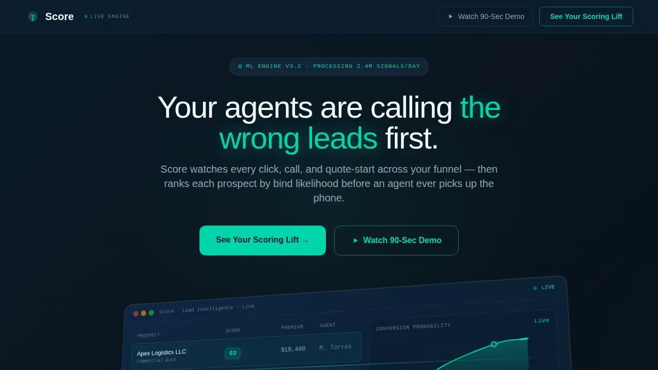
- A hero section with an isometric product screenshot, headline, and ghost call-to-action button
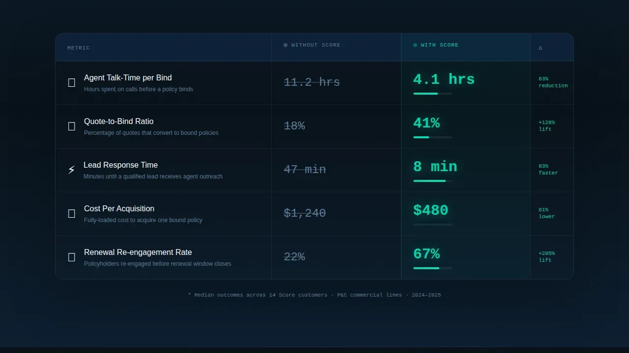
- An animated "Without Score versus. With Score" comparison table covering five key insurance operations metrics
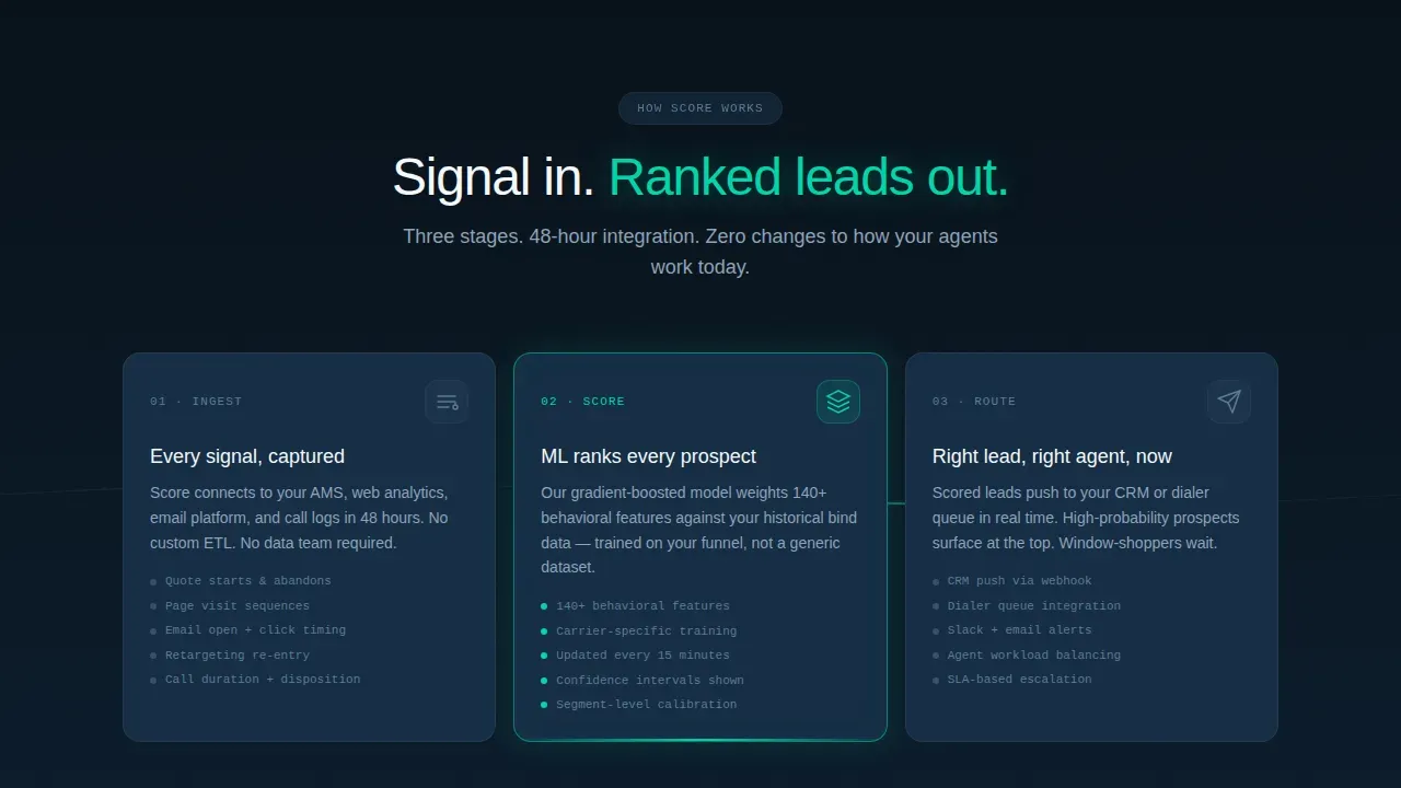
- A three-stage horizontal flow diagram showing the Ingest, Score, and Route leads process, a carrier case study block, and a full-width primary call-to-action button
Feature list
This template includes purpose-built components that work together to demonstrate the lead scoring model in action and move qualified buyers toward a demo click.
Isometric Hero with Live Dashboard Screenshot
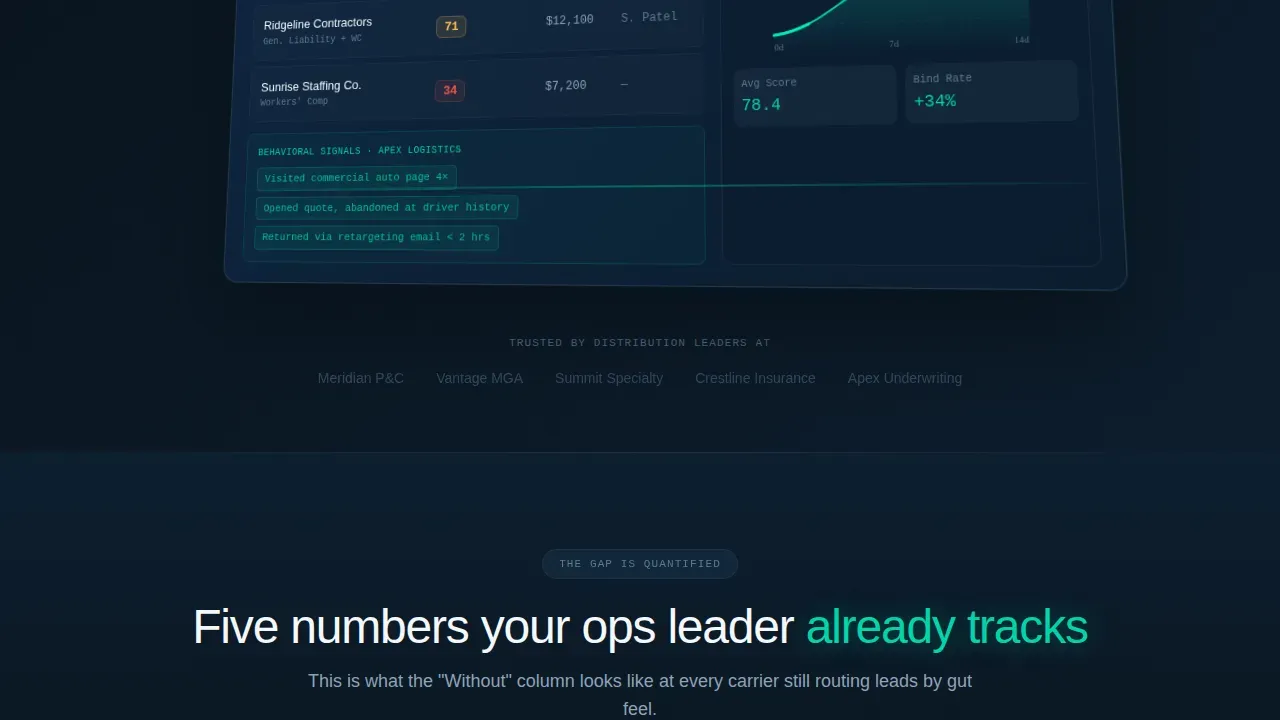
The header centers on a pixel-perfect product screenshot shown at a slight isometric tilt on a navy-to-black gradient. The screenshot displays a ranked lead list with teal score badges showing real values, a real-time conversion-probability curve, and an expanded lead card revealing behavioral signals. This approach makes the scoring system the proof, not an illustration.
Animated "Without versus. With" Comparison Table
The comparison table is the persuasive core of the page. It shows five rows that insurance operations leaders track: agent talk-time per bind, quote-to-bind ratio, lead response time, cost per acquisition, and renewal-stage re-engagement rate. The "Without" column uses muted slate numbers. The "With" column animates teal numbers counting up to their targets as each row scrolls into view, making the gap impossible to ignore.
Three-Stage How-It-Works Flow
Below the comparison table, a horizontal three-stage diagram walks through the lead scoring process step by step: Ingest, Score, and Route. Micro-animations show data points funneling into the scoring model and scored leads fanning out to agent queues. This section answers the "how does it actually work" question before a buyer even asks it.
Carrier Case Study Block
A single focused case study block includes a carrier logo, business vertical, percentage lift in bind rate, and a one-sentence quote from a Head of Distribution. This social proof element gives the data-driven approach a human face and reflects the reality that scoring model results are grounded in real insurance outcomes.
Dual Call-to-Action System
The primary call-to-action, "See Your Scoring Lift," appears first as a ghost button in the hero and again as a full-width teal button after the case study. A secondary sticky-navigation call-to-action labeled "Watch 90-Sec Demo" triggers a lightbox video modal for buyers who need to see the product in motion before committing to a meeting.
Minimal Developer-Style Footer
The footer follows a GitHub-developer minimal pattern: copyright text on the left, links centered, no visual clutter. This keeps the page's focus entirely on the scoring value proposition and the demo-booking click without distracting visitors at the bottom of the page.
Page sections overview
| Section | Purpose |
|---|---|
| Hero with Screenshot | Opens with the product dashboard and a challenge headline to create immediate relevance |
| Comparison Table | Quantifies the gap between current lead prioritization and a scored approach across five metrics |
| How It Works | Explains the three-stage Ingest, Score, Route process with motion to clarify the scoring model |
| Carrier Case Study | Provides real-world proof with a bind rate lift statistic and an executive quote |
| Primary Call-to-Action | Converts convinced visitors with a full-width teal button routing to demo booking |
| Sticky Nav call to action | Captures mid-scroll visitors with a lightbox video for those who need motion before commitment |
| Minimal Footer | Closes cleanly with copyright and navigation links, zero distraction |
Design & branding system
The visual language is built around a mission-control dashboard aesthetic. Deep navy dominates the hero and headers. Electric teal signals action and intelligence wherever scoring is happening: score badges, active-state table rows, and the primary call-to-action button. Cool slate draws the grid lines that give the comparison table its authority. Crisp off-white fills data fields so numbers breathe.
- Typography uses Manrope for bold headlines, JetBrains Mono for score badges and data values, and DM Sans for body copy
- Teal appears only where the AI is actively working: score badges showing values like 93, 71, and 34, active comparison table rows, progress rings, and call-to-action elements
- The overall palette feels like the glow of a command-center display: dark enough to focus the eye, bright enough at the edges to signal that something is accelerating
Mobile & speed optimization
The template is built desktop-first to serve VP-level buyers who evaluate vendor tools on large screens. The layout is structured to prioritize clarity and fast visual parsing at every breakpoint.
- Animations rely on Intersection Observer for count-up effects and CSS transforms only, keeping rendering smooth without heavy JavaScript libraries
- The comparison table and hero screenshot are structured to remain scannable on smaller viewports without losing the core "Without versus. With" contrast
- The sticky navigation call-to-action and lightbox video modal are designed to function cleanly across screen sizes, ensuring no buyer path is blocked on any device
How this template helps you convert
The page is engineered around a single conversion goal: one click to a demo booking page. Every section adds evidence before asking for anything.
- The comparison table does the convincing first. By the time a visitor finishes reading the five animated metric rows, they have seen their own inefficiency reflected in the "Without" column and cannot unsee it. This creates the pull toward the call-to-action without any form friction.
- The case study block lowers the remaining risk. A real carrier name, a specific bind rate lift percentage, and a direct quote from a Head of Distribution give the scoring model credibility that generic copy cannot provide. Visitors who were skeptical after the table are reassured by the proof.
- The dual call-to-action system captures buyers at different readiness levels. The ghost button in the hero captures early clickers. The full-width teal button after the case study captures convinced buyers. The sticky "Watch 90-Sec Demo" captures the middle group who need motion before commitment. No lead is lost to timing.
Other information about this template
This template is well-suited for teams that want to create a focused, high-conviction landing page without building from scratch. The layout reflects a data-driven approach to presenting a lead scoring system, and it can support different versions of the page for small business carrier segments or larger companies with enterprise distribution teams. The scoring rules and score thresholds shown in the comparison table can be updated to reflect reality for any specific agency or carrier vertical.
- The lead scoring criteria displayed in the comparison table rows are editable, allowing teams to align the "Without versus. With" data with their own key details and actual performance benchmarks
- The individual contributor buyer who reviews this page, such as a sales operations analyst or a director-level leader below VP, will find the step-by-step how-it-works section particularly useful for internal buy-in conversations
- The page uses conditional logic in its dual call-to-action layout to route leads differently based on entry point: ghost button clicks go directly to demo booking, while the sticky nav triggers the video lightbox first
- Teams that run email campaigns to drive traffic to this page will benefit from the frictionless no-form design, which reduces drop-off for cold outreach recipients who arrive with low commitment
- The scoring model depicted in the template can be adapted to reflect predictive lead scoring outputs, negative scoring logic, and score thresholds relevant to the carrier's actual lead qualification standards
- The page supports a company name and logo swap inside the case study block, making it straightforward to adapt for a specific carrier's co-branded proof section
- Buyers who arrive via a google search for AI lead scoring tools or from paid search results will land on a page that immediately answers their core question: what does the scoring look like and what does it change
- The Score AI Insurance Lead Scoring Landing Page Template is named after the core action it sells: the moment a machine-learning engine assigns a point value to each prospect and makes the next right call obvious
Theme
Startup Velocity
Creative direction
Problem→Solution Arc
Color system
Teal Catalyst
Style
Comparison Table
Direction
Click-Through
Page Sections
Animated Comparison Table with Scroll Triggers
Isometric Product Screenshot Hero
Three-stage Lead Scoring Flow Diagram
Carrier Case Study with Exec Quote
Dual Call-to-action with Lightbox Video
Related questions
Who is this landing page template designed for?
What sections are included in this template?
Can I update the metrics shown in the comparison table?
Does the template include a lead capture form?
How does the template demonstrate the lead scoring model to buyers?



