Cloud-Native Enterprise Software Specialist Cost Calculator Website Template
Assetflow is a card-grid landing page template built for cloud-native digital asset management platforms. It leads with an interactive ROI calculator, follows with a modular capability grid, and drives visitors toward a free-trial signup. The Slate & Sky color system and Feature Tab Switcher header give it a sharp, engineered feel that matches the speed of a growth-stage brand team.
by Rocket studio
Quick summary
Assetflow is a single-page, click-through landing page template designed for cloud-native digital asset management platforms. It opens with a three-tab product demo header, drops visitors straight into a personalized ROI calculator, then builds the case through a modular capability card grid. Every section moves toward one clear action: starting a free workspace.
Who this template is for
This template is built for growth-stage software companies that need to communicate speed, clarity, and capability to a technically aware audience. It suits teams launching or repositioning a digital asset management platform.
- Brand operations managers who manage large volumes of creative files across shared drives
- Creative directors and marketing teams shipping campaigns across multiple channels simultaneously
- Product marketers who need a high-converting landing page without a lengthy build process
What problem this template solves
Finding, formatting, and distributing brand assets at scale is genuinely painful. Teams waste hours hunting approved files, reformatting for different channels, and chasing down the latest version. This template helps a platform communicate that it solves exactly those problems, clearly and fast.
- Visitors cannot quickly grasp what the platform does or why it is faster than their current workflow
- Generic software landing pages fail to make the time-and-cost savings feel real and personal
- Friction-heavy signups lose visitors who are interested but not yet committed
What you get with this template
You get a fully structured, single-page layout that takes a visitor from curious to converted. Every section has a defined job, and nothing is decorative filler.
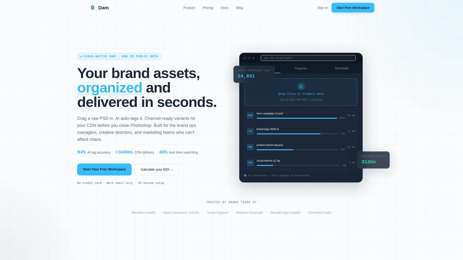
- A Feature Tab Switcher header with three interactive product screens: Ingest, Organize, and Distribute
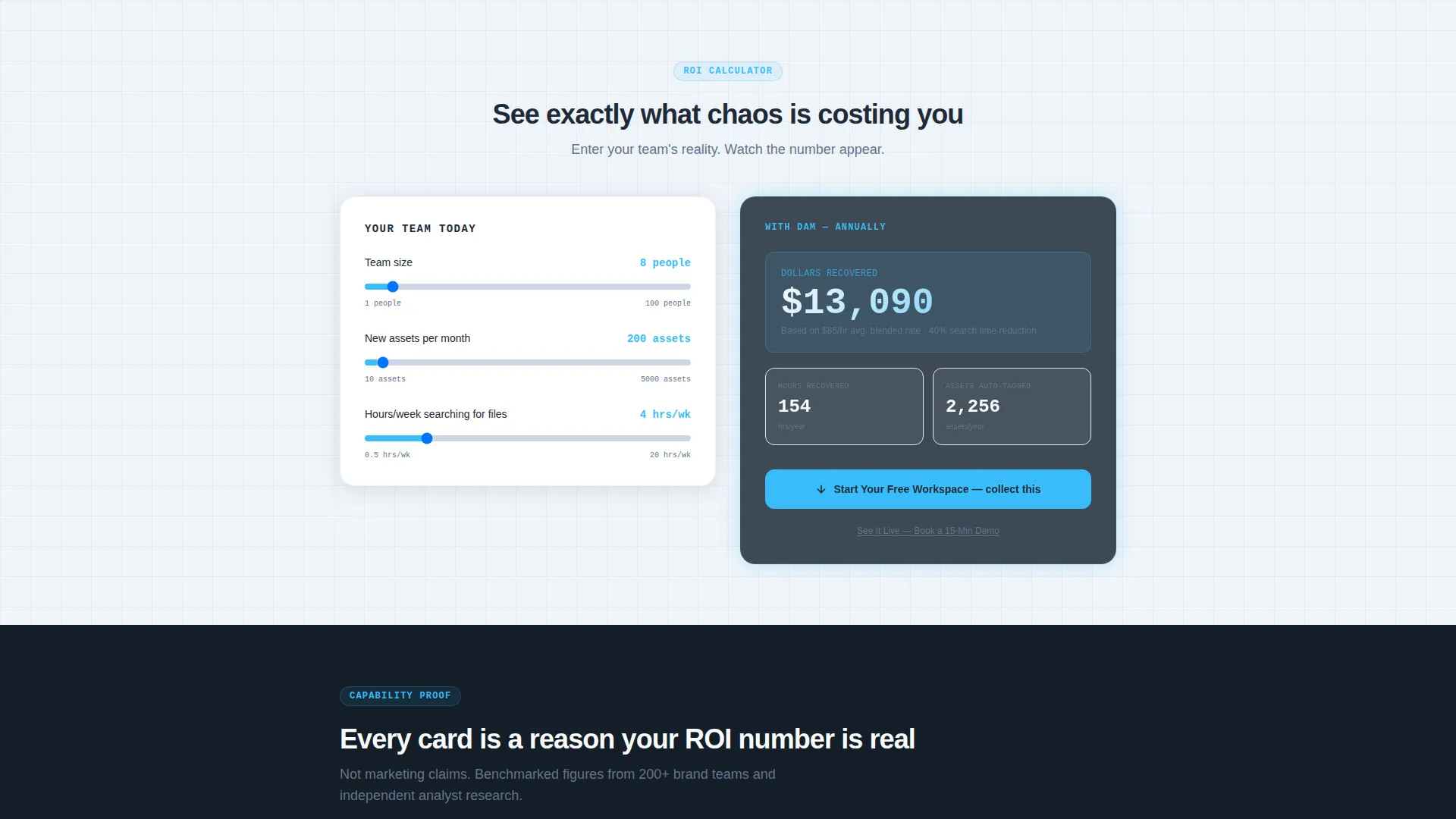
- An interactive ROI calculator that outputs personalized time and cost savings based on visitor inputs
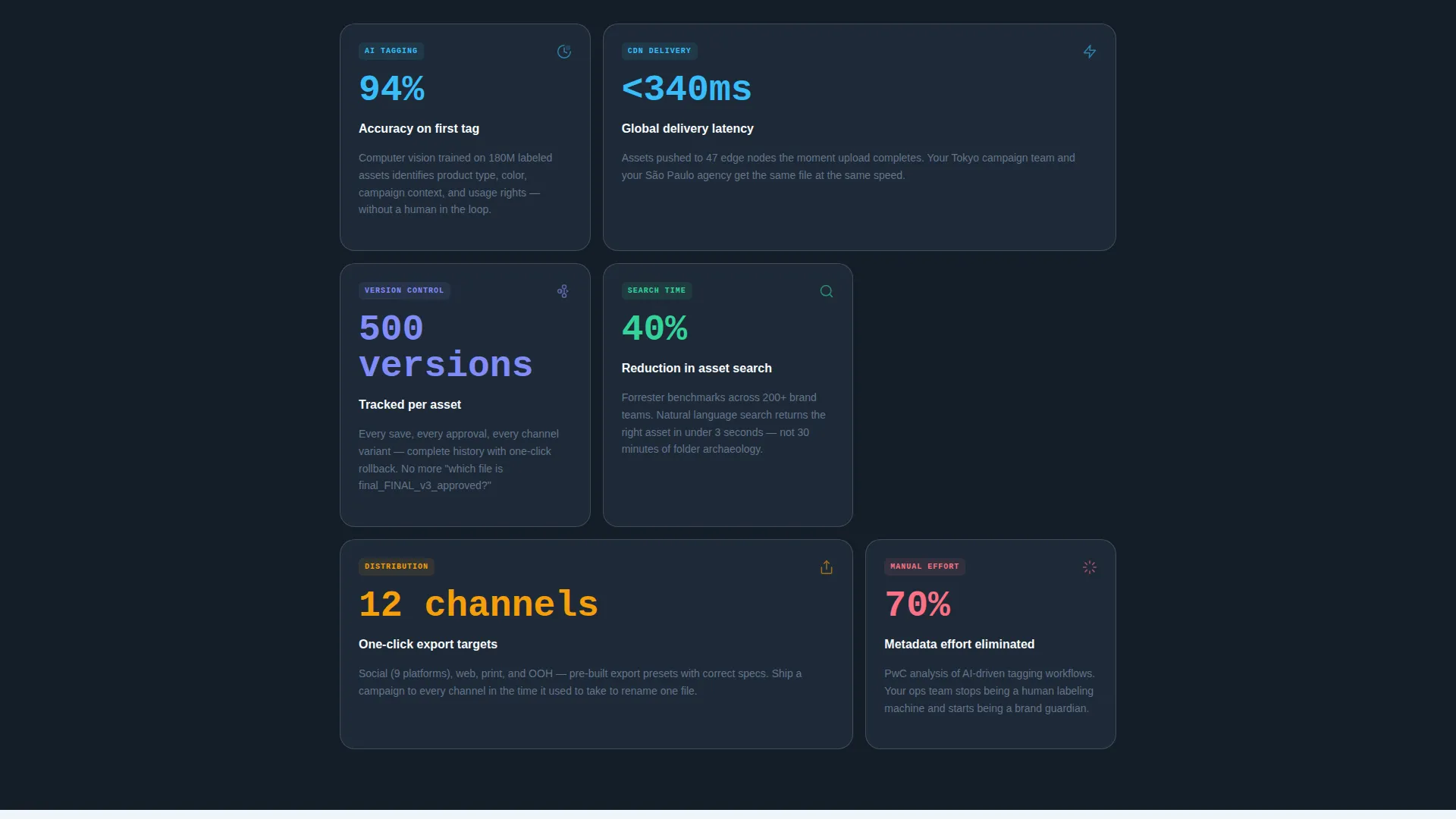
- A responsive modular card grid showcasing platform capabilities with scroll-triggered count-up animations
Feature list
This template ships with purpose-built components that do specific conversion work. Each one is grounded in the platform story and designed to move a visitor forward.
Feature Tab Switcher Header
Three clickable tabs sit across a browser-chrome mockup. Each tab swaps the visible product screen below it. "Ingest" shows a batch upload in progress. "Organize" reveals an AI-tagging panel. "Distribute" displays a one-click export matrix with real-time green checkmarks. The active tab glows sky blue so visitors always know where they are.
Interactive ROI Calculator
Visitors enter their team size, monthly asset volume, and hours spent searching for files. A live output card instantly tallies the hours and dollars recovered annually. The primary call-to-action button sits right next to that number, making the click feel like a natural next step.
Modular Capability Card Grid
Below the calculator, individual cards each prove one platform capability. Metrics count up on scroll entry. The grid is responsive and builds a cumulative argument: every card reinforces the savings number the visitor just saw in the calculator.
Sticky Navigation with Persistent call to action
A sky-blue "Start Your Free Workspace" button lives in the sticky navigation bar. It stays visible on scroll so the conversion opportunity is never more than one click away, regardless of how far down the page a visitor has read.
Dual Call-to-Action Architecture
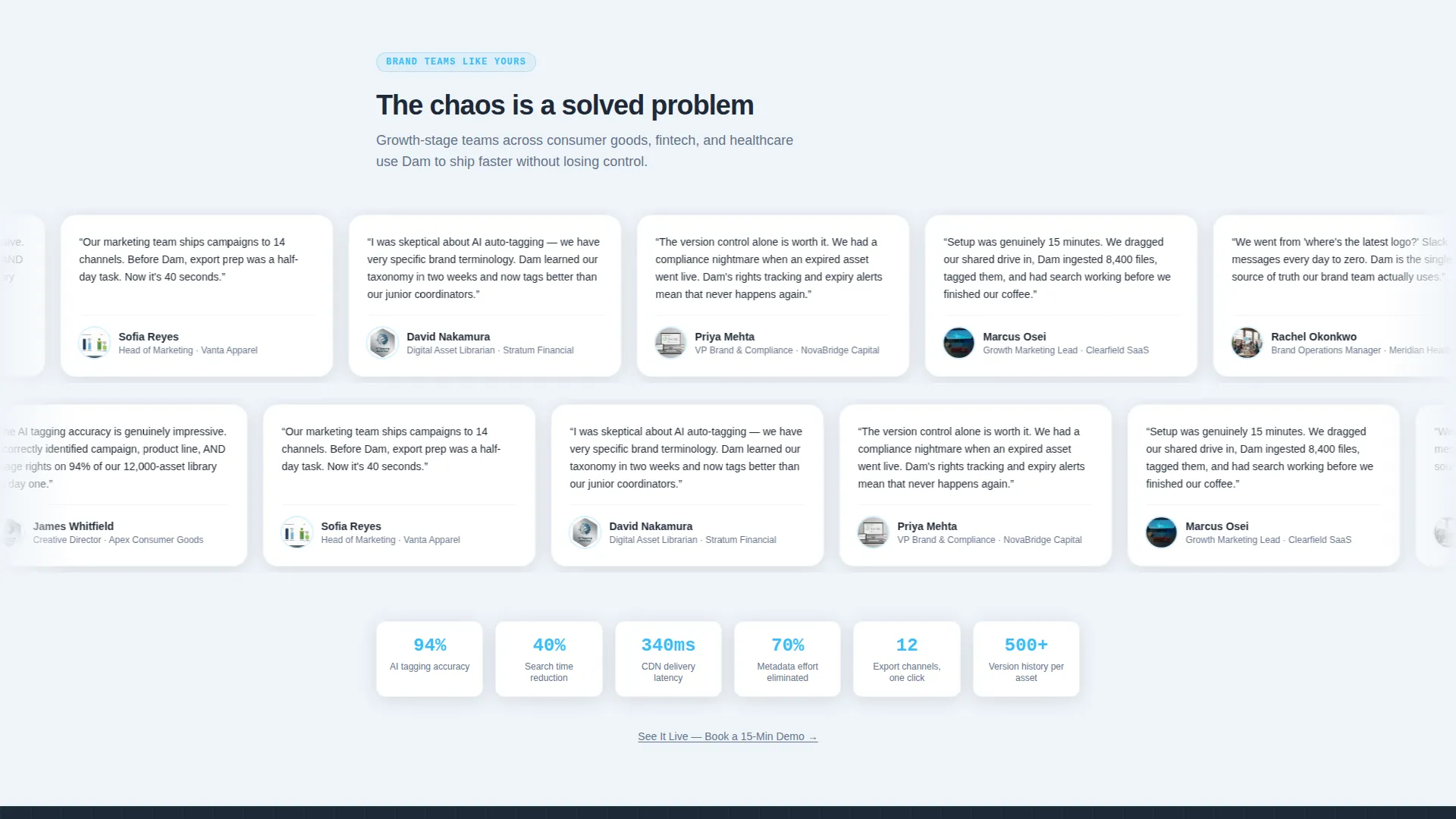
The primary action, "Start Your Free Workspace," links to a frictionless single-step signup requiring only a work email. A secondary text link, "See It Live, Book a 15-Min Demo," offers an alternative path for visitors who want a human conversation before committing.
Page sections overview
| Section | Purpose |
|---|---|
| Feature Tab Header | Show three product modes interactively |
| ROI Calculator | Personalize time and cost savings |
| Calculator Output Card | Deliver the primary call to action in context |
| Capability Card Grid | Prove each platform feature with metrics |
| Sticky Navigation Bar | Maintain persistent call to action visibility |
| Secondary Demo Link | Capture undecided, high-intent visitors |
Design & branding system
The Slate & Sky color system gives this template the visual language of a fast, engineering-led product. It feels precise without being cold, and optimistic without being playful.
- Deep graphite slate (#1E2A38) for card backgrounds and primary surfaces, mid-tone steel (#64748B) for secondary text and dividers, open-sky blue (#38BDF8) for all interactive states, and cirrus white (#F8FAFC) for the page canvas and card text
- The Startup Velocity theme drives the layout toward forward momentum: bold metrics, minimal clutter, and clear hierarchy
- Visual identity is engineered and optimistic, evoking a clear morning at altitude with dark structure below and open sky above
Mobile & speed optimization
The card grid layout is built responsively so it reflows cleanly across screen sizes. The template is designed to feel fast and uncluttered on any device.
- Modular card grid reflows into a single-column stack on smaller screens without losing readability
- The sticky navigation and persistent call to action button remain functional and tappable on mobile viewports
- Scroll-triggered count-up animations are scoped to individual cards so they fire when each card enters the visible viewport
How this template helps you convert
Every structural decision in this template serves the single goal of moving a visitor from awareness to signup. The layout follows a deliberate psychological sequence.
- The Feature Tab Switcher immediately shows the platform in action. Visitors understand the product within seconds of arriving, before they read a single line of copy.
- The ROI calculator makes the value personal. Once a visitor sees their own savings number, curiosity becomes motivation. The call to action placed directly beside that number removes any gap between interest and action.
- The capability card grid reinforces the calculator's credibility. Each scrolled card adds another proof point, so by the time a visitor reaches the bottom of the page they have seen both the headline benefit and the evidence behind it.
Other information about this template
This template is part of a broader set of Startup Velocity layouts optimized for cloud-native enterprise software products. It is particularly well-suited to digital asset management use cases where speed and organizational clarity are the core value propositions.
- The click-through structure means no form fields appear on this page, reducing abandonment risk significantly
- The Calculator/Tool First creative direction is a proven pattern for software products where ROI is a primary purchase driver
- This template can support light copy edits to reframe the calculator inputs for adjacent use cases within the broader digital asset management or creative operations category
Theme
Startup Velocity
Creative direction
Calculator/Tool First
Color system
Slate & Sky
Style
Card Grid (Modular)
Direction
Click-Through
Page Sections
Feature Tab Switcher Header
Interactive ROI Calculator
Modular Capability Card Grid
Sticky Navigation with Persistent Call to Action
Dual Call-to-action Architecture
Related questions
Does this template include actual calculator functionality?
Can I change the tab labels in the Feature Tab Switcher header?
Is this template suitable for a platform that is not a digital asset management tool?
Where does the primary call to action button link to?
How many cards can the capability grid hold?



