Bold Brutalist Architecture Course Comparison Landing Page
Atelier is a bold brutalist architecture course comparison landing page template built for design education platforms. It pairs a dark glass panel header, an oversized pain-point arc, and a structured side-by-side curriculum comparison table to move serious architecture students toward a single click. The layout is raw, direct, and built to convert.
by Rocket studio
Quick summary
Atelier is a single-page brutalist landing page template designed for architecture course and training platforms. It opens with a grid of dark glass panels, moves through three hard-hitting pain-point statements, and anchors the scroll on a side-by-side comparison table that argues the case for structured design thinking over scattered self-study. Every design decision serves the click.
Who this template is for
This template is built for course creators, design educators, and training agencies who serve serious architecture learners. The layout speaks directly to people who already know the tools but want something more rigorous. It is not a soft sell. It is a confident statement made to an audience that responds to honesty over polish.
The target audience includes:
- Final-year architecture undergraduates carrying thesis-season pressure and concept anxiety
- Mid-career drafters and technical professionals who want to cross into design and earn formal recognition
- Self-taught 3D artists who can produce beautiful renders but struggle to defend a concept at a crit table
What problem this template solves
Architecture education marketing often looks like every other course landing page: stock photography, a bullet list of features, and a price tag. That approach does not work for a design-literate audience. These visitors have seen polished pages before. They do not trust lightness. They trust structure, honesty, and directness.
This template solves that credibility gap by using the brutalist design philosophy as both the visual language and the persuasion logic:
- It names the real pain points in oversized type so visitors feel seen before they are sold to
- It replaces vague benefit claims with a row-by-row comparison table that lets the curriculum speak for itself
- It removes decorative distraction so the architecture of the argument carries the full persuasive load
What you get with this template
This template delivers a fully structured, single-page layout built around a Problem to Solution Arc creative direction. Every section has a clear job. Nothing is decorative for its own sake. The design is bold, the typography is cast-concrete heavy, and the layout is grid-disciplined throughout.
Included in the template:
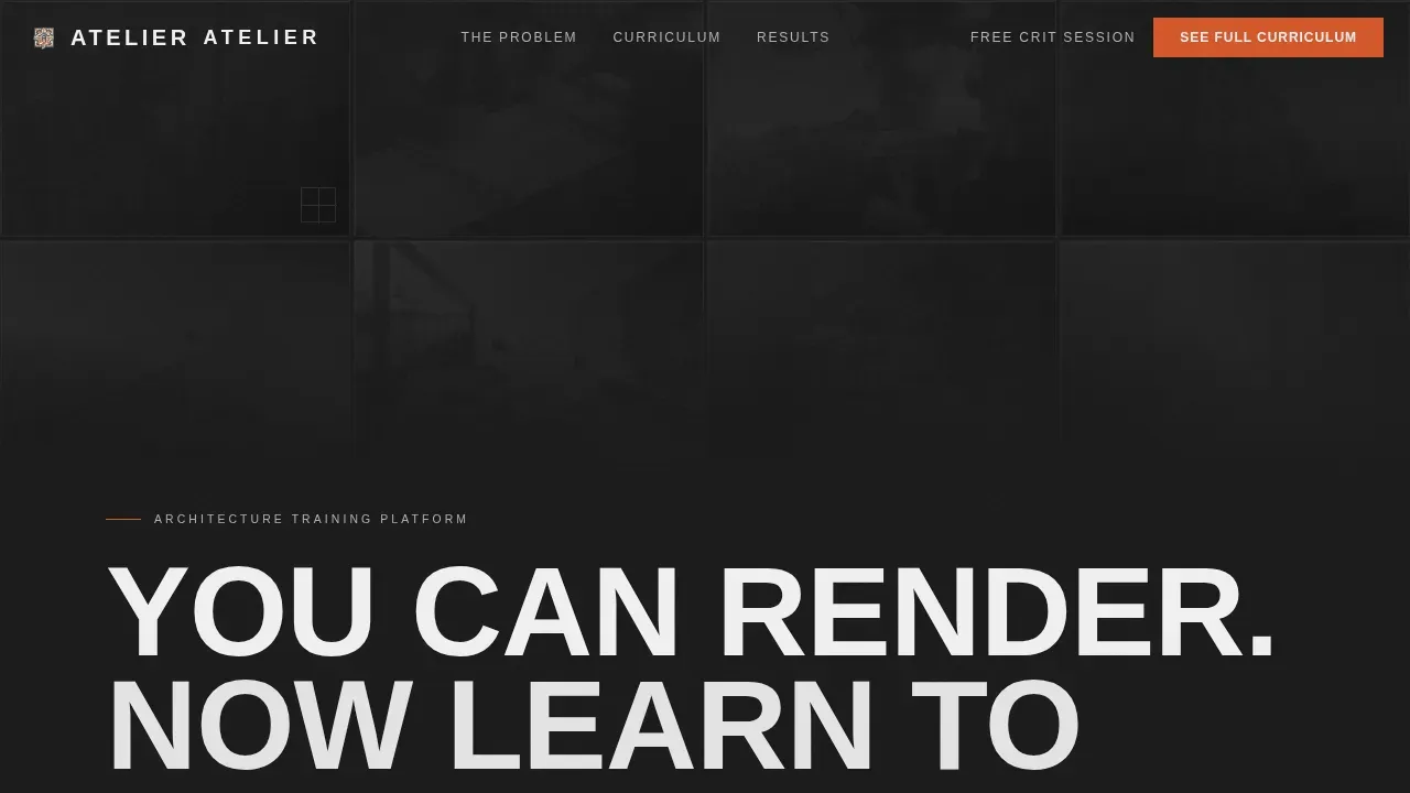
- A dark glass panel header grid with eight translucent panels, ghost-image overlays of architectural drawings, and a cast headline set in a heavy condensed typeface
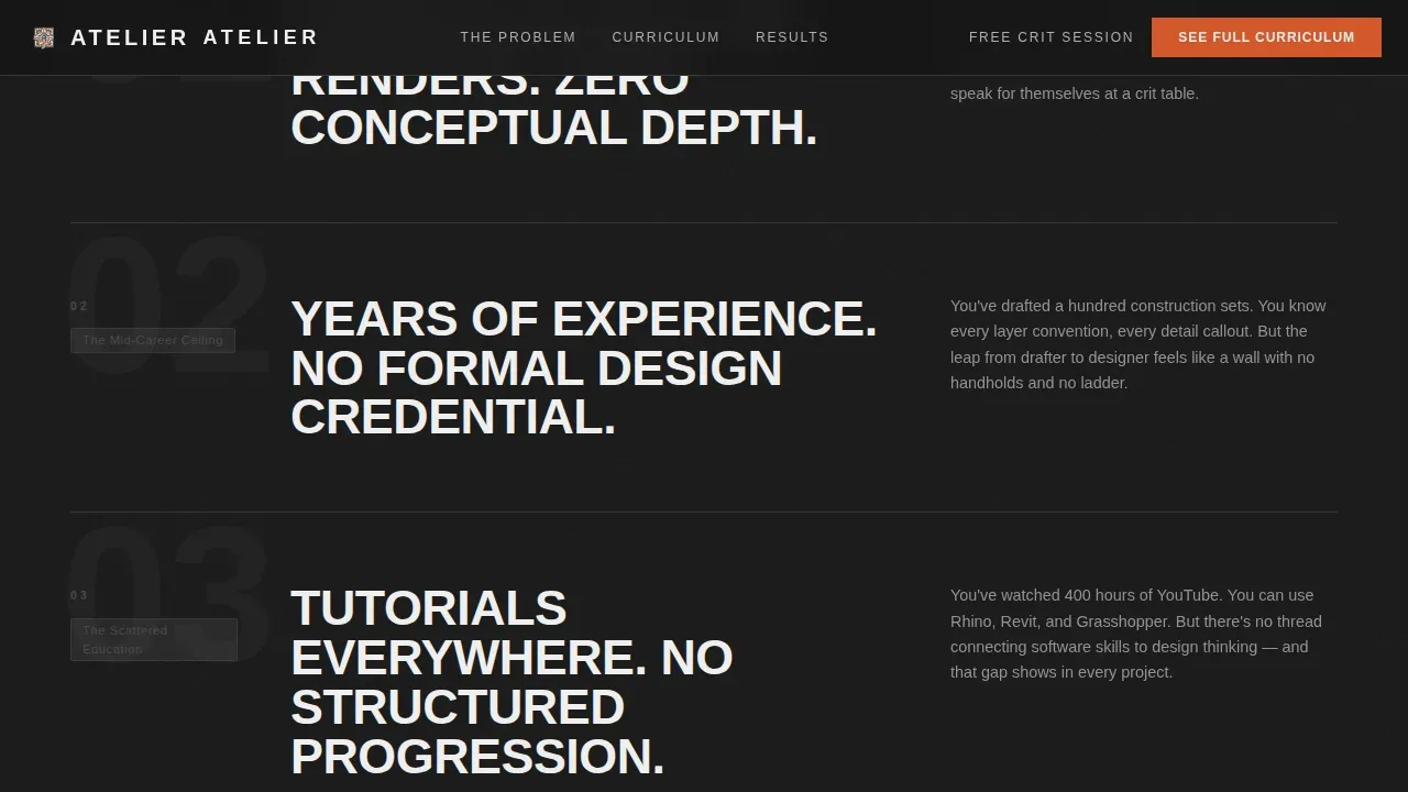
- A three-statement pain point section using oversized bold typography and raw typographic rhythm
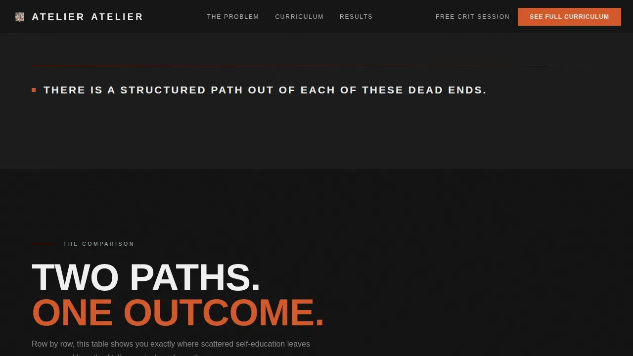
- A structured two-column comparison table contrasting the self-taught path against the Atelier curriculum, row by row, outcome by outcome
- Three dark glass student case study cards with before-and-after portfolio transformation data and timeline stamps
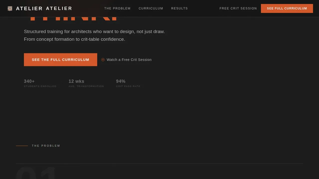
- A primary call-to-action section using rebar orange on charcoal, placed at the header fold, repeated after the comparison table, and anchored as a persistent bottom bar on mobile
- A secondary text link offering a low-commitment free crit session to capture hesitant visitors
- A linear single-row footer
Feature list
This template is characterized by a set of tightly integrated design and layout decisions that work together. Each feature listed below is present in the source template and contributes to the overall conversion architecture of the page.
Dark Glass Panel Header Grid
Eight translucent glass-effect rectangles are arranged in a grid at the top of the page. Each panel reflects a faint ghost image of architectural drawings, section cuts, and model photographs layered behind smoked glass. The panels have beveled edges that catch subtle light, giving the header a three-dimensional surface quality. The headline is set in a heavy condensed typeface, cast directly into the visual wall. No hero image, no human face. Just structure, type, and intent.
Oversized Pain Point Typography
Three brutal truths are written in oversized type and staggered down the page before the comparison table appears. Each statement is designed to land like a stamp on raw concrete. The typography does the emotional heavy lifting here. By the time the visitor reaches the comparison table, they already feel the gap the curriculum is about to close.
Side-by-Side Curriculum Comparison Table
The comparison table is the core persuasion engine of this layout. Two columns sit side by side: Self-Taught Path and Atelier Curriculum. Rows escalate from foundational skills like software competence up through design theory, thesis guidance, and portfolio critique. Each row compares outcomes, not just features. Row hover states add interactivity and draw the eye down the table. The layout is disciplined and the argument is cumulative.
Student Case Study Cards
Three dark glass cards load below the comparison table. Each card contains before-and-after portfolio transformation data tied to a timeline stamp showing progress in weeks. The card design mirrors the header glass aesthetic, maintaining visual consistency while shifting the page from argument to evidence. These visuals give the abstract curriculum claims a concrete, human anchor.
Persistent Mobile Call-to-Action Bar
On mobile screens, the primary call-to-action anchors itself as a persistent bottom bar throughout the scroll. This ensures the conversion action is always reachable without forcing the visitor to scroll back to the top. The rebar orange color on charcoal background makes the bar unmissable without being garish. The secondary free crit session link stays available as a lower-commitment alternative.
Staggered Scroll Animation System
The template includes a high-animation system built on staggered reveals, scroll-linked opacity transitions, magnetic button behavior, and glass panel depth shimmer effects. Each reveal is timed to feel like the page is being assembled in front of the visitor, echoing the construction logic of brutalist architecture itself. Animations use CSS transforms and an IntersectionObserver approach for smooth, scroll-driven delivery.
Page sections overview
| Section | Purpose |
|---|---|
| Dark Glass Header | Opens with structure, sets brutalist tone, delivers cast headline |
| Pain Point Arc | Names three brutal truths in oversized type before the pivot |
| Comparison Table | Argues curriculum value row by row against self-taught path |
| Case Study Cards | Proves transformation with before-and-after portfolio data |
| Call to Action | Delivers primary and secondary conversion actions post-evidence |
| Linear Footer | Closes the page cleanly in a single-row linear format |
Design & branding system
The design identity is built on a Monochrome Steel color system that channels the material honesty of brutalist architecture. Every color in the palette has a structural reason to exist. Nothing is decorative. The typographic system pairs a heavy condensed display face with a clean body font to create tension between mass and legibility.
The branding system includes:
- A four-tone palette of deep formwork charcoal (#1A1A1A), exposed aggregate gray (#4A4A4A), shuttered concrete (#B0B0B0), warm background gray (#E8E5E0), and near-white headline tone (#F0F0F0), with rebar orange (#D4572A) reserved exclusively for calls-to-action and interactive hover states
- Barlow Condensed for bold, cast-concrete headline weight paired with DM Sans for clear, readable body text across all descriptive paragraphs and table content
- Alternating charcoal and warm gray section backgrounds creating sectional rhythm, thin architectural hairline dividers between content zones, and a high-animation system including glass panel shimmer, magnetic button behavior, and scroll-linked opacity
Mobile & speed optimization
The template is designed desktop-first to match how architecture students and design professionals actually work. Large-screen layouts get the full comparison table experience, the glass panel depth, and the oversized typographic statements at their intended scale.
On smaller screens the layout adapts thoughtfully:
- The persistent bottom call-to-action bar anchors the conversion action at the base of the screen throughout the entire mobile scroll, so the click is never more than a thumb-reach away
- Animations use CSS transforms only, keeping the scroll-reveal and stagger system smooth without heavy scripting overhead
- The comparison table, glass cards, and pain point statements reflow to readable mobile widths while preserving the raw typographic weight of the desktop design
How this template helps you convert
This template is a click-through landing page. Its entire layout is engineered to move a qualified visitor from recognition to action in a single scroll. The persuasion logic is built into the page structure itself, not bolted on at the end.
- The pain point section opens with radical honesty, naming the exact frustrations the target audience already carries. Visitors who feel seen are visitors who keep reading.
- The comparison table does the selling without relying on superlatives or vague promises. Row by row, it makes the gap between scattered self-study and structured curriculum training visible, tangible, and undeniable.
- The call-to-action appears three times at carefully chosen moments: at the header fold before the argument begins, after the comparison table when conviction peaks, and as a persistent mobile bar throughout. By the third appearance, clicking feels obvious.
Other information about this template
Brutalism as a design movement has deep roots. The term brutalism comes from the French phrase béton brut, meaning raw concrete. The movement emerged in the late 1940s and early 1950s in post-war Europe as a response to the urgent need for efficient, honest architectural solutions. Brutalist architecture was often considered too rough and unattractive in its early days. Over time, brutalism gained momentum and inspired countless creatives across the wider design world, from architecture into graphic design, ui design, and eventually web design itself.
In the context of brutalist web design, the philosophy translates directly. Brutalist web design is characterized by strong and contrasting colors, bold typography, and a focus on usability rather than surface aesthetics. Brutalist websites tend to be more focused on the function of what the website offers rather than distracting users with unnecessary visual polish. Brutalist web design often includes repeating shapes or patterns used in a modular or grid-based layout, channeling the characteristic geometry of brutalist architecture. Brutalist web design often features jarring color palettes and raw, unpolished design elements that strive for authenticity over refinement.
Brutalism in web design is often seen as a reaction by a younger generation to the lightness, optimism, and frivolity of mainstream web design. It is a movement that values honesty, simplicity, and directness. Brutalist design is often a reaction against overly polished and refined aesthetics. It emphasizes function over form and prioritizes the needs of users over decorative beauty. A brutalist website can be a strong option for a company or agency looking for a way to stand out from the sea of highly stylized pages. Brutalist design can be intimidating and is best suited for clients willing to take risks and make a bold visual statement.
This template is one of the best examples of brutalist web design applied to education marketing. It does not describe its value in abstract terms. It shows the gap, proves the outcome, and makes the click feel structural rather than promotional. From a graphic design perspective, the layout exemplifies the postmodern honesty that defines the brutalist style: nothing hidden, no false ceiling on ambition, no artificial lightness applied to heavy subjects. The design acknowledges the beauty in raw materials and the authenticity of exposed structure.
The Atelier Bold Brutalist Architecture Course Comparison Landing Page Template is available on the platform and ready to use. You can save significant time on layout planning, visual hierarchy decisions, and copy architecture by starting from this fully structured template. Pin it to your project workspace and redesign the content layer to match your specific curriculum and brand voice.
Additional context worth noting:
- The brutalist style used here is not ornamental. It is the idea that structure is the message, and every design decision is load-bearing.
- This template can support any architecture education platform, design training agency, or creative professional services offering that wants a bold, no-compromise web presence.
- The comparison table layout is flexible. You can maintain the two-column structure while updating rows to reflect your specific curriculum categories, mentorship tiers, or program outcomes.
- Users who arrive at this page from social media or a paid campaign will find the layout immediately legible. The visual language is unexpected in the education category, which is exactly what makes it work.
- The template pages are built to describe a single, clear conversion action. There are no competing navigation links pulling visitors away from the primary goal.
- From a category standpoint, this template fits within the architecture digital presence and technology education space, but the brutalist design language travels well into graphic design, ui design, and any creative discipline that values directness over decoration.
Theme
Bold Brutalist
Creative direction
Problem→Solution Arc
Color system
Monochrome Steel
Style
Comparison Table
Direction
Click-Through
Page Sections
Dark Glass Panel Header Grid
Oversized Pain Point Typography
Side-by-side Curriculum Comparison Table
Student Transformation Case Study Cards
Persistent Mobile Call-to-action Bar
Staggered Scroll Animation System
Related questions
Who is this landing page template designed for?
Can I update the comparison table to match my own curriculum?
Does this template work on mobile devices?
What makes this template different from a standard course landing page?
Is the brutalist design style appropriate for my brand?



